
Effective presentation design is more than just choosing the right font or color scheme—it’s about structure, visual hierarchy, and clarity. One of the most underutilized yet powerful tools in Google Slides is layering. When used correctly, layering allows you to control the visibility, order, and interaction of elements on a slide, making your content more engaging and easier to follow. Whether you're building a sales pitch, educational lecture, or internal report, mastering layering can transform how your audience experiences your message.
Understanding Layering in Google Slides
In digital design, \"layering\" refers to the stacking order of visual elements on a canvas. In Google Slides, every object—text boxes, images, shapes, charts, and lines—exists on a virtual z-axis. Elements added later typically appear in front of earlier ones, but this default behavior can be adjusted. Understanding how to manipulate this stack gives you precise control over what appears on top, behind, or partially obscured, enabling complex compositions without clutter.
The concept may sound technical, but it's intuitive once applied. Think of layers like sheets of transparent paper stacked on a desk. You can move them up or down, hide some beneath others, or align them precisely to create depth and focus.
Step-by-Step Guide to Effective Layering
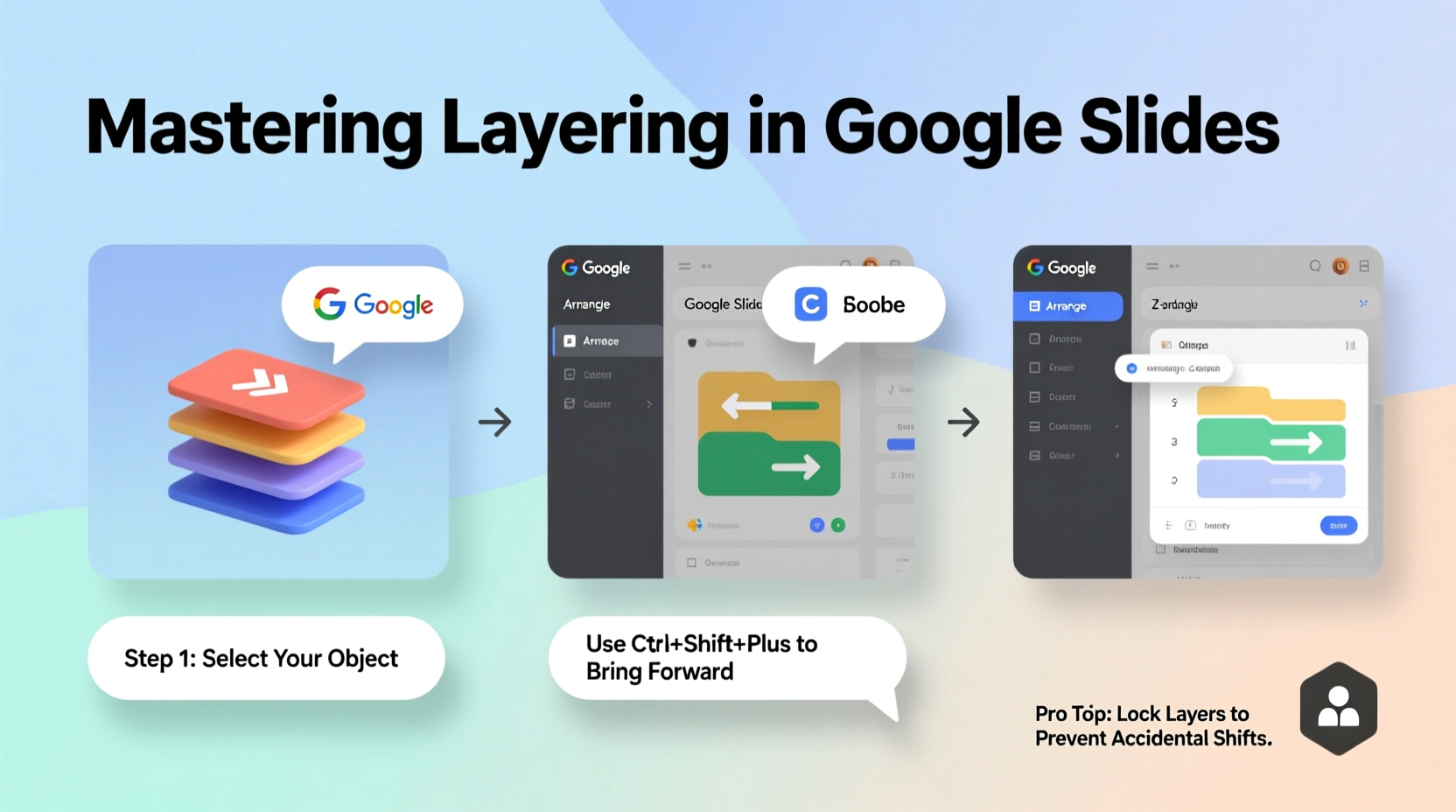
- Select the Object: Click on any element—text box, image, shape—to activate it.
- Access Arrange Options: Right-click the selected object and hover over “Arrange” in the context menu.
- Adjust Layer Position: Choose from:
- Bring to Front: Moves the object above all others.
- Send to Back: Places it beneath everything else.
- Bring Forward: Shifts it one level up.
- Send Backward: Moves it one level down.
- Use Grouping Strategically: Select multiple items (hold Shift), right-click, and choose “Group.” This locks their relative positions and layers, simplifying complex arrangements.
- Test Visibility: Zoom out or preview the slide to ensure no critical text is hidden behind shapes or images.
This process becomes essential when overlaying text on background images, creating callout boxes, or designing custom diagrams. Without proper layer management, important information can be lost or misaligned.
Best Practices for Organizing Your Slides with Layers
Layering isn’t just about aesthetics—it’s a structural tool that supports communication. A well-layered slide guides the viewer’s eye naturally through the content. Here are key principles to apply:
- Establish Visual Hierarchy: Place headlines and key data points on top layers so they’re immediately visible.
- Use Backgrounds Wisely: Subtle gradients or blurred images should sit at the bottom layer to avoid distracting from primary content.
- Highlight with Overlays: Semi-transparent rectangles placed over images (but beneath text) improve readability while maintaining visual interest.
- Avoid Overstacking: More than five overlapping elements can confuse viewers. Simplify where possible.
“Clarity trumps creativity when presenting. If your audience has to work to see the message, you’ve already lost them.” — Dr. Lena Torres, Cognitive Design Researcher
Common Layering Mistakes and How to Fix Them
| Mistake | Why It’s Problematic | Solution |
|---|---|---|
| Text buried behind images | Content is unreadable; audience misses key points | Right-click text box → “Bring to Front” or place image first, then add text |
| Overuse of transparency | Multiple see-through layers reduce contrast and legibility | Limited to one semi-transparent layer (e.g., dark overlay on background) |
| Random stacking order | Design feels chaotic; hard to edit later | Name objects in the selection pane (if using Slides add-ons) and layer logically |
| Forgetting grouping after layering | Elements shift during editing, breaking alignment | Group related layered items after finalizing position |
Real-World Example: Redesigning a Cluttered Slide
Jamal, a marketing manager, was preparing a quarterly review for stakeholders. His initial slide included a high-resolution hero image of a product launch event, with bullet points listed directly on top. During rehearsal, his team couldn’t read half the text due to poor contrast and overlapping visuals.
He revised it using strategic layering:
- Placed the photo as the base layer.
- Inserted a black rectangle with 40% transparency over the entire image.
- Brought white text boxes to the front layer.
- Added a subtle rounded rectangle behind each bullet point for emphasis.
The result? A polished, professional slide where every word was instantly readable. Stakeholders praised the clarity, and Jamal reported increased engagement during Q&A.
Checklist: Optimizing Layer Usage in Your Presentations
Before finalizing any slide, run through this checklist to ensure effective layering:
- ✅ All text is clearly visible and not obstructed by graphics
- ✅ Key elements (titles, stats) are on top layers
- ✅ Backgrounds support rather than dominate the content
- ✅ Transparent overlays are used sparingly and purposefully
- ✅ Related objects are grouped to maintain layout integrity
- ✅ Layer order makes logical sense (background → midground → foreground)
- ✅ The slide remains clean and uncluttered even with multiple elements
Frequently Asked Questions
Can I lock layers in Google Slides?
Google Slides doesn’t have a native “lock layer” feature, but you can simulate it by grouping elements together or using third-party add-ons like “Lucidchart” or “SlidesAI” that offer advanced layout controls. Alternatively, keep a duplicate slide as a reference template.
How do I select an object that’s hidden behind another?
Click on the area where the object should be—sometimes you can still select it if it slightly overlaps. Otherwise, use the selection panel: hold Shift and click repeatedly to cycle through overlapping items, or open the “Order” panel via right-click to manage stacking manually.
Does layering affect animation order?
Yes. Animations play in the order objects were added unless manually changed. Objects higher in the layer stack often animate last by default. To control timing, adjust both layer position and animation sequence in the sidebar to match your narrative flow.
Conclusion: Elevate Your Presentation Game
Mastering layering on Google Slides is not a minor detail—it’s a foundational skill for anyone serious about effective communication. By understanding how to organize elements in space and sequence, you turn static slides into dynamic visual stories. The difference between a forgettable deck and a compelling one often lies in these subtle, intentional choices.


 浙公网安备
33010002000092号
浙公网安备
33010002000092号 浙B2-20120091-4
Comments
No comments yet. Why don't you start the discussion?