
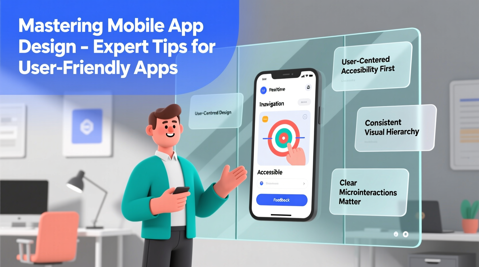
In today’s digital landscape, a mobile app isn’t just a convenience—it’s often the primary touchpoint between a brand and its users. But simply having an app isn’t enough. If it's confusing, slow, or unintuitive, users will delete it within minutes. The difference between an app that thrives and one that fails lies in thoughtful, user-centered design. Mastering mobile app design means understanding human behavior, anticipating needs, and delivering seamless experiences across devices and contexts.
Great app design goes beyond aesthetics. It balances visual appeal with functionality, accessibility, and performance. Whether you're building a productivity tool, social platform, or e-commerce experience, the principles of usability remain constant. Below are proven strategies used by top designers and developers to create apps that users love—and keep using.
1. Prioritize User-Centered Design from Day One
User-centered design (UCD) is not a phase; it’s a mindset. It starts long before wireframes or code. Begin by researching your target audience: their goals, pain points, technical literacy, and typical usage patterns. Conduct interviews, analyze competitor apps, and map out user journeys to identify friction points.
Design decisions should always be rooted in real user data, not assumptions. For example, if your research shows that most users access your app during short commutes, prioritize quick navigation and offline functionality. A banking app might focus on fast balance checks, while a fitness app emphasizes one-tap workout tracking.
2. Simplify Navigation with Intentional Architecture
Navigation is the backbone of any mobile app. Users should never ask, “Where am I?” or “How do I get back?” Common navigation patterns—such as tab bars, hamburger menus, and gesture-based swiping—should align with user expectations and platform conventions (iOS vs. Android).
Limit top-level menu items to five or fewer. Cognitive load increases with each additional option. Use clear, concise labels instead of creative jargon. “Profile” is better than “My Space,” and “Messages” beats “Chatsphere.”
Consider the flow between screens. Are users making unnecessary taps? Can key actions be reached in three steps or less? Tools like flowcharts or journey maps help visualize the path from entry point to goal completion.
“Good navigation feels invisible. When users don’t notice how they’re moving through an app, that’s a sign it’s working.” — Lena Torres, Senior UX Designer at AppFlow Studios
3. Apply Consistency Across UI Elements
Consistency builds trust and reduces learning time. Use standardized icons, typography, button styles, and color schemes throughout the app. If a blue button means “submit” on one screen, it shouldn’t mean “save draft” on another.
Create a design system or style guide early in the process. This ensures all team members—from designers to developers—are aligned. Include specifications for spacing, font sizes, iconography, and micro-interactions like loading spinners or success animations.
| Element | Do | Don’t |
|---|---|---|
| Buttons | Use consistent shape, color, and placement | Vary styles arbitrarily between screens |
| Icons | Follow platform standards (e.g., iOS Human Interface) | Invent new symbols without labels |
| Typography | Limit to 2–3 fonts with clear hierarchy | Use decorative fonts for body text |
| Feedback | Show loading states and confirmation messages | Leave users guessing after tapping |
4. Optimize for Touch and Real-World Conditions
Mobile devices are used in dynamic environments—on buses, in bright sunlight, or with one hand. Design for these realities. Buttons should be at least 44x44 pixels to accommodate finger taps. Avoid placing critical controls near screen edges where accidental touches occur.
Thumb zones matter. On larger phones, the bottom center of the screen is easiest to reach. Place primary actions like “Add Post” or “Scan Item” within this zone. Secondary actions can go in less accessible areas.
Also consider environmental factors. High contrast between text and background improves readability in sunlight. Voice input options help users who can’t type safely. Offline modes ensure functionality when connectivity is spotty.
5. Streamline Onboarding Without Overloading
First impressions determine retention. A cluttered onboarding sequence can turn users away before they experience your app’s value. Instead of dumping information, introduce features progressively.
Use interactive walkthroughs sparingly. Better yet, let users explore the app while offering contextual tips. For example, when someone opens a note-taking app for the first time, highlight the “+” button with a subtle animation and tooltip: “Tap here to create your first note.”
Only request permissions when necessary. Don’t ask for location access immediately upon launch unless it’s essential. Explain why you need the permission—users are more likely to grant it if they understand the benefit.
Mini Case Study: How ‘Taskly’ Reduced Drop-Off by 40%
Taskly, a task management app, initially had a seven-step onboarding process requiring email verification, profile setup, tutorial videos, and permission requests. Analytics showed 68% of users abandoned the app before reaching the home screen.
The team redesigned onboarding to be action-first: users could start adding tasks immediately. Optional setup steps were moved behind a “Get Started” button. Permission prompts appeared only when relevant—like requesting calendar access when scheduling a task. Within two months, drop-off decreased by 40%, and daily active users increased by 27%.
Step-by-Step Guide to Iterative Design Improvement
Even the best-designed apps evolve over time. Follow this cycle to continuously enhance usability:
- Observe: Use analytics tools to track user behavior—heatmaps, session recordings, funnel drop-offs.
- Identify: Pinpoint common pain points (e.g., high exit rate on checkout page).
- Hypothesize: Propose solutions (“Simplify form fields may reduce abandonment”).
- Test: Run A/B tests with small user groups comparing old vs. new designs.
- Implement: Roll out winning changes to all users.
- Repeat: Monitor results and begin the next cycle.
Essential Mobile App Design Checklist
- Conducted user research and created personas
- Defined core user flows (e.g., signup, purchase, search)
- Designed for both iOS and Android guidelines
- Ensured touch targets are minimum 44px
- Used sufficient color contrast for readability
- Tested on multiple device sizes and orientations
- Optimized loading times (under 2 seconds preferred)
- Provided feedback for all user actions (e.g., haptic response)
- Enabled easy access to help or support
- Validated design with real user testing
Frequently Asked Questions
How important is loading speed in app design?
Critical. Users expect apps to respond instantly. Delays of even one second can increase bounce rates by up to 30%. Optimize images, minimize HTTP requests, and use skeleton screens to manage perception of speed.
Should I follow Material Design or Human Interface Guidelines?
Yes—both. Tailor your design to the platform. Android users expect floating action buttons and bottom navigation; iOS users are accustomed to back swipes and tab bars at the bottom. Cross-platform frameworks like Flutter or React Native can help maintain consistency while respecting native patterns.
What’s the role of accessibility in mobile design?
Accessibility isn’t optional—it’s essential. Support screen readers, provide text alternatives for images, allow dynamic text resizing, and avoid relying solely on color to convey meaning. Accessible design benefits everyone, including older users and those with temporary impairments.
Conclusion: Design With Purpose, Iterate With Confidence
Mastering mobile app design isn’t about chasing trends or packing in features. It’s about solving real problems with clarity, empathy, and precision. Every tap, swipe, and transition should serve a purpose. When users feel understood, they stay longer, engage deeper, and recommend your app to others.
Start small. Focus on one core user journey. Test it. Improve it. Then expand. Great apps aren’t built overnight—they’re shaped through relentless refinement and genuine attention to human needs.


 浙公网安备
33010002000092号
浙公网安备
33010002000092号 浙B2-20120091-4
Comments
No comments yet. Why don't you start the discussion?