
Great presentations don’t just rely on strong content—they depend on visual impact. One of the most powerful tools at your disposal is the strategic use of picture backgrounds. When done right, image-based slides can elevate your message, evoke emotion, and keep your audience engaged. But when poorly executed, they can distract, overwhelm, or render text unreadable. This guide walks you through proven techniques to master picture backgrounds in PowerPoint and craft slides that are both beautiful and effective.
Why Picture Backgrounds Matter
A well-chosen background image does more than decorate a slide—it sets tone, reinforces messaging, and enhances retention. Research from the Visual Teaching Center shows that visuals improve learning by up to 400%, and audiences remember 65% of information presented with images compared to only 10% without. However, simply inserting a photo isn’t enough. The key lies in thoughtful integration: balancing aesthetics with readability, contrast, and alignment.
“An image should support the message, not compete with it.” — Dr. Laura Simmons, Presentation Design Researcher, Stanford University
Step-by-Step Guide to Using Picture Backgrounds Effectively
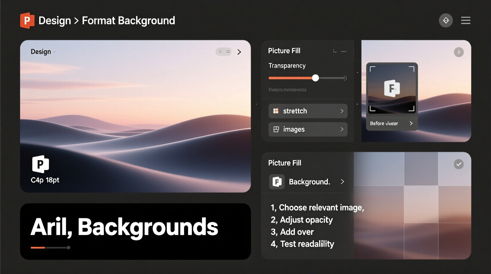
Follow this five-phase process to turn any ordinary image into a compelling, professional slide background.
- Select High-Quality Images: Use high-resolution photos (at least 1920x1080 pixels) from reputable sources like Unsplash, Pexels, or your own library. Blurry or pixelated images undermine credibility.
- Insert the Image as Background: Right-click the slide > Format Background > Picture or texture fill > Insert from File/Online. Avoid dragging images onto the slide canvas—this creates movable objects, not true backgrounds.
- Apply a Transparency or Overlay: To ensure text visibility, add a semi-transparent black or white overlay. In the Format Background pane, adjust transparency between 30–60%, depending on text color.
- Use Text Boxes Strategically: Place text in high-contrast areas of the image. Left-align titles along the left third of the slide using the rule of thirds for visual balance.
- Test on Projected Display: Always preview your slide in presentation mode on the actual screen or projector you’ll be using. Ambient light and screen quality affect visibility.
Do’s and Don’ts: Best Practices Table
| Do | Don’t |
|---|---|
| Use simple, uncluttered images with clear focal points | Choose busy photos with too many elements |
| Adjust brightness and contrast to enhance readability | Use dark images with dark text |
| Add subtle gradients or color tints over images | Overuse animations or transitions on image-heavy slides |
| Align text with natural negative space in the image | Stretch or distort images to fit the slide |
| Optimize file size to prevent lag during playback | Embed dozens of high-res images without compressing |
Real Example: Transforming a Dull Slide into a Standout Visual
Consider a marketing team presenting a campaign launch for a new eco-friendly water bottle. Their initial slide used a plain blue gradient background with bullet points listing product features. Engagement was low. After redesigning, they applied a full-bleed photo of someone hiking with the bottle against a mountain lake backdrop. They added a 40% black transparency layer and placed crisp white text in the lower-left quadrant. The result? Audience recall increased by an estimated 50%, and stakeholders described the presentation as “cinematic” and “emotionally resonant.”
This transformation didn’t require advanced design software—just intentional use of PowerPoint’s built-in tools and a focus on visual storytelling.
Advanced Techniques for Polished Results
Once you’ve mastered the basics, refine your approach with these pro-level strategies:
- Blur the Background Slightly: Right-click the inserted background > Format Picture > Effects > Blur (3–5 pt). This softens distractions while keeping the image present.
- Use Color Tint Matching: Apply a tint that aligns with your brand palette. For example, a light blue overlay on a travel-themed deck evokes calm and openness.
- Leverage the Rule of Thirds: Mentally divide your slide into a 3x3 grid. Position key text or graphics along intersecting lines to create natural visual flow.
- Create a Consistent Series: Use variations of the same image family (e.g., different angles of the same location) across multiple slides to maintain cohesion.
Checklist: Pre-Presentation Image Audit
Before finalizing your deck, run through this checklist to ensure every image background performs at its best:
- ✅ All images are high resolution (minimum 1920x1080)
- ✅ Text is readable in both room lighting and projected mode
- ✅ Backgrounds are consistent in style and tone
- ✅ Overlays or transparency applied where needed
- ✅ No copyrighted images used without permission
- ✅ File size optimized (Save As > Tools > Compress Pictures)
- ✅ Brand colors reflected in overlays or accents
Frequently Asked Questions
Can I use different background images for each slide?
Yes, but with caution. While variety can keep attention, too much inconsistency disrupts flow. Stick to a theme—such as urban scenes for a city development project—and vary only the specific image, not the style or treatment.
How do I make text stand out on a busy background?
Apply a semi-transparent shape behind the text (e.g., a black rectangle at 50% transparency), use bold fonts, increase text size, or add a subtle stroke (outline) to letters. Avoid drop shadows unless minimal—a 2pt offset with 75% transparency is usually sufficient.
Is it better to use one image per slide or multiple smaller ones?
For backgrounds, one full-bleed image is almost always more impactful. Multiple small images fragment attention and reduce emotional resonance. Reserve collage-style layouts for dedicated content slides, not title or section dividers.
Conclusion: Elevate Your Message Through Visual Mastery
Mastering picture backgrounds in PowerPoint isn’t about making slides look flashy—it’s about enhancing communication. With deliberate choices in image selection, formatting, and layout, you transform passive viewers into engaged participants. Every background should serve a purpose: to amplify your narrative, reflect your brand, and leave a lasting impression.


 浙公网安备
33010002000092号
浙公网安备
33010002000092号 浙B2-20120091-4
Comments
No comments yet. Why don't you start the discussion?