
A well-coordinated bed is the centerpiece of a thoughtfully designed bedroom. While sheets, duvets, and comforters form the foundation, it’s the pillow covers that add depth, texture, and personality. Yet, many people treat them as afterthoughts—tossing on whatever matches loosely or using mismatched sets that disrupt visual harmony. Mastering pillow cover coordination isn’t about buying new bedding; it’s about working intelligently with what you already own to create a polished, intentional look.
With the right approach, you can transform an ordinary bed into a layered, inviting retreat. This guide explores practical methods for harmonizing pillow covers with your current bedding, emphasizing color theory, fabric pairing, proportion, and seasonal adaptability—all without requiring a full room overhaul.
Understanding Your Current Bedding Palette
Before introducing new pillow covers, assess your existing bedding ensemble. Identify dominant colors, secondary tones, and accent hues present in your duvet, quilt, or comforter. Most bedding features 2–4 primary colors, even if they appear monochromatic at first glance.
For example, a gray duvet may include subtle undertones of blue, lavender, or charcoal. A cream-colored spread might have warm beige or cool ivory undertones. Recognizing these nuances ensures your pillow covers complement rather than clash.
Use a simple swatch test: place potential pillow covers beside your duvet under daylight. If the colors vibrate or seem “off,” there’s likely a tonal mismatch. Aim for either tonal harmony (similar shades) or strategic contrast (complementary colors).
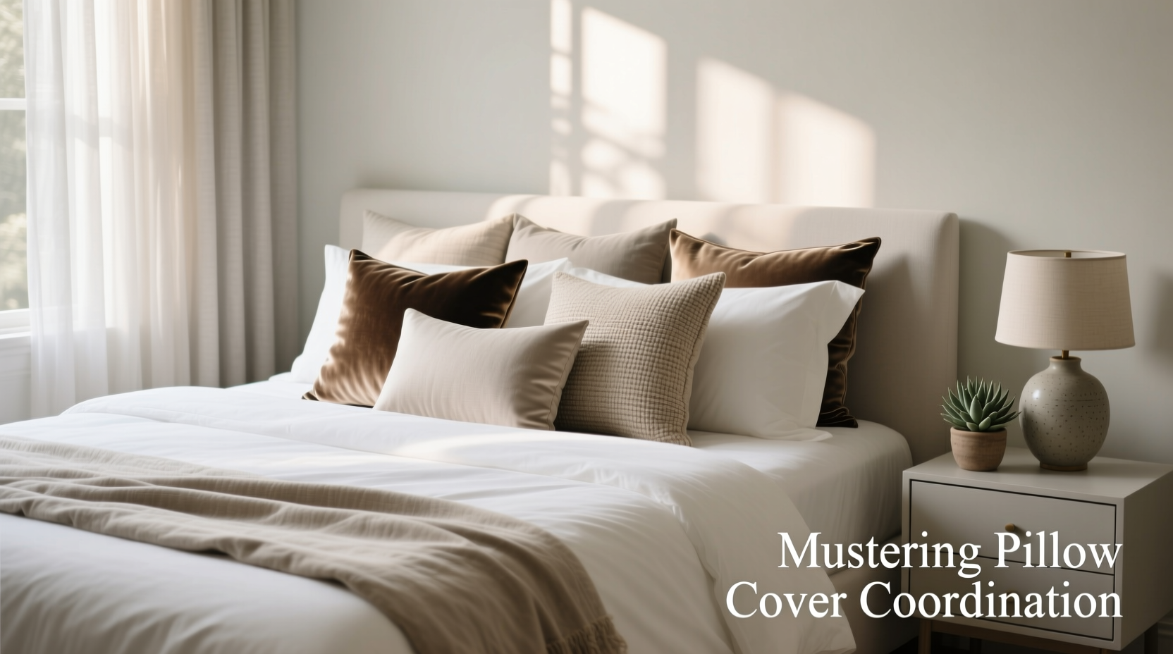
The Layering Formula: Size, Shape, and Placement
Pillow arrangement impacts both aesthetics and comfort. The most visually balanced beds use a mix of sizes and placements. A standard configuration includes:
- Two standard shams (against the headboard)
- One or two Euro shams (square, 26”x26”)
- Decorative lumbar or bolster pillows (optional)
- One or two accent pillows in front (20”x20” or 18”x18”)
Shams provide structure and background support, while decorative covers add interest. Avoid overcrowding—three to five pillows are usually sufficient for a queen bed.
“The key to elegant layering is asymmetry with intention. Odd numbers often feel more organic, but alignment matters more than quantity.” — Lena Torres, Interior Stylist & Textile Designer
Proportion Guidelines by Bed Size
| Bed Size | Euro Shams | Standard Shams | Accent Pillows |
|---|---|---|---|
| Twin | 0–1 | 1 | 1–2 |
| Full/Queen | 1–2 | 2 | 2–3 |
| King | 2 | 2 | 3–4 |
When arranging, place larger pillows in back, tapering down to smaller ones in front. Offset placement slightly can prevent a “military row” effect.
Color and Pattern Coordination Strategies
Harmonious pillow styling relies on a deliberate color strategy. You don’t need matching sets—variety adds character—but cohesion is essential. Consider these three approaches:
- Analogous Pairing: Use adjacent colors on the color wheel (e.g., sage green, olive, and soft yellow). This creates a calm, unified effect.
- Complementary Contrast: Combine opposites like navy and rust or teal and coral. Use one as dominant and the other as accent to avoid visual fatigue.
- Pattern Mixing: Combine scale and type—pair a large floral with a small geometric or stripe. Ensure all patterns share at least one common color.
If your bedding is patterned, choose solid pillow covers in one of its accent colors. Conversely, if your bedding is solid, introduce patterned covers to add dimension.
Real Example: Transforming a Beige Bed Set
Sarah had a neutral-toned bedroom with a beige linen duvet and white sheets. She felt her bed looked flat. Instead of replacing everything, she introduced two camel-colored Euro shams, two taupe standard shams, and two front pillows: one in textured terracotta velvet and another in a muted geometric print featuring beige, rust, and black. The result was warmth and depth without changing any core bedding. By anchoring the palette in existing neutrals and adding intentional pops, she achieved a high-end look for under $75.
Material Matters: Texture as a Design Tool
Texture influences how light interacts with your bed and how inviting it feels. Even within a single color family, varying materials can create rich contrast. Consider combining:
- Linen – airy and relaxed
- Cotton sateen – smooth and subtly lustrous
- Velvet – plush and dimensional
- Chenille – soft with a woven depth
- Bouclé – tactile and modern
For instance, pair matte linen shams with a glossy silk accent pillow for contrast. Or layer a nubby bouclé throw pillow over smooth cotton bedding to add sensory interest.
Seasonality also plays a role. Lighter weaves like cotton and linen suit spring and summer, while heavier textures such as velvet and wool blends enhance coziness in fall and winter.
Fabric Pairing Do’s and Don’ts
| Do | Don’t |
|---|---|
| Mix matte and shiny finishes for contrast | Combine too many high-shine fabrics (can look gaudy) |
| Use texture to echo room elements (e.g., a wool pillow near a wool rug) | Pair delicate silks with rough linens without a transitional fabric |
| Stick to 2–3 dominant textures per arrangement | Overload with competing weaves (e.g., bouclé, corduroy, and sequins) |
Step-by-Step Guide to Coordinating Pillow Covers
Follow this six-step process to refine your pillow styling efficiently:
- Inventory your current bedding and pillow inserts. Note colors, patterns, and textures already in use.
- Select a base palette. Pull 2–3 dominant colors from your duvet or quilt.
- Determine your desired mood. Calm? Energized? Luxe? Earthy? Choose textures and contrasts accordingly.
- Pick pillow types and quantities. Decide on sham count and accent pillows based on bed size and layout.
- Test combinations on the bed. Lay out options before finalizing. Step back and view from doorway distance.
- Rotate seasonally. Store off-season covers in breathable cotton bags to preserve fabric integrity.
“Your bed should evolve with the seasons—not just for comfort, but for emotional resonance. A few swapped covers can refresh a space like nothing else.” — Marcus Lin, Sustainable Home Consultant
Checklist: Perfect Pillow Coordination in 7 Steps
- ☐ Assess your current bedding’s dominant and accent colors
- ☐ Measure pillow inserts to ensure proper cover fit
- ☐ Choose a focal point (e.g., a bold accent pillow or textured sham)
- ☐ Limit patterns to 2–3 max, sharing at least one common hue
- ☐ Mix textures intentionally (e.g., smooth + nubby)
- ☐ Arrange from back to front: shams → Euro shams → accent pillows
- ☐ Re-evaluate every 3–4 months for seasonal updates
Frequently Asked Questions
Can I mix different pillow sizes?
Absolutely—and you should. Varying sizes add visual interest and mimic professional styling. Just ensure proportions align with your bed size (see table above).
How do I clean pillow covers without fading colors?
Always follow care labels. For longevity, wash in cold water with a mild detergent, turn covers inside out, and air dry when possible. Avoid bleach and direct sunlight during drying.
Should pillow covers match the curtains or walls?
They don’t need to match exactly, but echoing a wall or curtain color can unify the room. Even a slight tonal link (e.g., a dusty blue pillow near a pale blue wall) enhances cohesion.
Conclusion: Elevate Your Space One Pillow at a Time
Mastering pillow cover coordination is one of the most accessible and cost-effective ways to refine your bedroom’s aesthetic. It doesn’t require a redesign or major investment—just attention to detail, thoughtful layering, and a clear vision. By leveraging color, texture, and proportion, you can breathe new life into your existing bedding and create a sleep space that feels both intentional and inviting.


 浙公网安备
33010002000092号
浙公网安备
33010002000092号 浙B2-20120091-4
Comments
No comments yet. Why don't you start the discussion?