
Sublimation tumblers have become a staple in the custom merchandise market—prized for their durability, vibrant finishes, and personalization potential. Whether you're launching a small business or crafting gifts, mastering the design process is essential to producing professional-quality results. The key lies not just in equipment but in thoughtful, repeatable design techniques that ensure consistency and visual impact.
From selecting the right software to understanding heat transfer dynamics, every stage of the process influences the final product. This guide walks through the critical steps, common pitfalls, and expert-backed strategies to elevate your sublimation tumbler designs from amateur to exceptional.
Choosing the Right Design Tools and Software
The foundation of any successful sublimation project is high-quality digital design. Not all graphic programs are created equal when it comes to sublimation. Vector-based software like Adobe Illustrator or Affinity Designer offers precision and scalability, while raster editors such as Photoshop are ideal for photo-heavy wraps.
For beginners, free or low-cost alternatives like Inkscape (vector) and GIMP (raster) can deliver strong results with proper technique. Regardless of tool choice, ensure your files are created at 300 DPI resolution and in CMYK color mode to match printer output standards and avoid unexpected color shifts.
Designing for Seamless Wrap-Around Prints
One of the most challenging aspects of tumbler design is achieving a seamless wrap. Because the image wraps around a cylindrical surface, misalignment leads to visible seams or distorted elements. To prevent this, use bleed settings of at least 0.25 inches on each side and align key design components away from the seam line.
Many designers use a “template overlay” showing the seam location and grip zone (where hands typically hold the cup) to strategically place text and focal graphics in the optimal viewing area. Avoid placing fine lines or small text directly over the seam, as slight shifts during pressing can make them unreadable.
“Seam placement isn’t just technical—it’s psychological. The eye naturally focuses on the front third of the cup. That’s where your logo or main message should live.” — Jordan Lee, Industrial Designer & Sublimation Consultant
Step-by-Step Guide to Creating a Sublimation Tumbler Design
- Measure Your Tumbler: Use calipers or manufacturer specs to determine height and circumference. A standard 20 oz tumbler is approximately 8.5” tall and 8.75” in circumference.
- Create a Template: Set up a document in your design software with these dimensions plus 0.25” bleed on top and bottom. Mark the seam zone (usually 0.5” wide) on one edge.
- Select Color Palette: Use Pantone or CMYK swatches calibrated for sublimation ink. Bright reds and blues reproduce well; neon greens may require test prints.
- Import or Create Graphics: Use vector art for logos and typography. For photos, ensure they’re 300 DPI and properly color-corrected.
- Apply Overprint and Bleed: Extend background colors past the trim line. Avoid transparent backgrounds unless intentionally using the silver base of the tumbler.
- Mirror the Image: Always flip the design horizontally before printing—this ensures correct orientation after heat transfer.
- Export for Print: Save as a high-resolution PDF or PNG with embedded fonts and no compression artifacts.
Avoiding Common Design Mistakes: Do’s and Don’ts
| Do’s | Don’ts |
|---|---|
| Use high-resolution images (300 DPI minimum) | Stretch low-res images to fit the canvas |
| Leave safe margins for handles and seams | Place critical text over the seam line |
| Test print on plain paper first to check alignment | Skip test runs to save ink or time |
| Use sublimation-specific transfer paper | Use regular copy paper or generic inkjet paper |
| Calibrate monitor and printer colors regularly | Assume screen colors will match the final product exactly |
Real-World Example: Launching a Custom Coffee Brand
Sarah Thompson, a small-batch roaster in Portland, wanted branded tumblers for her café’s loyalty program. She initially used a basic Canva template with a centered logo and found that after pressing, the design appeared stretched and off-center due to improper scaling.
After consulting a designer, she adopted a structured workflow: measuring the tumbler, creating a bleed-inclusive template, and positioning her minimalist logo in the upper front third. She also switched from RGB to CMYK and began mirroring her designs before printing. The result? A crisp, professional wrap that customers praised for its clean look. Sales of bundled tumblers increased by 38% within two months.
This case underscores how attention to technical detail directly impacts brand perception and commercial success.
Optimizing Color and Layering for Maximum Impact
Sublimation ink reacts differently than standard inkjet or laser toner. It transitions from solid to gas under heat and bonds with polyester coatings. As such, color vibrancy depends on both design choices and material compatibility.
White areas in your design will not appear white—they’ll show as the base color of the tumbler (usually silver). If a white background is needed, consider using a white-coated tumbler or adding a white underbase layer, though the latter requires specialty printers.
For multi-layered effects like shadows or glows, keep opacity above 70% to ensure visibility post-transfer. Gradients should be smooth and gradual; abrupt transitions may band during printing.
“Color is emotional in branding. A warm coral might feel inviting on a wellness tumbler, but it could look dull if not adjusted for sublimation’s saturation curve.” — Dr. Lena Ruiz, Color Psychologist & Product Designer
Frequently Asked Questions
Why does my printed design look faded after pressing?
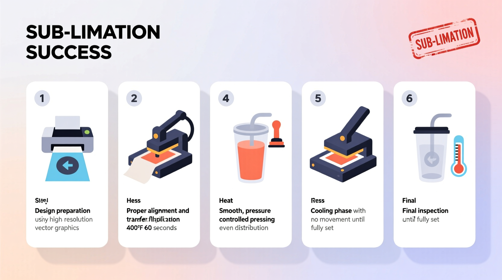
Fading usually results from incorrect heat press settings or expired ink. Ensure your press reaches 400°F (204°C), apply firm pressure for 60–90 seconds, and use fresh sublimation ink and paper. Also, verify that the tumbler has a polymer coating compatible with sublimation.
Can I reuse a sublimation print if I make a mistake?
No. Once the transfer paper is heated, the ink fully releases. Attempting to repress a used sheet will leave ghosting or blank spots. Always use a fresh print for each tumbler.
How do I prevent wrinkling during application?
Wrinkles occur when the transfer slips during pressing. Use heat-resistant tape to secure the paper at the top and bottom. Apply even pressure with a tumbler press or silicone pad insert to eliminate air pockets.
Essential Checklist for Flawless Sublimation Tumbler Production
- ✅ Confirm tumbler dimensions and coating type
- ✅ Design in 300 DPI, CMYK, mirrored format
- ✅ Include 0.25” bleed and avoid seam overlap for key text
- ✅ Use sublimation-specific transfer paper
- ✅ Perform a dry run with plain paper to test fit
- ✅ Set heat press to 400°F, 60–90 seconds, medium-high pressure
- ✅ Allow tumbler to cool completely before peeling
- ✅ Inspect for full transfer and clean edges
Final Thoughts: Elevate Your Craft Through Precision and Practice
Creating stunning sublimation tumblers isn’t about luck—it’s about systemization. Every element, from pixel accuracy to temperature control, contributes to the final impression. By adopting a disciplined design workflow, learning from real-world outcomes, and respecting the science behind dye-sublimation, you position yourself to produce consistently impressive work.


 浙公网安备
33010002000092号
浙公网安备
33010002000092号 浙B2-20120091-4
Comments
No comments yet. Why don't you start the discussion?