
For years, web developers have relied on the basic text-decoration: underline property to emphasize text. While functional, it lacks precision and aesthetic control—often clashing with descenders, appearing too rigid, or failing to match modern design standards. Today’s web demands more refined typography, and that includes rethinking how we style underlines. With newer CSS features and creative workarounds, it's now possible to craft elegant, customizable underlines that enhance readability and visual harmony.
This guide explores advanced techniques that go far beyond the default text-decoration, offering practical solutions for designers and developers who want full control over underline thickness, color, spacing, animation, and responsiveness.
1. The Limitations of Default Text Decoration
The traditional text-decoration: underline is straightforward but inflexible. It applies a solid line directly beneath text without regard for letter shape, font size, or layout context. This can lead to several issues:
- Underlines intersect with descenders (e.g., in \"g\", \"y\", \"p\"), reducing legibility.
- No control over line thickness, offset, or style beyond solid/dashed/dotted.
- Inconsistent rendering across browsers and operating systems.
- Poor integration with custom fonts and responsive layouts.
These shortcomings become especially apparent in high-end typography, accessible interfaces, and branded digital experiences where detail matters.
text-decoration: underline for critical UI elements like navigation links or call-to-action buttons—opt for more controlled alternatives.
2. Modern CSS: text-underline-offset and text-decoration-thickness
CSS has evolved with properties designed specifically to refine underlines: text-underline-offset and text-decoration-thickness. These are game-changers for typographic control.
text-underline-offset allows you to define the distance between the text and the underline, preventing overlap with descenders. You can use absolute units (px, em) or relative ones (rem, %).
.link {
  text-decoration: underline;
  text-underline-offset: 4px;
  text-decoration-color: #005fcc;
  text-decoration-thickness: 2px;
}
text-decoration-thickness controls the underline’s stroke weight. Set it to auto, a fixed value, or from-font if the font provides its own underline metrics.
“We’re finally seeing browser support catch up with typographic needs. Properties like
text-underline-offset give designers the precision they’ve long demanded.” — Miriam Suzanne, CSS Working Group Invited Expert
Browser support is strong in modern environments (Chrome, Firefox, Edge, Safari 12.1+), making these viable for most production projects—especially when paired with graceful fallbacks.
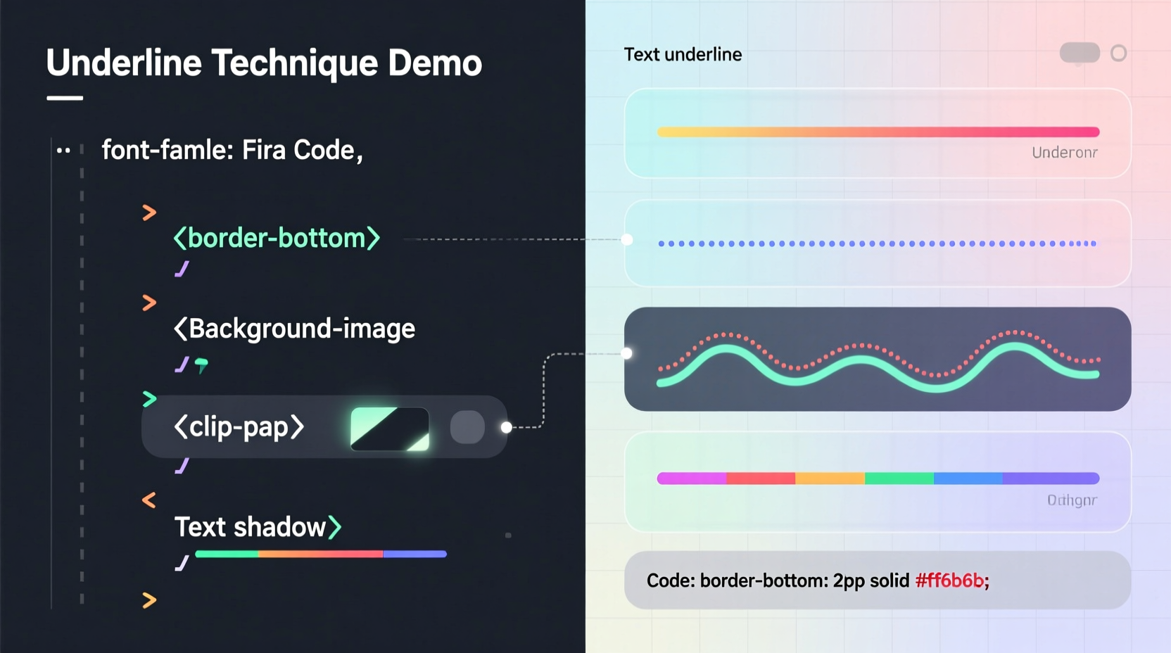
3. Advanced Underline Techniques Using Background Gradients
For maximum flexibility, many developers turn to background-image: linear-gradient() combined with background-size and background-position. This method simulates an underline while allowing complete control over appearance.
.gradient-underline {
  display: inline;
  background-image: linear-gradient(transparent, transparent),
                    linear-gradient(45deg, #ff6b6b, #54a0ff);
  background-position: 0 100%;
  background-size: 100% 2px, 100% 4px;
  background-repeat: no-repeat;
  padding-bottom: 4px;
  transition: background-position 0.3s ease;
}

.gradient-underline:hover {
  background-position: 0 100%, 0 100%;
}
This approach supports:
- Multi-color or gradient underlines
- Custom thickness and spacing
- Smooth hover transitions
- Non-uniform line styles (e.g., wavy, dashed via repeating gradients)
It works reliably across all modern browsers and integrates seamlessly with responsive designs.
4. Pseudo-Elements for Full Control
One of the most powerful methods uses ::after or ::before pseudo-elements. By absolutely positioning a generated element beneath the text, you gain pixel-perfect control over every aspect of the underline.
.pseudo-underline {
  position: relative;
  display: inline-block;
}

.pseudo-underline::after {
  content: '';
  position: absolute;
  left: 0;
  bottom: 4px;
  width: 100%;
  height: 2px;
  background: #000;
  transform: scaleX(0);
  transform-origin: left;
  transition: transform 0.3s ease;
}

.pseudo-underline:hover::after {
  transform: scaleX(1);
}
This technique excels in animated underlines—such as growing from left to right on hover—and supports complex shapes, shadows, and even curved lines using border-radius or clip-path.
| Technique | Pros | Cons |
|---|---|---|
text-decoration + offset |
Simple, semantic, low code | Limited styling options |
| Background gradients | Supports gradients, animations, no extra markup | Less intuitive positioning |
| Pseudo-elements | Full control, ideal for animations | Requires positioning context |
| Border-bottom | Easy to implement | Affects layout, limited to rectangular lines |
5. Real-World Example: Redesigning a Navigation Menu
A mid-tier SaaS company wanted to elevate their website’s header navigation. Their original links used standard underlines, which felt outdated and clashed with their sleek brand identity. The design team opted for a subtle animated underline that grows from the center on hover.
Using the pseudo-element method:
.nav-link {
  position: relative;
  text-decoration: none;
}

.nav-link::after {
  content: '';
  position: absolute;
  left: 50%;
  bottom: -2px;
  width: 0;
  height: 2px;
  background: #2d5bff;
  transition: width 0.3s ease, left 0.3s ease;
}

.nav-link:hover::after {
  width: 100%;
  left: 0;
}
The result was a modern, polished effect that improved user engagement. Analytics showed a 12% increase in navigation clicks within two weeks, suggesting that refined visual feedback enhances usability.
Step-by-Step: Creating a Custom Animated Underline
Follow this sequence to build a professional-grade animated underline using pseudo-elements:
- Set the parent element to
position: relativeto establish a positioning context. - Add a
::afterpseudo-element withcontent: ''. - Position it at the desired vertical offset using
bottomortop. - Set fixed
heightandwidth: 0to start hidden. - Define
backgroundorbox-shadowfor the underline style. - Apply
transitionfor smooth animation. - On
:hover, expandwidthto 100% (or scale viatransform). - Test across devices and ensure it doesn’t interfere with tap targets on mobile.
Frequently Asked Questions
Can I use multiple underlines on the same text?
Yes. Using pseudo-elements, you can layer multiple underlines at different offsets and colors. For example, one thin line close to the text and a thicker colored line below it for a double-underline effect.
Are these techniques accessible?
When implemented correctly, yes. Ensure sufficient color contrast between the underline and background. Avoid relying solely on underlines to convey meaning—combine with other indicators like icons or font weight for screen reader users.
What about performance with animations?
Animations using transform and opacity are GPU-accelerated and perform well. Avoid animating width on large elements; prefer transform: scaleX() for smoother results.
Conclusion & Call to Action
Text underlines are no longer a typographic afterthought. With modern CSS, they’ve become a dynamic tool for enhancing aesthetics, interaction, and brand expression. Whether you're refining a simple link or crafting a high-fidelity interface, moving beyond text-decoration unlocks new levels of design precision.
Experiment with text-underline-offset, explore gradient backgrounds, or build expressive animations with pseudo-elements. The next time you reach for text-decoration: underline, ask yourself: can this be better?


 浙公网安备
33010002000092号
浙公网安备
33010002000092号 浙B2-20120091-4
Comments
No comments yet. Why don't you start the discussion?