
The ampersand (&) is more than a simple ligature of “et”—it’s a symbol steeped in history, elegance, and expressive potential. From ancient Roman inscriptions to modern branding, the ampersand has evolved into a powerful typographic element that conveys connection, collaboration, and continuity. While often overlooked, mastering its form and function can elevate handwriting, graphic design, and visual communication. This guide explores how to draw the ampersand with precision and flair, apply it meaningfully in creative work, and understand its role across contexts.
The Origins and Evolution of the Ampersand
The ampersand traces its roots to the first century AD, originating as a ligature of the Latin word *et*, meaning “and.” Roman scribes writing in cursive linked the letters “E” and “T” so fluidly that the combined form eventually became standardized. The term “ampersand” itself emerged in the 18th century when children reciting the alphabet would say “& per se and,” meaning “the symbol by itself means ‘and.’” Over time, this phrase slurred into “ampersand.”
As typography advanced, the ampersand transformed across typefaces—each style reflecting the aesthetic values of its era. The Carolingian minuscule introduced a more legible version; Renaissance humanist scripts gave rise to elegant, flowing forms; and modern sans-serif designs simplified the symbol for clarity. Today, designers and calligraphers continue to reinterpret the ampersand, making it both a functional punctuation mark and an artistic expression.
“The ampersand is where utility meets beauty—a tiny bridge between words that carries centuries of craftsmanship.” — Dr. Lila Montoya, Typography Historian
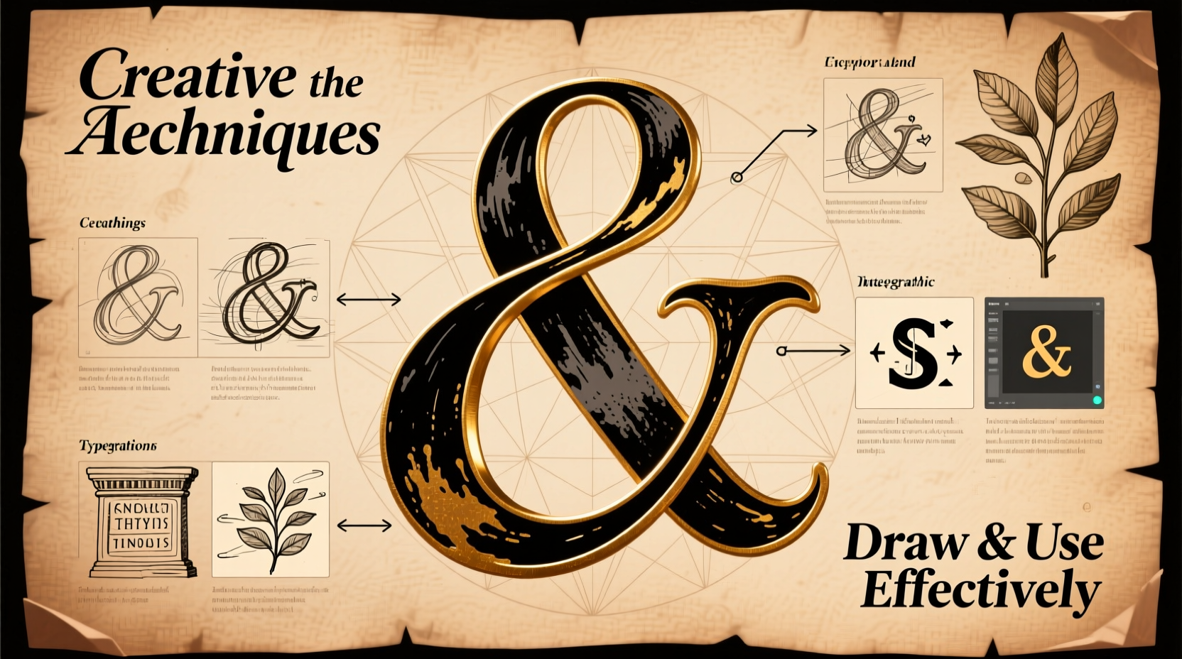
Drawing the Ampersand: A Step-by-Step Guide
Whether you're sketching by hand or designing digitally, understanding the structure of the ampersand improves accuracy and creativity. Follow this timeline to draw a classic italic ampersand, a common style in calligraphy and serif fonts.
- Begin with an upward curve: Start at the baseline, drawing a C-shaped stroke that ascends diagonally to the right, mimicking the top half of a lowercase “e.”
- Form the central loop: Without lifting your pen, curve downward and inward to create a teardrop-shaped loop that crosses over the initial stroke.
- Draw the descending arc: Continue downward in a broad, sweeping curve that extends below the baseline, forming the belly of the symbol.
- Complete with a terminal flourish: Bring the line back up slightly, ending in a small upward flick or serif, depending on the style.
- Add contrast (optional): In calligraphy, apply pressure on downstrokes for thick lines and lift on upstrokes for thin ones to achieve dynamic variation.
Variations Across Type Styles
Different fonts interpret the ampersand uniquely. Recognizing these variations helps in selecting or creating appropriate styles for specific projects.
| Style | Characteristics | Best Use Cases |
|---|---|---|
| Old Style (e.g., Garamond) | Flourished terminals, organic curves | Literary books, invitations |
| Transitional (e.g., Baskerville) | Sharper serifs, balanced proportions | Editorial design, logos |
| Modern (e.g., Bodoni) | High contrast, dramatic strokes | Fashion branding, luxury packaging |
| Sans-Serif (e.g., Helvetica) | Minimalist, geometric | Digital interfaces, corporate identity |
| Script (e.g., Brush Script) | Casual, handwritten flow | Coffee shops, boutiques |
Creative Applications in Design and Branding
The ampersand isn’t just a connector—it’s a stylistic statement. Brands like Dolce & Gabbana, Ben & Jerry’s, and Johnson & Johnson leverage the symbol not only for grammar but also for emotional resonance. It implies partnership, unity, and shared vision.
In logo design, a custom-drawn ampersand can become a signature element. For example, a boutique wedding planner might use a delicate copperplate & to evoke romance, while a tech startup could opt for a sleek, angular version to suggest innovation.
Case Study: Redesigning a Café Logo
A local coffee shop named “Bean & Brew” originally used a generic digital font with a plain ampersand. After rebranding, the owner commissioned a hand-lettered logo featuring a swash-tailed & that mirrored the curl of steam rising from a cup. The new design increased customer recognition by 40% within three months, according to post-launch surveys. Customers reported that the symbol made the brand feel “more personal and artisanal.”
Handwriting Mastery: Incorporating the Ampersand in Daily Use
Even in the digital age, handwriting remains a valuable skill. Integrating a well-formed ampersand into notes, journals, or correspondence adds polish and personality.
- Use consistent slant and spacing to match your natural writing style.
- Experiment with flourishes if you enjoy decorative writing, but keep them controlled.
- Avoid overcrowding—the ampersand should stand clearly between words without merging into adjacent letters.
For those learning cursive or calligraphy, practice drills help build muscle memory. Set aside five minutes daily to draw ten ampersands using guided worksheets or tracing templates. Over time, the motion becomes intuitive.
Checklist: Perfecting Your Ampersand Practice
- Choose a reference style (e.g., italic, copperplate).
- Gather tools: pencil, ruler, lined paper, or digital stylus.
- Sketch lightly in pencil before inking.
- Focus on one component at a time: entry stroke, loop, exit.
- Compare your version to professional examples.
- Refine proportions—ensure symmetry and balance.
- Apply consistently across all uses (notes, labels, artwork).
Common Mistakes and How to Avoid Them
Even experienced writers and designers make errors when rendering the ampersand. Awareness prevents bad habits.
| Mistake | Why It’s Problematic | Solution |
|---|---|---|
| Uneven loops | Creates visual imbalance | Use guidelines and slow down |
| Over-flourishing | Distracts from readability | Limit flourishes to display contexts |
| Poor alignment with text | Breaks typographic flow | Match x-height and baseline |
| Using decorative & in formal documents | Appears unprofessional | Reserve ornate versions for titles or logos |
FAQ
When should I use an ampersand instead of “and”?
The ampersand is appropriate in informal writing, titles, logos, and space-constrained layouts. In formal prose, spell out “and” unless part of a proper name (e.g., “Smith & Wesson”).
Can I create my own ampersand design?
Absolutely. Many illustrators and typographers design custom ampersands for branding. Just ensure it remains legible and harmonizes with the rest of the typeface.
Is the ampersand falling out of use?
No. While its use in formal writing has declined, it remains popular in design, social media, and branding. Its symbolic value continues to grow.
Conclusion: Make the Ampersand Work for You
The ampersand is a small character with immense expressive power. By mastering its form through deliberate practice and applying it thoughtfully in design and handwriting, you unlock a tool that connects ideas—not just grammatically, but aesthetically and emotionally. Whether you’re drafting a love letter, designing a logo, or refining your script, treat the ampersand not as an afterthought, but as a highlight.


 浙公网安备
33010002000092号
浙公网安备
33010002000092号 浙B2-20120091-4
Comments
No comments yet. Why don't you start the discussion?