
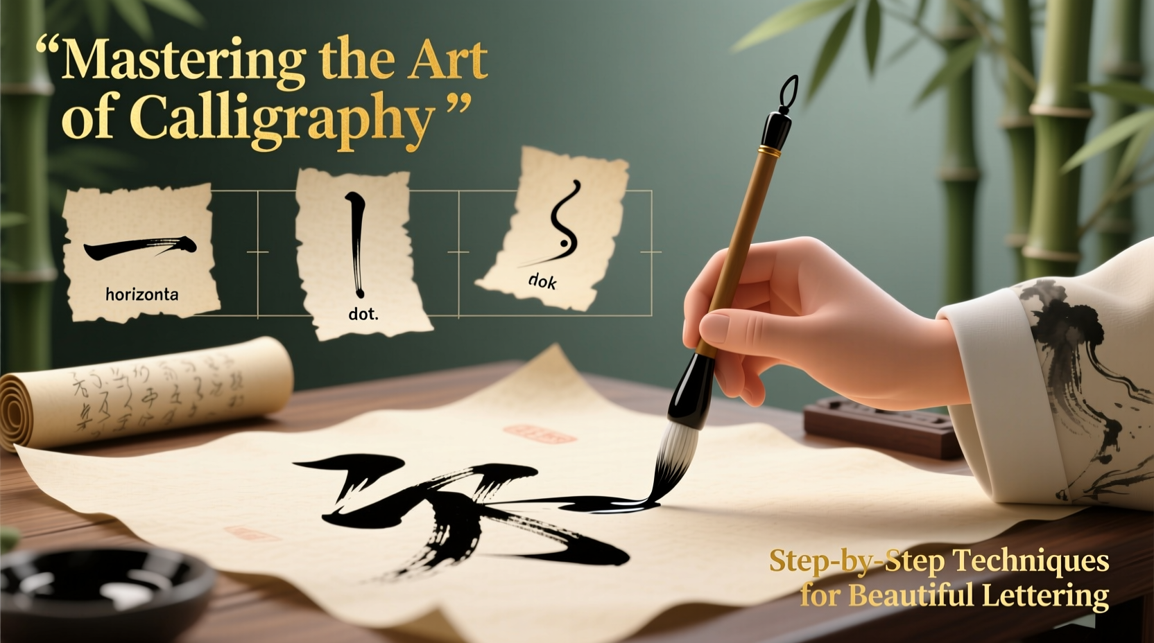
Calligraphy is more than just writing—it’s an expressive art form that transforms letters into visual poetry. The foundation of this craft lies in mastering the calligraphy alphabet: understanding stroke structure, rhythm, spacing, and consistency. Whether you're using a dip pen, brush marker, or fountain pen, developing strong fundamentals ensures your lettering evolves from shaky attempts to elegant compositions.
The journey begins not with flourishes or fancy scripts, but with disciplined practice of basic strokes and letterforms. This guide walks through essential techniques, tools, and mindset shifts that elevate your hand-lettering game—offering a structured path from novice to confident practitioner.
Understanding Calligraphy Tools and Materials
Before forming letters, it's crucial to choose the right tools. Each writing instrument behaves differently and influences stroke thickness, ink flow, and overall style.
- Nib pens: Ideal for traditional Western calligraphy (like Copperplate or Spencerian), offering high contrast between thick downstrokes and thin upstrokes.
- Brush pens: Great for modern styles and Asian-inspired scripts; flexible tips allow dynamic pressure control.
- Fountain pens: Convenient for everyday use, though limited in stroke variation unless designed for calligraphy.
- Paper: Use smooth, bleed-resistant paper (e.g., Rhodia or Tomoe River) to prevent feathering and ensure clean lines.
Core Principles of the Calligraphy Alphabet
Every well-executed script follows key principles that govern legibility, balance, and aesthetic harmony. These apply regardless of whether you're practicing italic, Gothic, or modern script styles.
- Slant Consistency: Maintain a uniform angle across all letters (commonly 55° for Italic, 30°–45° for casual scripts).
- Baseline Alignment: All letters should sit precisely on the same invisible line to avoid uneven text blocks.
- Letter Spacing: Even gaps between letters create rhythm. Avoid clustering or over-separating characters.
- Stroke Contrast: Controlled pressure creates thick downstrokes and hairline upstrokes—a hallmark of professional-looking calligraphy.
“Beautiful lettering isn’t about perfection. It’s about intentionality—each stroke serving a purpose.” — Maria Lopez, Calligraphy Instructor at The Letter Arts Studio
Step-by-Step Guide to Building the Calligraphy Alphabet
Learning the full alphabet can feel overwhelming. Break it down systematically using foundational strokes—the building blocks of every letter.
Phase 1: Practice Foundational Strokes
Spend 10–15 minutes daily drilling these core movements:
- Upstroke (thin, light pressure)
- Downstroke (thick, firm pressure)
- Oval
- Compound curve
- Ascending loop
- Descending loop
Phase 2: Learn Lowercase Letters Grouped by Structure
Group similar letters together to reinforce muscle memory:
| Letter Group | Examples | Shared Stroke Patterns |
|---|---|---|
| Oval-based | a, d, g, o | Use clockwise/counterclockwise ovals with entry/exit strokes |
| Vertical stem | l, t, i, h | Strong downstrokes with crossbars or ascenders |
| Looped forms | p, q, y, j | Incorporate descenders with graceful curves |
Phase 3: Master Uppercase Forms
Uppercase letters demand greater precision due to increased size and decorative elements. Focus on symmetry and proportion:
- Start with simpler caps like M, N, V before advancing to complex ones like B or R.
- Use guidelines with x-height, cap height, and ascender/descender lines.
- Incorporate serifs only after mastering base shapes.
Phase 4: Refine Word Flow and Kerning
Once individual letters are consistent, practice connecting them naturally. Write common word pairs (the, and, you) repeatedly, adjusting spacing until transitions feel fluid.
Common Mistakes and How to Fix Them
Even dedicated learners hit roadblocks. Recognizing these issues early accelerates improvement.
| Issue | Root Cause | Solution |
|---|---|---|
| Inconsistent stroke weight | Uneven pressure or incorrect pen angle | Practice vertical drills; hold pen at 45° to paper |
| Wobbly baselines | Lack of lined paper or poor posture | Use grid sheets; sit upright with forearm supported |
| Crowded letter spacing | Over-focusing on speed or shape | Pause between letters; visualize equal white space |
| Smudged ink | Using non-archival ink or resting hand on wet areas | Let work dry; write left-to-right if right-handed |
Checklist: Building Your Daily Practice Routine
To make lasting progress, structure your time effectively. Follow this checklist during each session:
- ✅ Warm up with 5 minutes of basic strokes
- ✅ Choose 2–3 new letters to focus on
- ✅ Review previous letters for consistency
- ✅ Write sample words incorporating practiced letters
- ✅ Analyze errors: mark problem areas and correct them immediately
- ✅ Store practice sheets to track progress weekly
Real Example: From Struggles to Success
Jamal, a graphic designer with no prior calligraphy experience, began practicing Copperplate script six months ago. His first attempts were uneven, with shaky loops and inconsistent spacing. Instead of copying full quotes, he committed to mastering one letter per day, repeating each 50 times with attention to stroke order.
After three weeks, he noticed improved control. By week eight, he could write full sentences with even baselines and proper slant. Today, Jamal teaches weekend workshops and credits his success to focused repetition—not talent. “I didn’t need artistic genius,” he says. “I needed patience and a plan.”
Frequently Asked Questions
How long does it take to master the calligraphy alphabet?
With daily practice of 20–30 minutes, most learners develop legible, consistent lettering within 6–8 weeks. Mastery—defined as effortless execution and personal style development—can take 6 months to a year.
Can I learn calligraphy without expensive tools?
Absolutely. Start with a beginner brush pen (like Tombow Fudenosuke) and printer paper. As skills grow, upgrade materials based on preference. Skill matters far more than equipment.
Why do my letters look uneven even after practice?
Inconsistency often stems from variable pen angle or pressure. Use a mirror to check your grip, or record yourself writing to identify subtle shifts in technique.
Conclusion: Your Journey Starts With a Single Stroke
Mastering the calligraphy alphabet isn’t about achieving instant perfection—it’s about cultivating discipline, observation, and joy in the process. Every loop, every downstroke, brings you closer to a personal handwriting style that communicates both clarity and beauty.
Begin today with just five minutes of stroke drills. Repeat them tomorrow. Then add a letter. Over time, those small efforts compound into remarkable skill. There’s no gatekeeper to this art—only your willingness to pick up the pen and begin.


 浙公网安备
33010002000092号
浙公网安备
33010002000092号 浙B2-20120091-4
Comments
No comments yet. Why don't you start the discussion?