
A well-dressed bed is more than just a place to sleep—it’s a statement. The right combination of decorative pillow cases can transform an ordinary bedroom into a curated retreat that reflects personality, comfort, and design sophistication. While many focus on sheets and duvets, it’s the layered pillows that add depth, texture, and visual interest. Mastering how to match decorative pillow cases isn’t about following rigid rules; it’s about understanding balance, contrast, and harmony in your space.
Understanding the Role of Decorative Pillow Cases
Decorative pillow cases serve both aesthetic and functional purposes. They protect standard or Euro shams from daily wear while introducing design elements such as pattern, color, and fabric variation. Unlike regular pillowcases meant for sleeping, decorative ones are typically placed at the front of the bed for visual impact.
These accents act as the jewelry of your bedding—small details that complete the look. When chosen thoughtfully, they tie together the room’s palette, reinforce its mood (cozy, modern, minimalist), and provide tactile variety through materials like linen, velvet, silk, or cotton sateen.
Building a Cohesive Color Palette
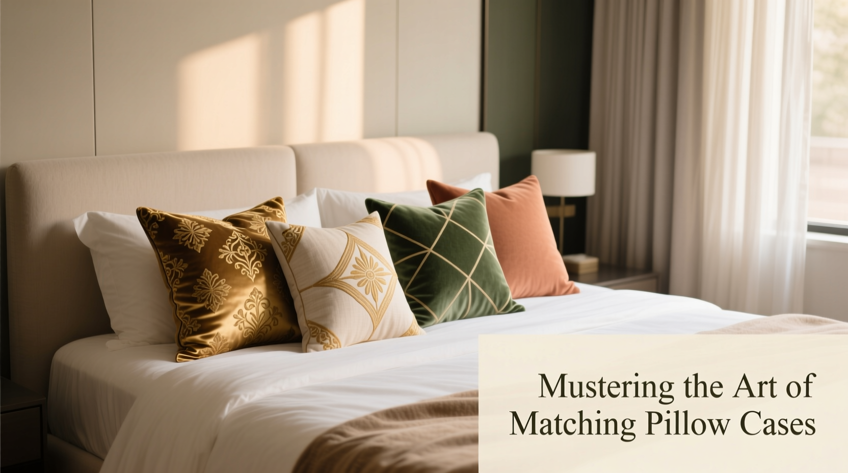
Color sets the emotional tone of your bedroom. A harmonious blend of hues in your pillow cases can create calm, energy, warmth, or elegance depending on your intent.
Start by identifying your base colors—the dominant shades in your bedding, walls, or rugs. From there, choose 2–3 complementary or contrasting colors for your pillow cases. Use the 60-30-10 rule: 60% dominant color (e.g., white duvet), 30% secondary (soft gray sheets), and 10% accent (terracotta or navy pillow case).
For example, a neutral bedroom with beige walls and cream bedding gains instant character with a mix of sage green, rust-orange, and charcoal-gray pillow cases. These colors don’t need to dominate—they only need to appear intentionally.
“The most inviting bedrooms use pillows not as afterthoughts, but as intentional punctuation marks in the room’s design language.” — Lena Torres, Interior Stylist & Author of *Bedroom Alchemy*
Selecting Textures and Fabrics for Dimension
Even with perfect color coordination, a flat-looking bed often lacks textural diversity. Mixing fabrics adds richness and invites touch. Consider pairing smooth cotton sateen with nubby linen, plush velvet with crisp canvas, or embroidered cotton with woven jacquard.
Texture creates subtle contrast even within monochromatic schemes. A set of ivory pillow cases in varying materials—matte linen, shiny silk, and ribbed cotton—can feel luxurious without a single bold color.
| Fabric | Best For | Pairing Suggestions |
|---|---|---|
| Linen | Rustic, relaxed, natural styles | Cotton, wool, raw silk |
| Velvet | Luxury, drama, winter months | Silk, satin, metallic embroidery |
| Cotton Sateen | Smooth finish, everyday elegance | Linen, printed cotton, chenille |
| Bouclé | Tactile depth, modern coziness | Plain weaves, leather-look fabrics |
Creating Visual Balance Through Size and Arrangement
The way you arrange your pillow cases matters as much as what you choose. Most beds benefit from a layered approach using multiple sizes: standard, Euro, king, and lumbar pillows.
A common and effective configuration includes:
- Two Euro shams at the back (against the headboard)
- Two standard or king shams in front
- One to three decorative pillows in front or stacked asymmetrically
For symmetry, mirror patterns on each side. For a more organic feel, vary sizes and orientations—try stacking a small square pillow atop a longer lumbar one. Rotate pillow placements seasonally to refresh the look without buying new items.
Step-by-Step Guide: Curating Your Pillow Case Ensemble
- Assess your current bedding: Note dominant colors, textures, and style (e.g., Scandinavian, boho, traditional).
- Pick a theme or mood: Calm? Bold? Romantic? This guides color and fabric choices.
- Choose a base pair: Start with two matching shams that align with your duvet or coverlet.
- Add contrast: Introduce one or two decorative cases with a different color, print, or texture.
- Incorporate pattern wisely: If using prints, ensure one element (like a color or motif) echoes elsewhere in the room.
- Layer and adjust: Place pillows on the bed and step back. Remove anything that feels cluttered or off-balance.
- Finalize and rotate: Once settled, take a photo for reference. Switch combinations seasonally.
Real Example: Transforming a Dated Bedroom
Sarah, a homeowner in Portland, had a guest room that felt outdated despite fresh paint. The all-white bedding looked sterile, and the space lacked warmth. She introduced two navy-blue linen Euro shams, layered with two soft taupe cotton sateen standards. In front, she added three decorative pillows: one geometric-print cotton in navy and cream, one textured oatmeal bouclé square, and one lumbar pillow in rust-colored velvet.
The result? Instant cohesion and depth. The navy tied into the artwork, the velvet added seasonal warmth, and the mix of textures invited touch. Guests began commenting on how “put-together” the room felt—proof that pillow styling can redefine a space.
Common Mistakes to Avoid
- Overcrowding the bed: Too many pillows look messy. Stick to 3–5 total for a queen bed, 5–7 for a king.
- Mismatched scale of patterns: Pairing a large floral with a tiny stripe can clash. Stick to one dominant scale per layer.
- Ignoring the room context: A neon yellow pillow might pop—but only if yellow appears elsewhere (in art, rug, chair).
- Using only flat, solid colors: Without texture or pattern, the bed can appear unfinished or bland.
- Forgetting maintenance: Decorative cases get dusty. Rotate and clean them every few weeks.
Frequently Asked Questions
How many decorative pillow cases should I use?
For visual balance, aim for 3–5 decorative pillows on a queen bed and 5–7 on a king. Include a mix of shams and accent pillows, but avoid overcrowding. Less is often more when styling.
Can I mix patterns successfully?
Yes—when done strategically. Choose patterns that share at least one common color. Combine different scales (e.g., large stripe with small dot) and vary orientation (vertical vs. horizontal). Anchor the mix with solid-texture pillows to prevent visual overload.
How do I store decorative pillow cases when not in use?
Store them flat or rolled inside breathable cotton bags. Avoid plastic bins, which trap moisture. Keep them in a cool, dry closet away from direct sunlight to prevent fading.
Essential Checklist for Perfect Pillow Pairing
- Identify your bedroom’s primary color scheme
- Select 2–3 complementary or contrasting accent colors
- Choose at least two different fabric types for texture contrast
- Pick one statement pillow (bold color, unique shape, or intricate detail)
- Ensure all selected pillow cases coordinate with existing room elements (curtains, rug, art)
- Arrange and photograph your setup for future reference
- Create a rotation schedule for seasonal updates
Conclusion: Elevate Your Space One Pillow at a Time
Matching decorative pillow cases is an accessible, affordable way to refine your bedroom’s aesthetic. With attention to color harmony, textural contrast, and thoughtful arrangement, you can turn any bed into a design centerpiece. The goal isn’t perfection—it’s personal expression grounded in balance.


 浙公网安备
33010002000092号
浙公网安备
33010002000092号 浙B2-20120091-4
Comments
No comments yet. Why don't you start the discussion?