
Throw pillows are more than just decorative accents—they’re powerful tools for expressing personality, adding texture, and transforming the mood of a room. When done well, combining patterned pillow covers can create a layered, curated look that feels intentional and inviting. But mismatched prints can quickly turn chaotic without a thoughtful approach. The key lies in understanding scale, color harmony, contrast, and rhythm. With the right principles, anyone can master this design technique and bring dynamic energy to their interiors.
Understanding Pattern Scale and Proportion
One of the most common mistakes in mixing patterns is using designs of similar size. When all prints are large—or all small—the eye struggles to find focus, resulting in visual clutter or flatness. Successful layering requires a deliberate variation in scale.
Think of pattern scale in three categories: large (statement), medium (transitional), and small (supporting). A balanced arrangement typically includes at least two of these scales. For example, pair a bold floral (large) with a subtle pinstripe (small) and a geometric check (medium). This creates depth and movement while maintaining cohesion.
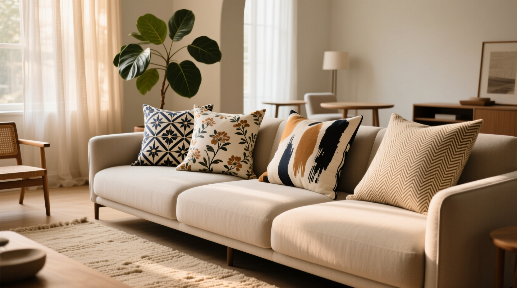
The Rule of Three in Pillow Styling
A classic interior design trick is to use odd numbers—especially three—for styling accessories. Groupings of three patterned pillows tend to feel more natural and dynamic than even sets. Try this combination:
- One large-scale print (e.g., oversized botanical)
- One medium-scale texture or pattern (e.g., herringbone weave)
- One small-scale accent (e.g., tiny dot or micro-check)
This trio allows each piece to stand out while contributing to an overall harmonious composition.
Building a Cohesive Color Palette
Color is the invisible thread that ties mixed patterns together. Even wildly different prints can coexist beautifully if they share a common hue. Start by identifying a base color scheme—such as earthy neutrals, coastal blues, or jewel tones—and select patterns that pull from that range.
Use the 60-30-10 rule as a guide: 60% dominant color (often from your sofa or walls), 30% secondary color (curtains or rug), and 10% accent color (pillows, art, decor). Let your pillow covers reflect the secondary and accent portions, ensuring they don’t introduce entirely new colors unless intentionally planned.
“Pattern mixing isn’t about randomness—it’s about rhythm. Shared colors act like musical notes in a chord; they make disparate elements feel like they belong.” — Lena Torres, Interior Stylist & Author of *Textured Spaces*
Creating Contrast Without Chaos
Contrast keeps a pillow arrangement from feeling monotonous, but too much contrast leads to dissonance. To strike the right balance:
- Vary pattern types: Combine florals with geometrics, stripes with ikats, or animal prints with abstracts.
- Anchor busy prints with solids or textured neutrals (like linen or bouclé).
- Repeat at least one color across multiple pillows to create visual continuity.
For instance, a navy-and-white striped cover pairs surprisingly well with a rust-toned paisley—if both include a touch of cream. That shared neutral becomes the glue holding them together.
Step-by-Step Guide to Mixing Patterns Like a Pro
Follow this five-step process to confidently assemble a stylish pillow collection:
- Start with a foundation. Choose your largest furniture piece (e.g., sofa) and note its dominant color(s).
- Select a unifying color. Pick one or two accent hues that will appear across all pillow covers.
- Choose pattern types. Pick 2–3 different kinds (e.g., stripe, floral, tribal) to ensure variety.
- Layer by scale. Include one large, one medium, and optionally one small pattern.
- Add texture or solid. Introduce a solid-colored or textural pillow (knit, velvet, etc.) to ground the arrangement.
Do’s and Don’ts of Pattern Mixing
| Do’s | Don’ts |
|---|---|
| Do use a consistent color thread across all patterns | Don’t combine more than 3–4 distinct patterns on one sofa |
| Do mix pattern types (floral + geometric) | Don’t use all large-scale prints together |
| Do include a solid or textured neutral for balance | Don’t ignore lighting—test prints in natural and artificial light |
| Do step back frequently to assess the overall effect | Don’t force a match—remove any pillow that feels “off” |
Real-Life Example: Revamping a Neutral Living Room
Sophie, a homeowner in Portland, wanted to add life to her beige sectional without overwhelming the calm atmosphere. She started with three neutral-toned pillows in varying textures—linen, knit, and corduroy. Then, she introduced two patterned covers: one with a soft sage-and-cream botanical (large scale) and another with a charcoal-and-ivory herringbone (medium scale).
To tie it together, she added a third patterned pillow featuring tiny rust-colored dots on cream—a subtle nod to the throw blanket draped nearby. The result? A layered, inviting look that felt collected over time rather than staged. By repeating cream across all pieces and anchoring with texture, Sophie achieved visual interest without sacrificing serenity.
Checklist: Your Pattern-Mixing Game Plan
Before arranging your pillow covers, run through this checklist:
- ☐ I’ve identified a primary color palette (2–3 core colors)
- ☐ I’m using at least two different pattern scales
- ☐ I’ve included a mix of pattern types (e.g., not all florals)
- ☐ At least one color repeats across multiple pillows
- ☐ I’ve added a solid or textured neutral for balance
- ☐ I’ve stepped back to view the arrangement as a whole
- ☐ I’ve removed any piece that feels jarring or unnecessary
Frequently Asked Questions
Can I mix vintage and modern patterns?
Absolutely. In fact, blending eras often adds character. Pair a retro 70s-inspired sunburst print with a minimalist Scandinavian stripe. The contrast tells a story. Just ensure they share a color or tone to avoid clashing.
How many patterned pillows is too many?
On a standard three-cushion sofa, three to four pillows is ideal. More than four can overcrowd the space. If using multiple patterns, limit yourself to two or three patterned covers and fill the rest with solids or textured neutrals.
What if my room already has a busy rug or wallpaper?
In high-pattern environments, let the floor or walls take center stage. Opt for solid or subtly textured pillow covers in colors pulled from the dominant pattern. You can still add one small-scale printed pillow for detail, but keep the focus elsewhere.
Final Thoughts: Confidence Is Key
Mixing and matching patterned pillow covers isn’t about following rigid rules—it’s about developing an eye for balance and learning to trust your instincts. Design evolves with experimentation. Begin conservatively, observe what works, and gradually push your boundaries. Over time, you’ll develop a personal style that feels authentic and polished.


 浙公网安备
33010002000092号
浙公网安备
33010002000092号 浙B2-20120091-4
Comments
No comments yet. Why don't you start the discussion?