
Light orange is a vibrant yet delicate hue that evokes warmth, creativity, and energy. Whether you're painting a sunset, designing a brand palette, or illustrating a children's book, achieving the right shade of light orange can make all the difference. But unlike primary colors, light orange isn't found straight from the tube—it requires careful blending and an understanding of color theory. This guide breaks down the science and artistry behind crafting the ideal light orange, offering practical steps, common pitfalls, and expert insights to help you mix with confidence.
The Science Behind Light Orange
Orange sits between red and yellow on the color wheel, making it a secondary color formed by combining these two primaries. A \"light\" version of orange means it has been tinted—typically with white—to reduce its intensity and increase its value (lightness). However, simply adding white to a standard orange often results in a chalky or washed-out appearance if not done thoughtfully.
To create a luminous light orange, consider three key factors:
- Hue: The balance of red and yellow determines whether your orange leans toward coral, peach, or golden tones.
- Value: How light or dark the color appears, adjusted using white (or black, though rarely recommended for lightening).
- Chroma (Saturation): The purity or intensity of the color. Over-dilution with white can desaturate the vibrancy.
Understanding these elements allows for intentional mixing rather than guesswork.
Step-by-Step Guide to Mixing the Perfect Light Orange
- Choose Your Base Orange
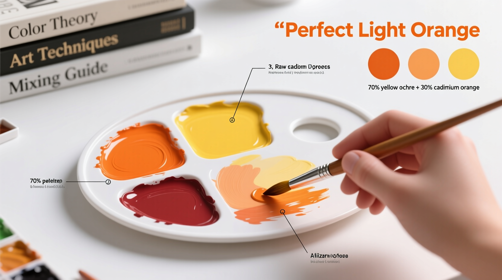
Select high-quality red and yellow pigments. For a warm, natural light orange, use cadmium yellow and cadmium red. For a softer, more modern tone, try a lemon yellow with a scarlet red. - Mix Equal Parts Red and Yellow
Begin with equal drops or dabs of each. Stir thoroughly until no streaks remain. Observe the resulting orange—is it too warm? Too cool? Adjust by adding a touch more yellow for brightness or red for depth. - Evaluate the Saturation
If the orange feels too intense, resist the urge to immediately add white. Instead, consider thinning with a medium (like linseed oil in oils or water in acrylics) to test translucency first. - Add White Gradually
Introduce titanium white—one small portion at a time. Mix completely before assessing. Stop once you reach the desired lightness without sacrificing vibrancy. - Adjust Warmth or Coolness
If the light orange appears too pinkish, add a hint more yellow. If it looks muddy or brownish, it may have too much red—correct with a tiny bit of yellow or even a whisper of white to lift it. - Test on Paper or Canvas
Colors look different when applied versus mixed on a palette. Paint a swatch and let it dry (especially important with acrylics and oils, which darken slightly as they cure).
Alternative Approach: Using Pre-Made Oranges
If starting from scratch feels overwhelming, begin with a premixed orange pigment such as permanent orange or pyrrole orange. These offer consistent base tones and require fewer adjustments. Then follow steps 4–6 above to lighten and refine.
Common Mistakes and How to Avoid Them
| Mistake | Why It Happens | Solution |
|---|---|---|
| Muddy or Brownish Orange | Too much red or impure pigments introducing unintended undertones | Use clean, transparent yellows; balance ratios carefully |
| Chalky Appearance | Overuse of white or low-pigment binders | Add white incrementally; consider using a lighter yellow instead |
| Inconsistent Results | Not measuring or recording mix ratios | Keep a mixing journal with notes on proportions |
| Drying Shift | Oils/acrylics change slightly when dry | Always test mixes and wait 24 hours before finalizing |
Expert Insight: The Artist’s Perspective
“Light orange isn’t just about adding white to orange. It’s about preserving the soul of the color. I often use Naples yellow instead of titanium white—it lightens while keeping warmth and richness.” — Lena Torres, Professional Muralist & Color Theory Instructor
Torres emphasizes that experienced artists often avoid stark whites when tinting warm hues. Substituting part of the white with a warm off-white like Naples yellow or mixing in a translucent medium can maintain glow without dulling the tone.
Real Example: Creating a Sunrise Gradient
Jessica, a freelance illustrator working on a children’s book scene featuring a sunrise, needed a soft, radiant light orange for the sky’s core. She began with cadmium yellow and alizarin crimson in a 3:1 ratio. After testing, she found the initial orange too intense. Rather than adding white directly, she first tried mixing in a touch of hansa yellow light to brighten it. Then, using a 70/30 blend of titanium white and Naples yellow, she achieved a glowing, creamy light orange that transitioned smoothly into pale yellow and blush pink. Her secret? Layering thin glazes instead of applying thick opaque strokes, allowing underlying warmth to shine through.
Checklist: Achieving Perfect Light Orange Every Time
- ☑ Use fresh, high-pigment red and yellow paints
- ☑ Start with equal parts, then adjust ratio based on desired warmth
- ☑ Mix thoroughly until smooth and uniform
- ☑ Add white gradually—no more than 10% at a time
- ☑ Consider substituting some white with Naples yellow for richer tints
- ☑ Test on actual surface and allow to dry
- ☑ Record successful formulas for future use
Frequently Asked Questions
Can I use watercolor to make light orange?
Absolutely. In watercolor, light orange is often achieved naturally by diluting a strong orange wash with water. Control transparency by adjusting pigment concentration. For a more opaque effect, consider lifting color or using a light background paper.
Why does my light orange look pink after drying?
This usually happens when the red used has blue undertones (like alizarin crimson). Stick to warm reds such as cadmium red light or pyrrole red, which lack cool undertones and produce cleaner oranges.
Is there a digital equivalent for light orange in design software?
Yes. In HEX, a balanced light orange might be #FFB347 (coral orange), while a softer peach-like tone could be #FFDAB9. In RGB, try R:255, G:179, B:71 for vibrancy, or R:255, G:218, B:185 for subtlety. Always check contrast and accessibility when using in design.
Final Thoughts and Call to Action
Mixing the perfect light orange is both a technical skill and an expressive choice. It demands attention to pigment behavior, patience in layering, and courage to experiment. Once mastered, this versatile hue can elevate your artwork, evoke emotion, and bring warmth to any composition. Don’t settle for near-enough shades—refine your technique, keep a mixing log, and trust your eye over time.


 浙公网安备
33010002000092号
浙公网安备
33010002000092号 浙B2-20120091-4
Comments
No comments yet. Why don't you start the discussion?