
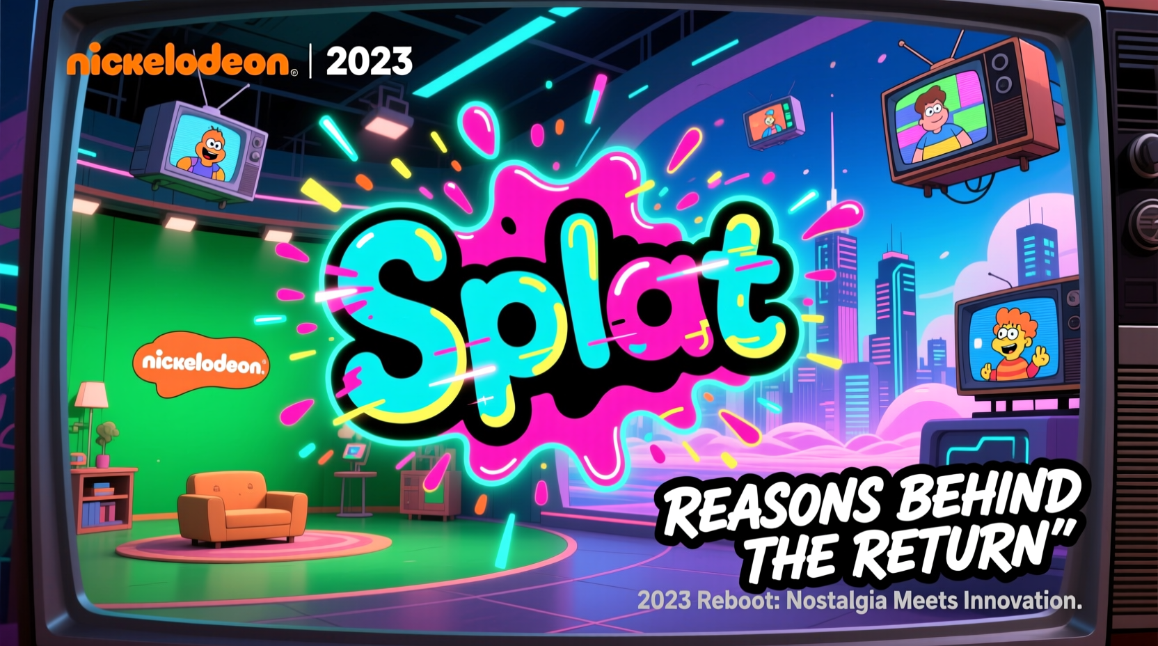
In early 2023, fans of classic children’s television were met with a nostalgic surprise: Nickelodeon brought back its legendary orange Splat logo. After years of minimalist branding and digital-first visuals, the network reintroduced the chaotic, playful emblem that defined its identity throughout the 1990s and early 2000s. The decision wasn’t merely cosmetic—it signaled a strategic shift in how the brand reconnects with audiences across generations. This reversion to a beloved visual icon reflects deeper trends in media branding, generational marketing, and emotional resonance.
The Legacy of the Splat Logo
First introduced in 1992, the Splat logo became synonymous with Nickelodeon’s irreverent, messy, and fun-loving spirit. Its design—a bright orange abstract splash resembling paint or slime hitting a wall—was both bold and instantly recognizable. It appeared during commercial breaks, show bumpers, and even on merchandise, embedding itself into the cultural memory of millions who grew up watching shows like Ren & Stimpy, Rugrats, and SpongeBob SquarePants.
Over the decades, the logo evolved. In 2009, it was replaced by a sleeker, flatter \"Nick\" wordmark as part of a broader trend toward minimalism in design. While modern and scalable for digital platforms, this version lacked the personality and whimsy of its predecessor. By the late 2010s, fan sentiment had grown increasingly vocal about wanting the old Splat back—not just as a logo, but as a symbol of authenticity and childhood joy.
Why Bring Back the Splat in 2023?
The return of the Splat logo wasn't a random retro gesture. It was a calculated move rooted in several key factors shaping today’s media landscape:
- Nostalgia Marketing: Adults who grew up with Nickelodeon now have purchasing power and influence over family entertainment choices. Reintroducing the Splat taps into their emotional connection with the brand.
- Brand Differentiation: In an oversaturated streaming market, standing out matters. The Splat is visually distinct from the clean, corporate aesthetics of competitors like Disney+ or Netflix.
- Cross-Generational Appeal: Parents are more likely to introduce their kids to shows and channels they loved as children, especially when the branding feels familiar and authentic.
- Content Revival Strategy: With reboots of Avatar: The Last Airbender, Invader Zim, and new SpongeBob spinoffs, Nickelodeon needed a unifying visual language that ties past and present together.
“The Splat isn’t just a logo—it’s a feeling. It represents unpredictability, humor, and creativity. Bringing it back reminds people that Nickelodeon still stands for something different.” — Dana Johnson, Brand Strategist at Media Futures Group
A Timeline of the Rebrand Rollout
The reintroduction of the Splat was carefully orchestrated across multiple touchpoints. Here’s how it unfolded:
- February 2023: Teaser campaigns on social media featuring distorted flashes of orange and slime sounds without revealing the full logo.
- March 10, 2023: Official unveiling during a live-streamed event celebrating Nickelodeon’s 45th anniversary, complete with archival footage and celebrity cameos from former cast members.
- April 2023: Full integration across linear TV, app interfaces, YouTube channels, and promotional materials.
- May–June 2023: Launch of limited-edition Splat-branded merchandise, including apparel, toys, and collectibles.
- July 2023: Introduction of dynamic variations of the Splat in animated form during show transitions, enhancing viewer engagement.
What Changed Visually? A Design Comparison
The 2023 version of the Splat isn’t a direct copy of the 1992 original. It retains the core shape and energy but benefits from modern design refinements. Below is a breakdown of key differences:
| Feature | Original Splat (1992) | Revived Splat (2023) |
|---|---|---|
| Color Palette | Flat orange with black outline | Vibrant gradient orange with subtle shadowing |
| Animation Style | Simple 2D squash-and-stretch | 3D-rendered with fluid motion and texture effects |
| Digital Scalability | Limited; pixelated at small sizes | Optimized for mobile, web, and HD formats |
| Usage Context | Primarily on-air graphics | Multi-platform: apps, social media, AR filters |
| Emotional Tone | Chaotic, rebellious | Playful, inclusive, celebratory |
This evolution ensures the logo feels both familiar and fresh—honoring legacy while meeting contemporary expectations for interactivity and digital performance.
Real Impact: A Mini Case Study
Consider the case of *NickSplat Night*, a programming block launched in June 2023 featuring classic episodes of CatDog, The Adventures of Jimmy Neutron, and remastered versions of Oh Yeah! Cartoons. Promoted heavily using the revived Splat logo and retro-themed trailers, the event saw a 42% increase in viewership compared to similar blocks in 2022. Social media engagement spiked, with hashtags like #BringBackTheSplat trending globally for two days.
More importantly, analytics revealed that nearly 35% of viewers were adults aged 25–40, many watching alongside younger siblings or children. This demonstrated the dual-audience appeal made possible by the rebrand—an outcome difficult to achieve with the previous, more sterile branding approach.
Checklist: Elements of a Successful Nostalgia Rebrand
If your brand is considering a retro-inspired refresh, consider these essential steps:
- ✅ Audit audience sentiment through surveys and social listening
- ✅ Identify which legacy elements resonate most emotionally
- ✅ Update the design for modern platforms without losing authenticity
- ✅ Launch with storytelling—explain why you’re bringing it back
- ✅ Support the rebrand with relevant content or product releases
- ✅ Monitor engagement across age demographics
- ✅ Allow room for playful variation (e.g., themed Splats for holidays)
Frequently Asked Questions
Was the Splat logo completely gone before 2023?
No. The Splat appeared occasionally in special programming blocks like “The Splat” (2015–2018), a nostalgia-focused channel on TeenNick. However, it was not the primary corporate logo until its official reinstatement in 2023.
Is the new Splat used everywhere Nickelodeon appears?
Yes, with some context-based exceptions. The main on-air and digital presence uses the Splat, though simplified wordmarks may appear in dense UI environments like streaming menus. The Splat remains the dominant brand identifier.
Are there plans to expand the Splat beyond TV?
Already underway. Nickelodeon has licensed the Splat for use in theme park zones, school supplies, video games, and augmented reality experiences. The goal is to make the logo a lifestyle symbol, not just a network marker.
Conclusion: Why the Splat Still Matters
The return of the Nickelodeon Splat logo in 2023 is more than a design update—it’s a statement. It says that playfulness has value, that memories can drive modern strategy, and that brands don’t always need to chase the future at the expense of their soul. By embracing its past with confidence and creativity, Nickelodeon has reignited emotional loyalty among older fans while giving younger audiences a gateway into its rich history.
In an era where algorithms favor sameness, the Splat dares to be messy, loud, and unforgettable. And perhaps that’s exactly what children’s entertainment—and adult nostalgia—needed all along.


 浙公网安备
33010002000092号
浙公网安备
33010002000092号 浙B2-20120091-4
Comments
No comments yet. Why don't you start the discussion?