
For graphic designers, choosing the right monitor is not just about aesthetics—it’s a critical decision that directly impacts the quality of their work. Color accuracy, contrast, consistency, and long-term reliability are non-negotiable. Two leading display technologies dominate the professional space: OLED and IPS (In-Plane Switching). While both deliver high-end visuals, they differ fundamentally in how they render color, manage brightness, and age over time. Understanding these differences is essential for making an informed investment.
OLED monitors have surged in popularity due to their perfect blacks, infinite contrast ratios, and pixel-level control. IPS panels, on the other hand, have long been the standard in creative workflows thanks to their excellent color reproduction and wide viewing angles. But when it comes to precision tasks like photo editing, branding design, or print preparation, which technology truly excels?
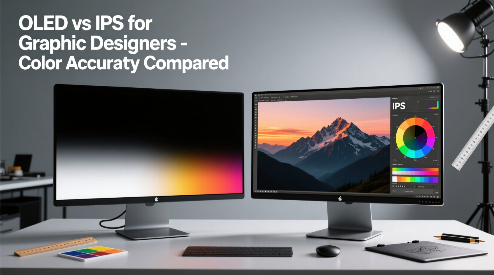
How Color Accuracy Is Measured
Before comparing OLED and IPS, it's important to understand what “color accuracy” actually means. It refers to how closely a display can reproduce colors as they were originally intended—matching industry standards such as sRGB, Adobe RGB, and DCI-P3. This is typically measured using Delta E (ΔE), where lower values indicate higher accuracy.
- ΔE < 1: Imperceptible to the human eye—ideal for professional use.
- ΔE 1–2: Barely noticeable; acceptable for most design work.
- ΔE 2–3: Slight deviation visible upon close inspection.
- ΔE > 3: Noticeable color error; not suitable for critical design tasks.
Professionals often calibrate their monitors using hardware tools like the X-Rite i1Display Pro or Datacolor SpyderX to ensure consistent ΔE across brightness levels and color gamuts. Calibration performance under sustained use is where OLED and IPS begin to diverge significantly.
IPS Monitors: The Established Standard
IPS technology has been the go-to choice for graphic designers for over a decade. Its strength lies in stable color reproduction across wide viewing angles, consistent brightness, and reliable long-term performance. Most high-end IPS panels used in professional monitors cover 99%+ of the sRGB and Adobe RGB color spaces, with many extending into DCI-P3 for video and motion graphics work.
Manufacturers like EIZO, BenQ, and NEC have built reputations on delivering factory-calibrated IPS displays with guaranteed ΔE < 2 out of the box. These monitors are engineered for longevity, often rated for 50,000 hours of use without significant color shift or backlight degradation.
One key advantage of IPS is its uniform backlight system. Since all pixels are illuminated by a consistent LED array behind the panel, color and brightness remain even from edge to edge. This minimizes issues like clouding or flashlighting, which can distract during detailed retouching or layout work.
“IPS remains the gold standard for color-critical design because of its predictability and calibration stability.” — Dr. Lena Torres, Display Technology Researcher at MIT Media Lab
OLED: The High-Contrast Contender
OLED (Organic Light-Emitting Diode) technology represents a paradigm shift. Each pixel emits its own light, eliminating the need for a backlight. When a pixel is off, it is truly black—resulting in infinite contrast ratios and stunning depth in images. For UI/UX designers working on dark-mode interfaces or digital artists creating cinematic visuals, this level of contrast can be transformative.
Top-tier OLED monitors like the LG UltraFine OLED Pro 32EP950 or ASUS ProArt PQ22UC deliver exceptional color volume, covering nearly 100% of DCI-P3 and Adobe RGB. Their per-pixel illumination allows for incredibly precise local contrast, making subtle gradients and shadow details more discernible than on even the best IPS panels.
However, OLED’s strengths come with trade-offs. Because each sub-pixel degrades at a different rate—especially blue, which ages faster—color balance can shift over time. This phenomenon, known as luminance decay, may lead to a pinkish tint after thousands of hours of use unless carefully managed through pixel refresh routines and usage limitations.
Burn-In Risk and Design Workflow Implications
Graphic designers often work with static toolbars, palettes, and interface elements—conditions that increase the risk of image retention or permanent burn-in on OLED panels. While modern OLEDs include pixel-shifting, automatic brightness limiting (ABL), and logo dimming features, prolonged use with fixed UI layouts can still result in faint ghosting.
This makes OLED less ideal for users who spend eight or more hours daily in Photoshop, Illustrator, or InDesign with persistent side panels. A designer working on a complex brochure layout might notice a faint outline of their layers panel after months of continuous use—a distraction that undermines confidence in color fidelity.
Direct Comparison: OLED vs IPS for Color Accuracy
| Feature | OLED | IPS |
|---|---|---|
| Color Accuracy (ΔE) | Excellent (ΔE < 2 when new) | Excellent (ΔE < 2, highly stable) |
| Contrast Ratio | Infinite (true blacks) | ~1000:1 (limited by backlight) |
| Viewing Angles | Near-perfect, minimal color shift | Excellent, slight glow at extreme angles |
| Lifetime Color Stability | Moderate (risk of tint shift) | High (consistent over years) |
| Burn-In Risk | Yes (especially with static UI) | No |
| Peak Brightness | Moderate (~400 cd/m² sustained) | Higher (up to 600+ cd/m² on premium models) |
| Adobe RGB Coverage | ~99% (with some saturation bias) | 99–100% (more linear response) |
The table highlights a crucial insight: while OLED wins in contrast and black levels, IPS maintains superior consistency and longevity in color-critical environments. For designers whose work must translate accurately across print, web, and mobile platforms, this stability is invaluable.
Real-World Case: Freelance Designer Evaluates Both Technologies
Sophie Chen, a freelance brand identity designer based in Berlin, recently upgraded her dual-monitor setup. She tested the LG 32EP950 OLED alongside her existing EIZO ColorEdge CG319X IPS over a three-month period. Her workflow includes logo design, packaging mockups, and client presentations—all requiring precise color matching.
Initially, Sophie was captivated by the OLED’s deep blacks and vibrant previews. “Colors felt more alive,” she said. “Gradients looked smoother, and I could see shadow detail I’d never noticed before.” However, after six weeks of daily use, she began noticing a faint afterglow of her Photoshop toolbar along the left edge of the screen. Though not full burn-in, it was enough to disrupt her focus.
Additionally, she found that the OLED required more frequent recalibration. “I calibrated both monitors weekly,” she explained. “The IPS stayed rock-solid. The OLED started drifting in blue luminance by week three, especially in darker grays.” Ultimately, Sophie reverted to her dual-IPS setup for client deliverables, reserving the OLED for conceptual exploration and video review.
Best Practices for Choosing Based on Your Design Discipline
Not all design work demands the same display characteristics. Your specific field should influence your decision:
- Print & Branding Design: Prioritize IPS for consistent white points and long-term calibration stability. Accurate CMYK-to-RGB conversion depends on predictable color rendering.
- Digital Illustration & Concept Art: OLED’s contrast and pixel response enhance depth and realism. Use dynamic UIs and auto-hide tools to mitigate burn-in.
- Web & UI/UX Design: Consider OLED if designing primarily for dark modes or HDR experiences. Otherwise, IPS offers safer, more balanced color representation.
- Photography Editing: High-end IPS monitors with hardware calibration (e.g., EIZO ColorEdge) remain the top recommendation. Consistency across sessions is paramount.
Checklist: Selecting the Right Monitor for Graphic Design
- ✅ Determine your primary design medium (print, web, motion).
- ✅ Assess your daily usage patterns (hours per day, static UI elements).
- ✅ Verify factory calibration data (ΔE, color gamut coverage).
- ✅ Test for uniformity issues (backlight bleed, tint shifts at edges).
- ✅ Confirm hardware calibration support (LUT compatibility).
- ✅ Evaluate warranty and burn-in policy (especially for OLED).
- ✅ Plan for regular recalibration every 2–4 weeks.
Future Outlook and Hybrid Solutions
The gap between OLED and IPS is narrowing. Newer technologies like mini-LED backlit IPS panels offer improved contrast (up to 200,000:1 with local dimming) while retaining the stability of traditional IPS. Models such as the Apple Pro Display XDR and Dell UltraSharp UP3221Q demonstrate that high dynamic range doesn’t require OLED trade-offs.
Meanwhile, manufacturers are addressing OLED longevity concerns. LG’s latest professional OLEDs incorporate AI-based pixel management and accelerated aging compensation. Samsung is exploring QD-OLED hybrids that improve blue pixel lifespan and color volume. These advancements suggest that OLED may eventually become viable for full-time design work—but we’re not there yet for mission-critical applications.
Frequently Asked Questions
Is OLED better than IPS for photo editing?
Not necessarily. While OLED provides superior contrast and deeper blacks, its potential for color shift and burn-in makes it less reliable for long-term photo editing. High-end IPS monitors with hardware calibration are still preferred by most professional photographers.
Can I use an OLED monitor safely for graphic design?
Yes, with precautions. Limit static content exposure, enable protective features (pixel refresh, auto-brightness), and avoid maximum brightness for extended periods. Use OLED for creative ideation and HDR previewing, but rely on IPS for final color grading and output.
Do IPS monitors have worse contrast than OLED?
Objectively, yes. IPS panels typically have a 1000:1 contrast ratio due to their backlight design, whereas OLED achieves infinite contrast by turning off individual pixels. However, modern IPS models with local dimming (mini-LED) are closing this gap significantly.
Final Recommendation
For most graphic designers, IPS remains the safer, more dependable choice. Its proven track record in color accuracy, uniformity, and durability aligns perfectly with the demands of professional creative work. OLED brings undeniable visual excitement and technological innovation, but its current limitations in longevity and static image handling make it a secondary option rather than a primary workstation monitor.
If budget allows, consider a dual-monitor setup: an IPS panel for production and delivery, and an OLED for inspiration, review, and HDR evaluation. This hybrid approach leverages the strengths of both technologies without compromising on reliability.


 浙公网安备
33010002000092号
浙公网安备
33010002000092号 浙B2-20120091-4
Comments
No comments yet. Why don't you start the discussion?