
For graphic designers, the screen is more than a window into their work—it’s a precision instrument. Color accuracy, contrast, and consistency directly influence how designs are perceived, approved, and ultimately reproduced in print or digital formats. As OLED and QLED technologies dominate today’s high-end monitor market, choosing between them isn’t just about brightness or price. It’s about whether your colors will be true, consistent, and reliable across devices.
This article dives deep into the core differences between OLED and QLED monitors, focusing specifically on what matters most to creative professionals: color fidelity, uniformity, longevity, and real-world performance under demanding design workflows.
Understanding OLED and QLED Technologies
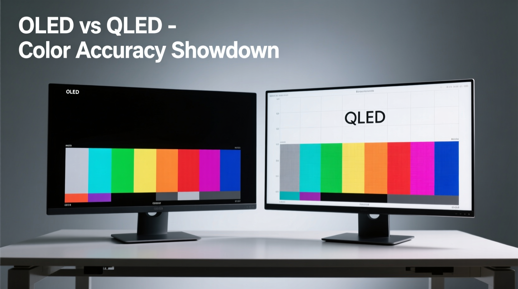
OLED (Organic Light-Emitting Diode) and QLED (Quantum-dot Light Emitting Diode) represent two fundamentally different approaches to image creation.
OLED relies on self-emissive pixels. Each pixel generates its own light when an electric current passes through organic compounds. This allows individual pixels to turn completely off, achieving perfect blacks and infinite contrast ratios. Because there’s no backlight, OLED panels are thinner and offer wider viewing angles with minimal color shift.
QLED, developed primarily by Samsung, uses a traditional LED backlight enhanced with quantum dots—nanocrystals that emit precise wavelengths of light when energized. These dots improve color volume and peak brightness but still rely on a backlight system, meaning blacks are not truly black unless advanced local dimming is used.
The structural difference leads to divergent performance in key areas relevant to graphic design: color gamut coverage, grayscale accuracy, and long-term reliability.
Color Science: How Monitors Render Hue, Saturation, and Luminance
Color accuracy is measured using Delta E (ΔE), where values below 2 are generally indistinguishable to the human eye. Professional-grade monitors aim for average ΔE < 1 across standard color spaces like sRGB, Adobe RGB, and DCI-P3.
OLED excels here due to its per-pixel control. Since each subpixel emits light independently, color blending at the pixel level is exceptionally precise. Combined with factory calibration and support for wide color gamuts, many OLED monitors achieve ΔE < 0.5 out of the box—making them ideal for tasks requiring pixel-perfect color matching.
QLED, while capable of covering over 99% of DCI-P3 and even Rec. 2020 in some models, depends heavily on the quality of its backlight diffusion and color filters. Even with full-array local dimming (FALD), halos around bright objects on dark backgrounds can subtly distort perceived color boundaries—a phenomenon known as blooming.
“OLED’s emissive nature gives it a fundamental advantage in color purity. When you need to match Pantone swatches or prepare files for CMYK conversion, that edge in accuracy can mean fewer revisions.” — Dr. Lena Zhou, Display Technologist at MIT Media Lab
Real-World Performance: Design Workflows Compared
To understand which technology performs better in practice, consider common design scenarios:
- Editing photographs with subtle skin tones
- Designing brand identities using specific spot colors
- Creating UI elements that must look consistent across mobile and desktop
- Preparing print-ready layouts with tight tolerances for ink overlap
In all these cases, accurate midtones and shadow detail are critical. OLED’s ability to render deep blacks without crushing detail allows designers to see gradients and transparencies exactly as intended. This is particularly useful when working with layered compositions in Photoshop or Illustrator, where transparency effects depend on precise luminance control.
QLED counters with higher sustained brightness—often exceeding 1,000 nits—which helps maintain visibility in brightly lit studios. However, this comes at the cost of potential tone-mapping artifacts when displaying HDR content, especially if the monitor lacks sufficient dimming zones.
Panel Uniformity and Consistency Over Time
One often-overlooked aspect of professional monitors is panel uniformity—the consistency of brightness and color across the entire screen surface.
OLED panels historically suffered from slight green or magenta tints in corners, though modern iterations (especially LG’s WOLED and newer tandem OLEDs) have significantly improved. Most high-end OLED monitors now include built-in compensation algorithms that adjust for minor variances.
QLED generally offers excellent uniformity straight from manufacturing, thanks to tightly controlled backlight arrays and quantum dot films. However, edge-lit QLED models may exhibit vignetting or clouding near the borders—issues less common in premium FALD-equipped units.
Longevity is another concern. OLED remains vulnerable to burn-in, especially when static UI elements (like toolbars or menus) remain visible for extended periods. While modern anti-burn-in features such as pixel shifting and logo dimming help mitigate risk, they don't eliminate it entirely.
QLED does not suffer from burn-in, making it a safer choice for designers who leave their software interfaces open for hours. On the flip side, prolonged exposure to intense backlighting can cause quantum dot degradation over several years, leading to gradual color drift—though typically slower than OLED luminance decay.
Color Space Coverage: Which Monitor Matches Industry Standards?
Professional graphic design demands adherence to standardized color spaces:
- sRGB: Web and general digital media
- Adobe RGB: High-end photography and print publishing
- DCI-P3: Video production and modern web standards
- Rec. 2020: Future-proofing for ultra-HDR content
The table below compares typical performance metrics of current-generation OLED and QLED monitors targeted at creative users:
| Feature | OLED (e.g., LG UltraFine OLED Pro) | QLED (e.g., Samsung ViewFinity S9) |
|---|---|---|
| Peak Brightness (HDR) | ~1,000 nits (limited duration) | Up to 1,600 nits sustained |
| Contrast Ratio | Infinite (true black) | 1,000,000:1 (with FALD) |
| sRGB Coverage | 100% | 100% |
| Adobe RGB | ~99% | ~98% |
| DCI-P3 | ~99.5% | ~99% |
| Delta E (avg.) | < 0.8 | < 1.2 |
| Burn-in Risk | Moderate (managed via tech) | None |
| Lifespan (L70) | ~30,000 hours | ~60,000 hours |
While both technologies deliver near-complete coverage of essential color spaces, OLED holds a measurable edge in grayscale tracking and shadow color fidelity. For example, when adjusting curves in RAW photo editing, OLED reveals smoother transitions in low-luminance regions where QLED might show slight banding due to backlight quantization.
Mini Case Study: Logo Design Under Tight Deadline
Jamal Rivera, a senior brand designer at a New York-based agency, was tasked with delivering a luxury skincare logo set across multiple formats—print brochures, social ads, and e-commerce banners. The client emphasized exact PANTONE 289 C reproduction.
Jamal used a 34-inch QLED ultrawide monitor initially but noticed discrepancies when proofs came back from the printer with slightly cooler blues. He switched to his secondary OLED reference display and immediately spotted a subtle cyan bias in the mid-gray tones that the QLED had masked due to backlight bleed.
After recalibrating his workflow using the OLED as primary, he adjusted the vector paths and exported new CMYK profiles. Final prints matched expectations perfectly. “It wasn’t the monitor being ‘wrong,’” Jamal noted. “It was that one showed me the truth earlier. That saved us a costly reprint.”
Step-by-Step Guide: Choosing the Right Monitor for Your Design Studio
Selecting between OLED and QLED shouldn’t be based on marketing claims alone. Follow this sequence to make an informed decision tailored to your needs:
- Assess Your Lighting Environment: Is your workspace dimly lit, naturally bright, or mixed? OLED thrives in controlled lighting; QLED handles glare better.
- Determine Primary Output Medium: Are you focused on print, web, or video? Print and photo work benefit more from OLED’s tonal precision.
- Check Software Interface Habits: Do you keep palettes, timelines, or toolbars fixed on-screen for hours? High static content increases OLED burn-in risk.
- Evaluate Budget and Lifespan Needs: OLEDs are pricier upfront and degrade faster. If you replace monitors every 5+ years, QLED may offer better long-term value.
- Test Before You Buy: Use demo units to view grayscale ramps, color gradients, and real project files. Look for banding, glow, or unevenness.
- Verify Calibration Support: Ensure the model supports hardware calibration via tools like X-Rite i1Display or Datacolor SpyderX.
FAQ: Common Questions About OLED and QLED for Designers
Can I use an OLED monitor for daily graphic design without burn-in issues?
Yes, provided you follow best practices: enable pixel refresh routines, use dark mode interfaces, avoid maximum brightness for prolonged periods, and employ screen timeout settings. Most modern OLED monitors include built-in protections that reduce risk significantly under normal usage.
Is QLED good enough for professional color work?
Absolutely. High-end QLED monitors like the Samsung ViewFinity series or Dell Ultrasharp models undergo rigorous factory calibration and support 10-bit color and HDR10+. They meet ISO 12646 standards for prepress proofing and are widely used in agencies and publishing houses.
Do I need HDR for graphic design?
HDR is beneficial when designing assets intended for HDR displays (such as streaming platforms or gaming UIs). However, for standard print or sRGB web work, HDR is less critical. What matters more is consistent luminance and color stability—not peak brightness.
Essential Checklist Before Buying
- ✅ Confirmed hardware calibration support
- ✅ Factory-calibrated with documented ΔE values
- ✅ Coverage of required color spaces (Adobe RGB / DCI-P3)
- ✅ USB-C or Thunderbolt connectivity for laptop integration
- ✅ Adjustable stand with height, tilt, and pivot options
- ✅ Anti-glare coating suitable for your environment
- ✅ Warranty covering dead pixels and major defects
- ✅ User-replaceable parts (e.g., power boards) if available
“The best monitor is the one that tells you the truth—even when you don’t want to hear it.” — Rafael Tong, Senior Colorist at Frame.io
Conclusion: So, Which Wins in Color Accuracy?
When judged solely on color accuracy, OLED takes the lead. Its self-emissive architecture enables unmatched grayscale neutrality, superior black-level definition, and finer control over color mixing at the pixel level. For designers working in photography, fine art reproduction, or high-end branding, that precision translates into fewer client revisions and greater confidence in output fidelity.
However, QLED remains a compelling alternative—particularly for those in dynamic environments, managing mixed media workflows, or prioritizing durability over absolute color nuance. With excellent brightness, zero burn-in risk, and strong color performance, top-tier QLED monitors continue to serve as reliable tools for professional studios.
The final decision should align with your specific workflow, environment, and long-term equipment strategy. Neither technology is universally superior; each excels in different contexts. But if uncompromising color truth is your highest priority, OLED currently stands as the gold standard.


 浙公网安备
33010002000092号
浙公网安备
33010002000092号 浙B2-20120091-4
Comments
No comments yet. Why don't you start the discussion?