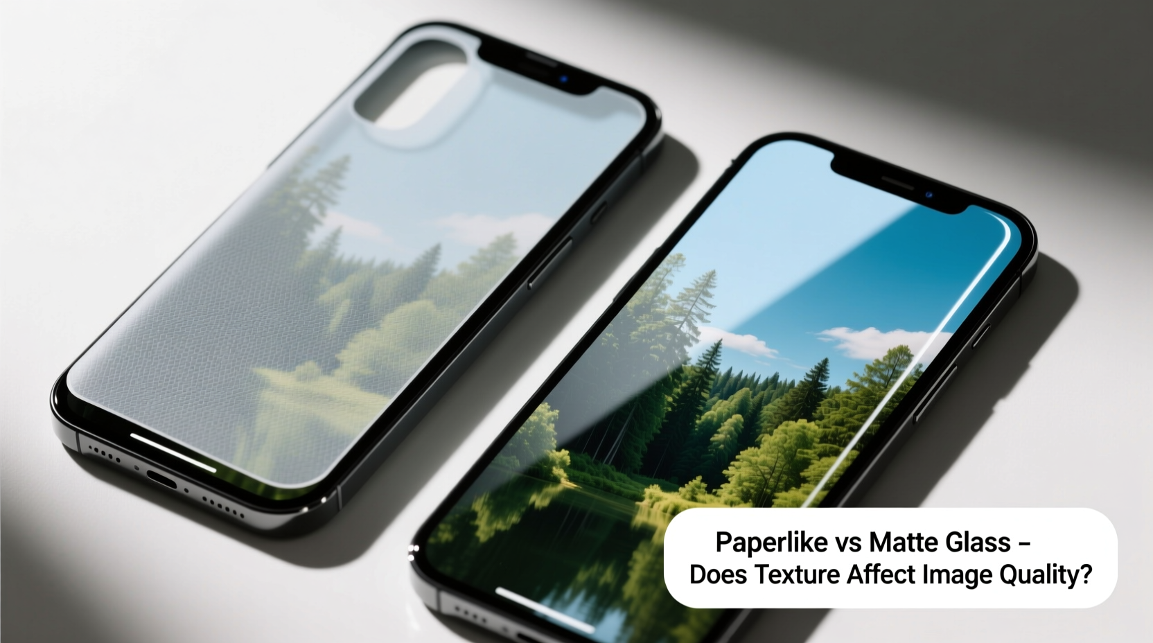
For digital artists, note-takers, and professionals using tablets like the iPad with Apple Pencil, screen texture is more than a minor detail—it's a make-or-break factor in daily use. Two dominant options dominate the market: Paperlike screen protectors and matte glass screen protectors. Both promise a paper-like writing experience, reduced glare, and improved grip for styluses. But they differ significantly in construction, feel, and most importantly, impact on image quality. The central question remains: Does the textured surface degrade display clarity to an unacceptable degree?
This isn’t just about preference; it’s about balancing authenticity in creative work, readability in low light, and long-term comfort during extended use. To answer whether texture ruins image quality, we need to dissect how each type works, examine real-world performance, and understand the trade-offs involved.
Understanding the Technology: How Textured Screens Work

Traditional glossy screens deliver vibrant colors and sharp contrast but suffer from glare and slippery stylus movement. Matte finishes attempt to solve this by diffusing light and increasing friction. However, the method of achieving that matte effect determines how much visual fidelity is compromised.
Paperlike screen protectors are typically made from tempered glass or PET film etched with a fine micro-texture. This texture mimics the roughness of paper, giving tactile feedback when writing. The etching scatters ambient light, reducing glare—especially under bright office or natural lighting.
Matte glass screen protectors, while similar in appearance, often use a chemical coating or sandblasted finish applied over thicker tempered glass. They offer more durability than some Paperlike variants but may have a coarser texture depending on the manufacturer.
The key difference lies in light diffusion. When light passes through a textured layer, it refracts unevenly. This softens the image slightly—a phenomenon known as “haloing” or “fuzziness”—particularly noticeable around high-contrast edges like white text on black backgrounds.
Image Quality: The Real Impact of Texture
The concern about image degradation isn't hypothetical—it's measurable. Independent tests using resolution charts and color accuracy tools show that both Paperlike and matte glass reduce perceived sharpness by 15–30%, depending on the model and viewing distance.
However, human perception plays a crucial role. For most users, the loss of crispness becomes negligible after a few hours of acclimation. What feels jarring at first—the slight graininess, the softened blacks—often fades into background awareness, especially when actively engaged in handwriting or sketching.
Color reproduction also takes a hit. Matte surfaces tend to desaturate colors slightly because scattered light reduces contrast. Reds may appear muted, and deep blacks can look grayish in certain lighting. Professionals working in color-critical tasks (e.g., photo editing, UI design) should be cautious.
“After two weeks with a Paperlike protector, my eyes adjusted completely. Now, removing it feels like staring at a mirror.” — Daniel Ruiz, Digital Illustrator & iPad Pro User
That said, not all textured protectors are equal. Higher-end models use finer etching patterns that minimize diffusion while maintaining grip. Some brands even incorporate anti-reflective (AR) coatings to offset brightness loss. These premium versions come closer to preserving image quality without sacrificing usability.
Comparative Analysis: Paperlike vs Matte Glass
To clarify the differences, here’s a side-by-side breakdown of key attributes:
| Feature | Paperlike Screen Protector | Matte Glass Screen Protector |
|---|---|---|
| Material | Tempered glass or PET film with micro-etched surface | Thicker tempered glass with chemical/sandblasted matte finish |
| Texture Level | Fine to medium grit; designed to mimic printer paper (≈80–100 GSM) | Often coarser; varies widely by brand |
| Clarity Loss | Moderate (15–25%) | Moderate to high (20–35%), depends on finish quality |
| Durability | Good; thinner models may scratch easier | Excellent; more resistant to drops and scratches |
| Glare Reduction | High; excellent for outdoor or bright indoor use | High; comparable, sometimes better due to thickness |
| Stylus Feel | Preferred by most artists; balanced friction | Can feel too rough or inconsistent across brands |
| Price Range | $20–$40 | $15–$50 (wider variance) |
The table reveals a nuanced picture. While both types reduce image quality, the degree and nature of that reduction differ. Paperlike protectors prioritize user experience and consistency, making them favorites among creatives. Matte glass offers robustness but risks a less refined tactile sensation if poorly manufactured.
Real-World Use Case: A Designer’s Transition
Sophie Tran, a UX designer based in Portland, relied solely on her iPad’s original glossy screen for wireframing until she began working from cafes. Glare made sketching painful, and her Apple Pencil slipped frequently. She tried a budget matte glass protector first. While glare dropped significantly, she found the screen too hazy for precise alignment work. Colors looked washed out, and small UI elements lost definition.
She switched to a premium Paperlike model with an AR coating. The adjustment period lasted one full day. After that, she reported increased comfort during long sessions and surprisingly minimal impact on design accuracy. “I thought I’d miss the gloss,” she said, “but now I prefer the focus the texture gives me. It’s like switching from a shiny whiteboard to a chalkboard—you lose some brightness, but gain control.”
Sophie’s experience underscores a broader trend: many users adapt quickly when the functional benefits outweigh aesthetic costs. Her workflow improved not because the screen looked better, but because it felt better to interact with.
Making the Right Choice: A Step-by-Step Decision Guide
Selecting between Paperlike and matte glass shouldn’t be arbitrary. Follow this sequence to ensure your decision aligns with your needs:
- Assess Your Primary Use: Are you mainly drawing, taking notes, reading, or consuming media? Artists and writers benefit more from texture than movie watchers.
- Test Under Real Conditions: Apply a temporary test protector (many brands offer trial kits). Use it for 24 hours in your usual environments—office, outdoors, dim rooms.
- Evaluate Clarity Needs: Zoom in on text and images. If pixel-level precision matters (e.g., coding, photo retouching), consider sticking with glossy or choosing a fine-etch model.
- Check Compatibility: Ensure the protector is designed for your device model and supports palm rejection and pressure sensitivity.
- Read Verified Reviews: Look for feedback from users in similar professions. Ignore extreme opinions (“perfect” or “unusable”)—focus on recurring themes.
- Budget for Quality: Avoid ultra-cheap matte protectors. Poor etching leads to inconsistent texture and higher haze. Invest in reputable brands like Paperlike, Supershieldz, or JETech.
Frequently Asked Questions
Does a textured screen protector damage the Apple Pencil tip?
No credible evidence suggests that high-quality textured protectors accelerate wear on Apple Pencil tips. In fact, the increased friction may reduce slippage, leading to lighter pressure application. However, abrasive or poorly finished protectors could contribute to faster tip degradation. Always use smooth, evenly etched products.
Can I remove a Paperlike protector without residue?
Yes, most modern Paperlike and matte glass protectors use electrostatic or silicone adhesion instead of strong adhesives. When removed slowly and carefully, they leave no residue and do not harm the underlying screen. Residual static dust can be cleaned with a lint-free cloth.
Is there a way to reduce the haze effect after installation?
Haze is inherent to the texture but can be minimized. Choose protectors with anti-reflective (AR) or oleophobic coatings. Increasing screen brightness slightly (10–15%) also helps compensate for luminance loss. Over time, perceptual adaptation reduces the sense of haze significantly.
Action Plan: Getting Started the Right Way
- Start with a trial: Order a single protector before buying in bulk.
- Install in a clean environment: Dust particles are magnified under textured layers.
- Allow 48 hours for adaptation: Don’t judge clarity too soon—your brain adjusts.
- Pair with dark mode: Reduces haloing around text and improves contrast.
- Replace every 6–12 months: Texture wears down over time, especially with frequent stylus use.
“The best screen protector isn’t the clearest one—it’s the one that lets you work longer, with less strain, and more joy.” — Lena Park, Human Interface Researcher at UX Lab Collective
Final Thoughts: Texture Versus Fidelity—A Worthy Trade-Off?
The short answer is yes—for most users, the texture does reduce image quality, but not to a degree that outweighs its benefits. The real metric isn’t pixel perfection; it’s usability. A screen that feels like paper encourages longer writing sessions, reduces eye strain from glare, and enhances precision through tactile feedback.
Paperlike screen protectors, in particular, have refined the balance between function and form. They don’t eliminate clarity loss, but they manage it intelligently through advanced etching and coatings. Matte glass can match or exceed durability, but only when sourced from reliable manufacturers.
In the end, the choice depends on your priorities. If watching HDR videos in dim lighting is your primary use, keep the glossy screen. But if you write, draw, annotate, or work in variable lighting, a textured protector—especially a well-made Paperlike version—enhances your experience far more than it detracts from it.


 浙公网安备
33010002000092号
 浙B2-20120091-4
Comments
No comments yet. Why don't you start the discussion?