
Penpot, an open-source design and prototyping tool built for collaboration, offers a powerful alternative to proprietary platforms. One of its standout features is seamless integration with web-based workflows. However, users often report discrepancies in how fonts render between the Penpot editor and the final web output. These inconsistencies can affect layout accuracy, readability, and brand consistency. Understanding the root causes—and how to manage fonts effectively—is essential for designers aiming for pixel-perfect fidelity.
Why Font Rendering Differs Between Penpot and Web Output
Font appearance differences between Penpot and live websites stem from multiple technical factors. While Penpot uses system-level or uploaded fonts during design, the web environment relies on browser behavior, font loading mechanisms, and available typefaces on the end user’s device.
The most common reasons include:
- Font availability: Fonts used in Penpot may not be available on all devices accessing the website.
- Fallback font stacks: Browsers apply default fallbacks when preferred fonts fail to load, altering visual hierarchy.
- Font loading strategies: Delayed or failed web font loading leads to flash of invisible text (FOIT) or unstyled text (FOUT).
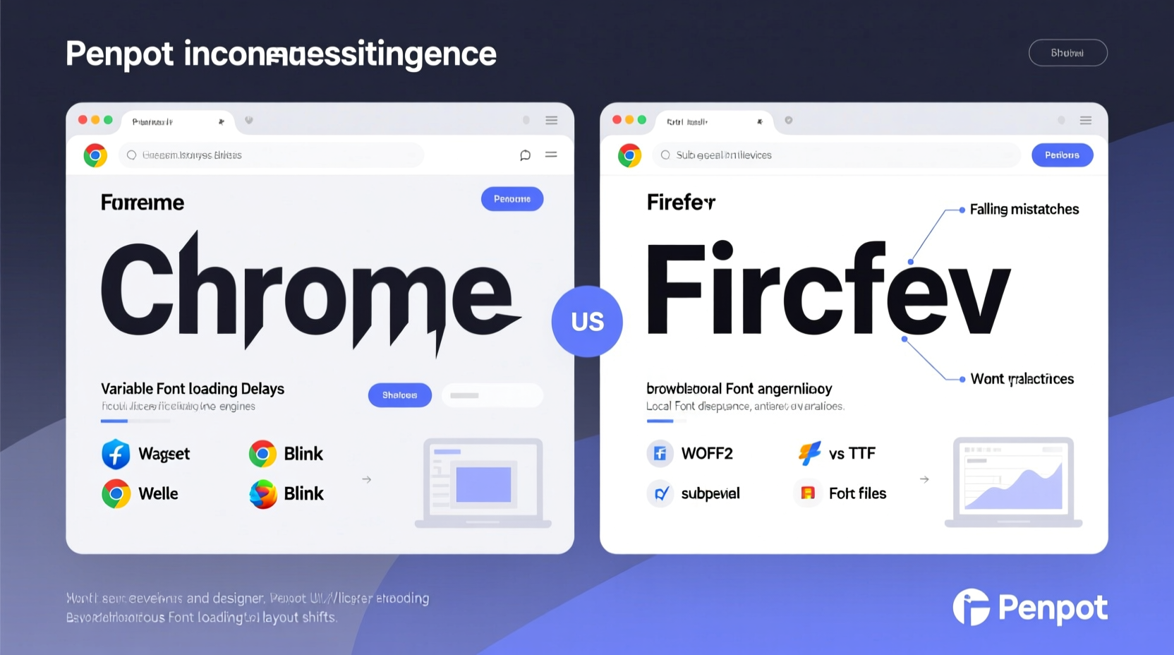
- Rendering engines: Different browsers (Chrome, Firefox, Safari) and operating systems (Windows, macOS) render the same font slightly differently.
- Text metrics variation: Even identical font files may have subtle differences in line height, letter spacing, or kerning across environments.
“Design systems require typographic consistency. If your mockup uses Inter but the site loads Arial due to a missing declaration, you’ve lost control over your design intent.” — Lena Torres, Frontend Architect & Design Systems Lead
Font Management Best Practices in Penpot
To minimize discrepancies, proactive font management within Penpot is crucial. Start by understanding that Penpot supports both system fonts and custom fonts uploaded via its asset management panel.
Use Web-Safe Font Pairings Strategically
When selecting fonts in Penpot, always consider their real-world web availability. Opt for widely supported fonts like Inter, Open Sans, Roboto, or Lato—fonts hosted on Google Fonts or included in CSS resets.
Upload Custom Fonts Correctly
If your project demands branded or unique typography, upload the correct font formats (.woff or .woff2) into Penpot’s font library. Ensure you have proper licensing rights for web use.
After uploading:
- Apply the font consistently across text styles.
- Name variants clearly (e.g., “Brand Sans Bold,” not “Font-Bold-v2”).
- Verify that weight and style metadata match actual file properties.
Aligning Penpot Designs with Web Implementation
The gap between design and development widens when font handling isn’t coordinated. Bridging this divide requires collaboration and standardization.
Establish a Shared Typography Scale
Create a unified typographic system shared between designers and developers. Define:
- Font families for headings, body, captions, and UI elements.
- Font sizes, line heights, and letter spacing in relative units (rem/em).
- Breakpoint-specific adjustments for responsive layouts.
Export and Document Font Usage
Use Penpot’s export features to generate design tokens or style guides. Include explicit notes such as:
| Element | Font Family | Weight | Size (px) | Line Height |
|---|---|---|---|---|
| H1 Heading | Inter | 700 | 32 | 1.2 |
| Body Text | Inter | 400 | 16 | 1.5 |
| Caption | Roboto Mono | 500 | 12 | 1.4 |
This ensures developers replicate typography accurately and reduces guesswork during handoff.
Step-by-Step Guide to Ensuring Font Consistency
Follow this workflow to maintain typographic integrity from Penpot to production:
- Choose web-compatible fonts: Prefer open-source or commercially licensed fonts available via CDNs like Google Fonts.
- Upload to Penpot: Add the exact font files you intend to use on the web.
- Define text styles: Use Penpot’s style system to set reusable heading and paragraph styles.
- Collaborate with developers: Share font names, weights, and fallback stacks.
- Implement with @font-face: Host fonts securely and declare them in CSS using WOFF2 format for performance.
- Test across devices: Validate rendering on iOS, Android, Windows, and macOS using real devices or tools like BrowserStack.
- Optimize loading: Use
font-display: swap;to prevent invisible text flashes while ensuring usability.
font-family: 'Inter', -apple-system, BlinkMacSystemFont, 'Segoe UI', sans-serif;
Mini Case Study: Fixing Font Drift in a SaaS Dashboard
A fintech startup used Penpot to design a dashboard with the custom font “Neue Haas Grotesk.” During development, engineers substituted it with Helvetica because the license didn’t permit web embedding. The result? Headings appeared bolder, line heights collapsed, and modal dialogs overflowed.
The team resolved this by:
- Switching to Inter—a free, metrically similar alternative.
- Updating all text styles in Penpot to reflect the change.
- Documenting the new font stack in Figma handoff notes (mirrored from Penpot exports).
- Adding
font-display: swapto ensure fast loading without layout shift.
Within two weeks, visual parity was achieved across design and production environments.
Checklist: Preventing Font Discrepancies
Use this checklist before finalizing any Penpot-to-web project:
- ✅ Confirm all fonts are licensed for web use.
- ✅ Upload correct WOFF/WOFF2 files to Penpot.
- ✅ Define consistent text styles using Penpot’s style library.
- ✅ Specify fallback fonts in order of visual similarity.
- ✅ Share font details with developers via documentation or export.
- ✅ Test font rendering in multiple browsers and OS combinations.
- ✅ Monitor Cumulative Layout Shift (CLS) related to font loading.
Frequently Asked Questions
Can I use Adobe Fonts in Penpot designs?
Yes, you can visually reference Adobe Fonts in Penpot if they’re installed on your system. However, for web deployment, Adobe Fonts require proper embedding via their API, which must be implemented separately in code. Always verify licensing terms before use.
Why does my font look bolder on Chrome than in Penpot?
This is often due to subpixel rendering differences between operating systems and browsers. Chrome on Windows applies ClearType, which can make text appear heavier. To mitigate, test on target platforms early and adjust font weights slightly if needed (e.g., use 500 instead of 600).
Does Penpot support variable fonts?
As of 2024, Penpot allows uploading variable font files, but full interpolation controls (like weight or width sliders) are limited. You can apply variable fonts as static instances (e.g., weight 700), but dynamic axis control isn’t yet supported in the UI.
Conclusion: Take Control of Your Typography Pipeline
Font discrepancies between Penpot and the web aren’t inevitable—they’re symptoms of misaligned workflows. By treating typography as a shared responsibility between design and development, teams can achieve consistent, professional results. Choose accessible fonts, manage assets proactively, document decisions clearly, and validate outputs rigorously.


 浙公网安备
33010002000092号
浙公网安备
33010002000092号 浙B2-20120091-4
Comments
No comments yet. Why don't you start the discussion?