
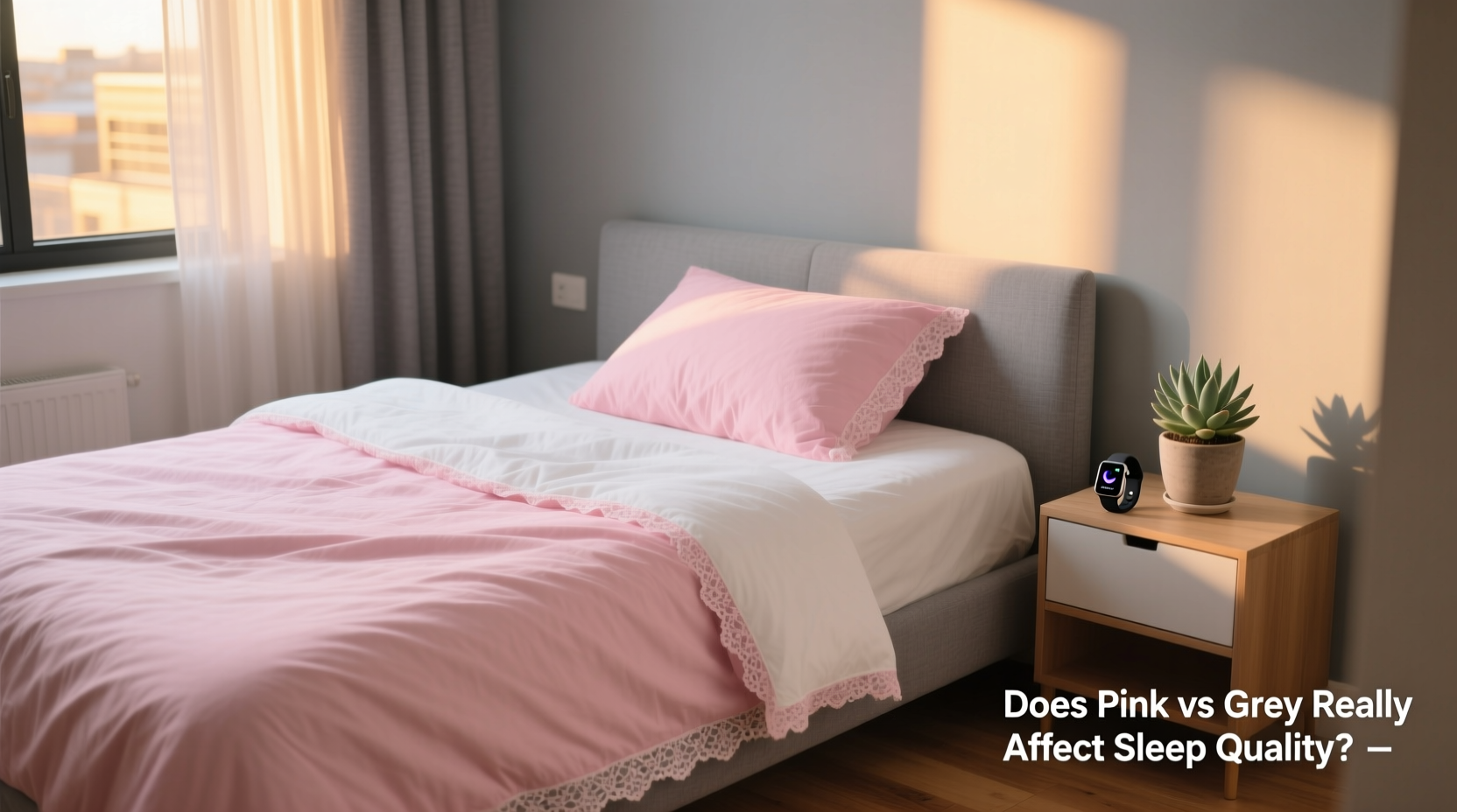
Sleep is a cornerstone of health, influencing everything from cognitive performance to emotional stability. While many focus on sleep duration and mattress quality, one often overlooked factor is the color of your bedding. In recent years, pink and grey have emerged as dominant choices in bedroom decor, each carrying distinct aesthetic and psychological associations. But beyond style, does choosing between pink and grey bedding actually impact how well you sleep? The answer lies at the intersection of neuroscience, environmental psychology, and circadian biology.
Colors influence mood, stress levels, and even physiological responses such as heart rate and cortisol production. Because the bedroom environment plays a critical role in signaling the brain that it’s time to wind down, the hues surrounding you—especially on your bed—can subtly shape your sleep experience. This article examines the science behind color perception, compares pink and grey bedding in terms of sleep support, and offers practical guidance for optimizing your sleep sanctuary.
The Science of Color and Sleep
Color affects us on both conscious and subconscious levels. Research in environmental psychology consistently shows that certain colors evoke specific emotional and physiological reactions. These responses are rooted in evolutionary cues, cultural conditioning, and biological rhythms regulated by light exposure.
The human eye detects color through photoreceptors in the retina, some of which are directly linked to the suprachiasmatic nucleus—the brain’s master clock. This connection means that visual stimuli, including color tones, can influence melatonin production, alertness, and relaxation.
Warm colors like red, orange, and bright pink tend to stimulate the nervous system, increasing arousal and energy. In contrast, cool and neutral tones such as soft blue, lavender, and grey promote calmness and reduce mental activity—conditions more conducive to falling asleep and staying asleep.
“Even in low light, the perceived warmth or coolness of a room’s color palette can influence autonomic nervous system activity, affecting heart rate variability and readiness for sleep.” — Dr. Lena Torres, Sleep Environment Researcher, University of Colorado Boulder
Pink Bedding: Calm or Counterproductive?
Pink is often associated with tranquility, compassion, and softness. In design, it's used to create soothing spaces, particularly in nurseries and spas. However, not all pinks are equal when it comes to sleep support.
Bright or saturated pinks—such as hot pink or bubblegum—can be overstimulating. These shades reflect high-energy wavelengths similar to red light, potentially interfering with melatonin release. On the other hand, muted or dusty rose pinks, especially those with grey undertones (often called \"millennial pink\"), emit a gentler visual signal that may support relaxation.
A 2020 study published in *Chronobiology International* found that participants exposed to soft pink environments before bedtime reported slightly improved subjective sleep onset compared to those in vibrant red-pink rooms. The key differentiator was saturation: lower chroma (color intensity) correlated with reduced arousal.
Grey Bedding: The Neutral Advantage
Grey has become a staple in modern bedroom design due to its versatility and minimalist appeal. As a neutral tone, grey doesn’t carry strong emotional connotations on its own, but its effect depends heavily on undertones and context.
Cool greys—those with blue or purple bases—lean toward calming, almost monochromatic serenity. They mimic twilight skies and shadowed spaces, aligning with natural cues for rest. Warm greys, infused with beige or brown, offer coziness without overstimulation, making them ideal for creating a grounded, retreat-like atmosphere.
Because grey absorbs rather than reflects intense light, it helps maintain low visual stimulation in the bedroom. This supports the brain’s transition into sleep mode by minimizing sensory input. Additionally, grey pairs effortlessly with accent colors known for promoting relaxation, such as sage green or navy blue.
However, overly dark or charcoal greys may feel oppressive in poorly lit rooms, potentially increasing feelings of isolation or melancholy in sensitive individuals. Balance is essential.
Comparing Pink and Grey: A Practical Breakdown
| Factor | Pink Bedding | Grey Bedding |
|---|---|---|
| Emotional Tone | Warm, nurturing, playful (if bright) | Neutral, balanced, serene |
| Sleep Suitability | Moderate (only if low saturation) | High (especially cool or mid-tone grey) |
| Light Reflectivity | Medium to high (can increase ambient brightness) | Low to medium (absorbs light, reduces glare) |
| Versatility | Lower (may clash with bold accents) | High (works with most color schemes) |
| Durability Perception | May show dust or wear more visibly | Hides minor imperfections well |
Real-World Example: A Shift Toward Better Sleep
Consider Sarah, a 34-year-old graphic designer living in Portland. For years, she struggled with delayed sleep onset and frequent nighttime awakenings. Her bedroom featured vibrant coral and magenta bedding—colors she loved for their “energy” during the day. After consulting a sleep coach, she replaced her bedding with soft dove grey sheets and added linen curtains in a pale taupe.
Within three weeks, Sarah reported falling asleep 20 minutes faster on average and experiencing fewer nocturnal disruptions. She noted that her room now felt “like a pause button,” whereas before it had subconsciously reminded her of her creative workspace. This case illustrates how personal preference must be balanced with functional design for optimal rest.
How to Choose the Right Bedding Color for Your Sleep
Selecting between pink and grey isn’t just about aesthetics—it’s about aligning your environment with your body’s natural rhythms. Follow this step-by-step guide to make an informed decision:
- Assess your current sleep challenges. Do you struggle to unwind? Are you sensitive to light? This helps determine whether you need a more calming or grounding palette.
- Evaluate your bedroom lighting. Rooms with abundant natural light can handle cooler tones; dimmer spaces benefit from warm neutrals.
- Test swatches in real conditions. Place fabric samples on your bed and observe them at night under bedside lamps. Notice any feelings of tension or ease.
- Consider undertones. A pink with grey or blue base will be calmer than one with yellow or orange. Similarly, avoid icy greys if you prefer warmth.
- Layer strategically. Use colored duvets or shams for personality, but keep pillowcases and fitted sheets in neutral, sleep-friendly tones.
Sleep-Optimized Bedding Checklist
- ✅ Choose low-saturation colors (muted pinks, soft greys)
- ✅ Avoid fluorescent or highly reflective fabrics
- ✅ Match bedding tone to overall bedroom color scheme
- ✅ Prioritize natural materials (cotton, linen, TENCEL™) for comfort
- ✅ Use dimmable, warm-white lighting (2700K or lower)
- ✅ Introduce texture over brightness for visual interest
Frequently Asked Questions
Can changing my bedding color improve insomnia symptoms?
While color alone won’t cure clinical insomnia, optimizing your sleep environment—including bedding hue—can support better sleep hygiene. Combined with consistent routines and reduced screen exposure, a calming color palette may help reduce sleep latency and improve sleep continuity.
Is grey too cold or depressing for a bedroom?
Not if chosen wisely. Opt for warm greys with beige, taupe, or terracotta undertones. Pair them with wooden furniture, soft textiles, and warm lighting to create a cozy, inviting space. Avoid pairing grey with stark white or metallic finishes, which can amplify sterility.
Are there any benefits to using pink in a child’s bedroom?
Soft pinks can be comforting for children, especially those who respond well to nurturing visuals. However, monitor behavior—if a child becomes overactive or restless, consider switching to gentler tones like lavender or sky blue, which have stronger evidence for calming effects.
Final Thoughts: Harmony Over Hue
The debate between pink and grey bedding ultimately centers on intentionality. Neither color is universally superior; what matters is how it functions within your unique sleep ecosystem. Grey generally holds an edge for its neutrality and adaptability, while carefully selected pink tones can add warmth without disruption.
Remember, color is just one component of a sleep-supportive bedroom. Combine thoughtful hue selection with temperature control, noise reduction, and digital detox practices for maximum benefit. Your bedding should serve not just your sense of style, but your long-term well-being.


 浙公网安备
33010002000092号
浙公网安备
33010002000092号 浙B2-20120091-4
Comments
No comments yet. Why don't you start the discussion?