
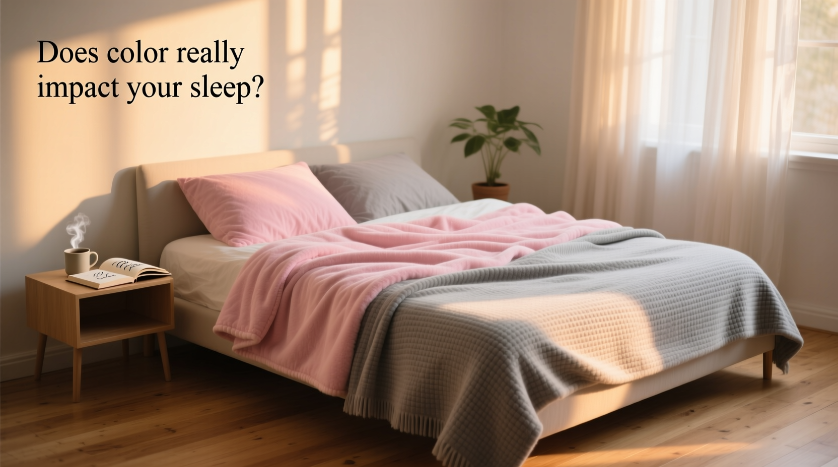
Color is more than a visual detail—it’s a silent influencer of mood, energy, and even sleep quality. In bedrooms and living spaces, one often-overlooked element that carries significant chromatic weight is the humble blanket. Whether you're drawn to soft blush pink or cool dove grey, the hue of your bedding may be shaping your nightly rest and daily atmosphere in ways you haven’t considered. While it might seem trivial to debate pink versus grey, the psychological and environmental implications of these colors are surprisingly profound.
This isn’t about fashion trends or fleeting aesthetics. It’s about understanding how color psychology, lighting, and personal associations interact to create a space that either supports relaxation or subtly disrupts it. By examining both hues through scientific, emotional, and design lenses, we can make intentional choices that elevate not just our decor—but our well-being.
The Science Behind Color and Sleep
Color perception begins in the retina but quickly travels to the brain’s limbic system—the area responsible for emotions, memory, and arousal. This means that the colors surrounding us aren’t passively observed; they actively influence our internal state. When it comes to sleep, research consistently shows that certain colors promote calmness, while others can increase alertness or anxiety.
A 2020 study published in *Sleep Health* found that individuals sleeping in rooms with cooler, muted tones—especially soft blues, greys, and lavenders—reported better sleep quality and faster sleep onset compared to those in brightly colored or warm-toned environments. The reasoning lies in light wavelengths: warmer colors like red, orange, and bright pink emit longer wavelengths that can stimulate the nervous system, while cooler tones have shorter wavelengths associated with tranquility.
However, “cool” doesn’t always mean calming. The emotional context of a color matters as much as its temperature. This is where pink enters the conversation—not as a universally energizing shade, but as a nuanced player in the psychology of comfort.
Pink Blankets: Comfort, Calm, or Overstimulation?
Pink is often stereotyped as playful, youthful, or overly feminine. But in interior design and sleep science, certain shades of pink—particularly dusty rose, mauve, and blush—have demonstrated measurable calming effects. These softer pinks mimic natural dusk lighting and can trigger feelings of nurturing and safety.
In therapeutic settings, a specific shade known as “Baker-Miller pink” was historically used in detention centers and psychiatric facilities due to early findings that it reduced aggressive behavior. Though later studies questioned the longevity of this effect, the initial observation underscores pink’s potential to modulate emotional states.
When used in blankets, soft pink can evoke warmth and emotional security. For individuals who associate pink with comfort—perhaps from childhood blankets or cozy sweaters—it becomes a sensory cue for relaxation. However, brighter or neon pinks may have the opposite effect, especially under artificial lighting, potentially increasing heart rate and mental activity.
Grey Blankets: Neutrality, Sophistication, and Emotional Coolness
Grey is a hallmark of modern minimalism—a neutral that pairs effortlessly with any palette. From charcoal to misty fog, grey blankets offer versatility and a sense of sleek sophistication. But neutrality comes with trade-offs. Unlike warm colors that feel inherently inviting, grey can lean emotionally cold if not balanced properly.
In color psychology, grey is associated with balance, composure, and detachment. For some, this creates a serene, distraction-free environment ideal for sleep. For others, especially those prone to low mood or seasonal affective tendencies, an excess of grey may feel isolating or dull.
The key lies in undertones. A grey with warm beige or taupe undertones adds subtle coziness without sacrificing elegance. Conversely, a blue-based grey can amplify coolness—beneficial in hot climates but potentially stark in dimly lit rooms during winter months.
From a design perspective, grey blankets excel in adaptability. They transition seamlessly from bedroom to couch, season to season, and style to style. But their emotional impact depends heavily on the broader environment: a grey blanket layered over warm wood tones and textured throws feels grounded; the same blanket in a sparsely furnished white room may amplify sterility.
Comparing Pink and Grey: A Practical Breakdown
| Aspect | Pink Blanket (Soft/Muted) | Grey Blanket (Warm Undertone) |
|---|---|---|
| Sleep Support | High—promotes emotional comfort and calm | High—encourages mental neutrality and focus |
| Mood Influence | Warming, nurturing, slightly stimulating if too bright | Cooling, stabilizing, potentially distancing if overused |
| Design Flexibility | Moderate—best with warm neutrals and earth tones | High—pairs with almost any color scheme |
| Seasonal Use | Ideal for fall/winter; may feel heavy in summer | Versatile year-round, especially lighter greys |
| Emotional Association | Comfort, nostalgia, care | Modernity, restraint, professionalism |
“Color in the bedroom shouldn’t be arbitrary. It’s environmental psychology in action. A blanket isn’t just fabric—it’s part of your sleep ecosystem.” — Dr. Lena Patel, Environmental Psychologist & Sleep Consultant
Real-Life Example: Two Bedrooms, Two Choices
Consider two individuals redesigning their bedrooms for better sleep. Maya, a graphic designer working from home, felt mentally overstimulated at night. She replaced her bright coral throw with a blush pink wool blanket and added warm walnut accents. Within a week, she reported feeling \"mentally quieter\" at bedtime.
On the other hand, James, a software engineer in a high-stress role, had trouble winding down due to racing thoughts. His previous room featured deep burgundy and gold—visually rich but emotionally intense. He switched to a warm-toned grey linen blanket, paired with soft lighting and acoustic panels. The shift didn’t eliminate stress, but he noted, “It feels like my room finally breathes. I don’t feel ‘held’ by the color anymore.”
Neither pink nor grey was objectively better. The success came from aligning the color choice with emotional needs and lifestyle context.
Actionable Steps to Choose the Right Blanket Color
- Assess your current sleep environment: Spend a few nights noticing how your room feels at bedtime. Is it too stimulating? Too cold? Too cluttered visually?
- Identify emotional associations: Do you find pink comforting or childish? Does grey feel peaceful or lifeless? Be honest—your personal history with color matters more than general rules.
- Test undertones: Hold swatches of pink and grey near your bed at different times of day. See how they interact with natural and artificial light.
- Layer strategically: You don’t need to commit fully. Use a grey base blanket with a soft pink throw on top for flexibility.
- Observe changes over time: Track sleep quality, mood upon waking, and general room satisfaction for two weeks after introducing the new blanket.
Frequently Asked Questions
Can changing my blanket color really improve my sleep?
Indirectly, yes. While color alone won’t fix insomnia, it contributes to an environment that either supports or hinders relaxation. A soothing color can reduce cognitive arousal, making it easier to transition into rest.
Is one color better for anxiety?
Softer pinks tend to provide emotional comfort, which may help those with anxiety rooted in insecurity or overstimulation. Greys work better for people overwhelmed by emotional intensity and seeking mental clarity. The best choice depends on your personal triggers.
What if I love both colors?
Combine them. Try a grey blanket with pink piping, or layer a lightweight pink throw over a grey duvet. This allows you to benefit from both warmth and neutrality without committing to one aesthetic.
Final Thoughts: Color as a Tool for Intentional Living
The debate between pink and grey isn’t about declaring a winner—it’s about recognizing that small design choices carry emotional weight. Your blanket is more than a functional item; it’s a tactile companion in your most vulnerable moments. Choosing its color with intention transforms a routine purchase into an act of self-care.
Whether you gravitate toward the gentle embrace of pink or the composed elegance of grey, the goal remains the same: to create a space where rest feels not just possible, but natural. Let your blanket reflect not just your taste, but your needs.


 浙公网安备
33010002000092号
浙公网安备
33010002000092号 浙B2-20120091-4
Comments
No comments yet. Why don't you start the discussion?