
When it comes to building a standout outfit, the choice between a red top and a neutral top isn’t just about personal preference—it’s a strategic fashion decision. Red commands attention. Neutrals offer balance. But which one actually makes your look more dynamic? The answer depends on context, intention, and composition. Understanding how each functions within an ensemble allows you to wield color with precision, turning simple outfits into statements.
The Power of Red: When Boldness Wins
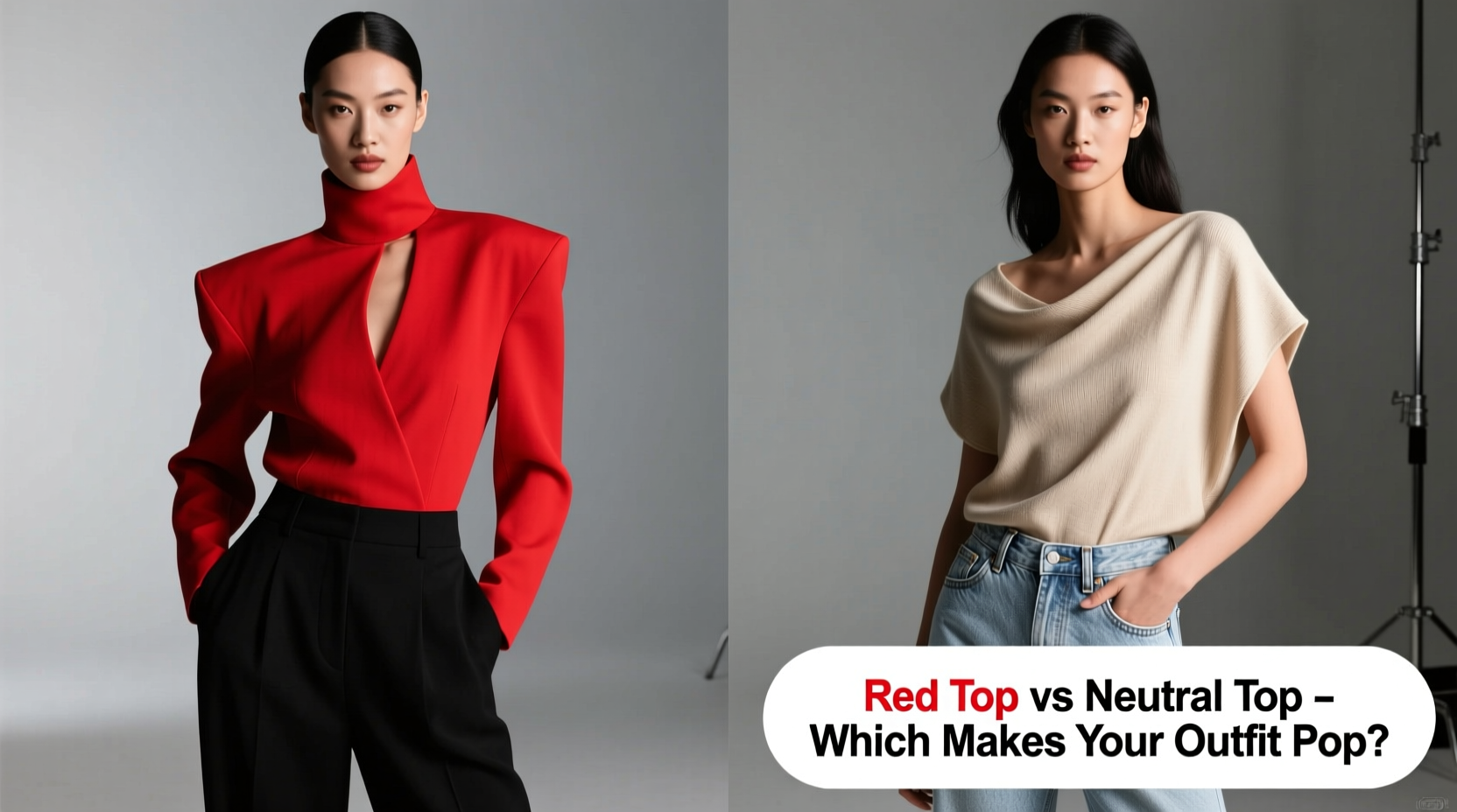
Red is psychologically charged. It signals confidence, energy, and urgency. In fashion, a red top doesn’t whisper—it speaks. Whether it's crimson, cherry, or burgundy, red instantly draws the eye. This makes it ideal when you want to be seen: at networking events, dates, presentations, or social gatherings where making an impression matters.
Wearing red activates what color psychologists call the “halo effect”—people tend to perceive those in red as more competent, attractive, and dominant. A 2010 study published in the Journal of Experimental Psychology found that individuals wearing red were consistently rated higher in attractiveness and status across cultures.
However, red’s strength can become a liability if misused. In overly busy environments—crowded streets, pattern-heavy settings, or events with loud visuals—red can blend into the noise rather than rise above it. It also demands complementary skin tones and makeup choices; a bright red may clash with warm undertones if not balanced correctly.
The Quiet Strength of Neutral Tops
Neutrals—think white, beige, gray, black, camel—are the foundation of sophisticated dressing. They don’t shout, but they endure. A neutral top acts as a canvas, allowing other elements—tailoring, texture, accessories, or statement bottoms—to take center stage.
Where red grabs attention, neutrals guide it. A beige silk blouse paired with wide-leg printed pants shifts focus to the pattern. A black turtleneck under a structured blazer emphasizes cut and silhouette. Neutrals are essential when the goal is elegance over excitement.
They also offer unmatched versatility. One neutral top can work across multiple occasions with simple accessory swaps: add gold hoops and heels for evening, switch to sneakers and a denim jacket for daytime.
“Neutrals aren’t boring—they’re intentional. They give structure to color, just as silence gives meaning to sound.” — Lena Torres, Fashion Stylist & Creative Director at Atelier Mode
Comparing Impact: Red vs Neutral in Real Contexts
To understand which top makes an outfit “pop,” consider not just the garment itself, but the entire visual ecosystem it enters. Below is a comparison of scenarios where each excels.
| Scenario | Best Choice | Why |
|---|---|---|
| Job interview (corporate) | Neutral (e.g., ivory blouse) | Projects professionalism; avoids distraction |
| First date | Red (e.g., deep wine tee) | Evokes warmth, passion, confidence |
| Casual brunch | Depends on vibe: red for fun, neutral for relaxed chic | Context defines tone |
| Photoshoot or event with camera presence | Red | Stands out in images; creates focal point |
| Layering under jackets or cardigans | Neutral | Won’t clash when partially visible |
Real Example: Olivia’s Outfit Dilemma
Olivia had two options for her friend’s rooftop party: a bold scarlet crop top or a soft oatmeal-colored linen blouse. She chose the red—and immediately stood out in group photos. However, when she later attended a mindfulness workshop, she wore the oatmeal blouse with tailored trousers and received compliments on her “calm, put-together energy.” Neither was wrong. Each served its purpose. The red made her unforgettable in a social setting; the neutral made her feel grounded in a reflective space.
How to Choose: A Step-by-Step Decision Guide
Follow this sequence to determine whether red or neutral works best for your occasion:
- Define the purpose: Are you aiming to impress, blend, express, or relax?
- Analyze the environment: Is it visually busy (festivals, markets) or minimal (galleries, offices)?
- Assess your bottom half: If your pants or skirt are bold, go neutral on top. If your bottom is plain, red can elevate it.
- Consider lighting: Natural light enhances red beautifully; fluorescent office lighting can make it appear harsh.
- Check your accessories: Do you have statement jewelry or a standout bag? If yes, a neutral top prevents visual overload.
Do’s and Don’ts: Quick Reference
| Do’s | Don’ts |
|---|---|
| Do wear red when you want to command attention or convey confidence. | Don’t pair red with other loud colors unless you’re going for maximalism. |
| Do use neutral tops as anchors in complex or layered outfits. | Don’t assume neutrals are “safe” in all cases—poor fit or fabric can make them look dull. |
| Do mix textures with neutrals (e.g., knit with silk) to add depth. | Don’t wear bright red to conservative professional settings unless subtly accented. |
Frequently Asked Questions
Can a neutral top ever make an outfit pop?
Absolutely. A perfectly tailored cream blazer or a luxe cashmere turtleneck in charcoal can make an outfit stand out through quality and fit. Pop isn’t only about color—it’s about presence. A neutral worn with confidence, great posture, and intentional styling can be more striking than a loud hue worn carelessly.
Is red flattering on all skin tones?
Most skin tones can carry red, but the right shade matters. Cool undertones shine in blue-based reds (like cherry or ruby). Warm undertones glow with orange-based reds (tomato, brick). Deep complexions can handle rich burgundies and wine shades. Fair skin often benefits from softer reds like coral or rose. Always test near your face in natural light before committing.
How do I keep a neutral outfit from looking flat?
Add dimension through texture, layering, and contrast. Pair a beige sweater with leather pants, or a white shirt with wide-leg denim and a longline coat. Use metallic accessories—gold cuffs, silver earrings—or a pop of color in shoes or a handbag. Monochrome doesn’t mean monotony.
Final Thoughts: Balance Over Bias
The debate between red and neutral isn’t about superiority—it’s about strategy. Red makes an outfit pop through intensity. Neutrals make it pop through refinement. The most stylish people don’t choose one over the other permanently; they rotate based on intent. A capsule wardrobe should include both: a red top for moments that demand visibility, and a collection of well-fitting neutrals for days when subtlety speaks louder.
Mastering this balance transforms dressing from a daily dilemma into a form of self-expression. You’re not limited to one role—bold or calm, vibrant or serene. You can be both, depending on the moment.


 浙公网安备
33010002000092号
浙公网安备
33010002000092号 浙B2-20120091-4
Comments
No comments yet. Why don't you start the discussion?