
Turning a simple image into a professional logo is more than just resizing or adding text. It requires thoughtful design decisions, an understanding of brand identity, and the right tools to ensure clarity, scalability, and visual impact. Whether you're launching a startup, rebranding a business, or creating a personal brand, converting a picture into a polished logo can be both cost-effective and creatively rewarding. This guide walks through every essential phase—from selecting the right source image to exporting your final design—so you end up with a logo that looks like it came from a top-tier design studio.
1. Choose the Right Source Image
The foundation of a strong logo begins with the right picture. While almost any image can technically be used, not all are suitable for transformation into a professional logo. The best candidates are high-resolution, visually distinct, and conceptually aligned with your brand’s message.
Avoid overly complex photos with too much detail, such as crowded landscapes or busy portraits. These don’t scale well and lose clarity when simplified. Instead, opt for images with clean lines, strong contrast, and a focal point that can stand alone without context.
2. Define Your Brand Identity
Before modifying any image, clarify what your brand represents. A logo isn’t just a symbol—it’s a visual promise. Ask yourself: What emotions should it evoke? Is your brand modern or traditional? Playful or serious? Answering these questions guides every design decision, from color selection to typography.
For example, a tech startup might want a sleek, minimalist version of a circuit board image turned into a geometric icon, while a bakery could simplify a hand-drawn croissant into a warm, inviting emblem. The image must reflect your values and resonate with your audience.
“Your logo is often the first impression customers have. Make it count by aligning form with function.” — Lena Patel, Brand Identity Consultant
3. Simplify and Vectorize the Image
This is where the real transformation happens. Most pictures are raster-based (made of pixels), which limits their use in professional branding due to resolution constraints. To make your logo scalable and print-ready, convert it into a vector format (SVG, EPS, or AI).
Step-by-step process:
- Crop and isolate the key element of the image using photo editing software like Photoshop or free tools like GIMP.
- Adjust contrast and brightness to enhance edges and reduce background noise.
- Trace the outline manually or use automated vectorization tools like Adobe Illustrator’s Image Trace, Inkscape, or online converters such as Vectorizer.io.
- Edit anchor points to smooth curves and remove unnecessary details, ensuring the shape remains recognizable at small sizes.
Manual tracing typically yields better results than auto-tracing, especially for nuanced images. Take time to refine paths so your logo retains character without clutter.
4. Apply Strategic Design Enhancements
Once vectorized, your image becomes a canvas for professional refinement. This stage involves integrating design principles that elevate a simple graphic into a memorable brand asset.
Color Psychology and Palette Selection
Choose colors deliberately. Blue conveys trust, green suggests growth, and red evokes energy. Limit your palette to 1–3 colors to maintain versatility across mediums. Tools like Coolors.co or Adobe Color can help generate harmonious schemes based on your original image.
Typography Integration
If your logo includes text, pair it thoughtfully. Avoid default fonts like Arial or Times New Roman. Instead, select typefaces that complement the image’s tone—sans-serif for modern brands, script fonts for elegance, or slab serif for authority.
Layout and Balance
Experiment with positioning: stacked, horizontal, or badge-style layouts. Ensure visual balance between the image and text. Negative space should feel intentional, not empty.
| Design Element | Do | Don't |
|---|---|---|
| Detail Level | Simplify to essential shapes | Keep intricate textures or shadows |
| Colors | Use brand-aligned, contrasting tones | Use more than three primary colors |
| Scalability | Test at favicon size (16x16px) | Assume it looks good at all sizes |
| File Formats | Save as SVG, PNG, EPS | Rely only on JPG exports |
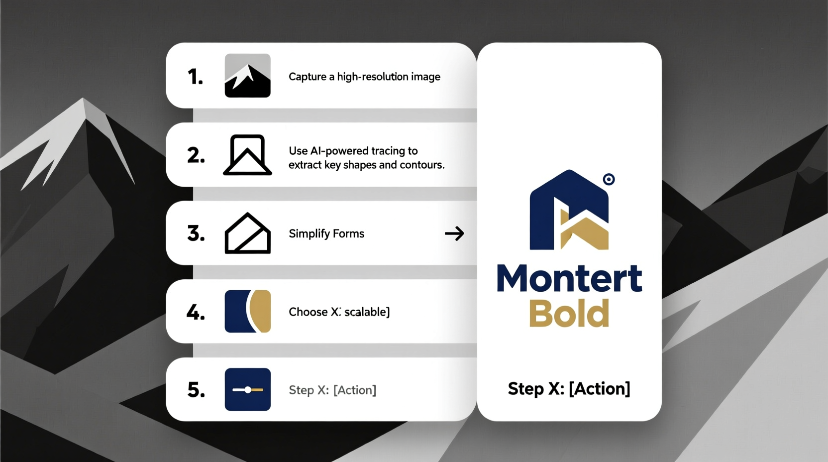
5. Real-World Example: From Photo to Logo
Consider “Summit Trails,” a new outdoor gear brand. The founder starts with a photograph of mountain peaks reflected in a lake. The image is beautiful but too detailed for a logo.
Using Photoshop, they isolate the mountain silhouette, increase contrast, and remove the water reflection. Then, in Illustrator, they trace the peak line and convert it into a sharp, two-tone vector. They add a clean sans-serif wordmark below in deep forest green, pairing strength with sustainability.
The final logo works on packaging, social media avatars, and embroidered patches. By focusing on simplicity and symbolism, a complex photo became a versatile brand mark.
Essential Checklist Before Finalizing
- ✅ Is the image legally usable or properly licensed?
- ✅ Have I reduced it to its most iconic elements?
- ✅ Does it look clear at 1 inch wide and as a 32x32px icon?
- ✅ Have I tested it in grayscale and on dark/light backgrounds?
- ✅ Are the fonts and colors consistent with brand guidelines?
- ✅ Have I exported in multiple formats (SVG, PNG, PDF)?
Frequently Asked Questions
Can I turn a copyrighted photo into my logo?
No. Using someone else’s copyrighted image—even if modified—can lead to legal issues. Always use photos you own, have permission to use, or source from royalty-free platforms like Unsplash, Pexels, or Shutterstock with proper licensing.
What if my image doesn’t vectorize cleanly?
Some images resist clean conversion due to low contrast or blurry edges. In such cases, redraw the core shape manually using pen tools. Focus on capturing the essence, not replicating every pixel.
Do I need professional software to create a logo from a picture?
Not necessarily. Free tools like Inkscape (vector), Canva (design layout), and Vectr (vector tracing) offer powerful features for beginners. However, Adobe Illustrator remains the industry standard for precision and export flexibility.
Final Thoughts and Next Steps
Transforming a picture into a professional logo blends technical skill with creative vision. It’s not about preserving every detail of the original image, but distilling its spirit into a symbol that communicates instantly and effectively. With careful selection, simplification, and strategic design choices, even a simple snapshot can evolve into a compelling brand identity.
The process may take several iterations—refine, test, gather feedback, and revise. Don’t rush the final export. When done right, your logo will serve as a cornerstone of your brand for years to come.


 浙公网安备
33010002000092号
浙公网安备
33010002000092号 浙B2-20120091-4
Comments
No comments yet. Why don't you start the discussion?