
Data is only as powerful as the way it's presented. A well-designed bar diagram can turn complex numbers into intuitive insights, making it easier for stakeholders to grasp trends, compare values, and make informed decisions. Microsoft Excel remains one of the most accessible tools for building such visualizations. With a few deliberate steps, you can transform raw data into polished, professional bar charts that communicate clearly and effectively.
This guide walks through the complete process of creating custom bar diagrams in Excel — from structuring your dataset to refining visual details. Whether you're preparing a business report, academic presentation, or internal dashboard, these techniques will help you deliver clarity and impact.
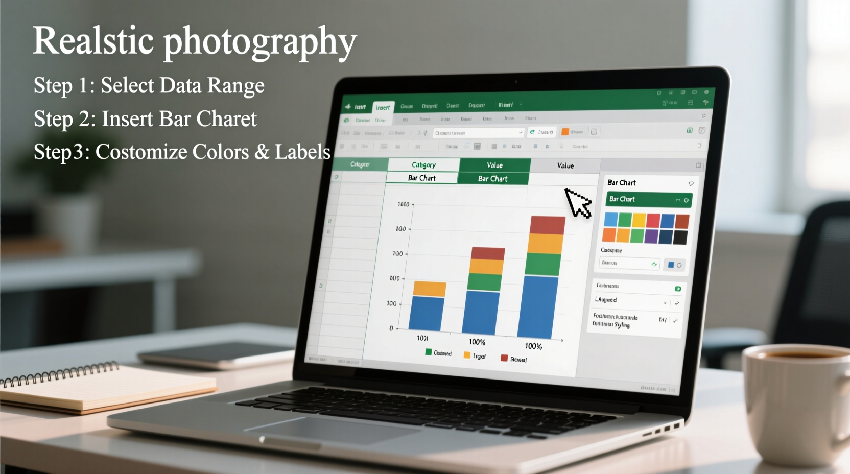
1. Prepare Your Data Structure
The foundation of any good chart is clean, organized data. Before inserting a chart, ensure your dataset follows a logical layout:
- Place categories in the first column (e.g., product names, months, regions).
- Use adjacent columns for numerical values (e.g., sales figures, survey results).
- Avoid blank rows or merged cells within the data range.
- Include clear headers at the top of each column.
For example:
| Product | Q1 Sales ($) | Q2 Sales ($) |
|---|---|---|
| A | 12000 | 14500 |
| B | 9800 | 11200 |
| C | 13500 | 13000 |
2. Insert a Basic Bar Chart
With your data selected, navigate to the Insert tab on the Excel ribbon. In the Charts group:
- Select the range of cells containing your data, including headers.
- Click Insert Column or Bar Chart.
- Choose Clustered Bar for horizontal bars or Clustered Column for vertical (often preferred for time series).
Excel will generate a default chart. At this stage, it may look basic or cluttered. The next steps refine its appearance and functionality.
3. Customize Chart Elements for Clarity
A default chart rarely meets professional standards. Adjust key components to enhance understanding:
Add and Format Axis Titles
Click the chart, then select the Chart Elements button (+) on the top-right corner. Check Axis Titles. Edit the placeholder text to reflect what each axis represents (e.g., “Sales in USD” for the value axis).
Improve Data Labels
Right-click on any bar and choose Add Data Labels. By default, labels show values. To format them:
- Right-click a label > Format Data Labels.
- Enable Value and disable Series Name if redundant.
- Adjust font size (10–12 pt) and alignment for legibility.
Refine the Legend
If comparing multiple data series (e.g., Q1 vs Q2), the legend helps distinguish them. Drag it to the bottom or right side for better balance. You can also rename series by editing the source data headers.
“Clarity in data visualization means removing everything that distracts from the core message.” — Alberto Cairo, Data Journalism Professor and Author
4. Apply Advanced Styling Techniques
To elevate your bar diagram beyond standard templates, use these customization options:
Color Strategically
Select individual bars by clicking once to highlight all, then a second time on a single bar. Right-click and choose Format Data Point. Use company-branded colors or contrasting shades to emphasize key data points (e.g., highest performer in green).
Sort Bars by Value
For clearer comparisons, sort bars in descending order. To do this:
- Sort your original data range by the relevant column (e.g., Q2 Sales, largest to smallest).
- Update the chart data range if needed.
This creates a Pareto-style layout, helping viewers instantly identify top performers.
Adjust Gap Width and Overlap
Right-click a bar series > Format Data Series. Under Series Options:
- Reduce Gap Width (75% → 50%) for denser, more modern appearance.
- Adjust Overlap when using clustered bars to prevent visual crowding.
5. Real-World Example: Monthly Revenue Dashboard
Sarah, a marketing analyst at a mid-sized SaaS company, needed to present monthly revenue growth to her executive team. Her initial table was dense and hard to interpret. She followed these steps:
- Structured her data with months in the first column and revenue figures in the second.
- Inserted a clustered column chart to show trends over time.
- Scaled the Y-axis appropriately (starting at $0) to avoid misleading exaggeration.
- Used a bold blue for all bars except the latest month, highlighted in orange.
- Added a clear title: “Monthly Revenue Growth – 2024” and labeled both axes.
The result was a clean, self-explanatory chart that sparked productive discussion during the meeting. Executives immediately noticed the upward trend and asked targeted questions about drivers behind the last quarter’s spike.
Best Practices Checklist
Before finalizing your bar diagram, run through this checklist:
- ✅ Data is accurate and properly formatted
- ✅ Chart type matches the intent (comparison = bar/column)
- ✅ Axes are labeled with units where applicable
- ✅ Title clearly states the chart’s purpose
- ✅ Colors are consistent and meaningful
- ✅ Data labels are readable and not overlapping
- ✅ No unnecessary 3D effects or decorative elements
- ✅ Font sizes are legible when projected or printed
Common Pitfalls to Avoid
| Do | Don’t |
|---|---|
| Start the Y-axis at zero for accurate bar length comparison | Truncate the Y-axis to exaggerate small differences |
| Use consistent intervals on the value axis | Use logarithmic scales without explanation |
| Limit color palette to support quick comprehension | Apply random colors to each bar |
| Keep titles concise and descriptive | Use vague titles like “Sales Data” |
Frequently Asked Questions
Can I create horizontal bar charts in Excel?
Yes. After inserting a column chart, right-click the chart, choose Change Chart Type, and select Bar instead of Column. Horizontal layouts work well for long category names or many items.
How do I update the chart when my data changes?
Excel charts are dynamic. If your original data range is correctly linked, any updates to values or labels will automatically reflect in the chart. Ensure the chart’s data source includes all relevant rows and columns.
Is it possible to combine bar and line charts?
Absolutely. Use a Combo Chart under Recommended Charts > All Charts > Combo. This is useful for showing bars (e.g., revenue) alongside a line (e.g., growth percentage) on a secondary axis.
Final Thoughts
Creating an effective bar diagram in Excel doesn’t require advanced design skills — just attention to detail and a focus on clarity. By organizing your data thoughtfully, choosing the right chart type, and refining visual elements, you can produce visuals that inform, persuade, and simplify decision-making.
Great data visualization isn’t about complexity; it’s about communication. Start applying these steps today, and turn your spreadsheets into compelling stories that resonate with your audience.


 浙公网安备
33010002000092号
浙公网安备
33010002000092号 浙B2-20120091-4
Comments
No comments yet. Why don't you start the discussion?