
Stacked bar graphs are powerful tools for visualizing part-to-whole relationships across categories. Whether you're comparing sales distributions, budget allocations, or survey responses, a well-designed stacked bar chart can communicate complex data clearly. However, default Excel charts often lack clarity and polish. This guide walks through practical techniques to transform basic stacked bars into professional, insightful visuals—without relying on third-party tools.
Understanding Stacked Bar Graphs: When to Use Them
A stacked bar graph divides each bar into segments, with each segment representing a subcategory. The total length of the bar reflects the sum of its parts. This format is ideal when you want to show both individual contributions and overall totals across different groups.
For example, imagine tracking quarterly revenue from three product lines. A stacked bar per quarter shows total revenue (bar length) and how much each product contributed (segment size). But without proper customization, such charts can become cluttered or misleading.
“Data visualization should clarify, not complicate. A well-formatted stacked bar removes ambiguity and highlights trends.” — Dr. Lisa Tran, Data Visualization Researcher, MIT Sloan
Step-by-Step: Building and Customizing Your Chart
1. Prepare Clean Source Data
Start with a structured dataset. Organize rows by category (e.g., months, regions) and columns by subcategories (e.g., product types). Include a header row and avoid merged cells or blank rows within the range.
| Quarter | Product A | Product B | Product C |
|---|---|---|---|
| Q1 | 12000 | 8500 | 6000 |
| Q2 | 14000 | 9200 | 7100 |
| Q3 | 15500 | 10000 | 8300 |
| Q4 | 18000 | 11500 | 9700 |
2. Insert the Initial Stacked Bar Chart
- Select your entire data range, including headers.
- Navigate to the Insert tab.
- In the Charts group, click Bar Chart, then choose 2-D Stacked Bar.
- Excel will generate a basic stacked bar graph.
At this stage, the chart may appear reversed (with Q1 at the bottom). To fix this, right-click the vertical axis, select Format Axis, and check Categories in reverse order. Adjust the horizontal axis bounds if needed to start from zero for accurate proportion representation.
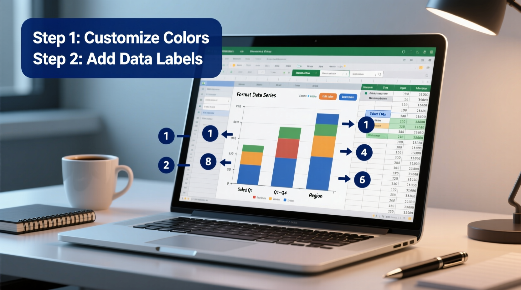
3. Refine Colors and Segments
Default color schemes are often arbitrary. Assign meaningful, consistent colors to each subcategory.
- Right-click any data series and choose Format Data Series.
- Select individual segments and assign colors that align with branding or intuitive associations (e.g., red for expenses, green for profits).
- Avoid overly bright or similar hues—use high contrast between adjacent segments.
4. Add Clear Labels and Data Values
Without labels, readers must guess what each segment represents. Right-click on the chart and select Add Data Labels. By default, labels show only values. To enhance clarity:
- Click Add Data Labels, then Add Data Callouts for bubble-style text boxes.
- Alternatively, format labels to include both category names and values via Label Options.
- Reposition overlapping labels manually by dragging them slightly outward.
Consider adding a total label at the end of each bar. While Excel doesn’t do this automatically, you can simulate it by adding a helper column in your data labeled “Total,” plotting it as a separate series, then making its fill transparent while keeping the label visible.
5. Improve Titles, Axes, and Legend
The legend placement often disrupts flow. Click the legend and drag it to the top or overlay it cleanly in the upper-right corner. Rename it meaningfully—e.g., “Revenue Streams” instead of generic series names like “Series1.”
Edit the chart title to reflect insight, not just structure. Instead of “Sales by Quarter,” write “Quarterly Revenue Distribution by Product Line (2024).”
Adjust axis titles: double-click the horizontal axis and add a descriptive title like “Revenue ($ thousands).” Ensure font sizes are legible—minimum 10pt for labels, 14pt for titles.
Design Checklist for Professional Charts
Before finalizing your graph, run through this checklist to ensure clarity and professionalism:
- ✅ Data is sorted logically (e.g., chronologically or by magnitude)
- ✅ All segments use distinct, accessible colors
- ✅ Data labels are present and readable
- ✅ Total bar lengths accurately represent combined values
- ✅ Axis starts at zero to prevent distortion
- ✅ Chart title conveys insight, not just structure
- ✅ Legend is positioned for minimal interference
- ✅ Font sizes are consistent and legible
- ✅ No unnecessary gridlines or decorative elements
- ✅ Units are clearly marked on axes
Common Pitfalls and How to Avoid Them
Even well-intentioned charts can mislead. Here are frequent mistakes and their solutions:
| Pitfall | Why It's Problematic | Solution |
|---|---|---|
| Using 3D effects | Distorts segment proportions and makes comparisons inaccurate | Stick to 2D charts; they’re cleaner and more precise |
| Too many segments per bar | Overwhelms the viewer and reduces readability | Lump small categories into an “Other” group |
| Missing data labels | Forces estimation, reducing accuracy | Always display key values directly on segments |
| Inconsistent color coding | Confuses viewers across multiple charts | Use the same color for the same category everywhere |
Real Example: Marketing Budget Analysis
A digital marketing team used a stacked bar chart to present quarterly spending across channels: social media, email, paid search, and content. Initially, the chart used random Excel colors and lacked value labels. Stakeholders struggled to identify which channel consumed the largest share in Q3.
After revision, the team applied brand-aligned colors (blue for email, green for social), added callout labels showing exact figures, reversed the axis to place Q1 on top, and included a subtle total label on each bar. The revised chart was presented alongside a one-sentence takeaway: “Paid search grew from 28% to 41% of total spend over the year.” This version enabled faster decision-making during budget planning meetings.
Frequently Asked Questions
Can I make a 100% stacked bar chart in Excel?
Yes. After inserting a regular stacked bar, right-click the chart, choose Change Chart Type, and select 100% Stacked Bar. This normalizes all bars to the same length, showing relative percentages rather than absolute values—ideal for comparing composition across categories.
How do I highlight a specific segment across multiple bars?
To emphasize a particular data series (e.g., declining product performance), increase its border width slightly or apply a contrasting shade. You can also add annotation shapes (text boxes) pointing to key segments with brief explanations like “Post-campaign drop.”
Why does my chart look reversed?
By default, Excel places the first category at the bottom. To correct this, format the vertical axis and enable Categories in reverse order. This aligns the chart with standard reading patterns, especially for time-based data.
Final Tips for Impactful Visuals
Great data visualization isn’t about complexity—it’s about clarity. A customized stacked bar should allow anyone to grasp the main message within seconds. Test your chart: show it to a colleague unfamiliar with the data and ask them to summarize the trend. If they hesitate, refine further.
Remember, Excel is more than a spreadsheet tool—it’s a communication platform. Every color choice, label placement, and formatting decision shapes how your audience interprets information. Invest time in polishing your charts; the payoff is faster understanding, better decisions, and greater credibility.


 浙公网安备
33010002000092号
浙公网安备
33010002000092号 浙B2-20120091-4
Comments
No comments yet. Why don't you start the discussion?