
A business webpage is more than just a digital placeholder—it’s your 24/7 sales representative. In today’s competitive online landscape, simply having a website isn’t enough. What matters is whether your page turns casual visitors into leads, customers, or subscribers. A high-converting business webpage combines clear messaging, intuitive design, strategic layout, and psychological triggers that guide users toward action.
This guide walks through the essential steps to build a business webpage that doesn’t just look good but performs exceptionally well. From defining your audience to optimizing for mobile and testing results, every element plays a role in conversion success.
1. Define Your Target Audience and Value Proposition
Before writing a single line of code or designing a layout, you must understand who you’re speaking to. A page built for startup founders will differ significantly from one targeting retirees interested in financial planning. Conversion begins with relevance.
Start by creating a customer persona: a semi-fictional representation of your ideal visitor. Include details like age, profession, pain points, goals, and online behavior. Once defined, craft a compelling value proposition—a concise statement explaining what you offer, who it’s for, and why it’s better than alternatives.
“Clarity sells. If your visitor can’t understand what you do in 5 seconds, they’ll leave.” — Peep Laja, Founder of ConversionXL
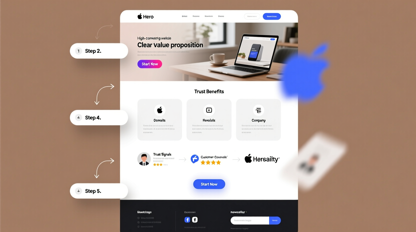
2. Structure Your Page for Maximum Impact
The layout of your webpage directly influences how users engage with your content. A well-structured page guides attention, reduces friction, and increases trust. Follow this proven sequence:
- Headline: Clear, benefit-driven, and aligned with search intent.
- Subheadline: Expands on the headline with additional context.
- Hero Image or Video: Shows your product, service, or team in action.
- Benefits (not features): Focus on outcomes, not technical specs.
- Social Proof: Testimonials, client logos, case studies.
- Call to Action (CTA): One primary CTA per section, using action-oriented language.
- FAQ Section: Addresses objections before they arise.
- Final CTA: Reiterates the offer at the bottom.
This structure follows the PAS framework: Problem, Agitation, Solution. It speaks directly to the user’s needs and guides them toward resolution.
Do’s and Don’ts of Webpage Layout
| Do | Don’t |
|---|---|
| Use whitespace to separate sections | Clutter the page with too many elements |
| Limit font styles to two max | Mix multiple fonts and sizes |
| Make CTAs stand out with color contrast | Bury buttons in text or use neutral colors |
| Optimize load speed (under 2 seconds) | Use heavy images or unoptimized scripts |
| Ensure mobile responsiveness | Design only for desktop screens |
3. Write Persuasive, Scannable Copy
Most visitors don’t read—they scan. That means your copy must be skimmable, benefit-focused, and easy to digest. Use short paragraphs, bullet points, subheadings, and bolded keywords to draw attention.
Focus on transformation. Instead of saying “We offer SEO services,” say “Get found first on Google and attract 3x more qualified leads.” The second version emphasizes outcome, not process.
Incorporate power words like proven, guaranteed, exclusive, and instant sparingly to add urgency and credibility. Avoid jargon unless your audience expects it.
4. Optimize for Conversions at Every Stage
Conversion optimization isn’t a one-time task—it’s an ongoing process. Even small changes can have a significant impact. Follow this checklist to ensure your page is primed for performance:
Conversion Optimization Checklist
- ✅ Single, clear primary goal (e.g., book a call, download a guide)
- ✅ CTA buttons use action verbs (e.g., “Start Free Trial,” “Get My Quote”)
- ✅ Forms are short—only ask for essential information
- ✅ Trust signals: SSL badge, money-back guarantee, privacy policy
- ✅ Mobile-friendly design tested on real devices
- ✅ Fast loading time (verified via Google PageSpeed Insights)
- ✅ A/B test headlines, CTAs, and images monthly
One company selling online courses increased conversions by 37% simply by changing their CTA from “Sign Up Now” to “Start Learning Today.” The subtle shift from transactional to aspirational language resonated more deeply with their audience.
Mini Case Study: How a Local Fitness Studio Doubled Sign-Ups
A boutique fitness studio in Austin struggled with low online enrollment despite high foot traffic. Their old webpage featured generic stock photos and a vague tagline: “We help you get fit.” After a redesign, they implemented these changes:
- Replaced stock images with real member photos and video testimonials
- Added a clear headline: “Lose Weight & Gain Energy in 8 Weeks—Guaranteed”
- Reduced form fields from 7 to 3 (name, email, phone)
- Added a live counter showing “23 people signed up this week”
Within six weeks, online sign-ups doubled, and class waitlists grew by 40%. The key wasn’t flashy design—it was relevance, social proof, and reduced friction.
5. Test, Measure, and Iterate
No webpage is perfect on the first try. The most effective pages are those continuously refined based on real user data. Use tools like Google Analytics, Hotjar, or Microsoft Clarity to track behavior: where users click, how far they scroll, and where they drop off.
Run A/B tests on critical elements:
- Headlines and subheadlines
- Button color, size, and text
- Placement of forms and CTAs
- Length of the page (long-form vs. short-form)
One B2B SaaS company discovered that moving their pricing table from the bottom to the middle of the page increased free trial sign-ups by 22%. Users didn’t want to hunt for pricing—they wanted transparency upfront.
“Website optimization is not about guessing what works. It’s about measuring what works and doing more of it.” — Brian Massey, Conversion Scientist and Author of *Your Customer Creation Equation*
Frequently Asked Questions
How long should my business webpage be?
There’s no universal length. Focus on completeness, not word count. If your offer is complex (like enterprise software), a longer page with detailed benefits and proof may perform better. For simple services (like local plumbing), a concise page with quick contact options is ideal. Always prioritize clarity and user intent over arbitrary length.
Should I include pricing on my webpage?
Yes, when possible. Transparent pricing reduces uncertainty and filters out unqualified leads. If your pricing varies, consider offering a starting rate (“Plans from $49/month”) or a price calculator. Hiding prices often leads to higher bounce rates as users seek clearer alternatives.
How often should I update my business webpage?
Review your page quarterly. Update outdated content, refresh testimonials, and incorporate new offers. More importantly, revisit it whenever you notice a drop in conversions or traffic. Even minor tweaks—like updating a headline or image—can restore performance.
Build, Launch, and Improve Continuously
An effective business webpage isn’t a one-off project—it’s a living asset that evolves with your audience and market. By focusing on clarity, user experience, and data-driven decisions, you create a powerful tool that works for you around the clock.
Start with a strong foundation: know your audience, articulate your value, and structure your message for impact. Then, refine relentlessly. Test headlines, optimize forms, and listen to what your visitors tell you through their behavior.


 浙公网安备
33010002000092号
浙公网安备
33010002000092号 浙B2-20120091-4
Comments
No comments yet. Why don't you start the discussion?