
Color shapes perception, influences mood, and silently communicates identity. Whether selecting an outfit, arranging a room, or designing a workspace, thoughtful color pairing transforms the ordinary into the exceptional. The most stylish choices aren’t about following trends blindly—they’re about understanding harmony, contrast, and context. Mastering a few key color combinations allows you to make consistent, confident decisions across all areas of life.
The Psychology Behind Color Pairing
Colors do more than decorate—they communicate. Blue evokes calm and trust, red signals energy and urgency, while green suggests balance and renewal. When paired effectively, colors amplify each other’s strengths. A well-chosen combination can project professionalism, warmth, or creativity depending on the setting.
Consider this: wearing navy and camel projects quiet sophistication; pairing coral and sage green brings a modern freshness to interior spaces. These effects are not accidental. They stem from an understanding of how hues interact—through temperature (warm vs. cool), saturation (intensity), and value (lightness or darkness).
“Color is the keyboard, the eyes are the hammers, the soul is the piano with many strings. The artist is the hand that plays.” — Wassily Kandinsky
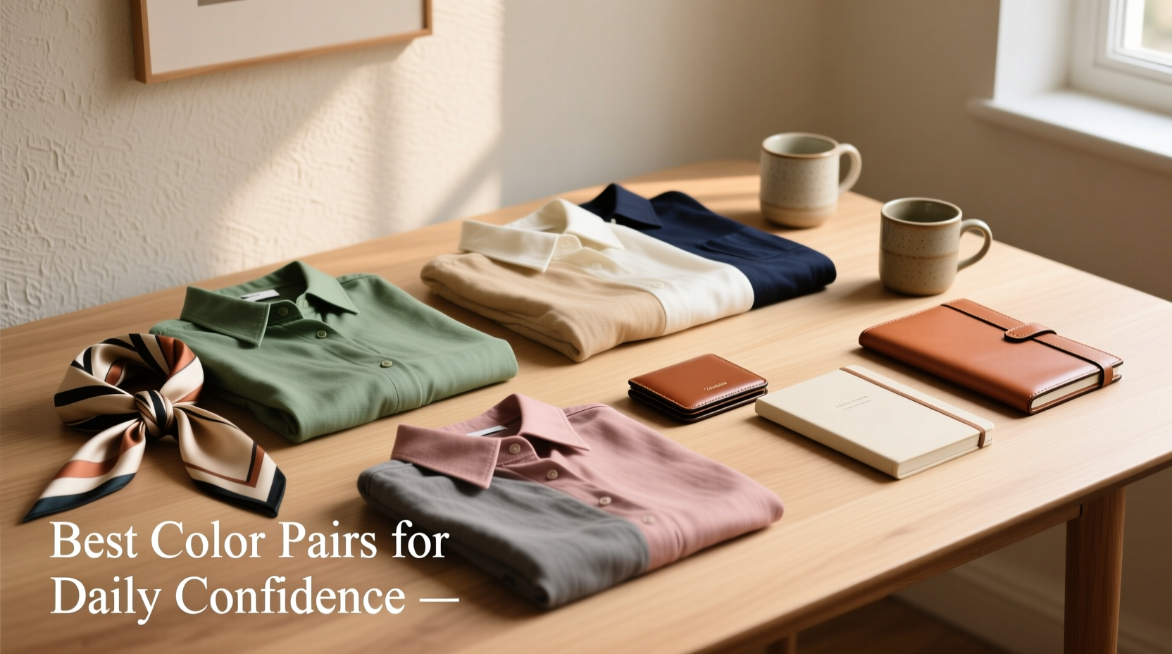
Five Timeless Color Combinations for Everyday Elegance
Some color duos withstand changing fashions because they align with natural harmony. These five pairings offer versatility across clothing, accessories, and living environments.
1. Navy & Camel
A cornerstone of refined style, this pairing balances deep cool blue with warm, earthy beige. Ideal for workwear, outerwear, or minimalist interiors, it exudes polish without being flashy. Swap in cognac leather accessories for added richness.
2. Olive Green & Cream
Earthy yet elegant, olive green grounds lighter cream tones beautifully. Use this combo in layered outfits—think an olive coat over a cream sweater—or in bedroom decor with linen bedding and timber accents.
3. Charcoal Gray & Mustard Yellow
This modern contrast blends neutrality with vibrancy. Charcoal provides a sleek backdrop, while mustard adds a bold but not overwhelming pop. Perfect for accent walls, statement scarves, or tailored blazers with vibrant ties.
4. Blush Pink & Deep Teal
Soft blush tempers the intensity of deep teal, creating a luxurious, spa-like atmosphere. In fashion, this duo works in formal wear or seasonal layering. In interiors, use blush textiles with teal cabinetry or artwork.
5. Black & Terracotta
A contemporary twist on classic neutrals. Black anchors the warm rust of terracotta, lending depth and cultural resonance. This combination shines in ceramics, footwear, and urban apartment design where warmth meets edge.
How to Apply Color Pairs Across Daily Choices
Stylish color coordination isn’t limited to wardrobe or decor—it extends to digital interfaces, meal presentation, even stationery. The goal is cohesion without monotony.
Fashion: Build a Capsule Wardrobe Around Key Duos
Select two or three core color pairs and build interchangeable pieces around them. For example, a navy/camel capsule could include a wool coat, tailored trousers, loafers, and a tote—all mixable and season-spanning.
Home Decor: Create Zones with Intentional Contrast
Use dominant and accent colors strategically. In a living room, let olive green dominate through upholstery, then introduce cream via throw pillows and curtains. This creates rhythm and visual comfort.
Digital & Workspace Aesthetics
Your laptop wallpaper, notebook covers, or desk organizers don’t have to be neutral. A charcoal gray notebook with mustard yellow pen holders reinforces your preferred palette subtly but consistently.
| Color Pair | Best For | Pro Tip |
|---|---|---|
| Navy & Camel | Professional wear, minimalist interiors | Add texture with tweed or cashmere to avoid flatness |
| Olive & Cream | Casual layering, bedrooms, rustic kitchens | Incorporate wood tones to enhance warmth |
| Charcoal & Mustard | Accent pieces, modern offices | Limited to 20% of space to prevent visual overload |
| Blush & Teal | Bathrooms, evening attire, creative studios | Use matte finishes for a luxe, non-garish effect |
| Black & Terracotta | Urban lofts, autumn fashion, ceramicware | Pair with metallic bronze for elevated contrast |
Real-Life Example: Reimagining a Morning Routine
Sophia, a graphic designer in Portland, wanted her daily routine to feel more intentional. She began by aligning her environment with her favorite color pair: olive green and cream. She switched to cream mugs and towels, wore an olive robe, and set her phone theme to a soft green gradient. Her closet now features cream blouses paired with olive skirts or pants.
The result? Clients noticed her “calm, grounded” presence during calls. More importantly, Sophia reported feeling more centered each morning. “It sounds small,” she said, “but seeing those colors together every day gives me a sense of continuity I didn’t realize I was missing.”
Step-by-Step Guide to Building Your Signature Color Pair System
Follow this six-week timeline to integrate color harmony into your lifestyle:
- Week 1: Audit your current wardrobe and living space. Identify which colors dominate and which feel out of place.
- Week 2: Choose one primary color pair based on your lifestyle (e.g., professional, creative, relaxed).
- Week 3: Shop intentionally—replace or add one item that fits your chosen palette (e.g., a scarf, pillow, or notebook).
- Week 4: Rearrange a single space using your colors as a guide. Limit competing hues.
- Week 5: Extend the palette to digital tools—customize device themes, email signatures, or calendar labels.
- Week 6: Evaluate. Note how the consistency affects your mood, confidence, and others’ perceptions.
Common Mistakes to Avoid
- Over-pairing: Using too many contrasting combos in one space dilutes their impact.
- Ignoring lighting: Artificial light can distort color perception—always test under multiple conditions.
- Mismatched undertones: Combining warm grays with cool pinks can create visual tension. Stick to harmonious undertones.
- Forcing trends: Not every trending palette suits every skin tone or space. Prioritize what feels authentic.
FAQ
Can I use bold color pairs in a small space?
Yes, but balance is key. Use one color dominantly (walls, large furniture) and the other as an accent (art, cushions). Darker shades can make small rooms feel cozier if paired with ample lighting.
How do I know which color pair suits my skin tone?
Observe how you look in natural light. Warm undertones (peach, golden) often suit camel, olive, or terracotta. Cool undertones (pink, blue) pair better with navy, gray, or blush. Test fabrics near your face to see which makes your complexion glow.
What if I love more than two colors?
Choose a primary pair and designate others as accents. For instance, if you love navy, camel, and burgundy, keep the first two as your base and use burgundy sparingly in socks, bags, or art.
Conclusion: Make Color Work for You
Great style isn’t about owning the most items—it’s about making deliberate choices that reflect who you are. By mastering just a few powerful color pairs, you gain a silent advantage: everything you wear, touch, and inhabit begins to feel more cohesive, more intentional, more *you*.
Start small. Pick one combination. Apply it thoughtfully across a single area of your life. Notice the shift. Then expand. Over time, your daily choices will not only look better—they’ll feel more aligned.


 浙公网安备
33010002000092号
浙公网安备
33010002000092号 浙B2-20120091-4
Comments
No comments yet. Why don't you start the discussion?