
Red is one of the most powerful and emotionally charged colors in visual design. From bold branding elements to expressive paintings and vibrant craft projects, mastering the use and creation of red can elevate your work from ordinary to unforgettable. But achieving the perfect red—whether deep crimson or bright cherry—isn’t always straightforward. This guide explores the science, artistry, and practical know-how behind generating and using red tones effectively across various mediums.
Understanding the Nature of Red in Color Theory
Red sits at the base of the visible light spectrum, with wavelengths ranging from approximately 620 to 750 nanometers. As a primary color in both traditional RYB (red-yellow-blue) and modern CMYK (cyan-magenta-yellow-key) models, red cannot be created by mixing other hues—but its variations are nearly infinite. The perception of red changes dramatically depending on context: a warm red next to green appears more intense, while the same shade beside pink may seem muted.
In psychological terms, red evokes urgency, passion, energy, and attention. That’s why it’s widely used in warning signs, call-to-action buttons, and romantic designs. However, poor execution—such as oversaturation or incorrect undertones—can make red feel garish or overwhelming. Understanding how to control saturation, temperature, and harmony ensures that your reds enhance rather than dominate your project.
“Red isn’t just a color—it’s an emotional trigger. Knowing how to modulate its intensity gives artists unmatched expressive power.” — Dr. Lena Torres, Color Psychologist & Design Educator
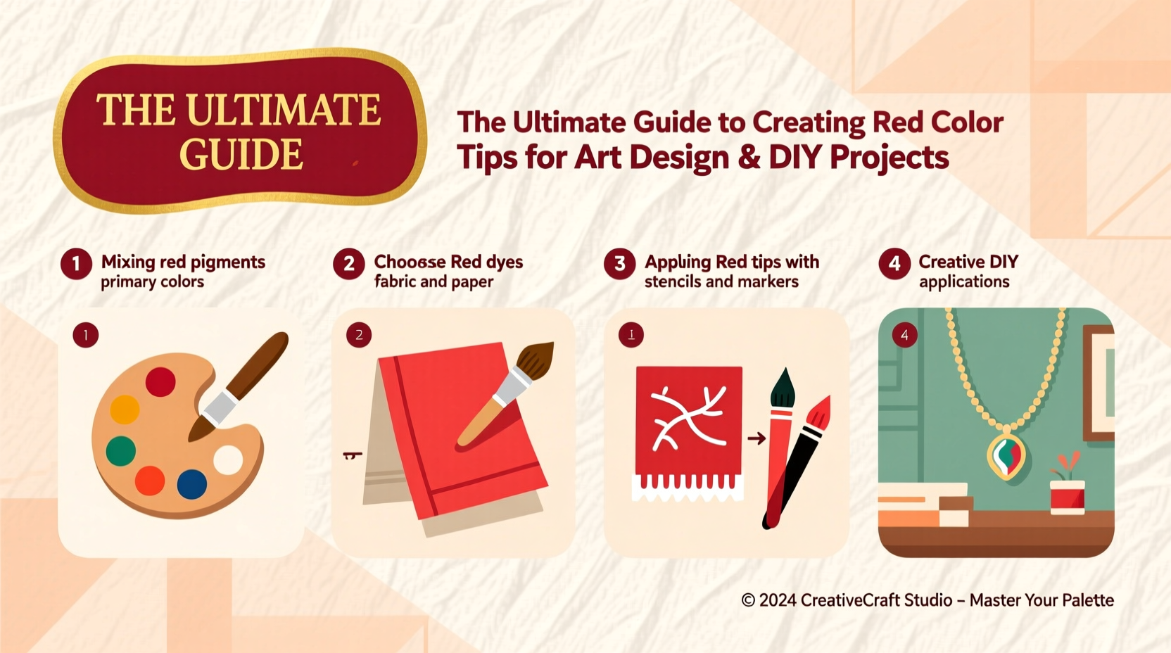
Creating Red from Scratch: Mixing Techniques Across Mediums
While pure red pigment is commercially available, many artists and DIYers benefit from learning how to mix custom reds tailored to their specific needs. The method varies significantly based on medium.
Paint Mixing (Acrylic, Oil, Watercolor)
To create clean reds without muddying the hue, start with high-quality cadmium red or alizarin crimson as a base. For warmer reds, blend with a touch of yellow ochre; for cooler versions, add a hint of ultramarine blue. Avoid combining red with green or brown unless intentionally dulling the tone.
Digital Color Creation (RGB & HEX Values)
In digital design, red is defined by RGB values. Pure red is RGB(255, 0, 0) or #FF0000. Adjusting the green and blue channels allows fine-tuning: lowering blue creates warmer reds, while increasing green produces orange-reds like tomato (#FF6347). Use tools like Adobe Color or Coolors to preview combinations before implementation.
Natural Dyes and Homemade Pigments
For eco-conscious creators, natural sources like beetroot, pomegranate rind, or madder root yield beautiful red tints. Simmer plant material in water for 1–2 hours, strain, then soak fabric or paper. Note: natural dyes often fade faster than synthetic ones unless fixed with mordants like alum.
Step-by-Step Guide: Crafting the Perfect Red for Your Project
Follow this structured process to develop a red that fits your artistic or functional goals.
- Define the Purpose: Is the red meant to stand out (e.g., logo), evoke warmth (interior decor), or express emotion (artwork)?
- Select Your Medium: Choose between paint, ink, dye, digital pixels, or fabric-based materials.
- Test Base Pigments: Try premixed reds first. Evaluate brightness, opacity, and drying time.
- Mix and Adjust: Gradually introduce complementary modifiers—white for tints, black or green for shades, gray for tones.
- Create a Swatch Library: Document each variation with notes on ratios and effects under different lighting.
- Apply in Context: Test the red alongside other colors in your composition to assess visual balance.
- Preserve the Result: Store leftover mixtures in airtight containers or save digital palettes for reuse.
Common Pitfalls and How to Avoid Them
Even experienced creators fall into traps when working with red. Below is a comparison of common mistakes and their solutions.
| Do’s | Don’ts |
|---|---|
| Use a limited palette to maintain color harmony | Combine multiple reds without testing compatibility |
| Balance red with neutral backgrounds (gray, beige) | Place bright red on equally intense backgrounds |
| Apply glazing techniques for depth in paintings | Over-layer opaque reds, which can look flat |
| Calibrate screens when designing digital reds | Assume red looks the same on all devices |
| Protect finished works with UV-resistant varnish | Expose red pigments to direct sunlight long-term |
Real-World Example: Reviving a Vintage Poster Design
A graphic designer tasked with restoring a 1950s movie poster discovered the original red had faded to pink. Instead of guessing, they scanned the document and used Photoshop’s color sampler tool to analyze remaining traces of ink. By cross-referencing historical printing standards, they recreated a faithful approximation of the era’s vermilion hue using #D92121. They then tested print proofs on matte and glossy paper to ensure vibrancy matched archival photos. The final result preserved authenticity while meeting modern display requirements.
Essential Checklist for Working with Red
- ✅ Determine the emotional or functional role of red in your project
- ✅ Choose the right type of red (warm, cool, bright, muted)
- ✅ Test your red under actual viewing conditions (natural light, screen, etc.)
- ✅ Mix small batches first to avoid waste
- ✅ Pair red with supporting neutrals or contrasting accents
- ✅ Protect red finishes from UV exposure and moisture
- ✅ Document your formulas or digital codes for future reference
Frequently Asked Questions
Can I make red by mixing other colors?
No—red is a primary color in most traditional systems and cannot be created by combining others. However, you can modify existing reds by blending them with secondary or tertiary hues to achieve desired undertones.
Why does my red look different in daylight vs. indoor lighting?
Red pigments reflect longer wavelengths that interact differently with light sources. Incandescent bulbs enhance warmth, while LED lights may emphasize blue undertones. Always evaluate reds in the environment where they’ll be displayed.
How do I prevent red from bleeding in fabric projects?
Pre-wash natural fabrics and use color-fast dyes. After application, rinse in cold water and fix with a vinegar bath (1 cup white vinegar per gallon of water) or commercial dye fixative.
Final Thoughts and Creative Call to Action
Mastering red means understanding not just how to produce it, but how to wield it with intention. Whether you're painting a mural, designing a website, or crafting handmade cards, the right red can command attention, stir emotion, and unify a composition. Now that you have the tools—from pigment mixing to digital calibration—apply them fearlessly in your next project.


 浙公网安备
33010002000092号
浙公网安备
33010002000092号 浙B2-20120091-4
Comments
No comments yet. Why don't you start the discussion?