
Typography shapes how we perceive language. A well-designed font can convey emotion, establish brand identity, and improve readability. While thousands of fonts exist, creating your own gives you full creative control and opens doors in design, branding, and digital art. For beginners, the process may seem daunting—but with the right tools and structured approach, anyone can design a functional, expressive typeface from scratch.
Understanding the Basics of Type Design
Before drawing your first letter, it’s crucial to understand the foundational elements of typography. Each character in a font follows consistent visual rules that define its style, weight, spacing, and proportions. Key components include:
- Baseline: The invisible line on which characters sit.
- X-height: The height of lowercase letters like 'x' or 'a'.
- Ascenders and Descenders: Parts of letters that extend above (b, d) or below (p, q) the x-height.
- Stem, Bowl, Counter: Structural parts of letters—vertical lines, curved strokes, and enclosed spaces.
- Kerning and Tracking: Adjustments to space between specific letter pairs and overall character spacing.
Consistency across all these elements ensures legibility and aesthetic harmony. Begin by studying existing fonts. Analyze serif, sans-serif, script, and display styles to internalize their construction principles.
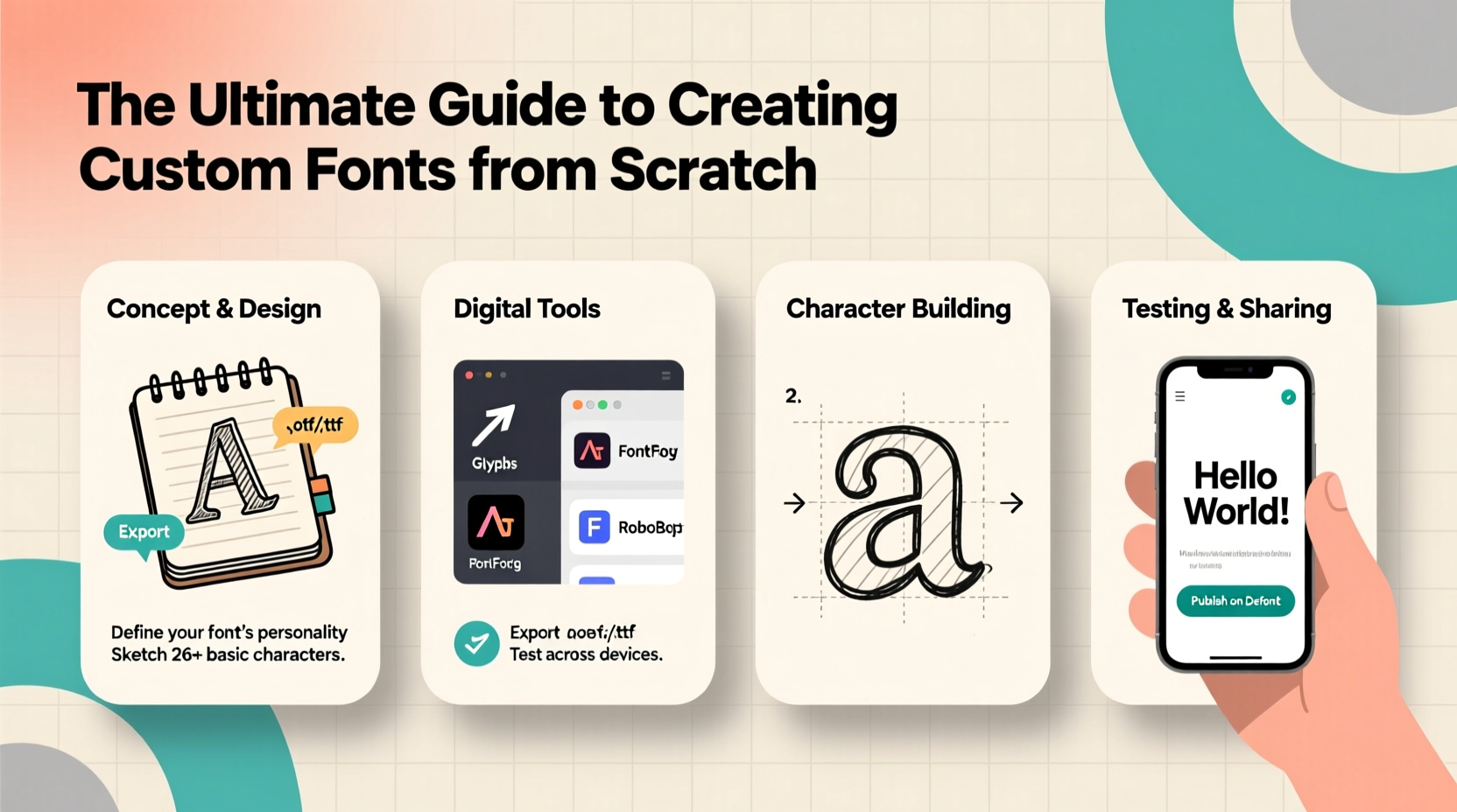
Step-by-Step Guide to Creating Your First Font
Creating a custom font is a methodical process. Follow this timeline to go from concept to usable typeface.
- Define Your Purpose: Decide if your font is for headlines, body text, logos, or decorative use. This influences style choices like weight, contrast, and flair.
- Sketch by Hand: Use pencil and paper to draft lowercase and uppercase letters. Focus on key characters (n, o, b, p) to establish rhythm and proportion.
- Choose Digital Tools: Transfer sketches to vector software. Glyphs, FontForge, or Illustrator paired with BirdFont are excellent starting points.
- Digitize Characters: Trace your sketches using Bézier curves. Start with core letters, then build others based on shared shapes (e.g., 'b' and 'd' share stems).
- Set Metrics: Define side bearings (left/right spacing), kerning pairs, and baseline alignment. Poor spacing ruins even the best-drawn glyphs.
- Test Early and Often: Export a test version and use it in short phrases. Look for inconsistencies in weight, spacing, or character flow.
- Add Punctuation & Numbers: Complete the character set with numerals, punctuation, and accented characters if needed.
- Generate and Install: Compile your font file (usually .otf or .ttf) and install it on your system to test in real applications.
“Designing a font isn’t just about making letters look good—it’s about crafting a system where every character supports the next.” — Laura Worthington, Professional Type Designer
Essential Tools for Beginner Font Designers
The right software simplifies the technical challenges of font creation. Here’s a comparison of top tools suited for beginners:
| Tool | Best For | Platform | Cost | Learning Curve |
|---|---|---|---|---|
| FontForge | Open-source, full-featured font editor | Windows, Mac, Linux | Free | Moderate |
| Glyphs Mini | Beginners stepping into professional workflows | Mac only | $45 | Low to Moderate |
| BirdFont | Vector-based font creation with export options | Windows, Mac, Linux | Free (basic), $39 (pro) | Low |
| RoboFont | Advanced customization and scripting | Mac | $249 | High |
| Inkscape + Calligraphr | Handwriting conversion via template | Cross-platform | Free + Web tool | Very Low |
For absolute beginners, pairing Inkscape (free vector tool) with Calligraphr.com allows you to draw letters on a printable template, scan them, and convert them into a working font—ideal for playful or handwritten styles.
Common Pitfalls and How to Avoid Them
New font designers often overlook subtle but critical details. Awareness of these issues improves quality significantly.
- Inconsistent Stroke Weight: Ensure vertical and horizontal strokes maintain uniform thickness unless intentionally varied for stylistic effect.
- Ignoring Spacing: Even perfectly drawn letters fail if they’re too tight or too loose. Test words like “vav,” “rio,” and “HAW” to spot spacing problems.
- Skipping Kerning: Some pairs like “To” or “Ya” need manual adjustment. Automating spacing isn’t enough.
- Overcomplicating Design: Start simple. A clean, readable font has broader utility than an overly ornate one.
- Not Testing in Context: Always preview your font in real-world settings—headlines, paragraphs, small sizes—to assess functionality.
Mini Case Study: From Sketch to Brand Identity
Jamie, a freelance graphic designer, wanted a unique font for a local coffee shop’s rebrand. With no prior experience, Jamie started by sketching letters inspired by hand-painted café signs. Using FontForge, the sketches were digitized over two weekends. Initial versions had uneven baselines and inconsistent round shapes (‘o’, ‘e’). After studying tutorials and adjusting anchor points, Jamie refined the curves and balanced spacing. The final font—named “BrewScript”—was used on packaging, menus, and social media. Customers praised its warmth and authenticity. The project not only elevated the brand but also gave Jamie a new skill to offer clients.
Checklist: Launch-Ready Font Preparation
Before releasing or using your font professionally, ensure it meets these criteria:
- ✅ All 26 uppercase and lowercase Latin letters are designed
- ✅ Numerals (0–9) and basic punctuation (. , ! ? ; : \") included
- ✅ Consistent baseline, x-height, and cap height
- ✅ Side bearings and kerning adjusted for common pairs
- ✅ Tested at multiple sizes (8pt, 12pt, 36pt)
- ✅ Exported in standard format (.otf or .ttf)
- ✅ Named clearly and documented (version, license, designer)
Frequently Asked Questions
Can I sell a font I create as a beginner?
Yes. Once your font is complete and legally original (not based on copyrighted designs), you can sell it through marketplaces like Creative Market, MyFonts, or your own website. Be sure to choose a licensing model—personal, commercial, or extended use.
How long does it take to make a basic font?
A simple, clean font with full Latin support can take 20–40 hours for a beginner. Time varies based on complexity, tools used, and attention to detail. Hand-drawn or script fonts may require more cleanup and kerning work.
Is coding knowledge required to make fonts?
No. Most modern font editors provide graphical interfaces. However, understanding basic OpenType features or using Python scripts in RoboFont can enhance functionality later on.
Start Shaping Language One Letter at a Time
Creating a custom font is both a technical challenge and a creative journey. It demands patience and precision, but the reward—a unique voice in visual language—is unmatched. Whether you're designing for a client, building a brand, or expressing personal style, the skills you develop will deepen your understanding of design and communication.


 浙公网安备
33010002000092号
浙公网安备
33010002000092号 浙B2-20120091-4
Comments
No comments yet. Why don't you start the discussion?