
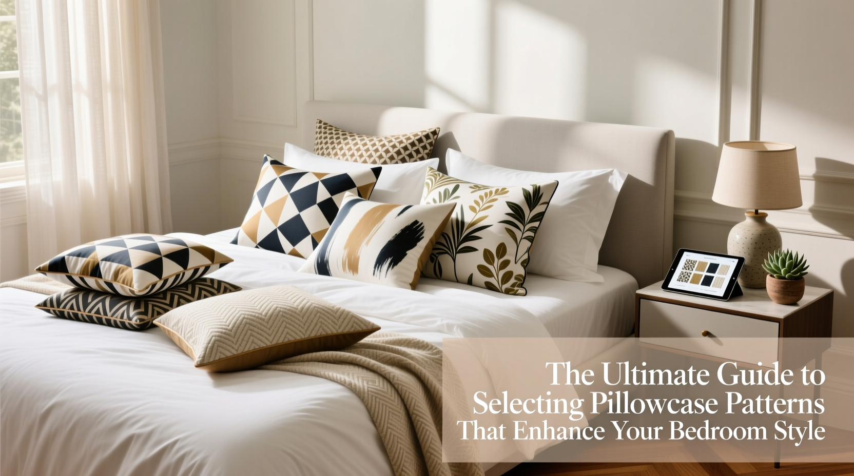
A well-designed bedroom is more than just furniture and lighting—it’s a carefully curated space where every textile contributes to the overall mood and visual balance. Among the most overlooked yet impactful elements are pillowcases. Beyond their function, pillowcases serve as subtle design statements. The right pattern can unify a color scheme, add texture, or introduce personality. The wrong one can clash, overwhelm, or make the room feel disjointed. Selecting the perfect pillowcase pattern involves understanding scale, color theory, fabric interaction, and personal style. This guide breaks down the essential principles to help you make intentional choices that elevate your bedroom’s aesthetic.
Understand Pattern Scale and Proportion
Pattern scale refers to the size of the design motif on the fabric—whether it’s large florals, tiny polka dots, or intricate geometrics. Choosing the right scale depends on both the size of your bed and the dominant features in the room.
Large-scale patterns command attention. They work best in spacious rooms with minimal competing decor. A bold tropical print or oversized damask can become a focal point when paired with solid-colored bedding and neutral walls. However, in smaller bedrooms, large patterns can feel overwhelming unless balanced with ample negative space.
Small-scale patterns, such as micro-checks or delicate paisleys, are versatile. They add visual interest without dominating the space. These are ideal for layered looks—pairing with duvet covers or shams that have bolder designs. Medium-scale prints offer a middle ground, providing rhythm and movement while remaining approachable.
Harmonize Patterns with Color Psychology
Color influences emotion and perception. Cool tones like blues and greens promote calmness, making them excellent for restful bedrooms. Warm hues such as rust, terracotta, or soft golds create intimacy and coziness. Your pillowcase pattern should align with the emotional tone you want to set.
When combining colors in patterns, consider the 60-30-10 rule: 60% dominant color (walls or bedding), 30% secondary (curtains or rugs), and 10% accent (pillowcases or decorative throws). A patterned pillowcase often serves as that 10% pop. For example, navy and white stripes on a cream bedspread introduce contrast while maintaining cohesion.
Clashing occurs not from multiple colors, but from poor balance. Avoid pairing two high-contrast patterns unless they share at least one unifying color. A floral pillowcase with coral, sage, and cream works beautifully with a geometric throw that repeats the same palette.
“Patterns succeed when they tell a story through repetition and restraint. One standout piece per layer keeps the eye moving without confusion.” — Lena Torres, Interior Stylist & Textile Consultant
Match Pattern Style to Bedroom Theme
Your bedroom likely follows a general design direction—modern, rustic, bohemian, minimalist, or traditional. Pillowcase patterns should reinforce, not contradict, that theme.
| Bedroom Style | Suitable Patterns | Patterns to Avoid |
|---|---|---|
| Modern Minimalist | Clean lines, tonal textures, subtle grids | Busy florals, loud graphics |
| Coastal/Scandinavian | Nautical stripes, watery hues, organic motifs | Dark jewel tones, ornate damasks |
| Bohemian | Global prints, ikats, ethnic embroidery | Overly structured plaids |
| Traditional | Florals, toile, brocade-inspired designs | Graffiti prints, neon geometrics |
| Rustic Farmhouse | Gingham, checks, muted botanicals | High-gloss metallic prints |
For instance, a modern loft bedroom with concrete floors and monochrome bedding benefits from a single charcoal-and-white herringbone pillowcase. In contrast, a sunlit boho bedroom might embrace a set of mix-and-match patterned cases in indigo batik, tribal weave, and embroidered mandala styles.
Coordinate with Existing Bedding and Room Elements
Pillowcases don’t exist in isolation. They interact with sheets, duvets, blankets, curtains, and even wall art. To ensure cohesion, follow a simple coordination strategy:
- Start with your largest textile—usually the duvet cover or quilt—and identify its dominant and accent colors.
- Select a pillowcase pattern that pulls one accent color from that piece and introduces a complementary texture or shape.
- Layer intentionally. If your duvet has a large floral, choose a pillowcase with a small geometric in a matching hue.
- Test in natural light. Colors shift throughout the day; view combinations near a window before finalizing.
Consider a real-world example: Sarah transformed her outdated master bedroom by replacing plain white pillowcases with ones featuring a soft sage-and-cream trellis pattern. The new cases echoed the vine-like wallpaper behind the bed and pulled green into the bedding, which had previously relied only on gray and beige. The change was subtle but unified the space instantly.
Balance Pattern with Texture and Fabric Choice
The material of your pillowcase affects how the pattern appears and feels. A silk pillowcase with a printed motif will have a fluid, luminous quality, while cotton percale renders the same design crisper and more matte. Satin finishes amplify sheen, making bold patterns appear richer; linen adds slub and irregularity, softening even busy prints.
Texture also plays a role in perceived complexity. A waffle-knit pillowcase with a tonal pattern adds depth without visual noise. Conversely, a smooth sateen with a high-contrast graphic stands out sharply. Pair textured fabrics with simpler patterns to avoid sensory overload.
For sensitive skin or hot sleepers, prioritize breathable natural fibers—even when drawn to a striking print. A beautiful design loses appeal if it causes discomfort. Look for OEKO-TEX certified dyes and tightly woven weaves that maintain print clarity without sacrificing softness.
Checklist: How to Choose the Right Pillowcase Pattern
- ✅ Assess your bedroom’s dominant style (e.g., modern, farmhouse, boho).
- ✅ Identify the main colors in your bedding and walls.
- ✅ Decide whether you want the pillowcase to blend in or stand out.
- ✅ Choose a pattern scale appropriate for your room size.
- ✅ Ensure at least one color in the pattern matches an existing element.
- ✅ Consider fabric type and how it affects both look and comfort.
- ✅ Limit pattern mixing to no more than two complementary designs.
- ✅ Test the combination in daylight and evening lighting.
Frequently Asked Questions
Can I mix different patterns on my pillowcases?
Yes, but do so mindfully. Combine one bold pattern with a smaller, coordinating one—such as pairing a striped case with a tiny dot or solid in a shared color. Maintain a consistent color palette to tie the look together.
How many patterned pillowcases should I use on a bed?
For a queen bed, two to four pillowcases are typical. Use patterned cases as accents—two behind solid Euro shams, for example. Overcrowding with patterns disrupts visual flow.
Do seasonal themes affect pillowcase pattern choices?
They can. Lighter, airy patterns like watercolor florals or seashell motifs suit spring and summer. Autumn and winter invite richer prints—plaid, tapestry, or deep-toned botanicals. Rotating pillowcases seasonally is an easy way to refresh your space.
Final Thoughts: Elevate Your Space One Pillow at a Time
Selecting the right pillowcase pattern isn’t about following trends—it’s about curating a space that reflects your taste and supports your well-being. With thoughtful consideration of scale, color, theme, and texture, even a small change can transform the energy of your bedroom. The goal isn’t perfection, but harmony: a place where every thread contributes to peace, comfort, and beauty.


 浙公网安备
33010002000092号
浙公网安备
33010002000092号 浙B2-20120091-4
Comments
No comments yet. Why don't you start the discussion?