
Color is more than just a visual detail—it’s a language. The right colors enhance your natural features, express your personality, and influence how others perceive you. Yet most people wear shades that clash with their undertones or dull their energy without realizing it. Finding your personal color palette isn’t about trends; it’s about alignment. When you wear colors that harmonize with your complexion, hair, and eyes, you don’t just look better—you feel more confident, vibrant, and authentic.
Why Your Personal Color Palette Matters
Your natural coloring—skin undertone, eye color, and hair pigment—creates a unique harmony that certain colors support and others disrupt. Wearing the wrong shades can make you appear tired, washed out, or aged, even if your outfit is stylish. Conversely, the right hues illuminate your face, sharpen your features, and project intentionality.
This isn’t about rigid seasonal categories like “Winter” or “Autumn.” While those systems offer a starting point, modern personal color analysis goes deeper. It considers not only your biology but also your emotional response to color, your lifestyle, and the image you want to project.
“Wearing your best colors is like tuning an instrument. Everything comes into resonance.” — Dr. Lila Chen, Color Psychology Researcher
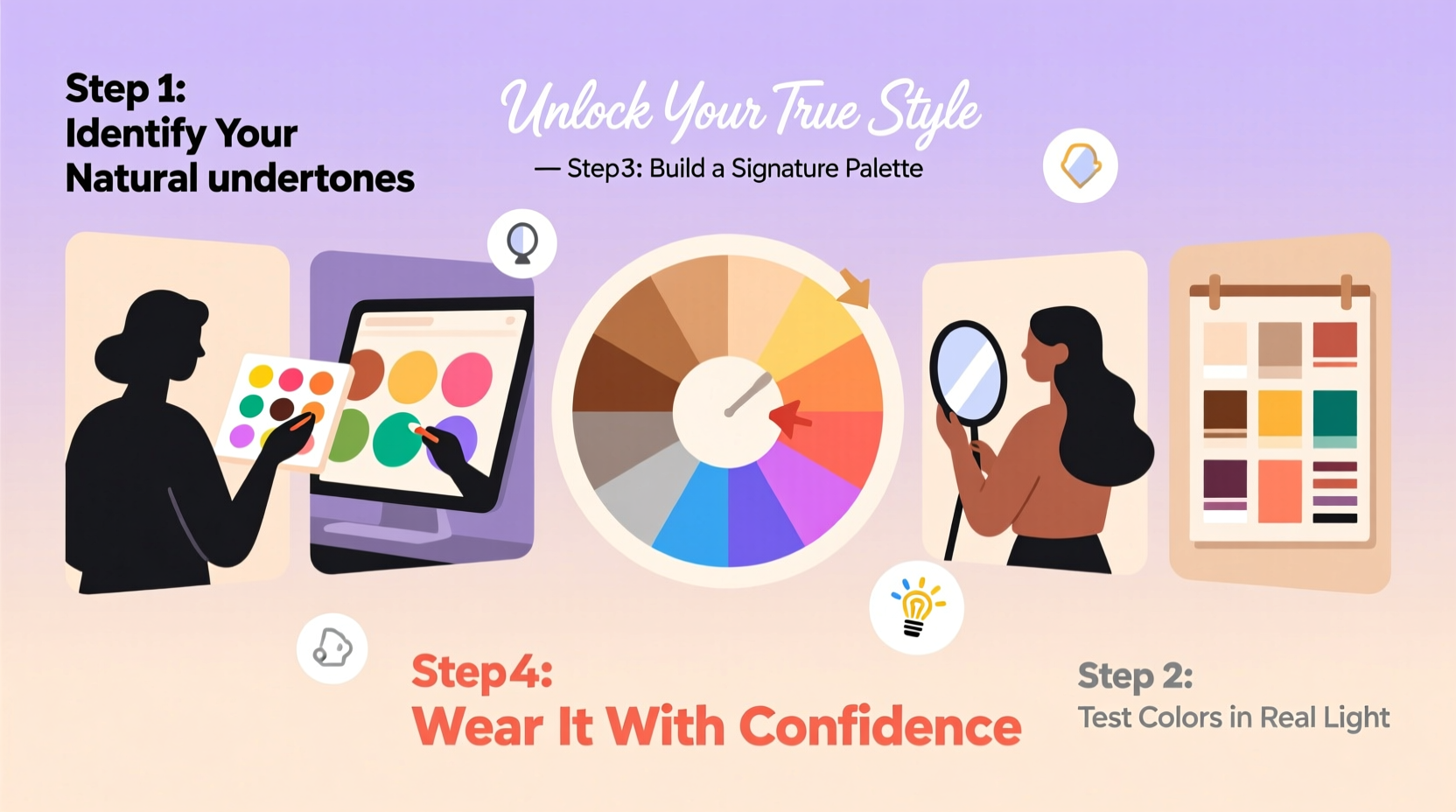
The Science of Undertones: Warm, Cool, and Neutral
The foundation of any personal palette is identifying your skin’s undertone. Unlike surface redness or tan, undertones are consistent beneath the surface and fall into three categories:
- Warm: Golden, peachy, or yellowish base. Veins appear greenish.
- Cool: Pink, red, or bluish base. Veins look blue or purple.
- Neutral: A mix of both. Veins may appear blue-green.
To test your undertone, hold up gold and silver jewelry next to your face in natural light. If gold enhances your glow, you likely have warm undertones. If silver brightens your complexion, you’re probably cool-toned. If both work, you may be neutral.
Step-by-Step Guide to Discovering Your Palette
Finding your ideal colors is a process of observation, experimentation, and refinement. Follow this five-step method for lasting clarity.
- Analyze Your Natural Features
Stand in natural light and examine your skin, hair, and eyes. Note whether your skin leans golden or pink, whether your hair has warm reds or cool ashy tones, and if your eyes shine with warmth (hazel, amber) or coolness (blue, gray). - Conduct a Fabric Swatch Test
Gather solid-colored fabrics or scarves in key shades: pure white, ivory, navy, royal blue, emerald green, burgundy, rust, and charcoal. Hold each under your chin and observe your reflection. Which make your skin look radiant? Which cast shadows or sallowness? - Map Your Reactions
Keep a journal. Note how different colors affect your mood and how others respond to you when wearing them. You might discover that while cobalt blue looks good, it feels too intense—whereas teal empowers you. - Build a Core Palette
Select 5–7 foundational colors that consistently flatter you. Include neutrals (your version of black, gray, beige) and accents (a signature red or green). These become your go-to choices for professional wear, social events, and everyday comfort. - Adapt Over Time
As your hair grays, skin changes with age, or your personal style evolves, revisit your palette annually. A color that worked at 25 might not resonate at 45.
Common Mistakes to Avoid
Even well-intentioned efforts can go off track. Here’s what to watch for:
| Mistake | Why It’s Problematic | Better Approach |
|---|---|---|
| Following fashion trends blindly | Trendy colors may not suit your undertone | Adapt trends using your palette—e.g., wear a trendy lilac if it complements your cool tone |
| Using outdated seasonal labels | Not everyone fits neatly into Winter or Spring | Use seasons as inspiration, not rules |
| Ignoring emotional impact | A color might look good but feel “off” | Choose colors that make you feel aligned, not just attractive |
| Relying on screens for color decisions | Screens distort color due to calibration | Test physical swatches in daylight |
Real-Life Example: From Washed Out to Radiant
Sophie, a 38-year-old marketing consultant, always wore black, navy, and gray. She believed they looked professional. But colleagues often said she looked “tired” in meetings. During a color consultation, she discovered her cool-pink undertones were dulled by dark, muted tones. Her eyes are icy blue, and her hair has ash-brown depth—traits suited to jewel tones.
She introduced sapphire blue, deep plum, and soft lavender into her wardrobe. Within weeks, clients commented on her “energy” and “clarity.” Sophie reported feeling more assertive and visible. “I didn’t change my skills,” she said, “but I finally looked like the leader I am.”
Your Personalized Color Checklist
Use this checklist to ensure you’re building a functional, flattering palette:
- ✅ Identified my dominant undertone (warm, cool, or neutral)
- ✅ Tested at least 6 key colors in natural light
- ✅ Selected 2–3 core neutrals that enhance my complexion
- ✅ Chosen 3 accent colors for versatility and impact
- ✅ Eliminated 1–2 previously loved colors that drain my appearance
- ✅ Documented my palette with fabric swatches or digital references
- ✅ Updated my closet with pieces in my best colors
Expanding Beyond Clothing: A Lifestyle Approach
Your color palette isn’t limited to fashion. Apply it to your environment and self-expression:
- Makeup: Choose lipstick and blush in hues from your palette. A coral that flatters your skin in clothing will likely work in cosmetics.
- Home Decor: Use your accent colors in throw pillows, artwork, or lighting to create spaces that energize you.
- Digital Presence: Align your website, social media themes, or professional headshots with your palette for visual consistency.
When your external world reflects your internal harmony, confidence grows organically.
Frequently Asked Questions
Can my color palette change over time?
Yes. Aging, sun exposure, hormonal shifts, and hair color changes can alter how colors interact with your skin. Reassess every few years or after major life transitions.
I’m neutral—how do I choose between warm and cool?
Neutral types can wear both, but some shades will still perform better. Focus on saturation and contrast. Bright cool tones may energize you more than muted warm ones, or vice versa. Let your reactions guide you.
Do tattoos affect my color analysis?
Generally, no. Tattoos are localized and don’t shift overall undertone. However, large colored tattoos might influence nearby fabric choices. Test garments as usual.
Final Thoughts: Style Is Alignment
Finding your perfect color palette isn’t a one-time event—it’s an ongoing conversation with yourself. It’s about choosing authenticity over imitation, resonance over trendiness. When you wear colors that honor your natural essence, you stop trying to impress and start expressing.
You don’t need a closet full of clothes. You need a few powerful shades that make you feel undeniable. Start today: pull out three tops, stand in daylight, and ask: which one makes me look alive? That’s your first clue.


 浙公网安备
33010002000092号
浙公网安备
33010002000092号 浙B2-20120091-4
Comments
No comments yet. Why don't you start the discussion?