
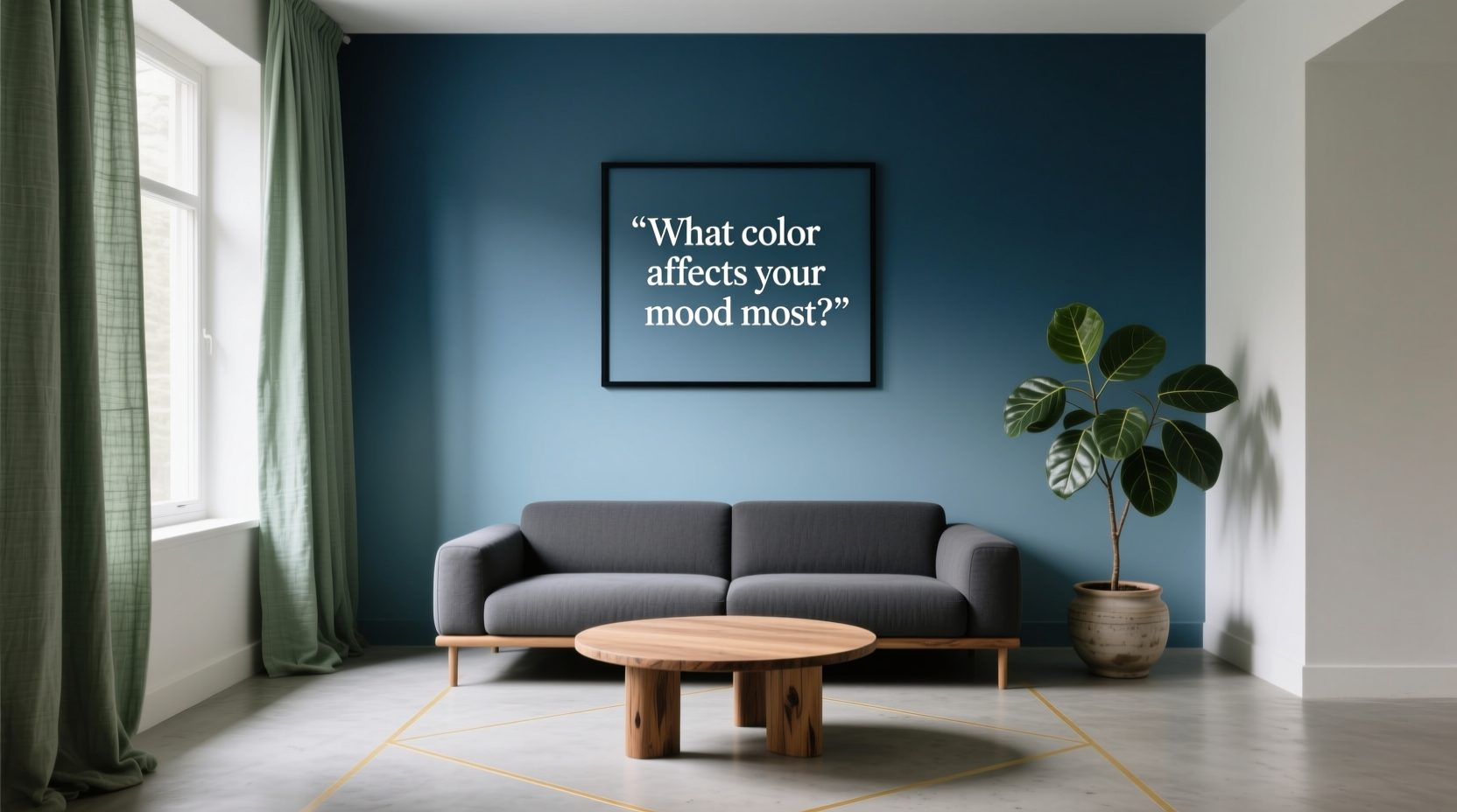
Color is more than just a visual experience—it’s a psychological force. From the walls of your bedroom to the accent pillows on your sofa, the colors you surround yourself with shape your emotions, energy levels, and even cognitive function. While individual responses vary, research consistently shows that certain hues have predictable effects on human mood and behavior. Among them, blue stands out as the color that affects your mood most profoundly—calming, stabilizing, and universally preferred across cultures.
Understanding how color influences emotion allows you to intentionally design spaces that support your mental health, productivity, and relaxation. Whether you're redecorating your living room, setting up a home office, or choosing paint for a child's bedroom, the right color choices can transform not only the look of a room but also how you feel within it.
The Science Behind Color and Mood
Color psychology examines how different wavelengths of light interact with our brains and nervous systems. When light enters the eye, it stimulates photoreceptors that send signals to the hypothalamus—the brain region responsible for regulating hormones, sleep, appetite, and emotional states. This biological process means that even subtle changes in color can shift your internal state.
Studies from institutions like the University of Texas and the University of British Columbia have shown that people exposed to blue environments report lower stress levels and improved focus. In one experiment, participants performed better on creative tasks in blue-lit rooms compared to red-lit ones. Red, while energizing, increased alertness at the cost of anxiety and reduced flexibility in thinking.
Blue’s dominance in mood regulation stems from its association with natural elements: the sky, clean water, and open horizons. These associations trigger feelings of expansiveness, peace, and safety. Unlike warmer tones such as red or orange—which stimulate adrenaline and heart rate—blue has a suppressive effect on the autonomic nervous system, lowering blood pressure and slowing respiration.
“Blue is the most universally calming color we have. It taps into deep evolutionary cues of safety and stability.” — Dr. Lena Torres, Environmental Psychologist, MIT Human Spaces Lab
Why Blue Affects Your Mood Most
Among all colors, blue consistently ranks highest in global preference surveys. A 2023 cross-cultural study by the International Association of Color Researchers found that over 65% of participants across 32 countries identified blue as their favorite color, citing calmness, trust, and clarity as key reasons.
But preference isn’t the only reason blue holds sway over mood. Its physiological impact is measurable:
- Reduces cortisol levels: Exposure to soft blue lighting or wall colors has been linked to decreased production of the stress hormone cortisol.
- Enhances concentration: Cool blues improve sustained attention, making them ideal for workspaces.
- Promotes restful sleep: Bedrooms painted in muted blue tones correlate with higher sleep quality and faster onset of sleep.
- Supports emotional regulation: In therapeutic settings, blue environments help individuals manage anxiety and emotional reactivity.
What makes blue uniquely effective is its versatility. Unlike green, which soothes but may lack stimulation, or yellow, which uplifts but can overwhelm, blue strikes a rare balance between calming and focusing. It doesn’t excite or depress—it centers.
How to Use Blue Effectively in Your Space
Knowing that blue is powerful is only half the equation. The real benefit comes from using it strategically. Here’s how to harness its mood-enhancing properties across different areas of your home or workplace.
Bedrooms: Optimize for Sleep and Relaxation
Sleep specialists often recommend painting bedroom walls in soft, cool blues. These shades mimic twilight skies and signal the brain that it’s time to wind down. Avoid bright or saturated blues (like electric or cobalt), which can be too stimulating.
Achieve depth and warmth by layering textures: a faded denim duvet cover, a light gray-blue wall, and off-white curtains. This creates a cocoon-like atmosphere conducive to rest.
Home Offices and Study Areas: Boost Focus Without Fatigue
For those working from home or studying, blue enhances mental clarity without the jittery side effects of brighter colors. Navy, steel blue, or dusty teal on an accent wall behind your desk can subtly anchor your attention.
Pair blue with neutral whites or soft grays to maintain brightness and avoid visual heaviness. Add metallic accents (like brushed nickel or chrome) to reflect light and keep energy flowing.
Bathrooms: Create a Spa-Like Retreat
Bathrooms are natural candidates for blue. Light aqua or seafoam tones evoke cleanliness and freshness, turning daily routines into mini rituals of renewal. Consider tiling in gradient blue mosaics or adding towels in varying ocean-inspired shades.
To elevate the sensory experience, combine blue decor with natural materials—stone countertops, bamboo shelves, and ceramic fixtures—to reinforce the connection to water and nature.
Living Rooms: Encourage Calm Conversation
In shared spaces, blue fosters open, relaxed communication. Instead of defaulting to beige or gray, try a medium-toned blue on one focal wall. Accent with cream cushions, woven throws, and indoor plants to soften the tone and invite comfort.
For families with children, blue can help regulate high energy levels while still feeling welcoming. Avoid pairing it with strong reds or oranges, which may create visual tension.
Do’s and Don’ts of Using Blue in Interior Design
| Do | Don't |
|---|---|
| Use soft or medium blues in bedrooms and bathrooms for relaxation. | Paint entire rooms in dark navy without adequate lighting—it can feel oppressive. |
| Layer different shades of blue for depth and interest. | Mix too many competing cool tones (e.g., blue, green, purple) without balance. |
| Pair blue with warm neutrals like beige, taupe, or walnut wood. | Use bright blue in spaces meant for socializing unless balanced with warm accents. |
| Test paint samples at different times of day to see how natural light affects the hue. | Ignore undertones—some blues lean gray, others green or purple; choose carefully. |
| Add texture through fabrics, rugs, and wall finishes to prevent flatness. | Rely solely on paint—incorporate blue through art, furniture, or accessories too. |
Real-Life Example: Transforming a Chaotic Home Office
Sarah, a freelance graphic designer in Portland, struggled with focus and burnout in her cluttered attic workspace. The room had white walls and fluorescent lighting, which she found harsh and uninspiring. After consulting with an interior therapist, she repainted one wall in a muted slate blue and replaced her overhead bulb with warm daylight LEDs.
She added a navy ergonomic chair, blue-patterned curtains, and a small fountain with blue glass stones. Within two weeks, Sarah reported a 40% reduction in afternoon fatigue and improved task completion rates. “It’s not just prettier,” she said. “I actually *feel* calmer when I walk in. My mind settles faster.”
This case illustrates how intentional color use—even in small doses—can yield measurable improvements in mood and performance.
Step-by-Step Guide: Implementing Blue Into Your Environment
- Assess your current space: Identify areas where you feel stressed, distracted, or emotionally drained. These are prime candidates for color intervention.
- Determine the function of each room: Match blue intensity to purpose—soft blue for rest, deeper blue for focus.
- Choose your shade: Sample 3–5 paint swatches or fabric options. Observe them in morning, midday, and evening light.
- Start small: Introduce blue through throw pillows, artwork, or a single accent wall before committing to full repaints.
- Balance with complementary elements: Add warmth with wood, leather, or metallic finishes. Include plants for vitality.
- Monitor your response: Keep a short journal for one week noting mood, energy, and focus changes after the update.
- Adjust as needed: If the space feels too cold, introduce creamy whites or terracotta accents to warm it.
When Blue Isn’t the Right Choice
While blue benefits most people, it’s not universally ideal. Some individuals associate blue with sadness or loneliness, particularly if they’ve experienced grief in blue-dominated environments. Others with low seasonal energy (such as those with winter-pattern depression) may find cool tones draining rather than soothing.
In these cases, consider alternatives:
- Green: Offers similar calming benefits with a more nurturing, life-affirming quality due to its link with nature.
- Soft yellow: Can gently elevate mood without overstimulation—ideal for north-facing rooms with little sunlight.
- Taupe or warm gray: Neutral bases that support emotional stability without strong chromatic influence.
The key is personal resonance. Ask yourself: When I look at this color, do I feel lighter or heavier? More open or closed off? Let your body’s response guide your decision.
Frequently Asked Questions
Can blue make a room feel smaller?
Generally, no. Cool colors like blue tend to recede visually, making walls appear farther away. However, very dark blues (like midnight or indigo) can create a cozy, enclosed feeling—ideal for large rooms but potentially overwhelming in small ones. Use lighter blues in compact spaces to enhance openness.
Is blue suitable for children’s rooms?
Yes, especially for children who are highly energetic or sensitive to overstimulation. Soft sky blue or pastel turquoise promotes calm without being sterile. Avoid overly saturated shades that might suppress playfulness. Balance with cheerful accents in yellow or white.
How do I choose between blue and green for a calming effect?
Blue is better for mental clarity and emotional restraint; green is superior for physical relaxation and connection to nature. Choose blue for study areas or bedrooms, green for living rooms or sunrooms. You can also blend them—think sage with navy—for a harmonious middle ground.
Final Thoughts: Design With Intention
Your environment is not passive. Every color, texture, and object contributes to your daily emotional landscape. Blue, more than any other hue, has the power to steady your mood, quiet mental noise, and foster resilience against stress. But its effectiveness depends on thoughtful application—not just aesthetics, but alignment with your lifestyle and emotional needs.
You don’t need a full renovation to benefit. Start with a single cushion, a framed print, or a fresh coat of paint on one wall. Notice how it changes the air in the room—and how it changes you. Over time, refine your palette based on what truly supports your well-being.


 浙公网安备
33010002000092号
浙公网安备
33010002000092号 浙B2-20120091-4
Comments
No comments yet. Why don't you start the discussion?