
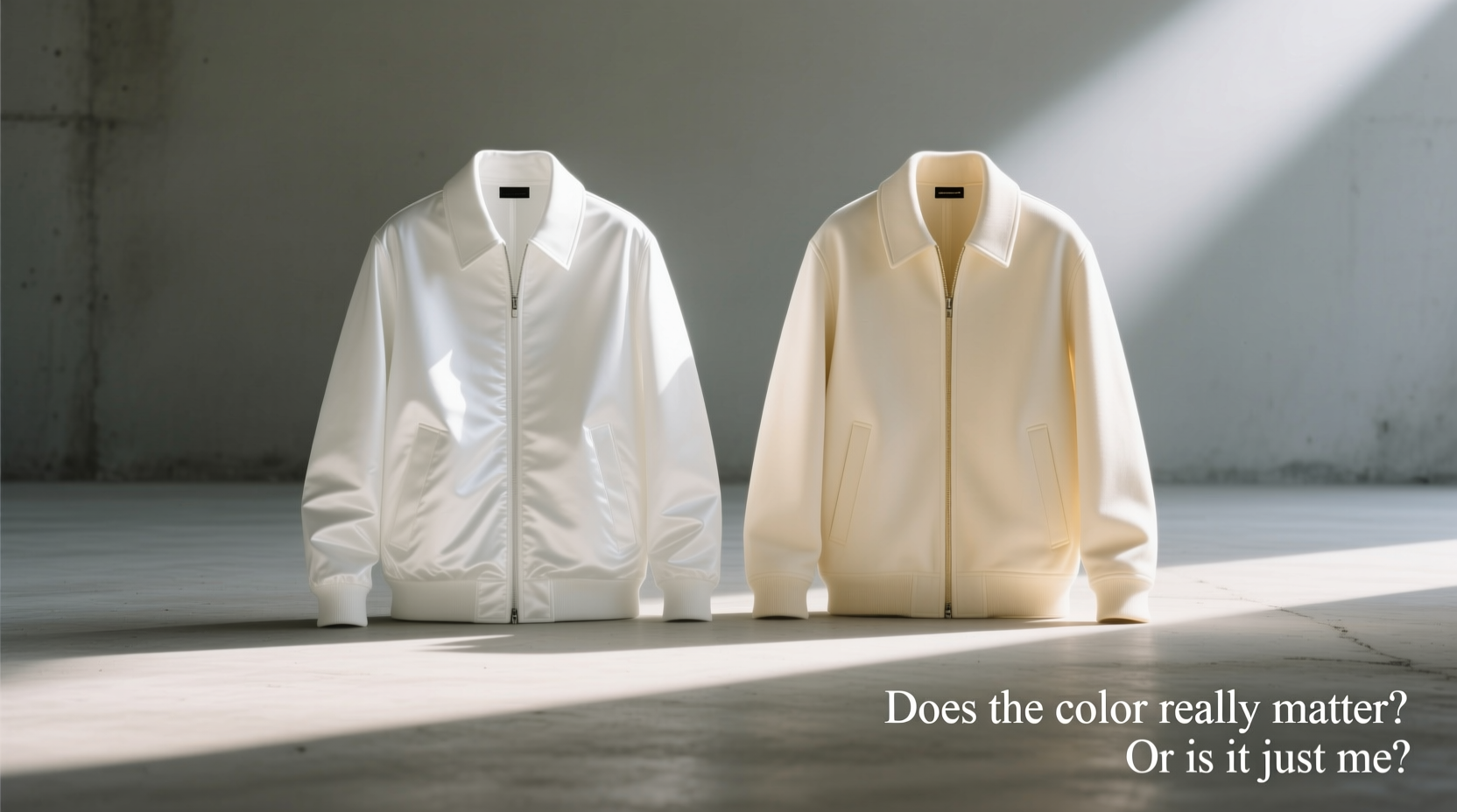
It starts with a simple decision: which jacket to wear. You stand in front of your closet, eyeing two nearly identical pieces—one white, one cream. On the surface, they look interchangeable. But something feels different. The white one seems sharper, more formal. The cream one radiates warmth, blending softly with your tan trousers. You pause. Is this distinction real, or are you overthinking?
The answer is both. Color perception in fashion isn’t arbitrary. It’s shaped by psychology, context, fabric, lighting, and personal identity. While white and cream may sit close on the color spectrum, their impact on appearance, occasion suitability, and even maintenance varies significantly. This isn’t just about aesthetics—it’s about intention.
The Psychology of Near-White Shades
Color influences mood and perception. White is associated with purity, minimalism, and precision. It commands attention through contrast. Cream, meanwhile, carries connotations of elegance, warmth, and subtlety. It’s less stark, more inviting. These associations aren't merely cultural—they’re cognitive.
In environments where formality matters—interviews, gallery openings, weddings—a white jacket can project confidence and modernity. However, its brightness may feel cold or clinical in relaxed settings. Cream operates differently. It softens an outfit, making bold silhouettes appear more approachable. It pairs naturally with earth tones, pastels, and vintage palettes, creating cohesion without sacrificing sophistication.
“Neutral tones like cream offer emotional warmth that pure white often lacks. They make the wearer appear more accessible, even when dressed formally.” — Dr. Lena Patel, Color Psychologist & Fashion Consultant
Material and Lighting: How Fabric Changes Everything
A cotton poplin white jacket under sunlight appears radiant, almost glowing. The same shade in wool crepe under indoor lighting might look harsh or yellow-tinted. Cream behaves more consistently across light sources due to its inherent warmth. It resists looking “off” in mixed lighting—a crucial advantage in transitional spaces like restaurants or event halls.
Fabric type also affects perceived color. Linen in natural white tends to have an ivory undertone, blurring the line between white and cream. Polyester blends, conversely, can produce a sterile, artificial white that clashes with skin tones. Always assess the jacket in multiple environments before deciding.
Real Example: The Summer Wedding Dilemma
James was invited to a beachside wedding. He bought a \"bright white\" linen jacket online, confident it would look fresh against the ocean backdrop. When he arrived, the midday sun revealed the truth: the fabric had a blue base, clashing with his warm-toned suit pants. Meanwhile, his friend wore a cream cotton-blend jacket. Under the same light, it glowed softly, complementing the sand and sky. James felt overdressed; his friend looked effortlessly appropriate.
The issue wasn’t the choice of white—but the lack of consideration for material interaction with environment. Cream adapted. White competed.
Practical Comparison: White vs Cream Jackets
| Factor | White Jacket | Cream Jacket |
|---|---|---|
| Versatility | Best with cool tones and monochrome outfits | Pairs well with warm, neutral, and earthy palettes |
| Maintenance | Shows stains easily; requires frequent cleaning | Hides minor spills and aging better |
| Seasonal Fit | Ideal for summer, festivals, urban settings | Suited for spring, fall, and indoor events |
| Aging Over Time | May yellow or gray, especially in sunlight | Develops a vintage patina; less noticeable fading |
| Skin Tone Compatibility | Can wash out warmer complexions | Flatters most skin tones due to warm base |
When the Difference Truly Matters
The distinction between white and cream becomes critical in three scenarios: professional image crafting, seasonal dressing, and long-term wardrobe planning.
In corporate or creative industries where personal branding is key, consistency in tone communicates attention to detail. A designer who always wears cream tailoring projects refined taste. One in stark white suggests innovation and disruption. Neither is wrong—but each sends a message.
Seasonally, white dominates summer wardrobes. But as temperatures drop, cream integrates more smoothly into layered looks. It works under camel coats, over charcoal knits, and beside olive accessories—pairings where white would break visual harmony.
For longevity, cream wins. White garments degrade more visibly. Sun exposure causes yellowing; repeated washing dulls brightness. Cream ages gracefully, developing character rather than appearing neglected.
Step-by-Step Guide: Choosing Between White and Cream
- Assess Your Wardrobe Palette: Lay out your frequently worn pants, shirts, and shoes. Do they lean warm (beige, rust, olive) or cool (gray, navy, black)? Warm bases favor cream; cool bases align with white.
- Consider Primary Use Cases: Will the jacket be worn mostly at outdoor events, offices, or casual gatherings? Outdoor summer use favors white; indoor or mixed settings favor cream.
- Test in Natural Light: Try both jackets near a window at midday. Observe how your skin tone interacts with each. Does one make you look vibrant? Does the other drain your energy?
- Evaluate Maintenance Commitment: Are you prepared to clean and protect a white garment regularly? If not, cream reduces long-term stress.
- Align with Personal Style Identity: Do you gravitate toward minimalist, high-contrast looks? Choose white. Prefer organic, textured elegance? Cream enhances that narrative.
FAQ
Can I wear white and cream together?
Yes, but intentionally. Pairing them requires tonal harmony. A cream shirt under a white jacket works if both have similar undertones (e.g., both cool or both warm). Avoid placing them side-by-side unless layered, as direct contrast can appear mismatched.
Is cream considered formal enough for events?
Absolutely. Cream is a classic formal neutral, especially in tailoring. It’s commonly seen in morning suits, resort weddings, and Mediterranean-style ceremonies. The key is fabric quality—crepe, gabardine, or fine wool elevate cream to formal status.
Why does my white jacket look yellow after a few months?
Exposure to UV light, sweat, and environmental pollutants causes white fabrics to yellow. To prevent this, avoid prolonged sun exposure, clean after every 2–3 wears, and store away from fluorescent lighting.
Checklist: Final Decision-Making Tool
- ✅ Determined primary use: casual, professional, or special events
- ✅ Checked compatibility with existing wardrobe colors
- ✅ Tested both shades in daylight and indoor lighting
- ✅ Assessed willingness to maintain a high-contrast garment
- ✅ Confirmed fabric quality matches intended frequency of use
- ✅ Considered long-term aging and discoloration risks
Conclusion
The choice between a white and cream jacket isn’t trivial—it reflects deeper decisions about self-presentation, lifestyle, and aesthetic values. It’s not just you. The color matters. Not because one is objectively better, but because each serves a distinct purpose. White asserts; cream harmonizes. White demands care; cream endures. Understanding this empowers intentional dressing.
Next time you face that closet dilemma, remember: the right shade doesn’t just match your outfit. It matches your moment.


 浙公网安备
33010002000092号
浙公网安备
33010002000092号 浙B2-20120091-4
Comments
No comments yet. Why don't you start the discussion?