
In a world driven by data, the ability to interpret information quickly and accurately is more valuable than ever. Numbers alone can be overwhelming, but when transformed into visual formats—especially graphs—they become powerful tools for understanding patterns, trends, and relationships. From business dashboards to scientific research, graphs simplify complexity and make decision-making more intuitive. Their usefulness extends far beyond aesthetics; they shape how we perceive reality in fields ranging from economics to epidemiology.
The Cognitive Advantage of Visual Data
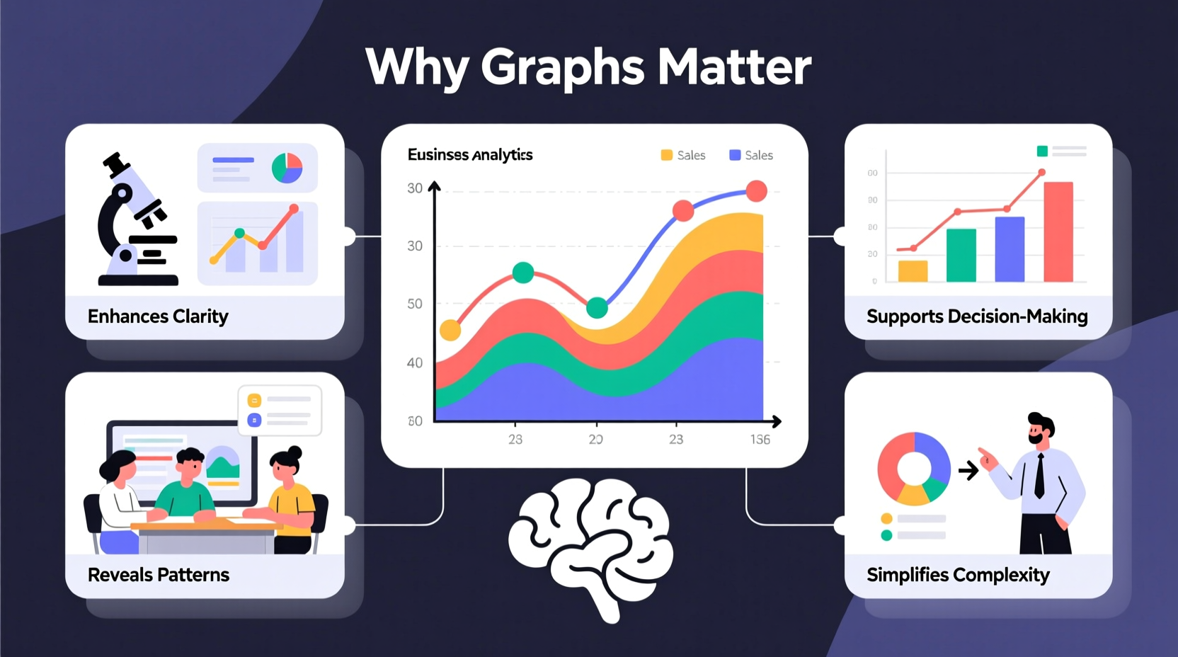
Human brains process images 60,000 times faster than text. This biological advantage makes graphs an essential medium for communication. When presented with raw numbers in a spreadsheet, even experienced analysts may struggle to identify key takeaways. A well-designed graph, however, reveals outliers, correlations, and progressions at a glance.
For example, consider monthly sales figures over two years. As a table, it’s a list of values. But plotted on a line graph, seasonal spikes become immediately visible—perhaps holiday shopping drives revenue surges every December. That insight might inform inventory planning, marketing campaigns, or staffing decisions.
“Visualization is not just about making data look pretty—it's about revealing truths that remain hidden in rows and columns.” — Dr. Edward Tufte, Statistician and Pioneer in Data Visualization
Applications Across Industries
Graphs are not niche tools confined to academic journals or corporate boardrooms. They play critical roles across diverse domains:
- Healthcare: Epidemiologists use time-series graphs to track disease outbreaks, such as monitoring daily new cases during a pandemic.
- Finance: Investors rely on candlestick charts to analyze stock price movements and forecast market behavior.
- Education: Teachers use histograms to assess student performance distribution across tests.
- Environmental Science: Climate scientists plot temperature anomalies over decades to demonstrate global warming trends.
- Marketing: Conversion funnels visualize customer journeys, highlighting where users drop off before purchasing.
In each case, the graph serves as both diagnostic and strategic instrument—helping professionals detect problems early and evaluate interventions effectively.
Key Benefits of Using Graphs
Beyond convenience, graphs deliver tangible advantages that enhance analysis, communication, and decision-making.
1. Simplifying Complexity
Large datasets often contain noise. Graphs distill this information into digestible visuals. For instance, a scatter plot can reveal a correlation between advertising spend and website traffic, while regression lines quantify the strength of that relationship.
2. Enabling Quick Comparisons
Bar graphs allow side-by-side evaluation of categories. A retail chain comparing quarterly profits across regions can instantly spot underperformers without scanning spreadsheets.
3. Revealing Trends Over Time
Line graphs excel at showing progression. Whether tracking inflation rates, app downloads, or carbon emissions, temporal trends help stakeholders anticipate future outcomes.
4. Improving Communication
Not everyone reading a report has statistical training. Graphs bridge knowledge gaps by presenting findings accessibly. Executives, policymakers, and clients can grasp core messages rapidly, leading to faster consensus and action.
5. Supporting Predictive Analysis
When combined with modeling techniques, graphs help validate forecasts. Plotting predicted versus actual values allows analysts to assess model accuracy and refine assumptions.
Common Pitfalls and How to Avoid Them
Despite their power, graphs can mislead if poorly designed. Misrepresentation isn’t always intentional—sometimes it stems from ignorance of best practices.
| Pitfall | Why It’s Problematic | Solution |
|---|---|---|
| Truncated Y-axis | Exaggerates small differences, creating false impressions of change | Start axis at zero when appropriate; clearly label breaks |
| Overusing 3D effects | Distorts proportions and makes comparison difficult | Use flat, clean designs focused on clarity |
| Misleading scales | Skewed ranges can hide stagnation or amplify minor fluctuations | Ensure scale reflects true variation; provide context |
| Cluttered labels | Reduces readability and distracts from main insights | Limit data points per chart; use legends wisely |
Real-World Example: Flattening the Curve During a Pandemic
One of the most impactful uses of graphs in recent history was during the early months of the COVID-19 pandemic. Public health officials used epidemic curves—graphs plotting daily new cases—to advocate for social distancing measures.
The concept of “flattening the curve” became a global rallying cry. The original graph showed two potential infection trajectories: one steep peak (overwhelming hospitals) and one flattened curve (managing capacity). This single visual communicated urgency better than any speech or statistic could.
It wasn't just informative—it was transformative. Governments implemented lockdowns, individuals changed behaviors, and healthcare systems prepared accordingly—all influenced by a simple yet profound graph.
Step-by-Step Guide to Creating Effective Graphs
To harness the full power of graphs, follow this structured approach:
- Define Your Objective: Ask what question you're trying to answer. Are you comparing values, showing composition, or analyzing trends?
- Select the Right Type: Match the goal to the format—line for trends, bar for comparisons, pie or stacked bar for part-to-whole relationships.
- Prepare Clean Data: Ensure accuracy, remove duplicates, and handle missing values appropriately.
- Choose Clear Labels: Include descriptive titles, axis labels, and units. Avoid jargon unless your audience understands it.
- Use Color Strategically: Highlight key data points or categories. Maintain consistency across related visuals.
- Test for Clarity: Show the graph to someone unfamiliar with the topic. Can they explain its meaning correctly?
- Update Regularly: If using dynamic data, automate updates to keep insights current.
Checklist: Building Better Graphs
- ☑ Purpose is clearly defined
- ☑ Correct chart type selected
- ☑ Axes are properly scaled and labeled
- ☑ Titles and legends are easy to read
- ☑ Colors enhance, not distract
- ☑ No unnecessary 3D effects or decorations
- ☑ Data sources are cited
- ☑ Message is immediately apparent
Frequently Asked Questions
Can graphs be manipulated to lie?
Yes. While graphs themselves are neutral, design choices like truncated axes, selective time ranges, or distorted proportions can misrepresent data. Always check the scale, context, and source before drawing conclusions.
What software should I use to create professional graphs?
Popular tools include Microsoft Excel and Google Sheets for basic needs, Tableau or Power BI for interactive dashboards, and programming libraries like Matplotlib (Python) or ggplot2 (R) for advanced customization.
Are there situations where graphs shouldn’t be used?
Yes. If the dataset is very small (e.g., two numbers), a table or direct statement may be clearer. Additionally, overly complex graphs that require lengthy explanations defeat the purpose of visualization.
Conclusion: Turn Data Into Decisions
Graphs are far more than decorative elements in reports—they are instruments of insight, clarity, and influence. In an age of information overload, their ability to turn abstract numbers into meaningful stories gives them unmatched utility. Whether you're managing a team, conducting research, or simply trying to understand the news, learning to create and interpret graphs empowers you to see deeper and act smarter.
Start small: take your next set of data and sketch a simple chart. Identify the trend, share it with a colleague, and observe how much faster they understand the point. That’s the real power of graphs—not just displaying data, but transforming how we think.


 浙公网安备
33010002000092号
浙公网安备
33010002000092号 浙B2-20120091-4
Comments
No comments yet. Why don't you start the discussion?