
Emojis have become a universal language in digital communication. Whether you're sending a smiley, a heart, or a thumbs-up, these tiny pictograms convey tone, emotion, and intent with remarkable efficiency. But anyone who's texted across platforms has likely noticed something odd: the same emoji can look completely different on an iPhone versus an Android device. One might show a grinning face with closed eyes, while the other displays wide-open eyes and exaggerated teeth. Why does this happen?
The answer lies not in miscommunication, but in design philosophy, branding strategy, and technical standards. While emojis appear to be standardized symbols, they are actually interpreted differently by each tech giant. This article explores the roots of these visual discrepancies, explains how they affect user experience, and reveals why Apple and Google choose divergent paths in emoji design.
The Origins of Emoji Standardization
Emojis originated in Japan in the late 1990s, created by designer Shigetaka Kurita for NTT Docomo’s mobile internet platform. These early 12x12 pixel icons were meant to enrich plain text messages. Over time, their popularity grew, leading to broader adoption. However, without a global standard, different companies began creating their own versions, resulting in visual chaos.
To solve this, the Unicode Consortium—a nonprofit organization responsible for text encoding standards—began unifying emoji characters in 2010. Unicode assigns a unique code point (like U+1F600) to each emoji, ensuring that when you type 😊, devices know which symbol is intended. But here’s the catch: Unicode specifies what an emoji is, not how it should look.
“Unicode provides the blueprint, but each platform builds its own house.” — Mark Davis, President of the Unicode Consortium
This means Apple, Google, Samsung, Microsoft, and others are free to design emojis in ways that align with their brand identity, user interface principles, and cultural preferences. As long as the meaning remains consistent, the visual representation can vary widely.
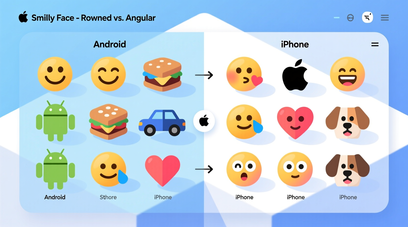
Design Philosophy: Apple vs. Google
Apple and Google take fundamentally different approaches to emoji design, reflecting their broader aesthetic philosophies.
Apple’s approach emphasizes realism, emotional expressiveness, and integration with iOS’s overall design language. iOS emojis feature detailed shading, subtle gradients, and lifelike facial expressions. For example, the “grinning face with smiling eyes” emoji (😀) on iPhone shows soft cheeks, gentle crinkles around the eyes, and a warm, inviting expression. The color palette is vibrant but balanced, aiming for emotional clarity.
In contrast, Google’s Android takes a more playful, cartoonish route. Historically, Android emojis leaned toward exaggerated features—larger eyes, bolder outlines, and flatter colors. The same 😀 emoji on many Android devices appears with rounder, almost googly eyes and a wider grin. In 2018, Google redesigned its emoji set (known as “Blob emojis”) to be even more whimsical, using amorphous, gelatinous shapes with minimal detail.
Key Design Differences at a Glance
| Feature | iPhone (Apple) | Android (Google) |
|---|---|---|
| Style | Realistic, detailed, expressive | Cartoonish, simplified, playful |
| Facial Expressions | Nuanced, human-like emotions | Exaggerated, often comedic |
| Color Palette | Warm, natural tones | Bright, saturated colors |
| Outline & Shape | Sleek, rounded, smooth edges | Bold outlines, blob-like forms |
| Consistency with UI | Matches iOS aesthetics (SFMono, San Francisco font) | Aligns with Material Design principles |
Technical and Branding Reasons Behind the Differences
Beyond aesthetics, several technical and strategic factors explain why emojis differ between platforms.
1. Proprietary Operating Systems
iOS and Android are built on entirely different software architectures. Each uses its own rendering engine, font system, and graphic libraries. When Unicode defines an emoji, the operating system must interpret that code point using its internal emoji font. Apple uses the \"Apple Color Emoji\" font; Google uses \"Noto Color Emoji.\" These fonts are developed independently, resulting in distinct visuals.
2. Brand Identity and User Experience
Apple positions itself as a premium brand focused on elegance and emotional connection. Its emoji designs reflect this—polished, refined, and emotionally resonant. Android, designed for broad accessibility across manufacturers and price points, opts for a friendlier, more universal style that appeals to a wider demographic.
3. Regional and Cultural Sensitivity
Different regions interpret symbols differently. For instance, the folded hands emoji 🙏 is often used in Western cultures to mean “prayer,” but in Japan, it signifies gratitude or greeting (“gassho”). To avoid misinterpretation, platforms adjust designs subtly based on regional settings. Apple tends to maintain symbolic clarity, while Google sometimes modifies poses or context cues.
4. Backward Compatibility and Legacy Support
Changing emoji designs isn’t simple. Millions of existing messages rely on current renderings. If Google suddenly changed all emojis overnight, users might misinterpret old texts. So updates are gradual, tested extensively, and often rolled out over multiple Android versions. Apple, controlling both hardware and software, can deploy changes more uniformly across devices.
Real-World Impact: Miscommunication and User Confusion
Visual differences aren’t just cosmetic—they can lead to misunderstandings. Consider the “face with tears of joy” emoji (😂). On iPhone, it shows a laughing face with one tear streaming down. On older Android versions, the same emoji had a more ambiguous expression, sometimes perceived as crying rather than laughing. Recipients unfamiliar with the sender’s platform might interpret the message as sad instead of humorous.
A notable case occurred in 2015 when a teenager sent the “weary face” emoji (😩) to her mother after a long day at school. On her iPhone, it clearly conveyed exhaustion. But on her mom’s older Android phone, the emoji rendered as a yellow face with downturned eyes and no context—appearing more like frustration or anger. The mother responded with concern, asking if everything was okay, leading to an unnecessary emotional exchange.
This scenario highlights how design choices can ripple into real-life interactions. While both emojis technically represent “weariness,” the lack of visual consensus affects tone perception.
“Emoji is the fastest-growing form of communication, yet we still lack a shared visual dictionary.” — Vyvyan Evans, Linguist and Author of *The Emoji Code*
How Manufacturers Respond: Toward Greater Consistency?
In response to confusion, both Apple and Google have made efforts to improve cross-platform alignment—without sacrificing brand identity.
- Apple updated its “smirking face” emoji (😏) in iOS 10 to reduce ambiguity, making the expression less suggestive.
- Google redesigned over 200 emojis in 2020 to better match Unicode recommendations and increase emotional clarity.
- Both companies now participate in Unicode emoji subcommittees, contributing to future design guidelines.
However, full standardization remains unlikely. Emojis are a competitive differentiator. Just as car brands design unique headlights or grilles, tech companies use emojis to reinforce brand recognition. A distinctive emoji set helps users identify screenshots, strengthens ecosystem loyalty, and adds personality to digital conversations.
FAQ: Common Questions About Cross-Platform Emoji Differences
Why don’t all phones show the same emoji design?
Because emoji rendering is controlled by the operating system and device manufacturer. Unicode defines the character, but each platform creates its own artwork. Your phone uses its native emoji font, so the same code point displays differently depending on whether you’re using iOS, Android, Windows, or another system.
Can I make my Android phone show iPhone-style emojis?
Not officially. While third-party apps and custom ROMs claim to offer “iOS-style” emojis, they often violate licensing agreements and can cause compatibility issues. Additionally, such changes may break app functionality or fail to update with new Unicode releases.
Does the difference affect how messages are stored?
No. The underlying data—the Unicode code point—is identical regardless of appearance. Whether you see a red heart ❤️ or an animated pulsing heart, the transmitted data is U+2764 + variation selector. The visual layer is applied only during display.
Step-by-Step Guide: How to Minimize Miscommunication
If you frequently communicate across platforms, follow these steps to reduce emoji-related confusion:
- Know your audience’s device. If texting someone on Android, research how key emojis render on recent versions.
- Avoid ambiguous emojis. Steer clear of symbols known for inconsistent interpretation (e.g., 💀, 🍆, 👌).
- Pair emojis with clarifying text. Instead of relying solely on 😤, say “I’m frustrated about the delay.”
- Update your OS regularly. Newer versions often include improved emoji designs aligned with Unicode standards.
- Use platform-specific previews when possible. Tools like Slack or WhatsApp Web sometimes show sender-intended formatting.
Checklist: Best Practices for Cross-Platform Emoji Use
- ✅ Test critical messages on both iOS and Android simulators
- ✅ Avoid sarcasm or irony that relies solely on emoji tone
- ✅ Use universally recognized emojis (❤️, 👍, 😂) for clarity
- ✅ Be cautious with hand gestures (e.g., 👌, ✌️), which vary culturally
- ✅ Enable predictive text and emoji suggestions to spot potential ambiguities
Conclusion: Embracing Diversity in Digital Expression
The differences between Android and iPhone emojis aren’t flaws—they’re features of a decentralized, creative digital ecosystem. Just as dialects enrich spoken language, varied emoji designs reflect cultural diversity, brand identity, and artistic interpretation. While occasional miscommunications occur, they also invite curiosity and dialogue.
Understanding these differences empowers you to communicate more effectively. You don’t need uniformity to achieve clarity—just awareness and intentionality. The next time you send a 😊 or a 🙌, remember: someone on the other end might see it slightly differently. And that’s okay.


 浙公网安备
33010002000092号
浙公网安备
33010002000092号 浙B2-20120091-4
Comments
No comments yet. Why don't you start the discussion?