For decades, the quintessential Christmas tree was a riot of color: red-and-green ornaments, multicolored lights, candy canes, tinsel, and garlands that mirrored the exuberance of the season. Yet over the past five years, interior designers, sustainability advocates, and homeowners alike have quietly pivoted toward something quieter—monochromatic trees. These aren’t minimalist by accident; they’re intentional statements: a single hue carried through every layer—ornaments, lights, ribbon, tree skirt, even the tree itself (often a white-frosted or naturally silvery-blue spruce). This shift isn’t about austerity—it’s about resonance. In a cultural moment defined by sensory overload, digital fatigue, and environmental awareness, the monochromatic tree offers coherence, calm, and curated meaning.
The Aesthetic Clarity of Single-Hue Design
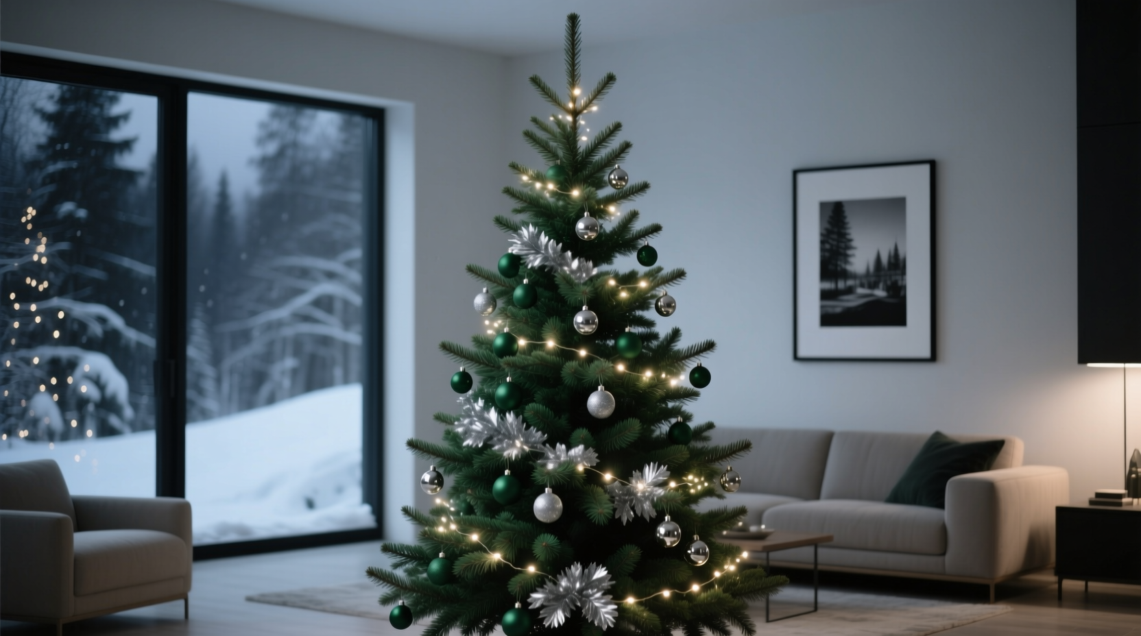
Monochromatic schemes operate on a foundational principle of visual design: reducing chromatic noise increases perceived sophistication. When every ornament, light, and textile shares the same base tone—whether cool ivory, warm champagne, deep charcoal, or luminous platinum—the eye doesn’t scan for contrast or hierarchy. Instead, it rests in rhythm: variations in texture, scale, and reflectivity become the focal points. A matte ceramic ball beside a hammered-metal star beside a frosted glass teardrop—all in varying shades of white—creates depth without dissonance.
This clarity serves practical functions too. Monochromatic palettes unify disparate decor elements across rooms, allowing the tree to anchor a broader design narrative rather than compete with it. In open-concept homes, where living, dining, and kitchen spaces flow into one another, a black-and-silver tree doesn’t “end” at the trunk—it extends visually through brushed-nickel cabinet pulls, graphite wall art, and slate-toned upholstery. The result is spatial harmony, not seasonal clutter.
Psychological Resonance in a High-Stimulus Season
Holiday stress is well-documented: financial pressure, social obligations, family dynamics, and the relentless pace of December. Neuroaesthetics research shows that environments saturated with high-contrast colors and competing patterns elevate cortisol levels and reduce cognitive recovery time. A 2023 study published in the Journal of Environmental Psychology found participants in monochromatic living spaces reported 37% lower self-reported anxiety during festive periods compared to those in traditionally decorated settings—even when both groups used identical lighting intensity and density.
Monochromatic trees support what psychologists call “visual anchoring”: a stable, predictable focal point that grounds attention. Unlike a multicolored tree—where the eye jumps from red bulb to green bow to gold ribbon—the monochrome version invites slower, more contemplative viewing. Ornament placement becomes meditative; the act of decorating shifts from assembly-line execution to deliberate curation. As interior architect Lena Ruiz observes:
“People don’t choose monochrome trees because they dislike color—they choose them because they’ve grown weary of decorative chaos. There’s profound intentionality in choosing *one* tone and honoring its full range: its shadows, its sheen, its weight. That choice is itself an act of self-care.” — Lena Ruiz, Founder of Studio Solace & Author of Calm Space, Clear Mind
Sustainability and Longevity as Quiet Values
A monochromatic palette inherently supports circular design thinking. When ornaments aren’t tied to seasonal color trends—no “red-and-green 2024 limited edition”—they transcend annual cycles. A set of mercury-glass orbs in antique silver, purchased in 2015, looks equally appropriate beside hand-blown cobalt glass in 2028—if the scheme remains cool-toned. This durability reduces consumption: no need to replace entire ornament collections every few years to “refresh” the look.
Moreover, monochrome themes simplify material ethics. Consumers increasingly seek ornaments made from reclaimed wood, recycled glass, or biodegradable ceramics—not plastic imitations of berries or Santas. A single-tone approach elevates these natural materials: raw walnut slices, unglazed stoneware, spun brass discs. Their inherent textures and subtle tonal shifts shine precisely because there’s no competing color to distract.
Consider this comparison of long-term ownership costs and values:
| Feature | Traditional Multicolor Tree | Monochromatic Tree |
|---|---|---|
| Ornament Lifespan | 3–5 years (trend-dependent wear, color fading) | 15+ years (timeless materials, tone-neutral design) |
| Storage Complexity | Multiple labeled boxes per color family; risk of mismatched sets | One unified storage system; easy inventory tracking |
| Adaptability to Home Renovations | Often requires full re-decorating if wall color or furniture changes | Integrates seamlessly with most neutral or bold backdrops |
| Donation/Resale Value | Low (perceived as dated or overly thematic) | High (collectible, designer-aligned, timeless) |
A Real-World Shift: The Thompson Family’s Three-Year Evolution
In Portland, Oregon, the Thompsons began their monochrome journey pragmatically. In 2021, after downsizing to a light-filled, Scandinavian-inspired condo, they found their traditional red-and-green tree visually “shouting” against pale oak floors and dove-gray walls. “It felt like wearing sequins to a poetry reading,” says Maya Thompson, a graphic designer. They tried a compromise: all-white ornaments with warm-white lights. The effect was startling—calm, luminous, and deeply personal.
By 2022, they’d committed fully. They sourced vintage mercury glass from estate sales, cast concrete ornaments from a local maker, and wrapped the tree in undyed linen ribbon. They kept only one “pop”: a single handmade copper star, chosen not for contrast, but for its warmth echoing the glow of their fireplace. In 2023, they extended the theme beyond the tree—replacing their red velvet tree skirt with a handwoven oatmeal wool rug, and swapping plastic light strings for dimmable, warm-white LED filaments with fabric-covered cords.
What began as aesthetic necessity became ritual. Their children now help select new ornaments based on texture and craftsmanship—not color. “We talk about how each piece has a story: where the wood came from, who blew the glass, why the clay cracked just so,” Maya explains. “The tree stopped being decoration and started being heirloom infrastructure.”
Building Your Monochrome Tree: A Practical Five-Step Framework
Switching doesn’t require discarding existing decor. It’s a process of editing, elevating, and unifying. Follow this sequence to avoid overwhelm and ensure cohesion:
- Define your core tone: Choose one base hue—not a color name (“gold”), but a descriptive quality (“sun-warmed brass,” “winter fog gray,” “oat milk ivory”). Test swatches against your wall paint and flooring under both daylight and evening lighting.
- Audit existing ornaments: Lay everything out. Keep only pieces that align with your tone’s temperature (cool/warm) and material integrity (avoid chipped plastic or faded finishes). Donate or repurpose the rest.
- Layer by reflectivity, not color: Group ornaments into three categories—matte (ceramic, wool, raw wood), semi-reflective (brushed metal, frosted glass), and high-gloss (mirrored acrylic, polished brass). Distribute evenly up the tree for dimensional balance.
- Unify lighting: Use a single light type—warm-white LEDs for warmth, cool-white for crispness—and ensure consistent filament style (e.g., all candle-shaped or all globe). Avoid blinking modes; opt for dimmable steady light.
- Anchor with texture-based accents: Replace colored ribbons with wide, natural-fiber bands (burlap, silk, unbleached cotton). Use a tree skirt made from tactile materials—woven seagrass, nubby bouclé, or heavy linen—rather than printed fabric.
Common Misconceptions and What to Avoid
Monochromatic doesn’t mean monotonous—and it certainly doesn’t mean sterile. Several assumptions hold people back from trying it. Let’s clarify:
- “It’s too cold or unwelcoming.” Not true. Warm undertones (ivory, caramel, terracotta-tinged clay) paired with soft lighting and plush textiles create profound coziness. The absence of jarring color contrast actually amplifies warmth perception.
- “I need to buy everything new.” False. Most households already own monochrome-adjacent pieces: clear glass balls, wooden stars, silver bells, or unpainted pinecones. Editing is more powerful than acquiring.
- “It lacks tradition.” Historically, pre-20th-century European trees were often adorned with white candles, edible white icing decorations, and natural elements—making monochrome arguably *more* traditional than today’s commercial palettes.
- “It’s only for modern or minimalist homes.” Incorrect. A deep charcoal tree with matte-black ceramic ornaments and velvet ribbon reads powerfully in a Victorian parlor, a farmhouse kitchen, or an Art Deco apartment—because it prioritizes material honesty over stylistic dogma.
FAQ
Can I mix metallics—like silver and gold—in a monochrome scheme?
Yes—but only if they share the same undertone. Warm gold and rose gold harmonize; cool silver and platinum do too. Mixing warm and cool metals (e.g., brass + nickel) creates visual vibration that undermines monochrome serenity. When in doubt, stick to one metal family and vary only its finish (e.g., polished, brushed, antiqued).
What if my tree is artificial and green? Won’t that clash?
Not at all. A green tree is a neutral canvas—like a beige wall. The key is tonal alignment: pair a blue-green artificial tree with cool tones (silver, ice blue, gunmetal); a yellow-green tree with warm tones (antique gold, ochre, rust). Or, embrace the contrast intentionally: a stark white tree (real or faux) with pure white ornaments creates ethereal depth that green simply can’t replicate.
How do I keep the look from feeling “flat” or boring?
Flatness comes from uniformity—not monochrome. Introduce variation through scale (tiny seed beads next to oversized spheres), texture (rough-hewn wood beside smooth porcelain), dimension (3D origami birds alongside flat cutouts), and intentional imperfection (hand-thrown ceramics with slight warping, irregularly frosted glass). Depth lives in detail, not diversity of hue.
Conclusion: Your Tree as a Quiet Declaration
Switching to a monochromatic Christmas tree isn’t about rejecting tradition—it’s about reclaiming intention. It’s choosing stillness over spectacle, longevity over disposability, and resonance over repetition. In a world that demands constant toggling between notifications, obligations, and expectations, the monochrome tree stands as a quiet declaration: *This space is held. This moment is honored. This beauty needs no explanation.*
You don’t need a design degree or a luxury budget to begin. Start with what you own. Edit ruthlessly. Prioritize texture over trend. Let light—not color—carry the emotion. And remember: the most meaningful traditions aren’t inherited; they’re chosen, refined, and lived with quiet conviction.


 浙公网安备
33010002000092号
浙公网安备
33010002000092号 浙B2-20120091-4
Comments
No comments yet. Why don't you start the discussion?