
In an era defined by information overload, the ability to make sense of data quickly and accurately has become a competitive advantage across industries. Raw numbers and spreadsheets may contain valuable insights, but they often fail to communicate meaning effectively. This is where data visualization steps in—transforming abstract figures into intuitive visual formats like charts, graphs, and dashboards. When done well, data visualization doesn’t just display information; it tells a story, reveals patterns, and drives decisions.
From healthcare to finance, marketing to public policy, organizations rely on visual tools to interpret trends, monitor performance, and forecast outcomes. The human brain processes images 60,000 times faster than text, making visuals a powerful medium for understanding complexity. But beyond speed, effective visualization fosters clarity, engagement, and action.
The Cognitive Advantage of Visual Perception
Our brains are wired to recognize patterns, colors, and spatial relationships instinctively. A column of percentages in a spreadsheet requires cognitive effort to interpret, while a bar chart displaying the same data allows immediate comparison. This is due to pre-attentive processing—the brain’s ability to absorb visual cues like length, color intensity, and position without conscious thought.
For example, spotting a sudden drop in sales from a line graph takes seconds. Identifying the same trend from a table might require multiple readings and calculations. Visualization reduces mental load, enabling users to focus on analysis rather than translation.
“Visualization gives you questions to ask of your data that you didn’t know you needed to ask.” — Ben Fry, Data Visualization Expert and Designer
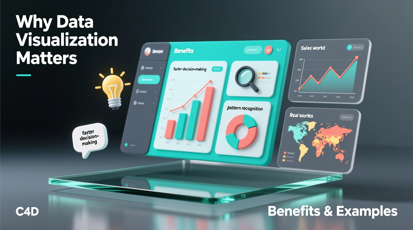
Key Benefits of Data Visualization
The value of data visualization extends far beyond aesthetics. It serves functional, strategic, and operational purposes across teams and sectors. Here are six core benefits:
- Speeds up decision-making: Executives can assess KPIs at a glance during board meetings using real-time dashboards.
- Reveals hidden patterns: Scatter plots and heatmaps expose correlations—like customer behavior tied to seasonal trends.
- Improves data accuracy: Visual anomalies (e.g., spikes or gaps) make errors easier to detect than in raw tables.
- Enhances storytelling: Presentations with visuals are more persuasive and memorable than those relying solely on numbers.
- Promotes accessibility: Non-technical stakeholders can understand insights without needing statistical training.
- Supports predictive analytics: Trend lines and forecasting models help anticipate future scenarios based on historical data.
Real-World Examples That Demonstrate Impact
Data visualization isn’t theoretical—it shapes real outcomes. Consider these impactful cases:
1. John Snow and the Cholera Outbreak (1854)
One of the earliest and most famous uses of data visualization occurred when physician John Snow mapped cholera deaths in London. By plotting cases on a street map, he identified a cluster around a contaminated water pump on Broad Street. Removing the pump handle helped stop the outbreak and proved disease could spread through water—not \"bad air,\" as was commonly believed. His map became foundational in epidemiology and urban planning.
2. NASA’s Mars Rover Mission Dashboards
NASA engineers use interactive dashboards to monitor the health and location of rovers on Mars. These visual interfaces display power levels, temperature readings, terrain maps, and navigation paths. Without such tools, interpreting terabytes of telemetry data would be nearly impossible in real time.
3. Financial Trading Floors
Stock traders rely on candlestick charts and moving averages to detect market momentum. A single screen can display dozens of indicators simultaneously, allowing split-second decisions. Color-coded alerts signal volatility, volume surges, or breakouts—information critical to high-frequency trading strategies.
Best Practices: A Step-by-Step Guide to Effective Visualization
Creating meaningful visualizations involves more than choosing a chart type. Follow this sequence to ensure clarity and impact:
- Define the objective: Ask: What question should this visualization answer? Who is the audience?
- Select appropriate data: Filter out irrelevant metrics. Ensure data is clean, accurate, and properly formatted.
- Choose the right chart type: Match the message to the format—use bar charts for comparisons, line charts for trends, pie charts sparingly (only for part-to-whole with few categories).
- Design for readability: Avoid clutter. Use labels, legends, and titles clearly. Prioritize contrast and font legibility.
- Add context: Include benchmarks, annotations, or reference lines to explain significance (e.g., “Sales dropped after policy change”).
- Test and refine: Share drafts with others. If viewers misinterpret the message, simplify or adjust design elements.
Common Pitfalls and How to Avoid Them
Poorly designed visualizations can mislead or confuse. Below is a comparison of recommended practices versus common mistakes:
| Do | Don’t |
|---|---|
| Use neutral backgrounds and highlight key data points with color | Overuse bright colors or 3D effects that distort perception |
| Start y-axis at zero for bar charts to show accurate proportions | Truncate axes to exaggerate minor differences |
| Label directly when possible instead of relying on legends | Force viewers to cross-reference between legend and chart repeatedly |
| Keep titles descriptive: “Monthly Website Traffic Growth (2023–2024)” | Use vague titles like “Data Overview” |
| Update visualizations regularly if used for monitoring | Present outdated data without timestamps or version control |
“Garbage in, garbage out applies doubly to visualization. A beautiful chart built on flawed data is worse than no chart at all.” — Dr. Tamara Munzner, Professor of Computer Science and Data Visualization Researcher
Checklist: Building Actionable Visualizations
Before publishing or presenting any data visualization, run through this checklist:
- ✅ Is the main insight immediately visible?
- ✅ Are units, sources, and dates clearly labeled?
- ✅ Does the chart type match the data relationship being shown?
- ✅ Have I removed unnecessary gridlines, borders, or decorations?
- ✅ Can someone unfamiliar with the topic understand it within 10 seconds?
- ✅ Is color used purposefully (e.g., red for warnings, green for growth)?
- ✅ Have I tested it in grayscale to ensure accessibility for colorblind viewers?
Frequently Asked Questions
What makes a good data visualization?
A good visualization communicates information clearly, accurately, and efficiently. It should guide the viewer to the correct conclusion without distortion or ambiguity. Simplicity, proper scaling, and contextual relevance are essential.
Can data visualization be misleading?
Yes. Misleading visuals often result from manipulated scales, cherry-picked data, inappropriate chart types, or omitted context. For instance, truncating a y-axis can make small differences appear dramatic. Always verify the integrity of both data and design.
Which tools are best for creating data visualizations?
Popular tools include Tableau and Power BI for interactive dashboards, Google Data Studio for web-based reports, and Python libraries like Matplotlib and Seaborn for custom coding. Excel remains widely used for basic charts, though it lacks advanced features.
Conclusion: Turn Data Into Decisions
Data visualization bridges the gap between information and insight. In a world where data grows exponentially, the ability to distill complexity into clear, compelling visuals is not just useful—it’s essential. Whether diagnosing public health crises, optimizing business operations, or teaching students about climate change, visualization empowers people to see what matters.
The goal isn’t to create flashy graphics, but to foster understanding. Every chart, graph, or dashboard should serve a purpose: to inform, to warn, to inspire action. As datasets grow larger and more intricate, so too must our commitment to clarity, honesty, and design excellence.


 浙公网安备
33010002000092号
浙公网安备
33010002000092号 浙B2-20120091-4
Comments
No comments yet. Why don't you start the discussion?