
In the weeks leading up to the holidays, department stores transform into winter wonderlands. One of the most striking changes is their lighting: golden glows in window displays, crisp white strands outlining rooftops, and soft amber hues draping across mannequins. But these choices aren’t random. Behind every bulb is a deliberate decision rooted in psychology, retail strategy, and environmental design. The specific color temperature of Christmas lighting—measured in Kelvin (K)—plays a critical role in shaping customer emotions, guiding behavior, and ultimately driving sales.
Color temperature refers to the warmth or coolness of light emitted by a source. Lower Kelvin values (2700K–3000K) produce warm, yellowish light that mimics candlelight or sunset, while higher values (4000K–6500K) emit cooler, bluish-white tones similar to daylight. Department stores don’t just decorate for the season—they engineer ambiance. By selecting precise color temperatures, they tap into subconscious emotional responses, enhance product visibility, and create a cohesive brand experience during one of the most competitive shopping periods of the year.
The Psychology of Light: How Color Temperature Affects Emotion
Light doesn’t just illuminate—it influences. Human perception of space, comfort, and even time spent in an environment is deeply tied to lighting conditions. Warm lighting (2700K–3000K) is universally associated with coziness, intimacy, and nostalgia. These are the exact feelings retailers want to evoke during the holidays: warmth, family, tradition, and generosity.
Studies in environmental psychology have shown that warm lighting increases perceived comfort and encourages longer dwell times in commercial spaces. When customers feel relaxed, they’re more likely to browse, interact with products, and make unplanned purchases. This is especially effective in apparel sections, where soft, golden lighting enhances skin tones and makes fabrics appear richer and more inviting.
In contrast, cooler lighting (4000K–5000K) is often used in electronics, cosmetics, or jewelry departments. It conveys precision, modernity, and cleanliness—qualities that align with high-tech gadgets or luxury beauty items. During the holidays, this lighting helps highlight reflective surfaces, making diamonds sparkle and metallic finishes pop under display cases.
“Warm lighting isn’t just decorative—it’s strategic. It activates emotional centers in the brain linked to memory and reward, which primes shoppers for indulgence.” — Dr. Lena Torres, Environmental Psychologist, Urban Design Lab
Retail Strategy: Lighting as a Sales Tool
Department stores operate on thin margins but rely heavily on holiday revenue. According to the National Retail Federation, nearly 20% of annual retail sales occur between Thanksgiving and Christmas. Every element of store design—from layout to music to scent—is optimized for conversion. Lighting is no exception.
Consider the typical holiday journey through a department store:
- You enter through a grand entrance lit with warm white string lights (3000K), evoking a sense of arrival and celebration.
- You pass a life-sized Santa village bathed in golden spotlights (2700K), triggering nostalgic memories and encouraging photo stops—and foot traffic.
- You move toward premium gift sections illuminated with slightly cooler, balanced white light (3500K), offering clarity without sacrificing warmth.
- Jewelry counters shine under focused 4000K LEDs, maximizing reflectivity and perceived value.
This gradient of color temperatures guides not only attention but also emotional pacing. Warm zones slow you down, encouraging reflection and sentimentality. Cooler zones speed up visual processing, helping you assess product quality quickly—ideal for high-value decisions.
A 2022 study by the Retail Environment Association found that stores using layered lighting strategies—combining warm ambient with cool accent lighting—saw a 14% increase in average transaction value compared to those using uniform lighting.
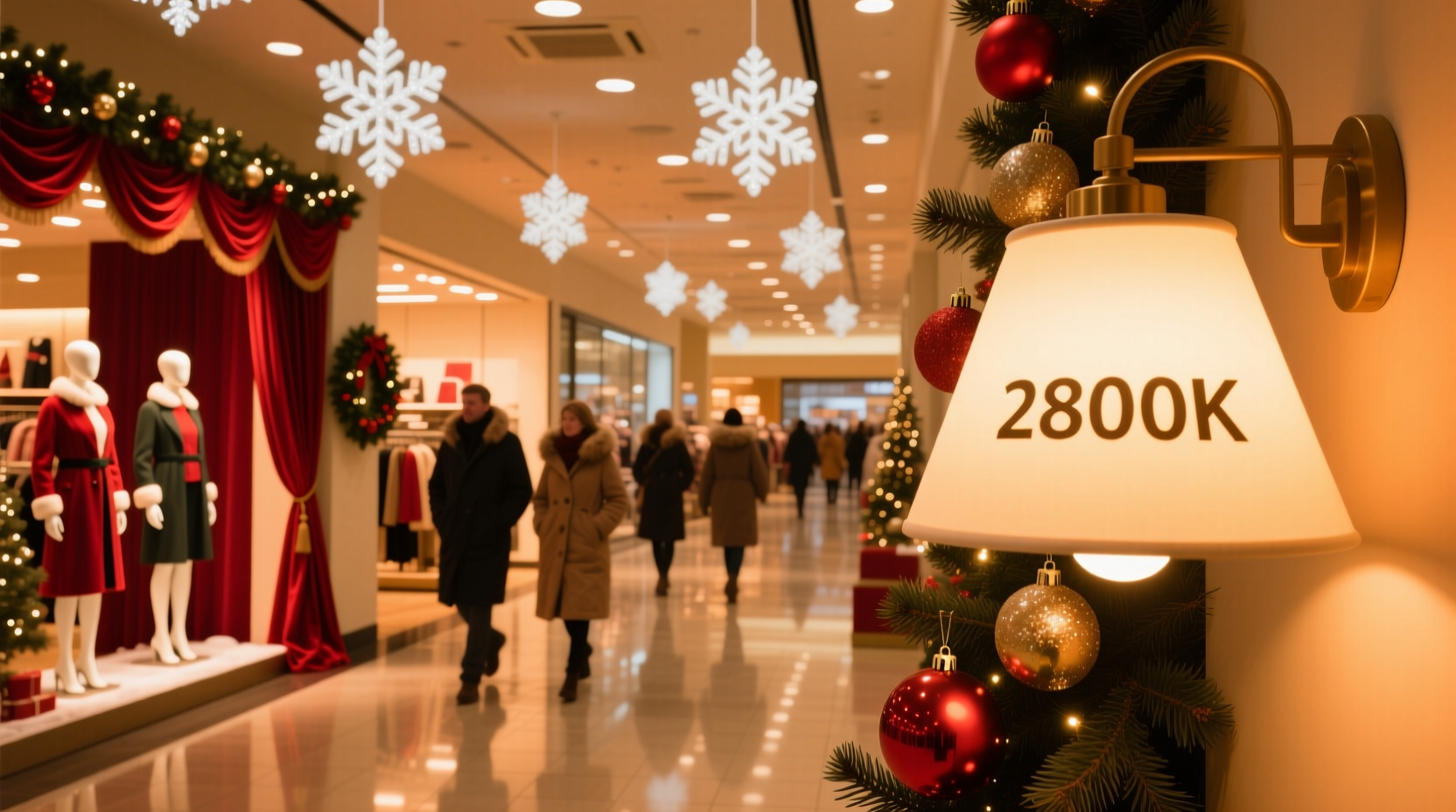
Mini Case Study: Macy’s Holiday Window Displays
Macy’s flagship store in Herald Square, New York, draws over two million visitors annually during the holiday season. Their iconic windows are renowned not just for storytelling but for lighting precision. Each scene uses custom LED systems calibrated to specific color temperatures.
One year, the “Nutcracker Sweet” display featured a gingerbread castle surrounded by glowing gumdrops. The background was lit at 2800K to simulate candlelight, creating a dreamy, storybook atmosphere. Meanwhile, individual candies were spotlighted at 3500K to emphasize texture and color vibrancy. This contrast made the scene feel both magical and tangible—inviting closer inspection.
Internal analytics showed that foot traffic increased by 22% in the adjacent toy department during the display’s run. Shoppers reported spending more time near the windows, and many mentioned being “drawn in” by the lighting. Macy’s lighting team confirmed that color temperature was adjusted weekly based on weather, crowd density, and even time of day—demonstrating the dynamic role of lighting in retail engagement.
Technical Considerations: Balancing Aesthetics and Efficiency
While aesthetics drive lighting choices, technical constraints shape them. Modern department stores rely on LED technology for holiday lighting due to energy efficiency, longevity, and controllability. Unlike incandescent bulbs, LEDs can be manufactured to emit precise color temperatures and are often tunable—allowing stores to shift from warm to cool tones dynamically.
Here’s a comparison of common lighting options used in holiday displays:
| Light Type | Color Temp Range | Energy Use | Lifespan | Best Use Case |
|---|---|---|---|---|
| Incandescent Mini Lights | 2400K–2700K | High | 1,000–2,000 hrs | Vintage-style displays, nostalgic themes |
| LED Warm White | 2700K–3000K | Low | 25,000–50,000 hrs | Main displays, entrances, cozy zones |
| LED Cool White | 4000K–5000K | Low | 25,000–50,000 hrs | Jewelry, tech, high-clarity areas |
| Tunable RGB LEDs | 2700K–6500K (adjustable) | Medium | 20,000–40,000 hrs | Digital displays, interactive zones |
The shift to LEDs has allowed retailers to experiment with mixed color temperatures within a single display. For example, a tree might have a warm core (3000K) with cool-tipped branches (4500K) to mimic snowfall, creating depth and visual interest. Smart controllers enable timed transitions—such as warming the entire store after dusk or cooling spotlight areas during peak hours.
Creating Brand Identity Through Light
Color temperature also reinforces brand identity. High-end department stores like Neiman Marcus or Saks Fifth Avenue often favor warmer, more luxurious lighting schemes. Their goal is to create an exclusive, intimate atmosphere—more akin to a private lounge than a retail floor. Warm lighting (2700K–3000K) supports this by reducing glare and emphasizing texture, making cashmere scarves look softer and leather handbags appear richer.
In contrast, mass-market chains like Target or Kohl’s may use slightly cooler lighting (3500K–4000K) to convey brightness, accessibility, and value. This spectrum keeps spaces feeling open and energetic, appealing to families and budget-conscious shoppers. Even within a single chain, regional variations exist—stores in sunnier climates might use warmer lighting to offset natural brightness, while northern locations lean cooler to balance long winter darkness.
Brands also use lighting consistency across locations to build recognition. If a shopper visits Nordstrom in Seattle and then Chicago, the similar warmth of holiday lighting creates a sense of familiarity and trust. This sensory branding extends beyond stores to websites and apps, where digital designers replicate the same color temperatures in banners and ads.
Step-by-Step Guide: How Stores Plan Holiday Lighting
Designing a holiday lighting scheme is a months-long process involving architects, lighting engineers, and marketing teams. Here’s how it typically unfolds:
- August – Concept Development: Teams review past performance data and define the season’s theme (e.g., “Winter Garden,” “Northern Lights”). Mood boards include color palettes and reference images with target lighting tones.
- September – Lighting Audit: Existing fixtures are assessed for compatibility. LED retrofits are planned where needed. Energy consumption models are created.
- October – Prototyping: Mock-ups of key displays are built in warehouses. Color temperatures are tested under different conditions (daylight, night, camera flash).
- Early November – Installation: Lighting crews install primary systems. Wireless controls are synced. Emergency backups are tested.
- Late November – Calibration: Final adjustments are made. Ambient light sensors ensure indoor-outdoor harmony. Staff are trained on control panels.
- December – Monitoring: Real-time feedback from security cameras and foot traffic sensors allows dynamic tuning. Burnout rates are tracked for post-season analysis.
FAQ
Why don’t stores use colored lights instead of white tones?
While colored lights are used for accents, white lighting (in various temperatures) is preferred for general illumination because it renders colors accurately. Colored lights can distort product appearance—making a red sweater look orange or a black coat appear brown. White light ensures customers see items as they truly are, reducing return risks.
Is there a standard color temperature for all holiday lighting?
No—there’s no universal standard. However, industry best practices suggest 2700K–3000K for emotional zones and 3500K–4000K for functional areas. Some brands develop proprietary standards; for example, Tiffany & Co. uses a custom 3200K tone to complement their robin’s egg blue packaging.
Can color temperature affect how long people stay in a store?
Yes. Research shows warm lighting increases dwell time by up to 18% compared to cooler lighting in non-task environments. Customers report feeling more relaxed and less rushed, which correlates with higher basket sizes.
Checklist: Optimizing Holiday Lighting in Retail Spaces
- Define the emotional goal of each zone (cozy, exciting, luxurious, efficient)
- Select color temperatures accordingly (2700K–3000K for warmth, 3500K–4000K for clarity)
- Use layered lighting: ambient, accent, and task lights with complementary temperatures
- Test displays under real-world conditions (day vs. night, camera vs. eye)
- Install dimmable or tunable LEDs for flexibility
- Ensure lighting complements merchandise—not competes with it
- Monitor energy usage and adjust schedules to reduce waste
- Collect post-season feedback from staff and customers
“Lighting is silent selling. The right temperature doesn’t just show the product—it shows the story behind it.” — Marcus Reed, Director of Visual Merchandising, Bloomingdale’s (retired)
Conclusion
The golden glow in a department store at Christmastime is more than festive decoration—it’s a calculated blend of science, psychology, and artistry. By choosing specific color temperatures, retailers shape how customers feel, move, and spend. Warm light invites lingering and emotional connection; cooler light enables clarity and confidence in high-stakes purchases. Together, they form a symphony of illumination that turns shopping into an experience.
Understanding this reveals a deeper truth: retail is not just about products. It’s about moments. And in those moments, light plays the lead role.


 浙公网安备
33010002000092号
浙公网安备
33010002000092号 浙B2-20120091-4
Comments
No comments yet. Why don't you start the discussion?