
Multicolor Christmas lights—those cheerful strings of red, green, blue, yellow, and white bulbs—carry deep cultural resonance. For many, they evoke childhood memories: the first time a parent strung them around the mantel, the glow against frosted windows, the chaotic joy of untangling them from last year’s storage box. Yet in contemporary interior design, architecture, and landscape lighting, those same strings often trigger an almost visceral reaction: “That looks so 1990s.” Or worse: “It clashes with everything.” The disconnect isn’t about nostalgia versus progress—it’s about visual language, context, and intentionality. Multicolor lights aren’t inherently outdated; they become dated when deployed without attention to scale, rhythm, contrast, or harmony. Modernizing them isn’t about discarding tradition—it’s about elevating it.
The Psychology of Color Clash: Why “Multicolor” Triggers Cognitive Dissonance
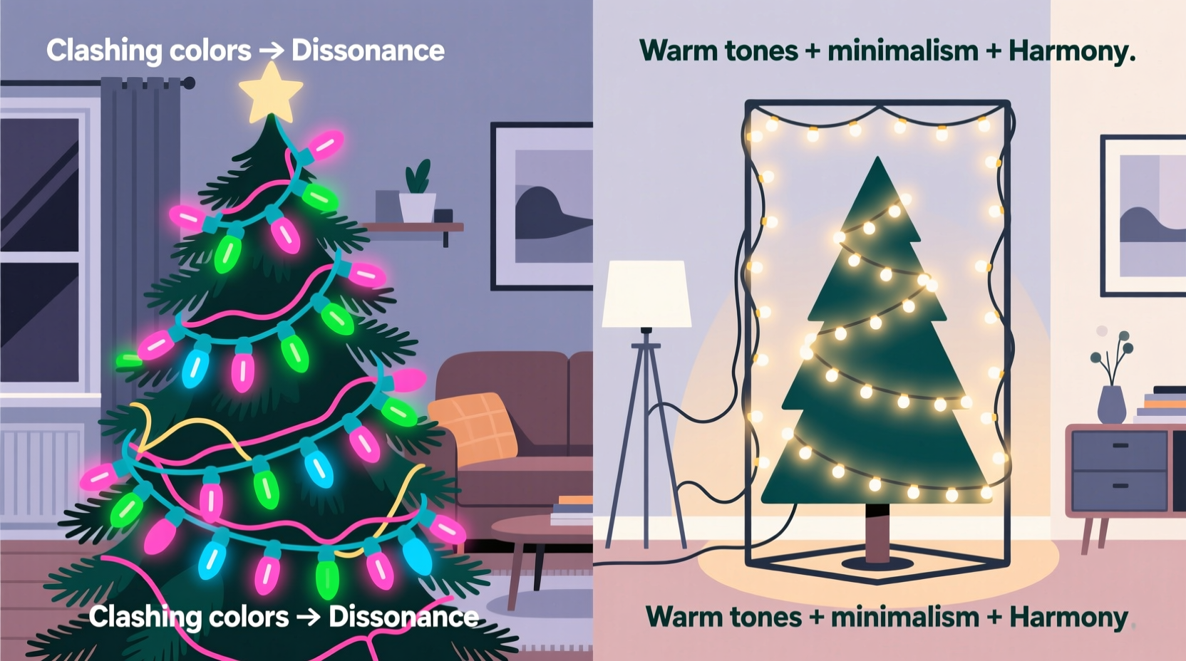
Human visual processing favors predictability. When light sources emit multiple saturated hues within close proximity—and especially when those hues lack tonal relationship—they create chromatic noise. Neuroaesthetics research shows that unmodulated color variety increases cognitive load: our brains work harder to parse competing wavelengths, resulting in subconscious fatigue or unease. A 2022 study published in Environment and Behavior found participants consistently rated multicolor string lights as “busier,” “less calming,” and “more visually demanding” than monochromatic or analogous-hue alternatives—even when total lumen output was identical.
This effect intensifies in modern environments. Today’s homes emphasize clean lines, neutral palettes (think warm greiges, oatmeals, and soft charcoals), and intentional materiality—wood, stone, linen, matte metal. In that context, a string of candy-bright red-and-green bulbs doesn’t just stand out—it disrupts spatial continuity. It reads less like festive accent and more like a visual interruption. As lighting designer and author Clara Voss notes:
“Lighting is the silent architecture of mood. Multicolor strings aren’t ‘wrong’—they’re just speaking a different dialect. When the room speaks in hushed tones and subtle gradients, shouting in primary colors creates semantic dissonance.” — Clara Voss, Principal Designer, Lumina Studio & Author of Light as Language
The issue isn’t the colors themselves—but their juxtaposition, saturation, and lack of hierarchy. Traditional multicolor sets use equal-intensity bulbs with no variation in size, spacing, or warmth. That uniformity, once charmingly democratic, now feels algorithmically generic in an era that values bespoke texture and curated contrast.
Five Design Principles That Make Multicolor Lights Feel Contemporary
Modernization begins not with swapping bulbs—but with rethinking intent. These principles apply whether you’re decorating a downtown loft balcony, a minimalist farmhouse porch, or a heritage brick façade.
- Principle 1: Anchor in Neutrality — Use multicolor elements only where they’re grounded by strong neutral backdrops (e.g., matte black railings, raw concrete walls, or unbleached linen drapery). Avoid placing them against busy wallpaper or highly patterned surfaces.
- Principle 2: Edit the Palette — Remove 30–50% of the bulbs—not randomly, but selectively. Pull every third red bulb and alternate green with amber. This introduces rhythm and breath, transforming “rainbow chaos” into “curated sequence.”
- Principle 3: Layer Warmth — Pair multicolor strings with warm-white fairy lights (2700K–3000K) at lower intensity. The warm base softens chromatic edges and adds depth—like adding cream to espresso.
- Principle 4: Control Scale — Use micro-LED multicolor strings (2mm bulbs, 6-inch spacing) for indoor accents (mantels, shelves, mirror frames). Reserve larger bulbs (5mm+) only for exterior architectural features where distance naturally diffuses saturation.
- Principle 5: Introduce Texture — Wrap multicolor strings around natural materials: eucalyptus garlands, birch branches, or woven rattan spheres. Organic texture absorbs harshness and grounds artificial color in tactile reality.
Modernization Roadmap: A Step-by-Step Transformation
Transforming dated multicolor lighting into a sophisticated seasonal statement requires deliberate sequencing—not just installation. Follow this actionable timeline, adaptable to any space:
- Week 1: Audit & Assess — Unbox all lights. Test each strand. Discard frayed wires or dead bulbs. Photograph your space at dusk—note existing ambient light sources (streetlights, neighbor’s LEDs, interior window spill). Identify one dominant architectural feature to anchor your lighting (e.g., front door frame, staircase railing, kitchen island).
- Week 2: Curate the Palette — Select one multicolor strand. Using needle-nose pliers, gently remove every fourth bulb—starting with the most saturated (often pure red or electric blue). Replace removed sockets with warm-white micro-LEDs (same voltage). Aim for a ratio of 3 multicolor : 1 warm-white.
- Week 3: Refine Placement — Hang only on vertical or linear elements—not random bushes or sprawling shrubs. For porches: wrap railings top-to-bottom in a single continuous line. For interiors: drape along ceiling beams or behind open shelving—not across picture frames.
- Week 4: Add Contextual Layers — Install a second, dimmable warm-white string (2700K, 150-lumen bulbs) 6 inches behind or below the edited multicolor strand. Use a smart dimmer to reduce its brightness to 40% at night—creating luminous depth without glare.
- Week 5: Final Calibration — At twilight, observe from three vantage points: street level, mid-yard, and inside looking out. Adjust spacing if bulbs appear clustered. Add natural elements (dried orange slices, cinnamon sticks, pinecones) threaded onto the string at 12-inch intervals to break visual repetition.
Do’s and Don’ts: A Practical Comparison Table
| Scenario | Do | Don’t |
|---|---|---|
| Indoor Mantel | Wrap edited multicolor string around a thick eucalyptus garland; tuck warm-white string beneath the garland’s base | Drape bare multicolor string over a marble mantel with brass candlesticks |
| Front Porch Columns | Spiral edited multicolor string tightly (3-inch spacing) from base to capital; add warm-white uplighting at column base | Loop multicolor strings loosely around columns with visible gaps and uneven tension |
| Tree Lighting | Use edited multicolor only on outer branches; fill inner layers with warm-white C7 bulbs | Layer multicolor and cool-white strings haphazardly throughout the tree canopy |
| Window Frames | Mount edited multicolor string flush inside the frame; backlight with sheer ivory curtains | Tape multicolor string to exterior glass with visible adhesive residue |
Mini Case Study: The Brooklyn Brownstone Porch Revival
When architect Lena Torres renovated her 1892 brownstone in Fort Greene, she inherited a box of her grandmother’s 1987 multicolor C7 lights—bulbs faded to dusty rose and sage, wires brittle with age. Her initial instinct was to replace them entirely with sleek, app-controlled white LEDs. But her grandmother’s handwritten note—“For the stoop, always”—gave her pause. Instead, Lena collaborated with a lighting technician to rebuild the strands: she replaced all bulbs with new, higher-CRI multicolor LEDs (but reduced red saturation by 20% and added amber), rewired them with braided copper cable, and mounted them in tight vertical runs along the iron railing posts—never horizontally. She added recessed warm-white step lights beneath each stair tread and hung dried magnolia leaves with gold-dipped edges along the railing. The result? A porch that feels both reverent and resolutely current—where the multicolor lights read not as relic, but as heirloom, thoughtfully reinterpreted. Neighbors now ask where she “found those vintage-inspired lights.” She smiles and says, “They were always here—I just taught them new grammar.”
FAQ: Addressing Common Concerns
Can I mix multicolor lights with smart home systems?
Yes—but only with purpose-built multicolor smart strings (e.g., Philips Hue Lightstrip Plus or Nanoleaf Shapes). Avoid retrofitting legacy multicolor strands with smart plugs: they lack granular control, making editing impossible. True modernization requires per-bulb or per-segment dimming and hue adjustment—not just on/off scheduling.
Won’t editing the bulbs void the warranty or cause electrical issues?
Most modern LED strings use shunt-wire technology, meaning removing one bulb won’t break the circuit—provided you don’t damage the socket or wiring. Always unplug before editing, use insulated tools, and never exceed the manufacturer’s maximum strand count when connecting multiple strings. When in doubt, consult the spec sheet: look for “shunted” or “parallel circuit” labeling.
Is there a way to modernize multicolor lights without touching the bulbs?
Absolutely. Focus on context: hang them exclusively against matte black, charcoal, or deep forest green backdrops; diffuse them through layered sheer fabric; or encase them in hand-blown glass orbs filled with dried lavender. Physical intervention isn’t required—intentional framing is often more powerful.
Conclusion: Lighting as Legacy, Not Liability
Multicolor Christmas lights are not obsolete. They’re underutilized. Their perceived datedness stems not from inherent flaws, but from decades of default deployment—hung without regard for proportion, contrast, or emotional resonance. Modernization isn’t about erasing tradition; it’s about honoring it with discernment. It’s choosing which memories to amplify—and which visual habits to retire. When you edit a strand, layer warmth, and anchor color in texture and neutrality, you’re not just updating decor—you’re practicing quiet reverence. You’re saying: this matters enough to refine. This joy deserves precision. This light, like all good light, should serve the space—not compete with it.
Start small. Take one strand this season. Apply Principle 2. Observe the difference. Notice how the red no longer shouts—but sings. How the green no longer clashes—but converses. How the whole feels less like decoration and more like dialogue between past and present, warmth and wonder, memory and moment. Your home doesn’t need fewer colors. It needs clearer intention.


 浙公网安备
33010002000092号
浙公网安备
33010002000092号 浙B2-20120091-4
Comments
No comments yet. Why don't you start the discussion?