
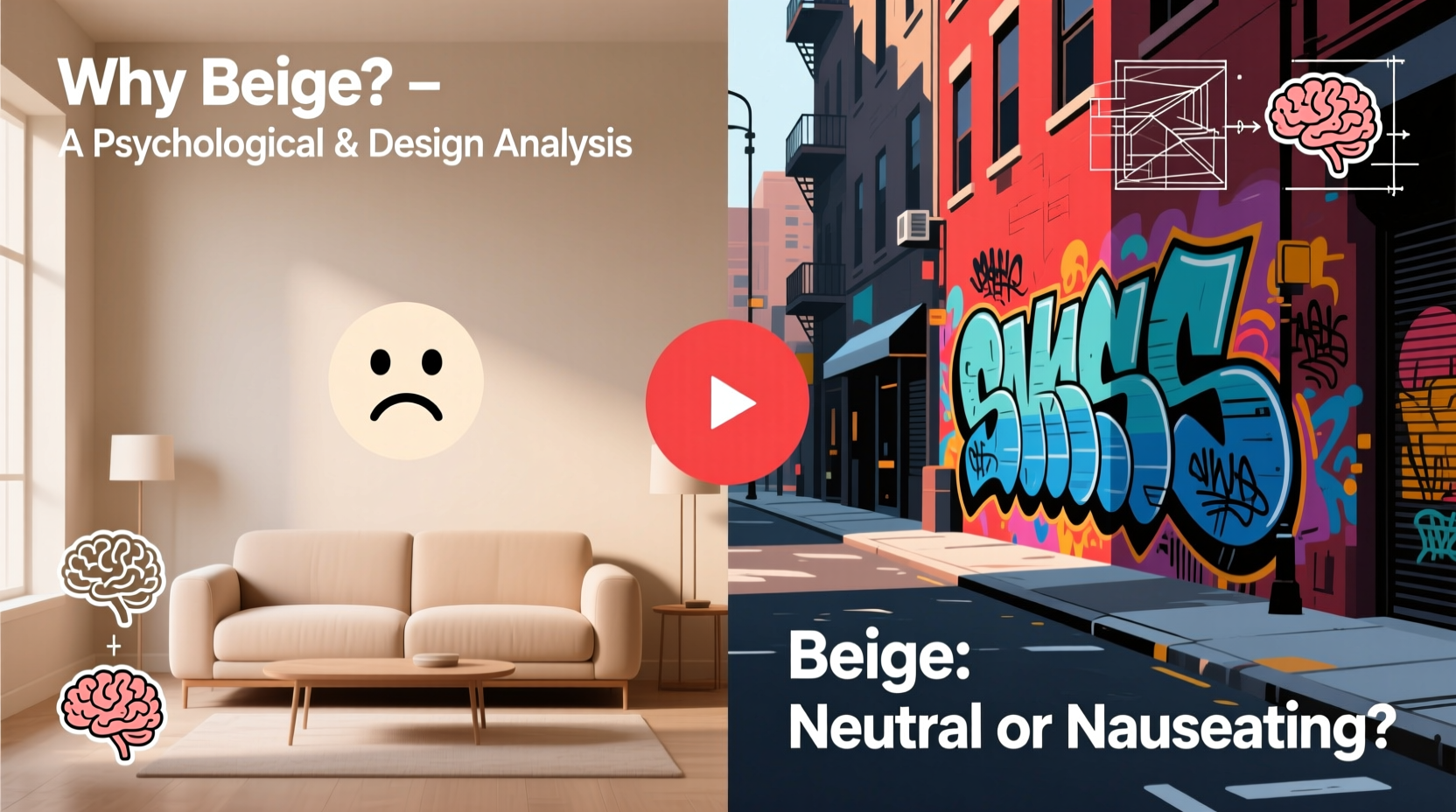
Beige is often described as safe, neutral, and timeless. Yet, for many, it evokes boredom, sterility, or even emotional detachment. While others find comfort in its subtlety, a growing number openly express disdain for the hue. This polarization raises an important question: Why do some people hate the color beige? The answer lies at the intersection of psychology, cultural context, and design philosophy—where color is never just a shade, but a signal.
From corporate offices to minimalist apartments, beige dominates spaces meant to feel calm, professional, or unobtrusive. But its very strength—neutrality—can become its greatest weakness. To understand this divide, we must examine how the human mind interprets color, how societal values shape aesthetic preferences, and how design choices either elevate or undermine the role of beige in our environments.
The Psychology of Beige: Comfort vs. Apathy
Color psychology suggests that hues influence mood, behavior, and perception. Beige, as a pale brown with yellow or gray undertones, sits on the warm side of the neutral spectrum. It’s derived from natural materials like sand, linen, and unbleached wool, which historically signaled simplicity and practicality.
For some, this connection to nature fosters feelings of warmth, stability, and groundedness. Beige can reduce visual stress, making it a popular choice in healthcare settings, meditation rooms, and recovery spaces. Psychologically, it provides a “blank canvas” effect—offering mental breathing room without sensory overload.
However, the same qualities that promote calm can also trigger perceptions of dullness or emotional flatness. Studies in environmental psychology show that prolonged exposure to monotonous, low-stimulus environments—often dominated by neutrals like beige—can lead to decreased alertness and motivation. In workplaces or homes, this may manifest as a sense of stagnation or lack of inspiration.
“Neutrals like beige are emotionally ambiguous—they don’t energize, but they also don’t agitate. That ambiguity makes them both universally acceptable and deeply underwhelming.” — Dr. Lena Torres, Environmental Psychologist, University of Copenhagen
This duality explains part of the resentment toward beige: it avoids conflict but also fails to inspire. In a world increasingly driven by self-expression and individuality, a color that refuses to take sides can feel like a passive refusal to engage.
Cultural and Generational Shifts in Color Perception
Attitudes toward beige are not static—they evolve with cultural trends and generational values. In the 1990s and early 2000s, beige was ubiquitous in fashion and interior design. Think khaki pants, taupe walls, and cream-colored sofas. At the time, it symbolized sophistication, maturity, and understated elegance.
But overexposure led to fatigue. By the 2010s, younger generations began associating beige with outdated office attire, suburban conformity, and the aesthetic of their parents’ living rooms. As social media amplified bold colors, maximalism, and vibrant personal branding, beige became shorthand for “boring,” “basic,” or even “emotionally repressed.”
In contrast, cultures with strong traditions of minimalism—such as Japan or Scandinavia—tend to view beige more favorably. In these contexts, it aligns with values of harmony, restraint, and intentionality. The Japanese concept of *wabi-sabi*, which finds beauty in imperfection and simplicity, embraces earthy neutrals as essential to mindful living.
Thus, hatred of beige is not universal—it reflects broader cultural narratives about identity, progress, and what it means to be “interesting.” For those who equate creativity with visibility, beige becomes an enemy of self-expression.
Design Dilemmas: When Beige Fails and When It Shines
In design, beige is both a tool and a trap. Used skillfully, it creates balance, enhances other colors, and supports spatial flow. Misused, it flattens interiors, drains energy, and makes spaces feel unfinished or impersonal.
One common criticism is that beige lacks contrast. In graphic design, for example, text on a beige background often suffers from poor legibility compared to black-on-white or white-on-dark schemes. Similarly, in architecture, all-beige façades can appear washed out under certain lighting conditions, especially in overcast climates.
Interior designers note that beige works best when paired with texture and accent colors. A room with beige walls, a nubby wool rug, dark wood furniture, and a single emerald green armchair can feel rich and layered. The same room without variation risks feeling like a rental property or a waiting area.
| Use Case | Success Factors | Risks |
|---|---|---|
| Office Interiors | Promotes focus, reduces distraction | Can feel sterile or uninspiring |
| Residential Walls | Versatile for decor changes | May appear dingy over time |
| Fashion Basics | Timeless, easy to match | Perceived as unoriginal |
| Web Design Backgrounds | Softer than white, less harsh | Poor readability if not contrasted |
The key is intentionality. Beige should not be chosen out of indecision or fear of boldness. When used deliberately—as a foundation rather than a default—it can elevate a design narrative. But when adopted as a “safe” option without considering light, material, or user experience, it becomes synonymous with mediocrity.
A Mini Case Study: The Beige Office Rebellion
In 2022, a mid-sized tech firm in Portland, Oregon, underwent a workplace redesign. Management opted for beige carpeting, light tan partitions, and off-white walls, aiming for a “calm, professional atmosphere.” Within months, employee surveys revealed a 32% increase in complaints about the space feeling “lifeless” and “depressing.” Productivity metrics dipped slightly, and creative teams reported difficulty brainstorming in the environment.
In response, the company introduced a pilot program: one floor was redesigned with deep navy accents, indoor plants, walnut furniture, and statement lighting. Employee satisfaction rose by 41%, and informal feedback highlighted the new space as “energizing” and “thoughtfully curated.” Notably, beige remained in use—but only as a secondary tone, no longer dominating the palette.
This case illustrates that the issue isn’t beige itself, but its dominance. When neutrality becomes the entire language, communication fades into silence.
The Fear of Neutrality: Identity and Self-Expression
Modern identity is increasingly performative—expressed through clothing, home decor, social media aesthetics, and lifestyle choices. In such a climate, color becomes a declaration. Bright red says confidence. Black signals sophistication. Neon green screams innovation.
Beige, by refusing to declare anything, can feel like a retreat from identity. To some, wearing or surrounding oneself with beige suggests a desire to disappear, to avoid judgment, or to conform at the expense of authenticity. This perception is especially strong among younger demographics who value visibility and distinctiveness.
Social psychologist Dr. Amara Lin notes, “We live in an era where being unseen is equated with being irrelevant. Choosing beige can be interpreted—fairly or not—as opting out of the conversation.”
Yet, this interpretation overlooks the power of subtlety. Some individuals choose beige precisely to resist consumerist trends and the pressure to constantly stand out. For them, it’s not apathy but resistance—a quiet rejection of the idea that everything must be loud to matter.
How to Reclaim Beige: A Step-by-Step Guide
If you’re drawn to beige but wary of its reputation, or if you’ve been avoiding it due to negative associations, consider reframing your approach. Beige doesn’t have to be boring. Here’s how to use it effectively:
- Assess the Lighting: Natural light brings warmth to beige, while cool artificial light can make it look gray and lifeless. Test swatches at different times of day before committing.
- Layer Textures: Combine matte paint with glossy finishes, smooth fabrics with rough weaves. Texture adds depth where color does not.
- Add Strategic Accents: Introduce one or two bold colors—terracotta, navy, or forest green—to create focal points and prevent monotony.
- Mix Neutral Tones: Pair beige with deeper browns, warm grays, or cream to build a tonal gradient that feels intentional.
- Consider Context: Use beige in transitional spaces (hallways, entryways) or as a backdrop for art and personal objects, allowing them to take center stage.
Checklist: Is Your Use of Beige Working?
- ☐ Does the space feel warm and inviting, not flat or cold?
- ☐ Are there enough contrasting textures to create visual interest?
- ☐ Do accent colors or objects stand out clearly against the beige?
- ☐ Have you tested the color in both daylight and evening lighting?
- ☐ Does the beige support your intended mood (e.g., calm, elegant, minimalist)?
Frequently Asked Questions
Is beige considered a warm or cool color?
Beige is generally considered a warm neutral due to its yellow, brown, or pink undertones. However, some variations—especially those with gray bases—can lean cool. Always check the undertone before pairing with other colors.
Why is beige so common in corporate environments?
Beige is perceived as non-confrontational, professional, and cost-effective. It hides wear and tear better than white and avoids the emotional intensity of bolder hues, making it ideal for high-traffic, multi-user spaces.
Can beige be modern and stylish?
Yes—when used with intention. Modern beige spaces often incorporate mixed materials (concrete, wood, metal), asymmetrical layouts, and carefully curated accents. The key is avoiding uniformity; variety within neutrality keeps the design dynamic.
Conclusion: Beyond Love and Hate—Understanding Beige
The aversion to beige is rarely about the color itself. It’s about what beige represents: safety over risk, conformity over expression, stillness over movement. In a culture that often equates visibility with value, neutrality can feel like surrender.
Yet, dismissing beige entirely ignores its potential for elegance, balance, and mindfulness. Like silence in music, beige provides necessary pause—the space between notes that allows meaning to emerge. The goal isn’t to force everyone to love beige, but to recognize that its presence—or absence—carries weight.
Whether you embrace it or reject it, understanding the psychological and design forces behind our reactions to beige empowers more thoughtful choices. In a world of constant stimulation, sometimes the most radical act is to choose calm.


 浙公网安备
33010002000092号
浙公网安备
33010002000092号 浙B2-20120091-4
Comments
No comments yet. Why don't you start the discussion?