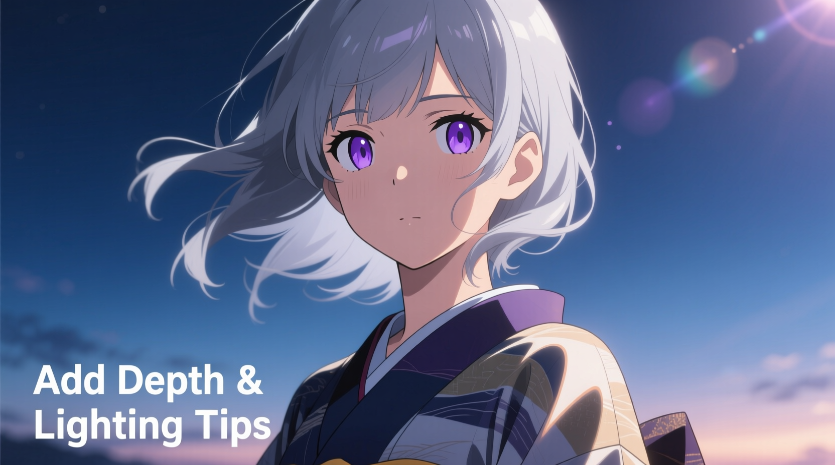
Many aspiring artists struggle with making their anime characters feel dynamic and three-dimensional. Despite clean linework and accurate proportions, the artwork often appears lifeless—flat on the canvas, lacking volume and presence. This issue isn't a flaw in talent, but rather a gap in understanding how light interacts with form. Without proper depth and lighting, even the most expressive characters can seem like cutouts pasted onto a background.
The illusion of depth in 2D art comes from strategic use of value, contrast, shadows, and perspective. Anime-style art, while stylized, still follows fundamental principles of realism when it comes to lighting and form. Ignoring these principles leads to flatness. The good news? With targeted adjustments and consistent practice, you can transform your characters from flat illustrations into vivid, dimensional creations.
Understanding Why Flatness Occurs

Flatness in anime art typically stems from uniform lighting, lack of tonal variation, or misapplied shading. When every part of a character receives equal brightness without consideration for light direction, surface curvature, or material properties, the brain perceives no depth. The drawing lacks cues that signal volume—such as gradients, cast shadows, or occlusion.
Another common cause is over-reliance on cel shading with hard edges and minimal midtones. While cel shading is a hallmark of anime aesthetics, skipping transitional values flattens rounded forms like cheeks, shoulders, or fabric folds. Additionally, placing highlights randomly instead of aligning them with a consistent light source breaks believability.
Common Causes of Flat Anime Art
- No defined light source or inconsistent lighting direction
- Overuse of flat colors without gradients or value shifts
- Lack of ambient occlusion in creases and overlapping areas
- Poor edge control—using only hard edges without soft transitions
- Ignoring subsurface scattering (e.g., ears or fingers glowing under light)
- Flat backgrounds that don’t interact with the character’s lighting
Establishing a Consistent Light Source
The foundation of dimensional artwork is a believable, consistent light source. Whether it's sunlight from above, a lamp from the side, or dramatic rim lighting, every highlight and shadow must obey the same rules. Begin by deciding the direction, intensity, and color temperature of your key light.
For example, a top-down light creates strong cast shadows under the nose, chin, and clothing folds. A side light emphasizes facial structure, sculpting one cheek while leaving the other in shadow. Backlighting produces silhouettes with glowing edges—ideal for dramatic scenes. Once chosen, maintain this direction across all elements, including hair, clothing, and accessories.
“Light defines form. Without a clear light logic, even perfect anatomy will look weightless.” — Ren Takahashi, Professional Character Illustrator
Step-by-Step: Setting Up Your Lighting Framework
- Determine the scene’s mood: Is it soft and dreamy, or high-contrast and intense?
- Choose one primary light source (and optionally, a secondary fill light).
- Sketch simple arrows indicating light direction on your canvas.
- Mark where highlights will hit (cheekbones, forehead, shoulder peaks).
- Plan core shadows opposite the light and cast shadows where forms block light.
- Use temporary overlay layers to test values before committing.
Adding Depth Through Value and Contrast
Value—the relative lightness or darkness of a tone—is the most powerful tool for creating depth. Even in highly stylized anime, subtle shifts in value suggest curvature, distance, and material. A face shaded with only two tones (light and dark) loses nuance; adding midtones between them restores roundness.
Consider the cheek: under side lighting, it transitions from highlight → midtone → core shadow → reflected light. Skipping the midtone collapses the form into a flat plane. Similarly, fabric folds need gradual gradients to show how cloth wraps around limbs. Use soft brushes or airbrush tools to blend smoothly, then sharpen edges only where necessary (e.g., sharp creases).
| Area | Recommended Value Range | Blending Tip |
|---|---|---|
| Highlight | 90–100% brightness | Keep small and focused |
| Midtone | 60–80% | Essential for smooth curvature |
| Core Shadow | 30–50% | No pure black unless needed |
| Ambient Occlusion | 10–20% | Add in crevices and overlaps |
| Reflected Light | 40–60% (cooler tone) | Subtle bounce under chins or arms |
Enhancing Dimension with Edge Control and Texture
Edges are not just lines—they’re visual signals about depth and focus. Hard edges attract attention and suggest proximity, while soft edges recede and imply distance or curvature. In anime, overusing hard outlines everywhere flattens the image. Instead, vary edge sharpness based on form and lighting.
For instance, the edge of a nose in direct light should be crisper than the softer transition along the jawline. Hair strands at the front can have sharp highlights, while distant strands fade into soft blends. This mimics how the eye naturally focuses and adds atmospheric depth.
Texture also contributes to perceived depth. Smooth skin reflects light differently than coarse fabric or shiny hair. Add micro-details like pore texture on skin, weave patterns on clothing, or flyaway hairs to break up flat surfaces. These subtle variations prevent large areas from appearing uniformly flat.
Do’s and Don’ts of Edge and Texture Application
| Do | Don’t |
|---|---|
| Vary edge hardness based on form curvature | Use the same line weight everywhere |
| Add texture only where light would emphasize it | Apply grain or noise uniformly across the image |
| Use soft blending for rounded surfaces | Leave harsh transitions on curved cheeks or arms |
| Incorporate directional strokes matching surface flow | Use random scribbles for shading |
Case Study: Transforming a Flat Sketch into a Dynamic Portrait
Sophie, an intermediate artist, submitted her initial sketch of a female character for feedback. The linework was clean, and colors were vibrant, but the face looked pasted on—especially the eyes, which lacked sparkle, and the hair, which appeared like a solid helmet. Her lighting was undefined, with highlights on both cheeks regardless of light direction.
She applied the following changes:
- Set a left-side window light as her primary source.
- Redrew shadows under the right eye, jaw, and neck accordingly.
- Added a soft gradient on the left cheek (highlight → midtone) and deepened the right side.
- Introduced a small specular highlight in the eyes aligned with the light.
- Used tapered strokes for hair strands, with lighter values on the left and darker on the right.
- Applied ambient occlusion under the hair near the neck and behind the ear.
The result was immediate: the character gained volume, realism, and emotional presence. Viewers commented that she “finally looked like she existed in space.” Sophie’s breakthrough wasn’t technical skill—it was understanding how light constructs form.
Essential Checklist for Adding Depth and Lighting
Before finalizing your anime artwork, run through this checklist to ensure depth and lighting are effectively applied:
- ✅ Defined a single primary light source (with optional secondary/fill)
- ✅ Marked highlight, midtone, core shadow, and reflected light zones
- ✅ Used ambient occlusion in creases, overlaps, and contact points
- ✅ Varied edge hardness—sharp where forms project, soft where they curve away
- ✅ Avoided pure black; used colored shadows (blues, purples, browns)
- ✅ Aligned highlights consistently with the light direction (eyes, hair, skin)
- ✅ Added subtle textures only where light would accentuate them
- ✅ Ensured background lighting complements the character (e.g., warm indoor vs. cool outdoor)
- ✅ Checked for value balance—no overly bright spots breaking harmony
- ✅ Flipped the canvas horizontally to spot inconsistencies in shading
Frequently Asked Questions
Why do my anime eyes look flat even with highlights?
Eyes appear flat when highlights are oversized, misplaced, or duplicated on both eyes without regard to light angle. Ensure the highlight position matches your light source and varies slightly between eyes due to curvature. Also, include a subtle gradient from the top (brighter) to bottom (darker) of the iris to simulate roundness.
Can I use cel shading and still create depth?
Absolutely. Cel shading can be deeply dimensional when combined with careful value planning. Use at least three tones: base color, shadow, and highlight. Add soft gradients at contour edges (like jawlines or shoulders), and include ambient occlusion. The key is balancing stylization with form-aware shading.
How do I make hair look voluminous instead of flat?
Treat hair as interlocking planes, not a single mass. Define top strands receiving direct light and underlayers in shadow. Use flowing, directional strokes that follow the hair’s movement. Add flyaways and semi-transparent strands near the edges to break silhouette rigidity. Overlap sections to create depth between layers.
Mastering Depth: A Call to Practice with Purpose
Creating depth in anime character art isn’t about complex tools or advanced software—it’s about observing how light shapes the world and applying those principles deliberately. Every stroke should answer the question: “How would this look under real light?”
Start small. Redraw a face with only grayscale values, focusing solely on light logic. Study professional illustrations and reverse-engineer their lighting. Use 3D mannequins or reference photos to test your assumptions. Over time, these habits become instinctive, and your characters will naturally emerge from the page with presence and emotion.


 浙公网安备
33010002000092号
 浙B2-20120091-4
Comments
No comments yet. Why don't you start the discussion?