
Digital anime art often starts with clean lines and vibrant colors, but many artists struggle when their characters appear lifeless or two-dimensional. Despite accurate proportions and appealing designs, the lack of depth can make a drawing feel unconvincing. The issue isn’t always in the line work—it’s in how light, form, and space are interpreted. Understanding why a character looks flat is the first step toward creating more dynamic, believable illustrations.
Flatness occurs when there's insufficient visual information to suggest volume, dimension, and spatial relationships. In anime, where stylization often simplifies anatomy and lighting, it’s easy to overlook cues that give the illusion of three-dimensionality. But with deliberate techniques in shading, perspective, and layering, even highly stylized characters can gain depth and presence on the canvas.
Understanding Visual Depth in 2D Art
In traditional and digital illustration, depth is an illusion created through contrast, value shifts, atmospheric perspective, and compositional layering. Unlike real-world objects, drawings exist on a flat surface, so artists must simulate depth using visual cues. When these cues are missing or inconsistent, the brain interprets the image as flat.
Anime characters often emphasize large eyes, simplified features, and minimal shading—traits that contribute to stylistic charm but can also strip away dimensional cues. Without proper attention to form and light logic, even well-drawn figures can seem pasted onto the background rather than existing within a space.
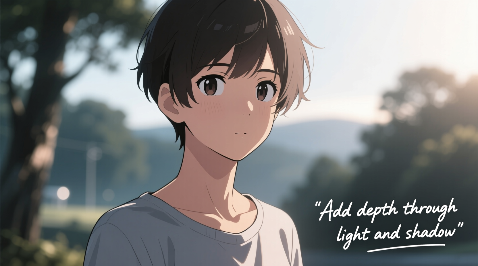
“Depth isn’t about complexity—it’s about consistency in how light interacts with form.” — Ren Sato, Concept Artist & Illustrator
The perception of depth relies on several key elements: value contrast (light vs. dark), edge variation (hard vs. soft edges), overlapping forms, and directional lighting. When these are applied cohesively, they guide the viewer’s eye through the image, reinforcing which parts are closer, farther, raised, or recessed.
Common Causes of Flat-Looking Anime Characters
- Uniform lighting: Applying flat, even tones without a defined light source removes shadows and highlights needed for volume.
- Poor value structure: Using similar midtones across all surfaces fails to differentiate planes and contours.
- Lack of form modeling: Not rendering rounded forms like cheeks, shoulders, or limbs with gradual gradients diminishes realism.
- Overuse of outlines: Heavy black lines around every shape can flatten forms by separating them from the environment.
- No environmental interaction: Characters not casting shadows or reacting to ambient light appear disconnected from their world.
Step-by-Step Guide to Adding Depth to Your Anime Characters
Creating depth doesn’t require photorealism. Even in stylized anime, subtle enhancements can dramatically improve perceived volume. Follow this structured approach to transform flat drawings into dimensional artwork.
- Establish a consistent light source
Decide where the main light is coming from—top-left, front-right, etc. Mark it mentally or sketch a small arrow. All subsequent shading should align with this direction. - Break forms into simple geometric shapes
Treat the head as a sphere, the torso as a capsule or box, limbs as cylinders. This helps visualize how light wraps around each form. - Define major planes
Identify front, side, and top planes of facial features and body parts. Apply darker values to receding planes and lighter ones to those facing the light. - Use gradients instead of flat fills
Avoid solid color blocks. Instead, use soft airbrushing or gradient tools to create smooth transitions between light and shadow. - Add core shadows and cast shadows
Place core shadows along the edge where a form turns away from light. Add cast shadows under the chin, arms, feet, or any part hovering above a surface. - Incorporate ambient occlusion
Darken areas where surfaces meet tightly—like armpits, behind knees, or under hair strands—to enhance contact realism. - Vary edge hardness
Use sharp edges for areas in focus or close to the viewer; soften edges in shadowed or distant regions to mimic depth of field. - Apply rim lighting selectively
Add a thin highlight on the opposite side of the light source to separate the character from the background and emphasize contour.
Example: Shading a Stylized Face with Depth
Imagine a character lit from the upper left. The forehead, bridge of the nose, cheekbone, and collarbone catch direct light. The right side of the face, jawline, and neck fall into shadow. A soft gradient bridges the transition. The earlobe, tucked behind, receives less light than the tip. Hair isn’t shaded uniformly—strands facing forward are brighter; those curving backward fade into midtone and shadow. A faint cast shadow under the chin grounds the head in space.
Do’s and Don’ts: Table of Common Mistakes vs. Best Practices
| Mistake | Best Practice |
|---|---|
| Using pure black for shadows | Use desaturated dark versions of base colors or cool/warm contrasts |
| Coloring skin, hair, and clothes in flat tones | Apply gradients based on form and light angle |
| Ignoring secondary light sources (e.g., bounce light) | Add subtle reflected light in shadow areas (e.g., under the jaw) |
| Outlining everything with thick black lines | Vary line weight—thinner in distant areas, broken or faded in shadows |
| Placing characters against plain white backgrounds | Add subtle gradients or environmental reflections to integrate the figure |
Checklist: Quick Fixes for Flat Anime Drawings
Before finalizing your artwork, run through this checklist to ensure depth is present:
- ✅ Is there a clear, consistent light direction?
- ✅ Are shadows aligned with that direction?
- ✅ Do rounded forms have smooth gradients, not flat colors?
- ✅ Are overlapping elements used to show spatial order (e.g., arm over torso)?
- ✅ Are cast shadows present under the character or body parts?
- ✅ Are edges varied—sharp in light, soft in shadow?
- ✅ Is there contrast between foreground and background elements?
- ✅ Does the character interact with the environment (reflections, shadows, light spill)?
Mini Case Study: From Flat to Dynamic – A Realistic Progression
Sophie, an intermediate digital artist, posted her anime-style portrait online. While praised for clean linework and color choice, several commenters noted it “looked like a sticker.” She revisited the piece using depth principles:
Initially, her character had uniform pink skin tone, no shadows, and floated on a white background. Sophie added a top-left light source, modeled the face with spherical shading, introduced soft cast shadows under the arms and feet, and applied a subtle ambient occlusion under the hairline. She reduced outline opacity in shadowed areas and added a faint rim light on the right shoulder. Finally, she placed the character on a softly graded background with a blurred ground shadow.
The transformation was immediate. The character appeared grounded, volumetric, and integrated into a believable space—all without altering the original style. Sophie reported increased engagement and confidence in her future pieces.
Advanced Techniques for Enhanced Realism
Once foundational depth skills are mastered, consider these advanced methods to elevate your work further:
- Subsurface scattering simulation: For skin and ears, add a warm glow in thin areas hit by backlights (e.g., red-orange tint on ear edges).
- Texture layering: Use overlay or soft light layers with noise or grain to break up flat color and suggest surface detail.
- Atmospheric perspective: Slightly desaturate and lighten distant parts of a character (e.g., far shoulder) to imply depth.
- Color temperature contrast: Use warm highlights and cool shadows (or vice versa) to increase dimensionality and mood.
- Dynamic posing with perspective foreshortening: Draw limbs extending toward the viewer with exaggerated shortening to create strong depth cues.
Frequently Asked Questions
Why does my character still look flat even after adding shadows?
Shadows alone won’t create depth if they’re not logically placed. Ensure your shadows follow a single light source, vary in intensity based on distance, and include both core and cast shadows. Also check that gradients are smooth and not banded or abrupt.
Can I add depth without realistic shading?
Absolutely. Even in cel-shaded anime styles, you can use hard-edged gradients, strategic highlights, and cast shadows to imply volume. The key is consistency in light logic and form separation.
How do I practice adding depth effectively?
Start by copying master studies from professional illustrators, focusing only on their value structure. Use grayscale mode to block in lights and darks. You can also practice 3D form drawing—spheres, cubes, cylinders—and apply anime-style features to them.
Conclusion: Bring Your Characters to Life
A flat anime character isn’t a failure of talent—it’s a gap in technique. By understanding how light defines form and how visual cues construct depth, you can transform static illustrations into compelling, dimensional artworks. It’s not about abandoning style for realism, but enriching your style with intelligent application of artistic fundamentals.
Every stroke should serve a purpose: defining volume, suggesting space, or guiding the eye. Whether you’re drawing a moe-style heroine or a shonen protagonist, depth makes them feel real, present, and emotionally engaging. Start small—add one cast shadow, refine one gradient, adjust one edge. Over time, these choices compound into artwork that doesn’t just look good, but feels alive.


 浙公网安备
33010002000092号
浙公网安备
33010002000092号 浙B2-20120091-4
Comments
No comments yet. Why don't you start the discussion?