
It’s a common experience: you spend time carefully formatting a document, email, or note on your Mac, only to open it on your iPhone and find that everything looks slightly off—fonts appear smaller, spacing shifts, or bullet points misalign. This inconsistency can be frustrating, especially when professionalism or precision matters. The differences aren’t random glitches but stem from fundamental design choices Apple has made across its ecosystem. Understanding why these variations occur—and whether one device handles formatting better than the other—can help you manage expectations and optimize how you create and view content.
The Core Reasons Behind Formatting Differences
At first glance, it might seem like a flaw that text doesn’t render identically across Apple devices. However, the variation is intentional and rooted in hardware, software, and user experience design principles. Several factors contribute:
- Screen size and pixel density: iPhones have much higher pixel density (PPI) than most Macs, which affects how fonts and spacing are rendered for optimal legibility.
- Operating system rendering engines: macOS and iOS/iPadOS use slightly different text layout algorithms, particularly in apps like Notes, Mail, and Pages.
- Default font scaling: iOS applies dynamic type scaling more aggressively than macOS, adjusting text size based on user preferences and readability settings.
- App-specific behavior: Some apps are not fully synchronized between platforms. For example, rich text in Notes may use different default margins or line heights on iPhone versus Mac.
“Cross-device consistency is a challenge even for companies with tightly integrated ecosystems. Apple prioritizes usability over pixel-perfect replication.” — Dr. Lena Torres, Human-Computer Interaction Researcher at Stanford
How Typography Is Handled Across Devices
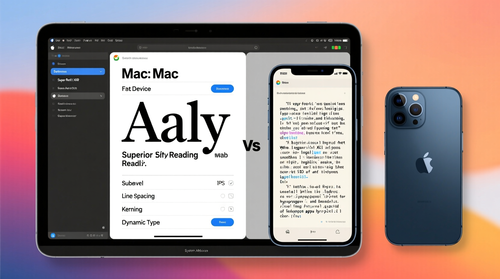
Apple uses San Francisco as its system font across all devices, but how it’s displayed varies. On iPhone, the font is optimized for small screens with tighter tracking (letter spacing) and adjusted x-heights for clarity. On Mac, the same font appears more spacious and refined, suited for longer reading sessions on larger displays.
In applications like Pages or Notes, what you see as “WYSIWYG” (what you see is what you get) on Mac isn’t always preserved on iPhone due to responsive layout rules. For instance:
| Metric | Mac Behavior | iPhone Behavior |
|---|---|---|
| Line Height | Fixed or user-defined | Automatically increased for readability |
| Font Size | Exact point size applied | Scaled dynamically based on accessibility settings |
| Margins | Respects document settings | Often reduced to fit narrow screen |
| Bullet Indentation | Precise control via ruler | Standardized indentation, less customizable |
This means a bulleted list meticulously aligned on your MacBook may appear compressed or uneven on an iPhone, not because of an error, but due to adaptive design meant to enhance mobile readability.
Is One Platform Better for Text Formatting?
The answer depends on your priorities. If precision, control, and desktop-grade editing are essential, the Mac is objectively superior. It offers granular formatting tools, full keyboard shortcuts, and consistent visual feedback. Professionals using Word, Google Docs, or LaTeX benefit significantly from the larger canvas and advanced features.
However, if your goal is readability, portability, and quick edits on the go, the iPhone excels in delivering accessible, well-proportioned text—even if it sacrifices some fidelity.
When the Mac Wins
- You need exact control over spacing, alignment, or typography.
- You're preparing documents for print or professional presentation.
- You rely on complex layouts (tables, columns, footnotes).
When the iPhone Wins
- You’re consuming long-form content (articles, notes, books).
- You prioritize accessibility (larger text, bold fonts, reduce motion).
- You make quick annotations or voice-to-text entries.
A Real-World Example: The Student’s Dilemma
Consider Maria, a university student who writes her essays on her MacBook Air using Pages. She formats headings, citations, and bullet points precisely to meet academic standards. Later, while commuting, she opens the same document on her iPhone to review. To her surprise, the indentation is gone, and the font appears bolder than expected.
She initially thinks something broke—until she realizes her iPhone has “Larger Accessibility Sizes” enabled, which overrides default font settings. Once she adjusts the dynamic type setting under Settings > Display & Brightness > Text Size, the document appears closer to the original. Still, minor spacing differences remain due to screen width constraints.
Maria learns that reviewing content on iPhone is fine for proofreading flow and grammar, but final formatting checks must be done on her Mac.
Step-by-Step: How to Minimize Formatting Discrepancies
To achieve greater consistency between your Mac and iPhone, follow this practical workflow:
- Use native Apple apps where possible: Notes, Pages, and Mail sync formatting more reliably than third-party alternatives.
- Disable aggressive text scaling: Go to Settings > Accessibility > Display & Text Size on iPhone and avoid extreme \"Larger Text\" settings unless necessary.
- Avoid custom fonts: Stick to system fonts (San Francisco, Helvetica, Times New Roman). Custom fonts may not embed properly across devices.
- Preview on both devices: Before sharing a document, open it on both Mac and iPhone to catch layout issues.
- Export as PDF for final delivery: If formatting accuracy is critical, export your document as a PDF on Mac—this locks in layout and ensures universal consistency.
Checklist: Ensuring Cross-Device Text Consistency
- ✅ Use iCloud-synced apps (Notes, Pages, Keynote)
- ✅ Match font settings across devices
- ✅ Avoid excessive use of tabs or spaces for alignment
- ✅ Test documents on both platforms before finalizing
- ✅ Export to PDF when sharing professionally
- ✅ Keep iOS and macOS updated for improved syncing
Frequently Asked Questions
Why do bullet points look different on my iPhone than on my Mac?
iPhone applies standardized indentation and spacing to improve touch interaction and readability. On Mac, you have more control over precise positioning, which may not translate directly to the mobile version due to responsive layout adjustments.
Can I make text look exactly the same on both devices?
Perfect pixel-for-pixel matching is difficult due to differing screen sizes and OS behaviors. However, using system fonts, avoiding manual spacing, and exporting to PDF will get you very close to consistent appearance.
Does using third-party apps like Google Docs solve the problem?
Google Docs improves cross-platform compatibility but introduces its own rendering quirks. While it’s more consistent than some apps, it still adapts layouts subtly between desktop and mobile views. For best results, stick to Apple’s native suite or finalize in PDF format.
Conclusion: Embrace the Ecosystem, Optimize Your Workflow
The differences in text formatting between Mac and iPhone aren’t a bug—they’re a reflection of thoughtful design tailored to each device’s purpose. The Mac delivers precision and control; the iPhone prioritizes clarity and accessibility. Neither is universally “better,” but understanding their strengths allows you to work smarter across both.
Instead of fighting the variations, adapt your workflow: draft and format on Mac, review on iPhone, and lock in final versions as PDFs. With a few smart habits, you can maintain professional-quality output without frustration.


 浙公网安备
33010002000092号
浙公网安备
33010002000092号 浙B2-20120091-4
Comments
No comments yet. Why don't you start the discussion?