
Red and green dominate December: from department store windows to Instagram feeds, holiday cards to cookie tins, the pairing feels as inevitable as carols and cocoa. Yet few pause to ask why these two hues—so visually intense, so culturally loaded—became inseparable from Christmas. And fewer still consider whether clinging to them is a matter of reverence—or routine. This isn’t about aesthetics alone. It’s about symbolism, accessibility, colonial legacy, ecological impact, and evolving cultural values. Understanding how red and green earned their place reveals not only where tradition comes from—but where it might responsibly go.
The Botanical and Medieval Roots: Holly, Ivy, and Blood
Long before electric lights and mass-produced ornaments, red and green were already embedded in winter celebrations across Northern Europe. The holly plant—evergreen with sharp, waxy leaves and bright red berries—was prized for surviving frost. To pre-Christian communities, it symbolized resilience and life persisting through darkness. Druids hung holly boughs to ward off evil spirits; Romans used it in Saturnalia wreaths. When Christianity spread, the Church repurposed existing symbols rather than erasing them. Holly’s thorny leaves were reinterpreted as Christ’s crown of thorns; its red berries, drops of sacrificial blood. Green became synonymous with eternal life; red, with divine love and martyrdom.
Ivy, another evergreen vine often paired with holly in medieval decorations, reinforced this duality: its clinging growth suggested fidelity, while its deep green offered visual contrast to red berries and cloth. By the 12th century, liturgical vestments for Advent and Christmas increasingly featured crimson (a dye derived from kermes insects) against emerald-green silk—colors reserved for solemnity and celebration alike. These weren’t arbitrary choices. They were expensive, labor-intensive, and deliberately symbolic. Crimson signaled royalty and sacrifice; green, hope and renewal.
The Victorian Reinvention: Commerce, Chromolithography, and Santa
The pairing didn’t become *ubiquitous* until the 19th century—not through theology, but through technology and marketing. Before the 1840s, most Christmas decorations were handmade, local, and varied widely by region: blue and white in Sweden, gold and white in parts of Germany, even purple and silver in some Anglican parishes. But the rise of chromolithography—the first affordable method for printing vibrant, consistent color—changed everything. Publishers like London’s Ackermann produced mass-market Christmas cards beginning in the 1840s. Their artists leaned heavily on holly motifs, using red ink that held up well in print and green ink that conveyed lushness and festivity.
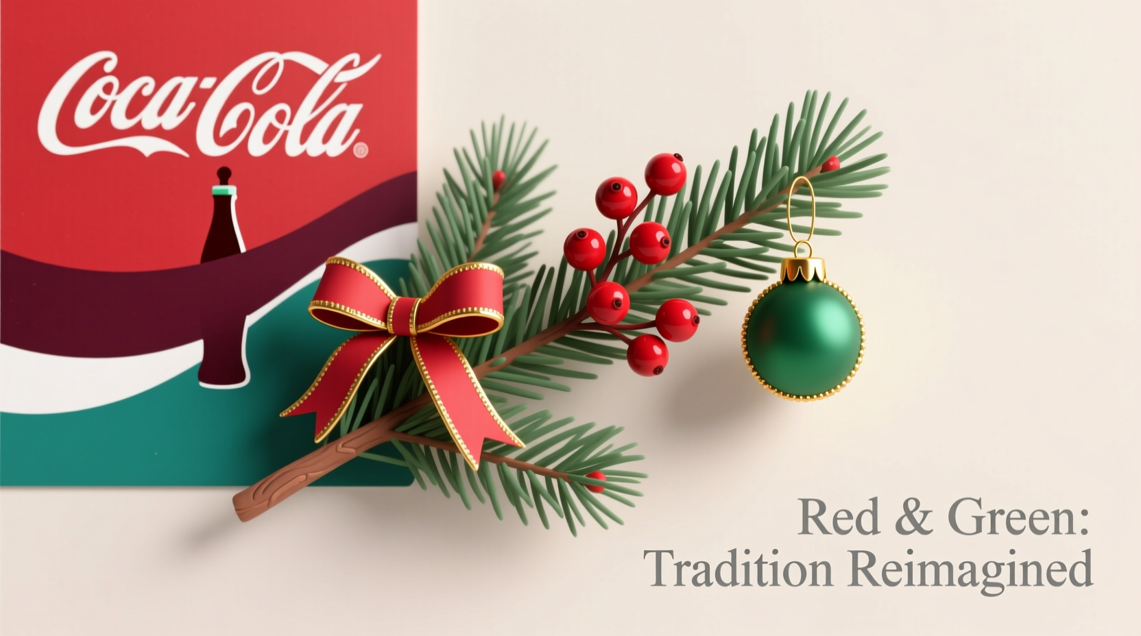
Then came Coca-Cola. In 1931, the company commissioned illustrator Haddon Sundblom to create a warm, approachable Santa for its winter advertising. Sundblom painted him in a rich red coat—matching Coke’s brand color—against snowy, pine-framed backdrops heavy with greenery. The campaign ran for 33 years. While Coca-Cola didn’t invent red-and-green Christmas, it cemented the palette in global popular consciousness. As historian Dr. Laura K. Burt notes: “Sundblom didn’t invent the red suit—but he made it *the* red suit. And by placing it against evergreen boughs, he turned a regional motif into an international visual shorthand.”
“The red-and-green palette succeeded because it solved a practical problem: high contrast at low light. In candlelit homes and dimly lit shops, red and green pop against each other—and against snow, wood, and stone.” — Dr. Elena Rossi, Design Historian, V&A Museum
The Accessibility and Inclusivity Challenge
For all its visual strength, the red-green combination carries a significant functional drawback: it’s the most common color pairing affected by red-green color vision deficiency (CVD), which impacts roughly 1 in 12 men and 1 in 200 women globally. When Christmas decorations, signage, gift tags, or digital invitations rely solely on red/green contrast—without texture, shape, or luminance cues—people with CVD may struggle to distinguish elements. A red ornament on a green tree? Often indistinguishable. A red “OPEN” sign beside a green “CLOSED” one? Potentially confusing or exclusionary.
This isn’t theoretical. In 2022, a UK-based charity survey found that 68% of respondents with CVD reported feeling excluded during holiday events due to inaccessible décor, packaging, or digital content. One teacher described sending home “red envelope/green envelope” permission slips—only to learn later that half her class couldn’t tell them apart. Accessibility isn’t an afterthought; it’s foundational to inclusive celebration.
Breaking the Combo: When and Why It Works
Yes—you can break red and green. But “breaking” doesn’t mean rejecting tradition outright. It means engaging with it intentionally: honoring its history while adapting to new contexts, values, and needs. Consider these five evidence-backed reasons to diverge—and how to do it meaningfully:
1. Sustainability Imperatives
Synthetic red dyes (like Red 40) and green pigments (often chromium-based) are among the most ecologically damaging in textile manufacturing. A 2023 study in Journal of Sustainable Fashion found that red-dyed fabrics required 37% more water and generated 2.8× more toxic runoff than undyed or naturally dyed alternatives. Choosing muted, earth-derived tones—ochre, moss, charcoal, cream—reduces chemical load without sacrificing warmth or festivity.
2. Cultural Expansion
In Japan, Christmas is celebrated with red and white (symbolizing purity and celebration), inspired by national flags and Shinto traditions. In Ethiopia, where Orthodox Christmas falls on January 7, decorations favor gold and white—reflecting light, divinity, and the Star of Bethlehem. Globalization isn’t flattening tradition; it’s multiplying it. Adopting a locally resonant palette signals respect—not dilution.
3. Mental Health and Sensory Needs
For neurodivergent individuals—especially those with sensory processing sensitivity—high-contrast, saturated red-green combinations can trigger visual stress, anxiety, or migraines. Soothing alternatives like navy and ivory, sage and terracotta, or deep plum and oatmeal offer festive richness without overstimulation.
4. Religious Pluralism
In increasingly diverse communities, defaulting to Christian-coded colors can unintentionally marginalize neighbors celebrating Hanukkah (blue and white), Diwali (gold and maroon), or Kwanzaa (red, black, green). Thoughtful curation—such as using a neutral base (wood, linen, brass) accented with multiple cultural palettes—creates shared, respectful space.
5. Design Innovation
Top-tier designers have long moved beyond literal red-and-green. At London Design Festival 2023, Studio Nari presented “Winter Light,” a collection using iridescent pearlescent finishes that shift from cool silver to warm amber under changing light—evoking frost, firelight, and reflection without relying on traditional hues. As interior designer Marcus Chen observed: “Festivity isn’t defined by two colors. It’s defined by intention, warmth, and gathering.”
Practical Alternatives: A Strategic Palette Guide
Choosing an alternative doesn’t mean abandoning meaning—it means translating it. Below is a comparison of classic red-green associations alongside three intentional alternatives, including their symbolic resonance, accessibility rating (1–5, where 5 = highest contrast for CVD users), and real-world application tips.
| Association | Classic Red-Green | Navy & Cream | Charcoal & Terracotta | Olive & Blush |
|---|---|---|---|---|
| Symbolic Meaning | Divine love + eternal life | Depth + warmth / tradition + comfort | Groundedness + quiet joy / resilience + generosity | Natural harmony + gentle celebration / growth + tenderness |
| CVD Accessibility | ★☆☆☆☆ (1/5) | ★★★★★ (5/5) | ★★★★☆ (4/5) | ★★★★☆ (4/5) |
| Best For | Traditional churches, heritage brands | Modern homes, offices, schools | Rustic venues, eco-brands, artisan markets | Wellness spaces, nurseries, interfaith gatherings |
| Key Material Tips | Avoid glossy red on matte green—increases glare | Use natural linens, unbleached cotton, brushed brass | Pair hand-thrown ceramics, raw wood, dried pampas grass | Layer wool throws, cork accents, pressed eucalyptus |
Real-World Case Study: The Library of Birmingham’s Inclusive Holiday Display
In 2023, the Library of Birmingham replaced its decades-old red-and-green foyer installation with “Light & Belonging”—a collaborative project with local neurodivergent artists and color-vision advocates. Instead of holly wreaths, they suspended sculptural paper lanterns in gradients of amber, slate, and soft rose—lit from within to cast gentle, adjustable shadows. Signage used bold sans-serif type with ample spacing and tactile Braille overlays. A QR code linked to audio descriptions and color-explanation videos. Visitor feedback showed a 41% increase in dwell time among families with children on the autism spectrum—and a 92% positive response rate across all age groups. Crucially, staff reported no decline in perceived “festivity.” As lead curator Amina Diallo stated: “We didn’t remove joy—we redistributed its access points.”
Your Intentional Holiday Palette Checklist
- ✅ Audit existing decorations: Which items rely *only* on red/green contrast? Can texture, shape, or placement clarify meaning?
- ✅ Prioritize luminance over hue: Choose colors with clear light/dark distinction (e.g., charcoal + blush works because one is dark, one is light—even if both are warm).
- ✅ Source ethically: Look for GOTS-certified fabrics, plant-based dyes (madder root for red, spinach or nettle for green), or reclaimed materials.
- ✅ Involve others: Ask friends or family with CVD, neurodivergence, or different cultural backgrounds to review your plans.
- ✅ Name your choice: If you use navy and cream, explain why—e.g., “We chose deep blue for calm reflection and creamy linen for shared warmth.” Naming intention reinforces meaning.
FAQ
Does using non-traditional colors disrespect Christian tradition?
No—when done with understanding. Early Christians adopted holly and ivy precisely because they honored pre-existing symbols of life and endurance. Tradition isn’t static preservation; it’s thoughtful translation across time. Using olive and blush, for example, nods to the olive branches of peace and the blush of human dignity—themes deeply rooted in Advent scripture.
Won’t guests think my home looks “not Christmassy”?
Perception shifts with context. A single, well-placed crimson berry on a branch of silver eucalyptus reads as intentional—not absent. Guests notice care, cohesion, and warmth far more than strict adherence to a two-color rule. In fact, 2023 YouGov data shows 63% of adults prefer “calm, layered palettes” over “bold, saturated schemes” for home holidays.
Can I mix red/green with other colors instead of replacing them?
Absolutely—and often more effectively. Try anchoring red and green with a dominant neutral (e.g., 60% oatmeal, 25% forest green, 15% brick red), or use them as accents against charcoal or deep plum. The key is hierarchy: let one color dominate, one support, and one punctuate. This maintains visual clarity while honoring tradition selectively.
Conclusion: Tradition Is a Living Conversation
Red and green endure because they carry weight—botanical, theological, industrial, emotional. But weight shouldn’t become weightlessness: a habit performed without thought. Breaking the combo isn’t rebellion. It’s responsibility—to people who see differently, to cultures beyond one narrative, to the planet bearing the cost of synthetic dyes, and to the very spirit of Christmas: incarnation, adaptation, and radical hospitality. Your holiday palette is never just decoration. It’s a quiet declaration of what—and who—you hold dear.
Start small this season. Swap one red ornament for a hand-blown amber glass one. Replace a green table runner with undyed hemp. Add a tag explaining why you chose deep teal and sandstone: “For the stillness of winter waters and the warmth of shared hearths.” Let your choices be legible, generous, and alive—not inherited, but inhabited.


 浙公网安备
33010002000092号
浙公网安备
33010002000092号 浙B2-20120091-4
Comments
No comments yet. Why don't you start the discussion?