
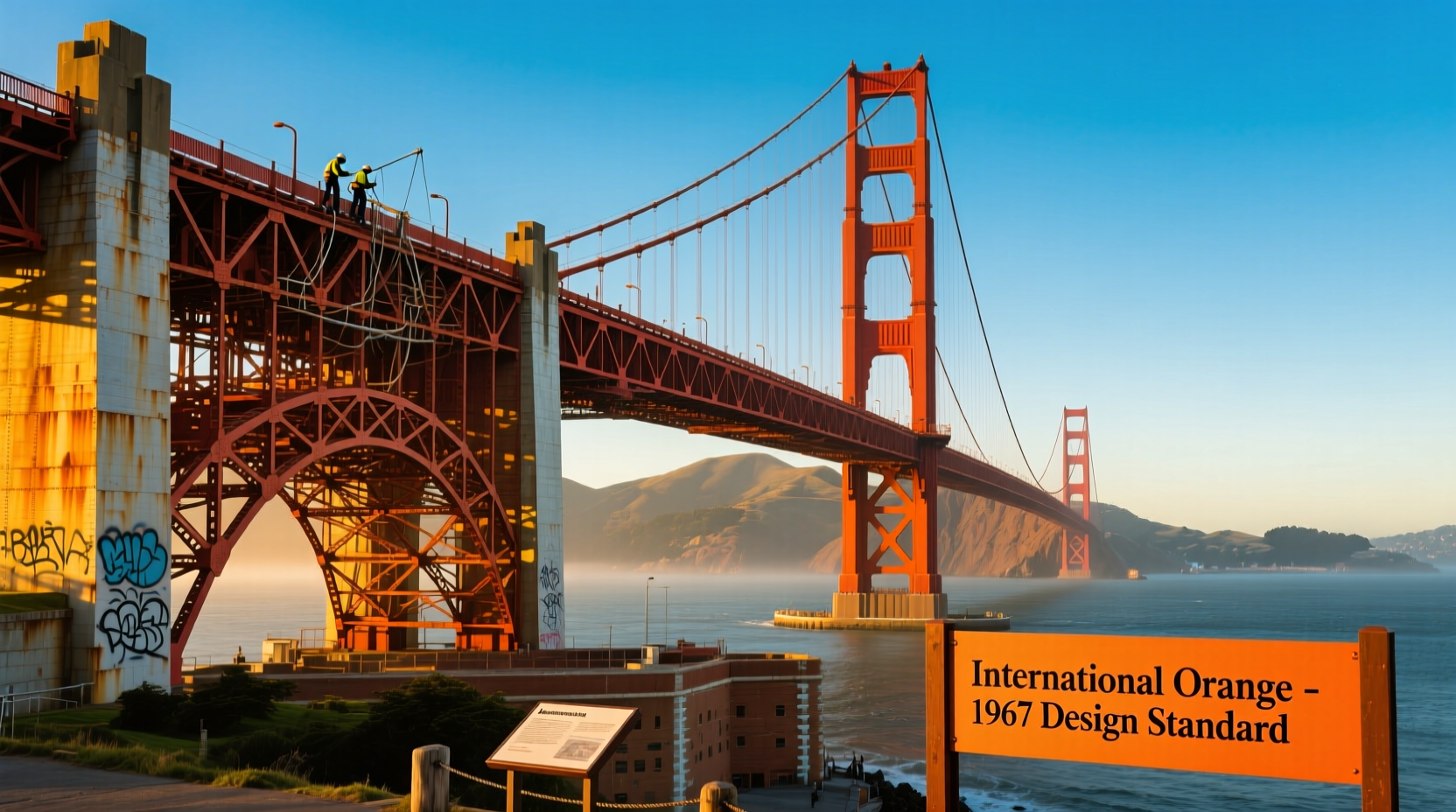
The Golden Gate Bridge stands as one of the most recognizable structures in the world, not just for its engineering marvel but also for its striking appearance. Its deep, warm red-orange hue cuts through San Francisco’s frequent fog, making it both visible and majestic. Yet, many assume its name implies a golden structure. The truth is more complex—and far more intentional. The bridge isn’t gold; it’s painted International Orange, a color chosen not by chance, but through careful consideration of safety, aesthetics, and environmental factors.
The Misconception Behind the Name
The name “Golden Gate” does not refer to the color of the bridge. Instead, it originates from the Golden Gate Strait, the entrance to San Francisco Bay from the Pacific Ocean. In the mid-19th century, explorer John C. Frémont named the strait “Chrysopylae,” Greek for “Golden Gate,” inspired by the Golden Horn harbor in Istanbul. When the bridge was finally constructed in the 1930s, the name carried over—despite the structure being painted a bold orange-red.
This naming quirk often leads to public confusion. Many first-time visitors expect a gilded landmark. Instead, they’re greeted by a vibrant vermilion arc soaring above the water. But that very color is what makes the bridge so unforgettable.
The Original Color Debate
When construction began in 1933, the U.S. Navy proposed painting the bridge in black and yellow stripes for maximum visibility—a practical but visually jarring option. Meanwhile, some engineers favored a standard carbon gray, typical of industrial steel structures at the time. However, the bridge’s chief engineer, Joseph Strauss, wanted something bolder.
Strauss initially suggested a dull gray to blend with the environment. But Irving Morrow, the project’s architectural consultant, saw an opportunity to elevate the design beyond mere utility. He championed a richer, more resonant color. After experimenting with various shades on test panels, Morrow settled on a unique reddish-orange tone that would later be standardized as “International Orange.”
“The color is not merely decorative—it harmonizes with the natural surroundings, enhances visibility, and gives the bridge its soul.” — Irving Morrow, Architectural Consultant, Golden Gate Bridge Project
Why International Orange?
The final color choice wasn’t arbitrary. Several key factors influenced the decision:
- Fog Visibility: San Francisco’s coastal fog can reduce visibility to near zero. A bright, warm color like International Orange stands out against the cool gray mist, improving safety for ships and aircraft.
- Aesthetic Harmony: The hue complements the warm tones of nearby hills, contrasts beautifully with the blue water and sky, and enhances the bridge’s visual presence without clashing with the landscape.
- Structural Protection: The paint serves a dual purpose: protection against corrosion. The original primer contained red lead, contributing to the base color. Maintaining a consistent paint system helps prevent rust in the salty, humid marine environment.
- Public Reception: Early renderings in black-and-white made the bridge appear too stark or industrial. The orange-red softened its profile and gave it a human scale, making it more inviting and iconic.
A Timeline of Color Application and Maintenance
Maintaining the bridge’s color has been an ongoing effort since its completion in 1937. Unlike most large structures, the Golden Gate Bridge is painted continuously—not in one go, but in a perpetual cycle of inspection, repair, and repainting.
- 1933–1937: Original construction uses red lead primer and a topcoat of International Orange, hand-mixed by workers on-site.
- 1965: The bridge receives its first full repaint using a more durable synthetic version of the original color.
- 1990: The corrosive primer is phased out. A new zinc-based, environmentally safer coating system is introduced, maintaining the same hue.
- Present Day: A team of painters works year-round, focusing on high-exposure areas first. The entire surface is inspected and touched up on a rotating schedule.
The Role of Continuous Painting
Due to constant exposure to salt spray, wind, and fog, the bridge never stops needing maintenance. Rather than a full repaint every few decades, crews use a spot-treatment approach. This method saves time, money, and resources while ensuring structural integrity.
| Era | Paint Type | Color Consistency | Environmental Impact |
|---|---|---|---|
| 1930s–1960s | Red lead primer + oil-based topcoat | High (hand-mixed batches) | High toxicity |
| 1965–1990 | Synthetic alkyd topcoat | Standardized | Moderate |
| 1990–Present | Zinc silicate primer + acrylic topcoat | Precisely matched | Low (eco-friendly) |
Expert Insight: Engineering Meets Art
The collaboration between engineers and designers was pivotal. While Strauss focused on function, Morrow insisted on beauty. His advocacy for International Orange transformed the bridge from a utilitarian span into a work of art.
“Bridges are not just about crossing space—they’re about inspiring people. The color had to reflect that ambition.” — Donald MacDonald, Bridge Designer and Legacy Consultant
Morrow’s influence extended beyond color. He designed the bridge’s lighting, railing patterns, and even the shape of the towers. His holistic vision ensured that every aesthetic choice served both form and function.
Mini Case Study: The 1996 Fog Test
In 1996, transportation officials conducted a visibility study to assess whether the bridge’s color remained optimal for navigation. Using simulated fog conditions and pilot feedback, researchers compared International Orange with alternatives like white, gray, and navy blue.
The results confirmed that International Orange provided the highest contrast against both fog and twilight skies. Pilots reported spotting the structure nearly 30% faster than with other colors. This study reaffirmed the wisdom of Morrow’s original decision and led to stricter color-matching protocols during repainting.
Common Myths About the Color
Despite decades of documentation, several myths persist:
- Myth: The bridge was painted red to honor the Golden Gate’s “golden” namesake.
Reality: The name predates the bridge and refers to the strait, not the color. - Myth: The color fades quickly and needs constant reapplication.
Reality: Modern coatings last 15–20 years in protected areas; only exposed sections need frequent touch-ups. - Myth: It was originally intended to be silver or gray.
Reality: While gray was considered, the orange-red was selected early in the design phase.
Checklist: Key Facts About the Golden Gate Bridge’s Color
To summarize the essential points, here’s a quick-reference checklist:
- ✅ The bridge is painted International Orange, not gold.
- ✅ The color improves visibility in fog and blends with the landscape.
- ✅ Irving Morrow, not an engineer, was the driving force behind the hue.
- ✅ The paint protects against corrosion in a harsh marine environment.
- ✅ Repainting is continuous, not periodic—crews work year-round.
- ✅ The current coating system is environmentally safer than earlier versions.
FAQ
Is International Orange an official color standard?
Yes. Although initially mixed by hand, International Orange is now defined by precise Pantone and federal specifications (Pantone 1807 C, Federal Standard 595b No. 12197) to ensure consistency across repairs.
Has the bridge ever been painted a different color?
No. Since its construction, the bridge has always been some variation of International Orange. Even during early construction, temporary structures were painted the same shade to maintain visual continuity.
Why not repaint it gold for branding or tourism?
Changing the color would compromise safety, violate historic preservation standards, and damage public sentiment. The current hue is protected as part of the bridge’s heritage.
Conclusion
The Golden Gate Bridge’s red-orange hue is far more than a stylistic flourish. It is the result of deliberate, multidisciplinary decision-making that balanced engineering, safety, and artistic vision. What began as a debate among planners evolved into a globally recognized symbol—one whose color plays a critical role in its function and legacy.
Every brushstroke applied today honors Irving Morrow’s insight that infrastructure should inspire as much as it endures. The next time you see the bridge glowing through the fog, remember: its color isn’t accidental. It’s a masterpiece of practical design.


 浙公网安备
33010002000092号
浙公网安备
33010002000092号 浙B2-20120091-4
Comments
No comments yet. Why don't you start the discussion?