
The 7-Eleven logo is instantly recognizable: bold red and green colors, a clean sans-serif font, and that curious detail—the lowercase “n” in “eleven.” At first glance, it seems like a typo. But far from being an error, this subtle typographic choice is intentional, rooted in branding psychology, visual balance, and decades of design evolution. Understanding why the “n” is lowercase reveals more than just a quirky font decision—it uncovers how thoughtful design shapes brand identity.
The Origins of the 7-Eleven Name and Logo
Founded in 1927 as the Southland Ice Company in Dallas, Texas, the business began selling groceries and eventually adopted extended hours—opening at 7 a.m. and closing at 11 p.m. By 1946, this schedule inspired the name “7-Eleven,” reflecting its then-unusual operating hours. The rebranding was both practical and memorable, positioning the store as convenient and accessible.
The original logo featured a simple block-letter design with “7” followed by “ELEVEN” in all uppercase letters. Over time, as consumer culture evolved and branding became more sophisticated, so did the logo. In the 1960s and 70s, 7-Eleven underwent a major visual transformation to modernize its image. This included refining the typography for better legibility and emotional appeal.
The Typographic Shift: From Uniformity to Personality
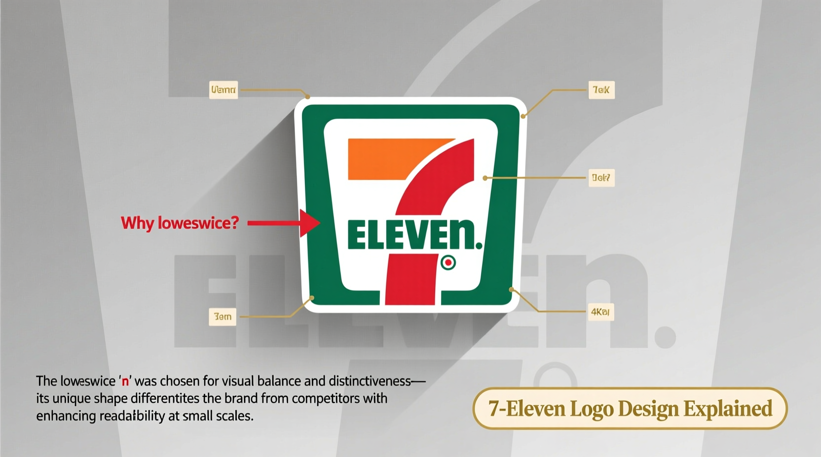
One of the most significant changes came in the redesign led by design consultants working with 7-Eleven during the late 20th century. The goal was to humanize the brand—to make it feel less corporate and more approachable. That’s where the lowercase “n” enters the picture.
Using a lowercase letter within an otherwise capitalized word breaks formal conventions. In typography, such deviations are rarely accidental. They serve specific purposes: creating rhythm, drawing attention, or adding warmth. In this case, the lowercase “n” softens the rigid geometry of all-caps text, giving the logo a friendlier, more conversational tone.
“Typography is never neutral. A single letter can shift perception from cold efficiency to welcoming familiarity.” — Dr. Lena Pruitt, Brand Identity Researcher, University of Arts London
Visual Balance and Letterform Dynamics
To understand the impact of the lowercase “n,” consider the shape of the word “ELEVEN” in uppercase: E-L-E-V-E-N. All letters are tall, blocky, and uniform. When written this way, the final “N” creates a sharp diagonal slash at the end, which can feel abrupt or visually heavy.
By switching to a lowercase “n,” designers achieved several subtle but powerful effects:
- Improved exit flow: The curved tail of the lowercase “n” leads the eye smoothly off the word, enhancing readability.
- Reduced visual weight: The smaller letter prevents the end of the word from appearing too dense or aggressive.
- Added asymmetry: A slight irregularity makes the logo more memorable—our brains tend to recall things that break patterns.
A Case Study in Brand Consistency
In 2009, when 7-Eleven updated its logo globally, many expected a full modernization—perhaps a sleeker font or digital-inspired elements. Instead, the company retained the iconic color scheme (red and green) and preserved the lowercase “n.” This decision wasn’t oversight; it was strategic.
During user testing, versions of the logo with an uppercase “N” were perceived as “more corporate” and “less friendly.” Consumers associated the familiar lowercase “n” with reliability and neighborhood presence. Removing it risked alienating loyal customers who had grown up seeing that distinctive curve at the end of the word.
This real-world example underscores a key principle in branding: consistency builds trust. Even minor details become embedded in public memory over time. Changing them—even for aesthetic perfection—can disrupt emotional connections.
Psychological Impact of Typography in Branding
Fonts communicate silently but powerfully. Serif fonts suggest tradition and authority; rounded sans-serifs imply friendliness and accessibility. The 7-Eleven typeface—a custom variation of a geometric sans-serif—leans toward simplicity and modernity. The lowercase “n” amplifies this effect.
Research in cognitive psychology shows that people form impressions of brands within milliseconds of seeing a logo. Subtle cues like letter casing influence whether a brand feels human or mechanical. The lowercase “n” nudges perception toward the former.
Consider two versions of the same word:
| Version | Perceived Tone | Brand Association |
|---|---|---|
| ELEVEN (all caps) | Formal, institutional | Utility provider, government service |
| Eleven (capital E, lowercase rest) | Approachable, personal | Local shop, community brand |
| Seven + eleven (mixed case) | Balanced, dynamic | Innovative yet trustworthy |
The actual 7-Eleven logo uses a hybrid approach: “7” in bold numerals, “eleven” starting with a capital “E” and ending with a lowercase “n.” This balances authority (the number, the capital E) with approachability (the flowing lowercase letters).
Design Evolution Timeline: How the Lowercase 'n' Emerged
The transition to the current logo didn’t happen overnight. Here’s a simplified timeline showing the evolution:
- 1946–1960s: Original “7-ELEVEN” in all caps, often inside a circular badge. Functional but generic.
- 1970s: Introduction of slanted text (“italicized”) to suggest motion and energy. First experiments with mixed case.
- 1980s: Adoption of the now-familiar red-and-green split background. “eleven” begins using mostly lowercase letters, except the initial “E.”
- 1990s–Present: Refinement of proportions and kerning. The lowercase “n” becomes standardized across global markets.
This gradual shift reflects broader trends in branding—from rigid corporate identities to warmer, customer-centric designs. The lowercase “n” is not just a stylistic flourish; it’s a marker of cultural adaptation.
Frequently Asked Questions
Is the lowercase 'n' in 7-Eleven a mistake?
No, it is not a mistake. It is a deliberate typographic choice made during a brand redesign to improve visual flow and create a more approachable brand image.
Has 7-Eleven ever used an uppercase 'N' in official logos?
Early versions of the logo from the 1950s and 60s used all-uppercase lettering. However, since the 1980s, the lowercase “n” has been consistently used in the primary logo.
Do other brands use similar typographic tricks?
Yes. Brands like iPod (lowercase “i”), delicious (formerly spelled with a lowercase “d”), and YouTube (custom “tube” with stylized letters) use unconventional casing to stand out and appear more personable.
How to Apply This Insight to Your Own Branding
If you're designing a logo or refreshing a brand identity, consider these lessons from 7-Eleven:
- Test readability and emotion: Show variations to diverse audiences. Ask not just “Can you read it?” but “How does it make you feel?”
- Respect legacy: If your brand has established visual elements, assess their emotional value before removing them.
- Use contrast wisely: A single lowercase letter in a sea of uppercase can act as a visual anchor or point of interest.
Checklist: Evaluating Typographic Choices in Logo Design
- ✅ Does the font reflect the brand’s personality (e.g., friendly, reliable, innovative)?
- ✅ Is the letter casing consistent with industry norms—or intentionally breaking them?
- ✅ Have you tested the logo at different sizes and distances?
- ✅ Does any element (like a lowercase letter) improve visual flow?
- ✅ Would removing a distinctive feature weaken brand recognition?
Conclusion: Small Details, Big Impact
The lowercase “n” in 7-Eleven’s logo may seem insignificant at first glance. But in the world of branding, nothing is arbitrary. Every curve, angle, and case decision serves a purpose. This tiny typographic nuance contributes to the brand’s accessibility, memorability, and longevity.
It reminds us that great design isn’t about following rules—it’s about knowing when to bend them. Whether you’re building a global chain or launching a local business, pay attention to the details. Sometimes, the smallest choices leave the deepest impressions.


 浙公网安备
33010002000092号
浙公网安备
33010002000092号 浙B2-20120091-4
Comments
No comments yet. Why don't you start the discussion?