
In the world of design and printing, CMYK is a foundational color model. While most people recognize C (cyan), M (magenta), and Y (yellow), the K often raises questions. Why is it \"K\" and not \"B\"? And why does black hold such a special place in this system? The answer lies at the intersection of history, practicality, and precision in print technology.
The use of \"K\" to represent black may seem arbitrary, but it reflects a deliberate decision rooted in the mechanics of color separation and printing workflows developed over a century ago. Understanding its origin reveals much about how modern printing evolved from early 20th-century processes to today’s digital standards.
The Role of Black in Print Color Theory
At first glance, combining cyan, magenta, and yellow should produce black. In theory, when all three pigments absorb their respective light wavelengths, no light is reflected—resulting in black. However, real-world inks are imperfect. When mixed, CMY typically yields a muddy brown rather than a clean, deep black.
This limitation made an additional ink essential: pure black. It enhances contrast, defines sharp text and outlines, and reduces ink consumption. Using black instead of layering all three colored inks saves cost, prevents oversaturation of paper, and improves drying time.
Thus, black became a key component—not just an enhancement, but a necessity for professional-quality printing.
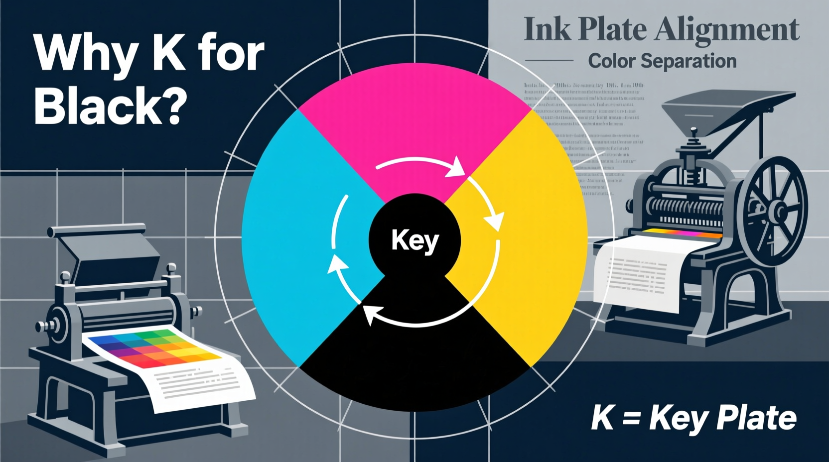
Why “K” Instead of “B”? The Naming Convention Explained
If black completes the CMYK model, why isn’t it labeled “B”? The answer is both practical and linguistic. In color modeling, \"B\" was already associated with blue—especially in RGB (Red, Green, Blue)—so using \"B\" for black would create confusion across systems.
“K” was chosen as a compromise. It comes from the term \"key plate,\" a critical concept in traditional color printing. In early four-color printing processes, each color required a separate printing plate. The key plate carried the image's detail—the outlines, textures, and contrast elements that \"locked\" the other colors into place. This master plate was almost always printed in black ink.
Hence, “K” doesn't stand for “black” phonetically, but symbolically: it represents the key to alignment and clarity in multicolor reproduction.
“Choosing ‘K’ wasn’t arbitrary—it honored the role of black as the structural foundation of printed imagery.” — Dr. Alan Reeves, Historian of Printing Technology
Historical Evolution of the CMYK Model
The roots of CMYK trace back to the late 19th and early 20th centuries, during the rise of commercial color printing. As newspapers and magazines began incorporating photographs and illustrations, printers needed a reliable method to reproduce full-color images using limited ink sets.
Tri-color printing (CMY) emerged first, but results were inconsistent. The addition of black in the 1930s significantly improved tonal range and definition. By the 1950s, CMYK had become the industry standard for offset lithography, especially in publishing and packaging.
Digital prepress tools later formalized these conventions. Software like Adobe Photoshop and Illustrator adopted CMYK as a default print mode, preserving the “K” designation to maintain compatibility with existing workflows.
Timeline: Key Developments in CMYK History
- 1890s: Early experiments with color separation using cyan, magenta, and yellow.
- 1930s: Introduction of black ink to correct muddy dark tones and improve sharpness.
- 1950s: Standardization of four-color process printing in commercial offset presses.
- 1980s: Digital desktop publishing adopts CMYK as the default print color space.
- 2000s–Present: CMYK remains essential despite advances in spot colors and digital printing.
Technical Advantages of Using Black (K) in Printing
Beyond historical reasons, there are clear technical benefits to including a dedicated black channel:
- Improved Contrast: Pure black ink delivers deeper shadows than composite black (CMY mix).
- Text Clarity: Small fonts and fine details remain legible only when printed in solid black.
- Ink Efficiency: Replacing layered CMY with K reduces total ink coverage, preventing paper bleed and cockling.
- Registration Accuracy: The key plate aligns other colors, minimizing misalignment artifacts.
- Cost Reduction: Less ink usage translates to lower material costs and faster production.
Designers working on brochures, business cards, or packaging must understand how K functions differently from composite black. For example, setting rich black (a mix of CMY plus K) requires careful calibration to avoid oversaturation.
| Black Type | CMYK Values | Best Use Case |
|---|---|---|
| Pure Black | 0C, 0M, 0Y, 100K | Body text, thin lines |
| Rich Black | 60C, 40M, 40Y, 100K | Large background areas |
| Composite Black | 100C, 100M, 100Y, 0K | Avoid—causes registration issues |
Common Misconceptions About the “K”
Despite widespread use, several myths persist about the meaning of “K”:
- Myth: “K” stands for “black” in German (“Kohl”) or French (“noir”).
Reality: No evidence supports this; the term originated in English-speaking printing industries. - Myth: “K” means “dark” from the word “keytone.”
Reality: This is a backronym. “Key” refers specifically to the key plate, not tonal value. - Myth: Digital systems invented the K notation.
Reality: The term predates digital design by decades, originating in analog print shops.
Mini Case Study: A Magazine Publisher’s Color Challenge
A regional lifestyle magazine once experienced complaints about blurry headlines and smudged photos. Their designers used RGB black (#000000) converted automatically to CMYK, resulting in unintended 100% cyan, magenta, and yellow overlays without sufficient K dominance.
After consulting a prepress expert, they revised their templates to enforce 100K for all text and outlines, while reserving rich black (with high K values) only for large blocks. Registration improved instantly, ink costs dropped by 18%, and readers noted sharper visuals.
The fix wasn’t technological—it was conceptual: understanding that K isn’t just another color, but the anchor of print fidelity.
Checklist: Best Practices for Using K in Design
- ✅ Use 100% K for body text, captions, and hairline rules.
- ✅ Apply rich black (e.g., 60C, 40M, 40Y, 100K) only for large dark areas.
- ✅ Avoid 100% coverage on all four channels to prevent drying issues.
- ✅ Confirm K alignment in PDF proofs before sending to print.
- ✅ Specify K-only black in style guides for brand consistency.
Frequently Asked Questions
Why can’t we just mix cyan, magenta, and yellow to make black?
Due to impurities in ink and limitations in pigment absorption, mixing CMY produces a dark brown, not true black. Adding black ink ensures depth, clarity, and efficiency.
Is K the same in every printing process?
The principle remains consistent, but exact K formulations vary by press type, paper, and manufacturer. High-gloss coated stock may require different K density than uncoated paper.
Can I design in RGB and convert to CMYK later?
You can, but automatic conversion often leads to inaccurate blacks and color shifts. It’s best to work in CMYK from the start when the final output is print.
Mastery Starts with Understanding the Basics
The humble “K” in CMYK carries more significance than its single letter suggests. It embodies over a century of refinement in color reproduction—a convergence of engineering, artistry, and practical necessity. Whether you're a graphic designer, printer, or marketer, recognizing why K stands for black empowers you to produce cleaner, more professional results.
Next time you set a headline in 100% black, remember: you’re not just choosing a color. You’re engaging with a legacy of precision, where every dot matters and alignment is everything.


 浙公网安备
33010002000092号
浙公网安备
33010002000092号 浙B2-20120091-4
Comments
No comments yet. Why don't you start the discussion?