
Maps are indispensable tools for navigation, education, urban planning, and scientific research. Yet few consider the complex mathematical challenge behind transforming a spherical planet into a flat, two-dimensional representation. The Earth is roughly a sphere—more precisely, an oblate spheroid—and any attempt to display its surface on paper or screen requires a compromise. This is where map projections come in. They are not just technical conveniences; they are necessary solutions to an inherent geometric problem. However, every projection introduces some form of distortion—whether in shape, area, distance, or direction. Understanding why these distortions occur and how different projections manage them is crucial for interpreting maps accurately.
The Fundamental Challenge: Flattening a Sphere
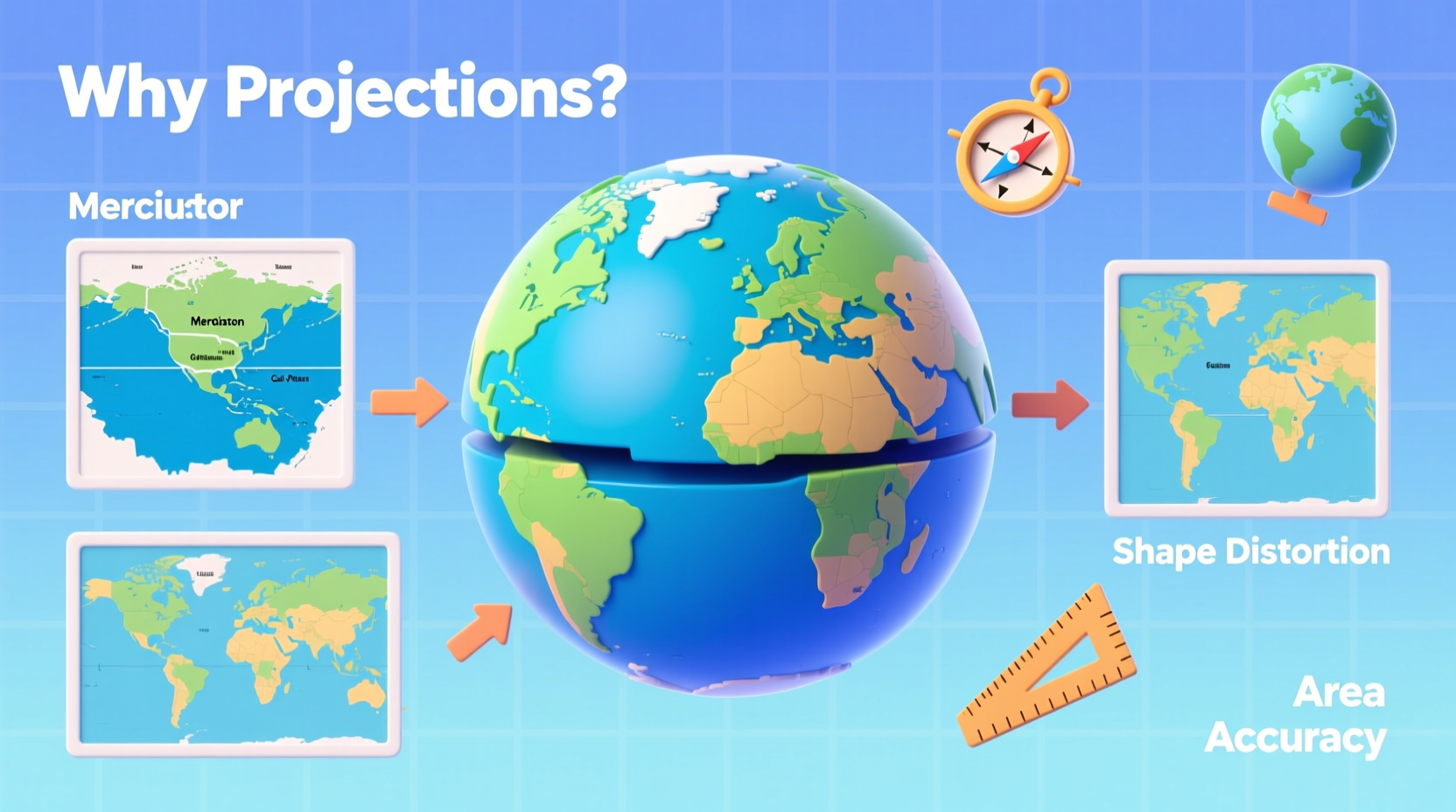
Imagine trying to flatten an orange peel without tearing or stretching it. No matter how carefully you try, the peel will either crack or distort. The same principle applies to Earth’s surface. A globe is the only truly accurate way to represent the planet because it maintains correct proportions, distances, and angles across its curved surface. But globes are impractical for many uses—too bulky to carry, difficult to annotate, and limited in scale.
This is why cartographers rely on map projections: mathematical transformations that convert the 3D coordinates of latitude and longitude into 2D plane coordinates. While effective, this process inevitably distorts reality. No flat map can perfectly preserve all spatial properties at once. The core issue lies in geometry: a sphere has positive curvature, while a plane has zero curvature. You cannot “unfold” one into the other without deformation.
“Map projections are not about finding the perfect map—they’re about choosing the right trade-offs for your purpose.” — Dr. Rebecca Langston, Geospatial Scientist, National Cartographic Institute
Types of Distortion in Map Projections
All map projections distort at least one of four key spatial properties:
- Shape (Conformality): Whether local angles and shapes are preserved. Conformal projections maintain accurate shapes over small areas but often exaggerate size, especially near the poles.
- Area (Equivalence): Whether relative sizes of regions are true to reality. Equal-area projections preserve landmass proportions but may stretch or compress shapes.
- Distance: Whether measured distances between points remain consistent. Only specific projections maintain accurate distances along certain lines.
- Direction (Azimuthality): Whether directions from a central point to others are correct. Useful for navigation and radio signal mapping.
No single projection can retain all four properties simultaneously. For example, the Mercator projection preserves shape and direction but grossly inflates the size of landmasses like Greenland and Antarctica, making them appear larger than continents such as Africa, which is actually 14 times bigger.
Common Map Projections and Their Trade-offs
Different projections serve different purposes based on their distortion profiles. Below is a comparison of widely used projections:
| Projection | Preserves | Distorts | Best Used For |
|---|---|---|---|
| Mercator | Shape, Direction | Area (severe at high latitudes) | Nautical navigation, online maps |
| Robinson | Balanced appearance | Moderate in all categories | General world maps, education |
| Gall-Peters | Area | Shape (extreme stretching) | Social justice, comparative geography |
| Winkel Tripel | Low overall distortion | Slight in all categories | Atlas maps (e.g., National Geographic) |
| Azimuthal Equidistant | Distance and direction from center | Area and shape away from center | Polar routes, UN emblem |
The choice of projection influences perception. For instance, the widespread use of the Mercator projection in classrooms has led generations to misjudge the relative sizes of countries, reinforcing geographic misconceptions. In contrast, the Gall-Peters projection, though visually unappealing due to stretched shapes, highlights global equity by showing developing nations at their true size.
Real-World Implications: A Case Study in Education
In 2017, Boston Public Schools made headlines by switching from Mercator-based wall maps to the Gall-Peters projection in classrooms. The decision followed a growing awareness that students were forming skewed perceptions of the world. One teacher observed that students often believed Greenland was comparable in size to Africa—a misconception reinforced by traditional maps.
After the switch, educators reported increased student engagement in discussions about global inequality, colonialism, and environmental justice. Seeing Africa, South America, and Southeast Asia represented more proportionally helped students contextualize issues like climate vulnerability and economic disparity. While the Gall-Peters projection introduced new visual distortions, its emphasis on area accuracy served the educational goal better than aesthetic appeal.
This case illustrates that map projections are not neutral. They carry implicit values and influence how we understand space, power, and relationships between regions.
How to Choose the Right Projection: A Practical Checklist
Selecting an appropriate map projection depends on your objective. Use the following checklist to guide your decision:
- ✅ Define the map’s purpose: Is it for navigation, education, data analysis, or presentation?
- ✅ Identify critical spatial properties: Do you need accurate areas? True shapes? Reliable distances?
- ✅ Consider the region of focus: Polar, equatorial, or global coverage?
- ✅ Evaluate audience expectations: Will users be familiar with non-traditional projections?
- ✅ Test readability: Does the projection make patterns clear without excessive warping?
- ✅ Cite the projection: Always label which projection is used to promote transparency.
Minimizing Misinterpretation: Best Practices
To reduce errors in interpretation, follow these steps when working with or viewing maps:
- Always identify the projection—know what kind of distortion to expect.
- Use interactive or dynamic maps when possible, allowing users to switch projections or view globe comparisons.
- Pair maps with data visualizations that account for area distortion, especially in thematic mapping.
- Educate viewers about the limitations of flat maps through captions or footnotes.
- Prefer multiple views—combine projections to show different aspects of the same data.
Frequently Asked Questions
Why can’t we just use globes instead of flat maps?
Globes are accurate but impractical for detailed work, portability, or large-scale data display. Flat maps allow zooming, printing, layering information, and integration into digital platforms—making them essential despite their distortions.
Is there a “best” map projection?
There is no universally best projection. The Winkel Tripel is widely respected for minimizing overall distortion and is used by National Geographic, but even it makes compromises. The best choice depends entirely on context and purpose.
Can technology eliminate map projection distortions?
While 3D globes in digital environments (like Google Earth) reduce reliance on flat projections, most applications still require 2D representations. Augmented reality and virtual globes help, but projections remain necessary for print, web maps, and analytical models.
Conclusion: Embracing the Imperfect Map
Map projections are not flaws—they are solutions to an impossible geometric task. Recognizing their necessity and understanding their distortions empowers us to use maps more critically and effectively. Whether you're a student, traveler, researcher, or policymaker, being projection-literate means asking the right questions: What does this map show well? What does it hide? And who benefits from this view?
Next time you look at a world map, pause and ask: What projection is this? What am I not seeing clearly? By cultivating this awareness, we move beyond passive consumption to informed interpretation—one of the most important skills in our increasingly mapped world.


 浙公网安备
33010002000092号
浙公网安备
33010002000092号 浙B2-20120091-4
Comments
No comments yet. Why don't you start the discussion?