
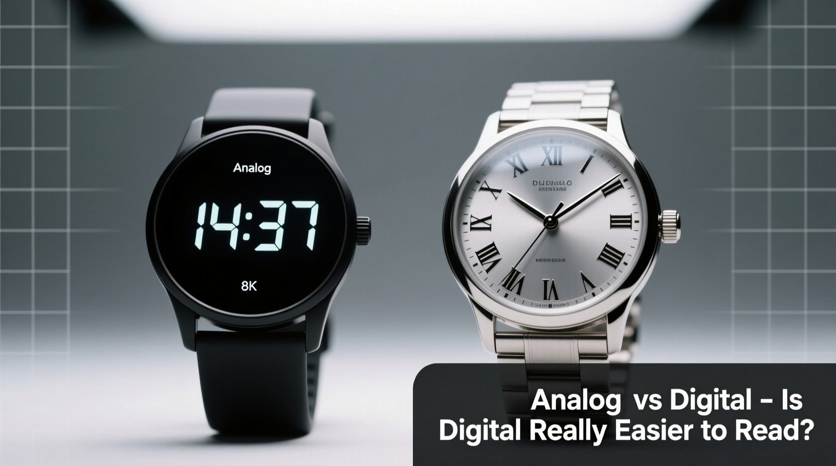
When it comes to telling time, the debate between analog and digital watches isn’t just about style or nostalgia—it’s fundamentally about readability. At first glance, digital watches appear simpler: numbers flash clearly, no interpretation needed. But is that always true? In practice, readability depends on more than just display type. It involves human cognition, environmental conditions, user habits, and even age-related vision changes. The assumption that digital is inherently easier to read doesn’t hold up under closer scrutiny.
This article examines the real-world performance of analog and digital watches in terms of readability, exploring how each functions across different scenarios—from quick glances during a meeting to checking the time while jogging at dawn. We’ll look at cognitive processing, visual clarity, design variations, and user needs to answer the central question: Are digital watches truly easier to read?
The Cognitive Mechanics of Telling Time
How we process time differs significantly between analog and digital displays. Digital watches present time as raw data: “9:47” appears instantly, requiring minimal mental effort to decode. This directness is their primary advantage—especially for children learning to tell time or individuals with cognitive impairments who benefit from literal representations.
Analog watches, by contrast, rely on spatial recognition. The positions of hour and minute hands form a pattern that the brain learns to interpret almost subconsciously. Over time, experienced users don’t “calculate” the time—they see it as a shape. A slightly past-the-hour hand position might register instantly as “just after 3,” without needing to parse numerals.
“Analog dials train the brain to estimate time intervals visually, which can enhance time awareness.” — Dr. Lena Patel, Cognitive Psychologist specializing in perception
This intuitive grasp gives analog watches an edge in estimating duration. For example, seeing that the minute hand is two-thirds of the way around the dial immediately suggests “about 40 minutes past,” whereas a digital display requires mental subtraction to reach the same conclusion. In fast-paced environments where timing matters—like sports coaching or medical rounds—this subtle difference can be meaningful.
Visual Clarity in Different Conditions
Readability isn’t static; it shifts with lighting, motion, and viewing angle. Let’s break down how analog and digital perform across key variables:
| Condition | Analog Watch | Digital Watch |
|---|---|---|
| Low Light | Luminous hands and markers work well if charged; older models may fade quickly | Backlit LCD or LED screens offer instant visibility but can cause glare |
| Bright Sunlight | Matt dials with high-contrast markers remain legible; reflective crystals can hinder | LCD screens often wash out in direct sun; OLED performs better but drains battery |
| Motion (e.g., running) | Hands may blur; fixed indices help maintain reference points | Numerals stay sharp, but screen refresh rate can lag slightly |
| Peripheral Glance | Familiar hand patterns allow reading without focus | Requires focused attention to parse digits |
In low-light situations, many digital watches shine—literally. Backlighting ensures immediate legibility, a feature most analog watches lack unless equipped with robust lume. However, that backlight can be disruptive in dark rooms or during night shifts, momentarily affecting night vision.
User Demographics and Readability Needs
Not all users have the same requirements. Children, seniors, and people with dyslexia or visual processing disorders often find digital displays easier because they eliminate symbolic interpretation. For these groups, seeing “7:15” removes ambiguity.
However, older adults with presbyopia (age-related farsightedness) may struggle with small digital fonts, especially on compact fitness trackers. Analog watches with large, bold numerals and high-contrast dials—such as those designed for pilots or divers—can actually offer superior legibility.
A 2021 study by the Vision Research Institute found that adults over 65 were 23% faster at reading time from a well-designed analog face than from a cluttered digital display with secondary metrics like date, step count, and notifications. The takeaway? Simplicity matters more than format.
Mini Case Study: Emergency Medical Technician (EMT) Field Test
An urban EMS team tested both watch types during 12-hour shifts. Paramedics wore either a minimalist analog dive watch or a rugged digital multi-function model. After four weeks, 70% preferred the analog option for one reason: speed of time assessment during patient care.
One EMT noted, “When I’m logging medication times, I don’t need to ‘read’ the watch—I feel the hand position. It’s like muscle memory. With the digital one, I had to stop and focus each time.”
The digital watch offered advantages in stopwatch accuracy and elapsed time tracking, but for core time-telling, the analog model won on instinctive readability.
Design Evolution and Hybrid Solutions
Modern technology has blurred the line between analog and digital. Smartwatches now mimic analog faces with digital precision, offering the best of both worlds. Some e-ink watches combine low-power digital displays with analog-style layouts, maintaining clarity without constant backlight use.
Hybrid watches—mechanical hands with hidden digital sensors—allow wearers to access alarms, timers, and notifications while preserving the clean look of analog. These cater to users who value tradition but need modern functionality.
Yet even within categories, design choices heavily influence readability. A poorly laid-out digital display with tiny characters and excessive icons can be harder to parse than a well-proportioned analog dial with luminous markers and cathedral hands.
Checklist: Choosing for Readability
- ✅ Assess your primary use case: quick glances, outdoor activity, professional settings
- ✅ Prioritize contrast—black-on-white or white-on-black works best
- ✅ Ensure adequate size: larger cases (40mm+) improve legibility
- ✅ Test luminosity if used in low light
- ✅ Avoid overly complex dials with multiple subdials or crowded digital menus
- ✅ Consider viewing distance and angle (e.g., desk work vs. fieldwork)
FAQ
Are digital watches better for people with poor eyesight?
It depends. Large-digit digital watches with high contrast can help, but some users find the brightness overwhelming. Analog watches with oversized numerals and glowing hands—like those in the “senior” category—can be equally effective. The key is customization to individual vision needs.
Do analog watches take longer to read?
For beginners, yes. But with regular use, most adults develop rapid pattern recognition. Studies show that experienced users read analog time in under 0.5 seconds—comparable to digital. The initial learning curve shouldn’t overshadow long-term efficiency.
Can a smartwatch be as readable as a traditional watch?
Some can. Models with always-on e-ink or transflective displays maintain visibility in sunlight and reduce eye strain. However, most rely on active backlights that dim when not in use, creating delays. Choose a smartwatch with a true analog mode if readability is critical.
Conclusion: Format Isn’t Everything—Context Is King
The idea that digital watches are universally easier to read is a myth rooted in oversimplification. While digital displays offer literal, immediate information, analog watches provide intuitive, spatial understanding that often translates to faster real-world use. Readability isn’t determined by technology alone—it’s shaped by design, environment, and personal habit.
Instead of defaulting to digital for clarity, consider what you’re using the watch for. Need split-second precision during workouts? A digital timer excels. Prefer seamless time checks throughout the day? A well-crafted analog dial might serve you better. And don’t overlook hybrids—they’re redefining what readability means in the 21st century.


 浙公网安备
33010002000092号
浙公网安备
33010002000092号 浙B2-20120091-4
Comments
No comments yet. Why don't you start the discussion?