
For decades, holiday decorating advice leaned heavily toward uniformity: all glass, all gold, all vintage, or all rustic. But today’s most compelling trees—those featured in design magazines, styled for boutique windows, or photographed for Instagram feeds—rarely obey that rule. Instead, they thrive on contrast: rough linen ribbons beside polished mercury glass, hand-thrown ceramic baubles next to high-shine acrylic spheres, matte-finish wood slices nestled between mirrored brass stars. The real question isn’t whether you *can* mix matte and glossy ornaments—it’s whether you can do it with intention, balance, and quiet sophistication. The answer is a resounding yes—if you understand light, texture, rhythm, and restraint.
Why the Fear of Mixing Finishes Exists (and Why It’s Overblown)
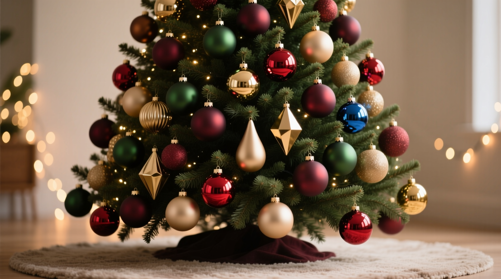
The hesitation around mixing matte and glossy finishes stems from two common misconceptions. First, that “matching” equals harmony—when in truth, harmony is born from thoughtful contrast, not sameness. Second, that gloss automatically reads as “cheap” or “tacky,” especially when paired with natural or artisanal elements. Neither holds up under scrutiny. Glossy surfaces reflect ambient light, adding dimension and sparkle; matte surfaces absorb light, lending depth, warmth, and grounding presence. Used together, they create visual breathing room—gloss draws the eye, matte gives it somewhere to rest.
Interior designer Lena Torres, whose work has been featured in Architectural Digest and Martha Stewart Living, puts it plainly: “A tree made entirely of one finish feels flat—not festive, but fatigued. Light needs variation to feel alive. A single glossy red ball among dozens of matte velvet ones doesn’t disrupt the scene; it becomes a punctuation mark. It says, ‘Look here.’ And then the eye moves on, enriched by the contrast.”
The 5-Point Texture Balance Framework
Successful mixing relies less on rigid rules and more on calibrated relationships. Think of your tree as a three-dimensional composition where light, scale, color, material, and placement interact. Use this framework to guide decisions—not as a checklist, but as a lens for evaluation.
- Anchor with matte: Begin with matte ornaments as your foundational layer—60–70% of your total ornament count. These provide tonal consistency and visual weight. Think wool-felt stars, clay-dipped pinecones, unfinished wood slices, or brushed-metal bells.
- Accent with gloss: Reserve glossy pieces for deliberate emphasis—no more than 20–30% of your ornaments. Prioritize them at key focal points: the outer tips of strong branches, near the tree topper, or clustered in small groupings (3 or 5) at eye level.
- Unify through color—not finish: Choose a cohesive palette (e.g., deep forest green, charcoal, cream, and burnt sienna) and apply both matte and gloss versions within it. A matte sage sphere and a glossy sage teardrop belong to the same family—even if their surfaces behave differently.
- Vary scale, not just sheen: Pair a large matte ornament (e.g., 4-inch burlap-wrapped sphere) with a small glossy one (e.g., 1-inch mirrored star). Scale contrast prevents visual competition and reinforces hierarchy.
- Introduce a third texture: Add tactile variety with something neither matte nor glossy—like woven rattan, raw-edged linen, or hammered metal. This triad (matte + gloss + neutral texture) creates fullness without chaos.
Do’s and Don’ts: A Practical Decision Table
| Situation | Do | Don’t |
|---|---|---|
| Ornament distribution | Cluster glossy pieces in intentional groupings of odd numbers (3 or 5), spaced evenly around the tree. | Scatter single glossy ornaments haphazardly—especially near the trunk or lower branches where they’ll compete for attention. |
| Color coordination | Use the same hue across both finishes (e.g., matte navy velvet + glossy navy acrylic). | Mix finishes within clashing colors (e.g., matte lime green + glossy hot pink)—this amplifies dissonance, not contrast. |
| Material pairing | Pair matte ceramics with glossy glass, or matte wood with glossy metal—complementary material families. | Combine matte plastic with glossy plastic—they’re too similar in origin and lack textural distinction. |
| Lighting interaction | Place glossy ornaments where ambient light naturally falls—near windows, above lamps, or opposite existing light sources. | Hang glossy ornaments deep inside dense branch clusters where light can’t reach them—they’ll vanish, not shine. |
| Visual rhythm | Alternate matte-gloss-matte-gloss along horizontal sightlines (e.g., eye-level ring around the tree). | Stack multiple glossy ornaments vertically on one branch—creates a “glare line” that breaks flow. |
A Real-World Case Study: The Brooklyn Brownstone Tree
In December 2023, interior stylist Maya Chen styled a 7.5-foot Nordmann fir for a client’s historic Brooklyn brownstone. The space featured exposed brick, black steel beams, and warm oak floors—rich textures demanding a tree with equal gravitas and lightness. Maya began with a core palette: charcoal, oyster white, oxidized copper, and deep plum. Her ornament inventory included:
- Matte: Hand-dipped wool felt balls (charcoal & plum), unglazed stoneware pears (copper), dried eucalyptus bundles wrapped in undyed linen
- Glossy: Mercury glass orbs (oyster white), blown-glass teardrops (plum), copper-plated brass stars (oxidized finish with subtle reflective sheen)
Her process was methodical: She first hung all matte ornaments—spacing them generously to avoid crowding. Then, she identified three “light zones”: the upper third (near the topper), the midsection at seated-eye level (54–60 inches), and the outer perimeter of the lower branches. Into those zones, she placed glossy pieces in tight trios—never more than five per zone. Crucially, she avoided matching shapes: a glossy orb sat beside a matte pear; a glossy star hovered above a matte linen bundle. The result? A tree that felt layered, collected, and quietly luxurious—not busy, not bland, but deeply intentional. Clients reported guests repeatedly commenting, “It looks like it belongs here—not like a decoration, but like part of the architecture.”
Step-by-Step: Building Your Balanced Tree in 7 Actions
- Start bare: Remove all existing ornaments. Fluff branches fully. Assess natural light patterns—where does sun hit? Where are lamps positioned?
- Sort and categorize: Separate ornaments into three piles: Matte, Glossy, and Neutral Texture (e.g., woven, knotted, raw-edge). Count each pile.
- Establish your anchor ratio: Aim for 65% matte, 25% glossy, 10% neutral texture. Adjust slightly if your glossy pile contains many small pieces (they read lighter visually).
- Hang matte first—strategically: Begin at the trunk and work outward. Place larger matte ornaments deeper in the tree; smaller ones toward tips. Leave consistent negative space between them—no touching.
- Map glossy placements: Using painter’s tape, lightly mark 3–5 spots per “light zone” (upper, mid, lower-perimeter). Avoid symmetry—stagger heights and angles.
- Add gloss in clusters: Hang 3 glossy ornaments per marked spot—varying shape or orientation (e.g., one sphere, one teardrop, one star). Ensure at least one faces forward.
- Weave in neutral texture: Tuck in your neutral pieces last—draping linen ribbons, wrapping branches with jute, or tucking dried botanicals into gaps. Let them soften transitions between matte and gloss.
FAQ: Addressing Common Concerns
Won’t glossy ornaments make my tree look dated or overly commercial?
Not if they’re curated with restraint and context. Vintage mercury glass, hand-blown Czech glass, or sustainably plated brass carry inherent craftsmanship that elevates—not cheapens—the display. The issue isn’t gloss itself, but mass-produced, overly bright plastic ornaments with no material integrity. Choose pieces with substance: thickness, weight, subtle imperfections. A heavy, softly reflective glass orb reads as heirloom; a thin, hyper-reflective plastic ball reads as disposable.
What if I only have a few glossy ornaments—and mostly matte?
This is ideal. A small number of glossy accents creates powerful focal points without overwhelming. In fact, scarcity increases impact. Treat each glossy piece like a jewel: place it where it catches light meaningfully, and surround it with complementary matte textures (e.g., a glossy brass star nestled in a nest of matte wool garlands and dried lavender). Less truly is more—especially when light does the work.
Can I mix matte metallics (like brushed gold) with glossy metallics (like polished silver)?
Absolutely—and it’s one of the most sophisticated combinations possible. Brushed, hammered, or antiqued metals are technically matte in reflectivity but carry luminous warmth. Polished silver or chrome delivers cool, crisp reflection. Together, they echo the interplay of sunlight and moonlight. Just ensure undertones align: warm matte gold pairs beautifully with warm glossy brass, but clashes subtly with cool glossy nickel. When in doubt, hold samples side-by-side under your room’s actual lighting.
The Quiet Confidence of Intentional Contrast
Mixing matte and glossy ornaments isn’t about defying tradition—it’s about honoring how we actually experience beauty. We don’t live in monochrome worlds. We move from the soft glow of candlelight to the sharp gleam of rain-slicked pavement, from the velvety nap of a cashmere scarf to the liquid shimmer of a wine glass. Our eyes are wired to appreciate nuance, not uniformity. A tree that embraces both matte and glossy finishes, handled with care and clarity, becomes more than seasonal decor. It becomes a quiet statement about comfort with complexity—a reminder that richness lives in layers, not lines.
There’s no universal “right” combination, because your tree isn’t meant to match a magazine spread. It’s meant to resonate with your space, your light, your story. So trust your eye. Start small—add just three glossy ornaments to your existing matte collection this year. Notice where light catches them. Notice where your gaze rests longest. Refine next season. Decorate not to impress, but to inhabit—deeply, thoughtfully, and with full sensory presence.


 浙公网安备
33010002000092号
浙公网安备
33010002000092号 浙B2-20120091-4
Comments
No comments yet. Why don't you start the discussion?