
Checkered patterns—whether classic black-and-white, soft pastels, or bold jewel tones—have long held a place in design history. From Victorian-era floor tiles to mid-century modern textiles, the grid-like motif brings rhythm, contrast, and structure to any space. Far from outdated or overly traditional, today’s designers are reimagining checkered elements in fresh, sophisticated ways. When used thoughtfully, this pattern can anchor a room, define zones, and add depth without overwhelming. The key lies not in avoiding it, but in mastering its application across different textures, scales, and settings.
1. Start with Flooring: Timeless Appeal Underfoot
One of the most enduring uses of checkered patterns is in flooring. Think of iconic entryways with alternating black and white marble tiles or vintage kitchens with checkerboard linoleum. These designs don’t just stand the test of time—they often become the focal point of a room.
Modern interpretations allow for subtlety. Consider using warm gray and cream porcelain tiles in a 6x6 inch grid for a softer take on the classic look. Or opt for encaustic cement tiles in terracotta and sage green to bring Mediterranean charm into a sunroom or bathroom.
In open-concept homes, use checkered flooring to subtly demarcate areas—like placing a checker tile rug under a dining table to distinguish it from a living zone. This works especially well in monochrome schemes where texture and pattern provide contrast instead of color.
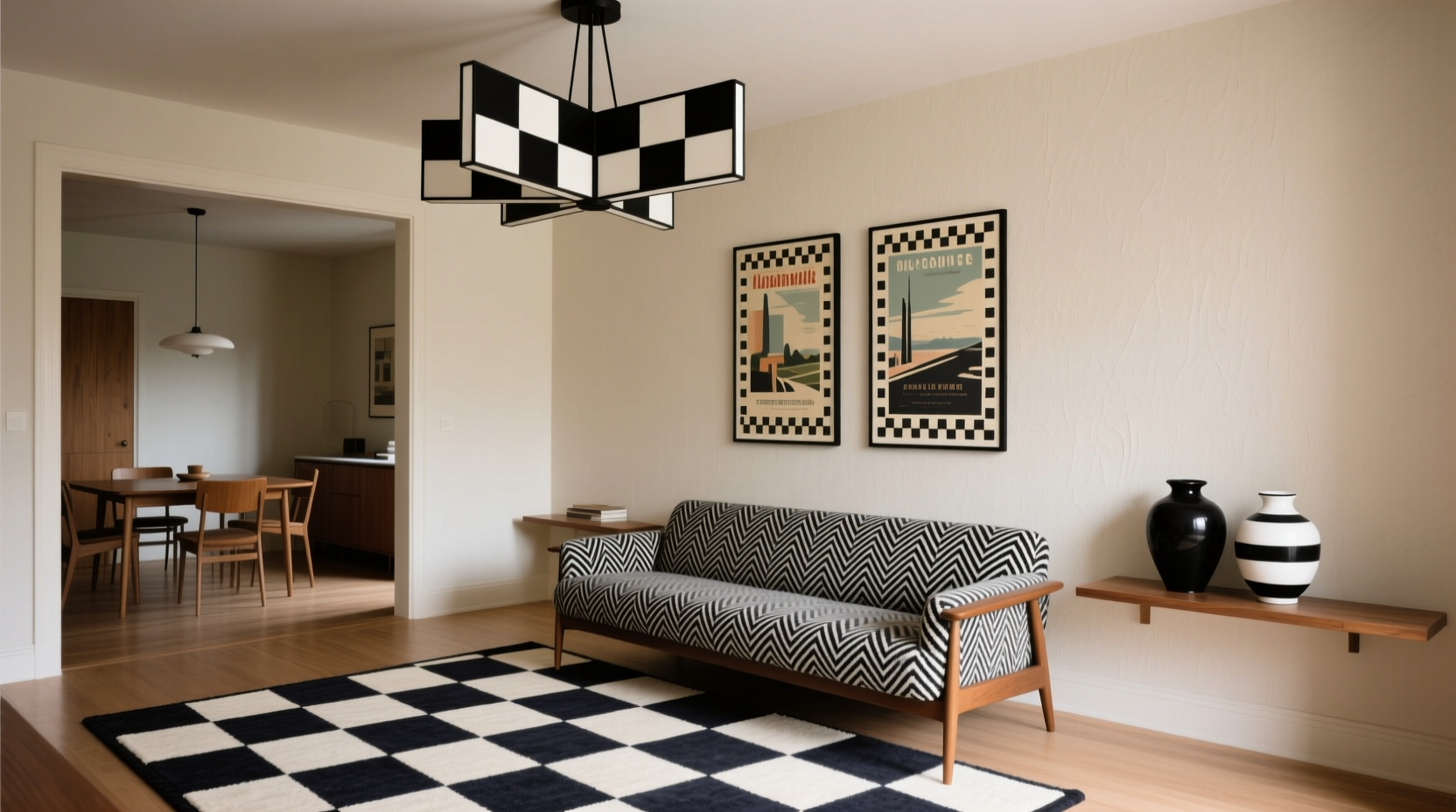
2. Reimagine Textiles: From Curtains to Throws
Textiles offer a low-commitment way to introduce checkered patterns. A throw blanket draped over a neutral sofa, curtains framing a window, or even a set of dining chair cushions can instantly elevate a space.
Varying the scale of the check adds dimension. For instance, small gingham on dining napkins complements larger checks on upholstered headboards. Mix cotton checks with wool plaids for layered texture in bedrooms.
“Pattern mixing is about balance, not avoidance. A well-placed check can ground busier prints like florals or geometrics.” — Lena Torres, Interior Stylist & Author of *Pattern Play*
For a contemporary twist, consider tonal checks—where the squares differ only slightly in shade. A charcoal-gray-on-slate check on linen drapes creates movement without stark contrast, ideal for minimalist or Scandinavian interiors.
Textile Application Checklist
- Choose one dominant checkered textile per room
- Pair with solid neutrals to prevent overwhelm
- Mix fabric weights (e.g., cotton, velvet, wool)
- Avoid matching checks exactly—vary scale or hue
- Use washable materials in high-traffic areas
3. Scale and Proportion: Mastering Visual Impact
The size of the check dramatically affects how it reads in a space. Small checks (like gingham) feel cozy and cottage-like; large checks (24 inches and up) make bold architectural statements.
In compact rooms, oversized checks can create optical illusions—large floor tiles aligned diagonally can make a narrow hallway appear wider. Conversely, tiny checks on wallpaper suit powder rooms or reading nooks, adding intimacy without heaviness.
| Check Size | Best Use Cases | Recommended Color Contrast |
|---|---|---|
| Micro (under 2\") | Accent pillows, stationery, trim details | Low to medium |
| Small (2–6\") | Curtains, bedding, kitchen towels | Medium |
| Medium (6–12\") | Floor tiles, area rugs, upholstery | Medium to high |
| Large (12\"+) | Feature walls, accent ceilings, statement furniture | High for drama, low for subtlety |
4. Unexpected Surfaces: Ceilings, Backsplashes, and Furniture
To truly innovate with checkered patterns, think beyond floors and fabrics. Designers are now applying checks to overlooked surfaces for maximum impact.
A painted checkered ceiling in a breakfast nook draws the eye upward and adds whimsy. Use semi-gloss paint for durability and clean lines—taping is essential. Alternatively, install peel-and-stick vinyl tiles on a backsplash for a retro kitchen update without renovation costs.
Furniture upgrades are another frontier. Reupholster an old bench in black-and-white checkered fabric, or paint a bookshelf with alternating colored cubbies. Even drawer interiors lined with checkered paper add a delightful surprise when opened.
Step-by-Step: Paint a Checkered Accent Wall
- Select two complementary paint colors—one dominant, one accent.
- Measure and mark grid lines with a level and pencil (e.g., 12-inch squares).
- Apply painter’s tape along all lines, pressing edges firmly to prevent bleed.
- Paint alternate squares in the accent color; let dry completely.
- Touch up corners and remove tape carefully once fully cured.
- Style with neutral art or furniture to let the wall shine.
5. Real-World Inspiration: A Brooklyn Brownstone Entryway
In a recent project, designer Mara Chen transformed a dim, narrow entry in a Brooklyn brownstone using a diagonal black-and-white checkered floor. The client wanted vintage charm without feeling dated.
Chen chose matte-finish ceramic tiles cut to 8x8 inches and installed them at a 45-degree angle. She paired the floor with a walnut console table and brass mirror to warm the monochrome base. Walls were painted Benjamin Moore’s “White Dove” to reflect light, while a single checkered umbrella stand added playful continuity.
“The diagonal layout made the tight space feel larger and more intentional,” Chen noted. “It’s not just a pattern—it’s spatial strategy.”
Common Pitfalls and How to Avoid Them
Despite its versatility, the checkered pattern can go wrong if misapplied. Overuse leads to visual fatigue; poor alignment breaks the illusion of order. Here’s what to watch for:
- Overloading the room: Stick to one or two checkered elements per space unless layering intentionally.
- Ignoring lighting: High-contrast checks in dark rooms can feel oppressive. Opt for softer tones or smaller scales in low-light areas.
- Skipping prep work: Misaligned tiles or crooked paint lines undermine the precision that makes checks effective.
- Clashing with existing architecture: Avoid competing patterns—don’t pair checkered walls with busy wallpaper elsewhere.
FAQ
Can I mix checkered patterns with other prints?
Yes, but follow the rule of thirds: pair checkered elements with one other dominant pattern (like stripes or florals), and anchor both with solids. Ensure one pattern is clearly dominant in scale or placement.
Is checkered decor suitable for small spaces?
Absolutely—especially when used strategically. Small checks add texture without taking visual space, and large checks laid diagonally can enhance perceived dimensions. Just maintain ample negative space around the pattern.
What colors work best for a timeless checkered look?
Classic combinations like black-and-white, navy-and-cream, or charcoal-and-linen transcend trends. For warmth, try terra cotta and sand or olive green and beige. Avoid overly bright or neon hues unless aiming for a temporary, themed look.
Conclusion: Make the Pattern Work for You
The checkered pattern isn’t a relic of the past—it’s a dynamic design tool waiting to be rediscovered. Whether through heritage-inspired tilework or a daring ceiling installation, its structured rhythm brings clarity and character to modern interiors. The secret lies in intentionality: choosing the right scale, color, and surface to match your lifestyle and aesthetic goals.


 浙公网安备
33010002000092号
浙公网安备
33010002000092号 浙B2-20120091-4
Comments
No comments yet. Why don't you start the discussion?