
Red is a powerful color—energizing, passionate, and undeniably bold. When used as a dominant hue in home decor, especially on furniture or walls, it sets a strong tone. But pairing accessories like pillow covers with a red background can be intimidating. Too much contrast feels chaotic; too little creates visual flatness. The key lies not in avoiding red, but in mastering how to complement it with intention. Thoughtful pillow cover pairings can elevate your space from overwhelming to opulent, balancing warmth, texture, and harmony.
Understanding the Psychology and Impact of Red
Before selecting pillow covers, it’s essential to recognize what red brings to a room. As one of the most emotionally charged colors, red stimulates conversation, increases heart rate, and draws immediate attention. Interior designers often use it in living rooms and dining areas where engagement and energy are desired. However, its intensity means surrounding elements must be carefully curated to prevent sensory overload.
A red background—whether from a sofa, accent wall, or large textile—acts as a focal point. Pillow covers layered over or beside it should either soften its dominance or enhance its richness without competing. This balance is achieved through thoughtful consideration of undertones, saturation, and complementary palettes.
Color Pairing Strategies That Work
The success of any pillow arrangement depends on how well the colors interact with the red base. Here are five proven strategies:
- Neutral Anchors: Cream, beige, taupe, or soft gray pillow covers provide breathing room. They tone down the vibrancy of red while adding sophistication.
- Complementary Contrast: Green, the direct complement of red on the color wheel, offers striking contrast. Use sage, olive, or forest green in muted tones to avoid clashing.
- Analogous Harmony: Combine red with adjacent hues like burnt orange, deep coral, or terracotta. This creates a warm, cohesive palette ideal for cozy spaces.
- Monochromatic Layering: Use varying shades of red—from cherry to burgundy to rust—in different textures. This adds depth without introducing new colors.
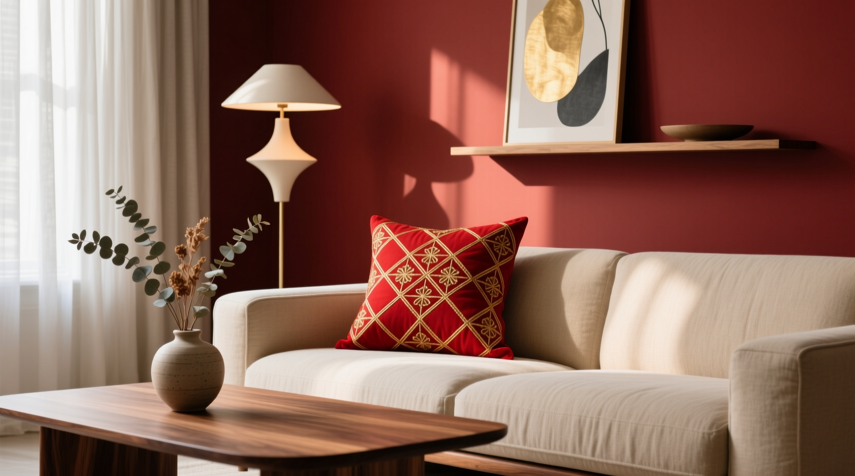
- Accent Pops: Introduce small doses of gold, mustard yellow, or navy blue through patterned or textured pillow covers to create visual interest.
“Red doesn’t need to be tamed—it needs context. A well-chosen neutral or earth tone gives it room to breathe.” — Lena Torres, Interior Stylist & Color Consultant
Texture and Pattern: Beyond Color
While color is critical, texture and pattern play equally important roles in achieving a stylish look. A red background benefits from tactile variety to prevent a flat appearance. Consider mixing materials such as:
- Linen – adds natural, relaxed texture
- Velvet – introduces luxury and depth, especially in darker tones
- Cotton canvas – offers durability and a casual feel
- Embroidered fabrics – bring intricate detail and artistry
- Faux fur or bouclé – add softness and dimension
When combining patterns, follow the rule of thirds: one bold print, one medium-scale design, and one solid or subtle texture. For example, pair a geometric tribal print in cream and black with a solid velvet olive pillow and a nubby linen in sand.
| Texture Type | Best Paired With (on Red) | Avoid |
|---|---|---|
| Velvet | Burgundy, emerald, gold | Shiny synthetics (can look cheap) |
| Linen | Cream, sage, charcoal | Overly bright patterns |
| Knit or Bouclé | Taupe, rust, ivory | Heavy brocades (too bulky) |
| Embroidery | Black, white, ochre | Clashing motifs (e.g., florals with geometrics) |
Step-by-Step Guide to Styling Pillow Covers on a Red Background
Follow this sequence to create a balanced and intentional pillow arrangement:
- Assess the red element: Is it a sofa, chair, or wall? Determine its size and prominence in the room.
- Choose a base palette: Decide whether you want calming neutrals, bold contrasts, or warm analogs.
- Select 3–5 pillow covers: Include at least one solid, one textured, and one patterned option.
- Test combinations: Lay them out on the floor first. Step back and evaluate balance.
- Arrange on furniture: Use the “odd numbers” rule—three or five pillows usually look more natural than even counts.
- Add finishing touches: Incorporate a throw blanket in a coordinating tone to unify the look.
Real Example: Transforming a Crimson Sofa
Sophie, a graphic designer in Portland, inherited a vintage crimson velvet sofa. While she loved its character, the room felt unbalanced. She started by introducing two large cream linen pillows to soften the red. Then, she added a pair of smaller cushions: one in forest green velvet and another in a black-and-white ikat pattern. Finally, she included a lumbar pillow in burnt orange suede for warmth.
The result? A living room that felt both vibrant and grounded. Guests consistently remarked on the \"effortless elegance\" of the space. By using texture contrast and a thoughtfully layered palette, Sophie turned a potentially overpowering piece into a sophisticated centerpiece.
Checklist: Perfect Pillow Pairing with Red
Use this checklist before finalizing your pillow selection:
- ✅ Identified the undertone of the red (warm or cool)
- ✅ Chose at least one neutral-toned pillow for balance
- ✅ Included multiple textures (e.g., velvet + linen)
- ✅ Limited bold patterns to one or two pillows max
- ✅ Ensured color harmony across all elements (rugs, curtains, art)
- ✅ Tested arrangement before permanent placement
- ✅ Considered seasonal adaptability
Frequently Asked Questions
Can I use patterned pillow covers with a red background?
Absolutely—just ensure the pattern includes at least one color that complements red, such as cream, black, olive, or navy. Avoid overly busy prints that compete for attention. Small-scale geometrics or classic damasks work best.
What if my red furniture feels too loud?
Introduce neutral pillows in off-white, beige, or light gray to create visual calm. Layer with a textured throw in a similar range. You can also add plants or artwork with green tones to naturally balance the red.
Are metallic accents safe with red?
Yes—gold, brass, or copper accents in pillow trims or decorative tassels add glamour and warmth. Just use them sparingly. A gold-fringed pillow or one with metallic thread embroidery can elevate the look without overwhelming it.
Conclusion: Confidence in Color Coordination
Matching pillow covers with a red background isn’t about playing it safe—it’s about embracing boldness with intelligence. By understanding color dynamics, leveraging texture, and applying strategic layering, you can turn a daring red statement into a refined, inviting space. Whether your style leans modern, bohemian, or traditional, the right pillow combination will reflect your personality while maintaining harmony.


 浙公网安备
33010002000092号
浙公网安备
33010002000092号 浙B2-20120091-4
Comments
No comments yet. Why don't you start the discussion?