
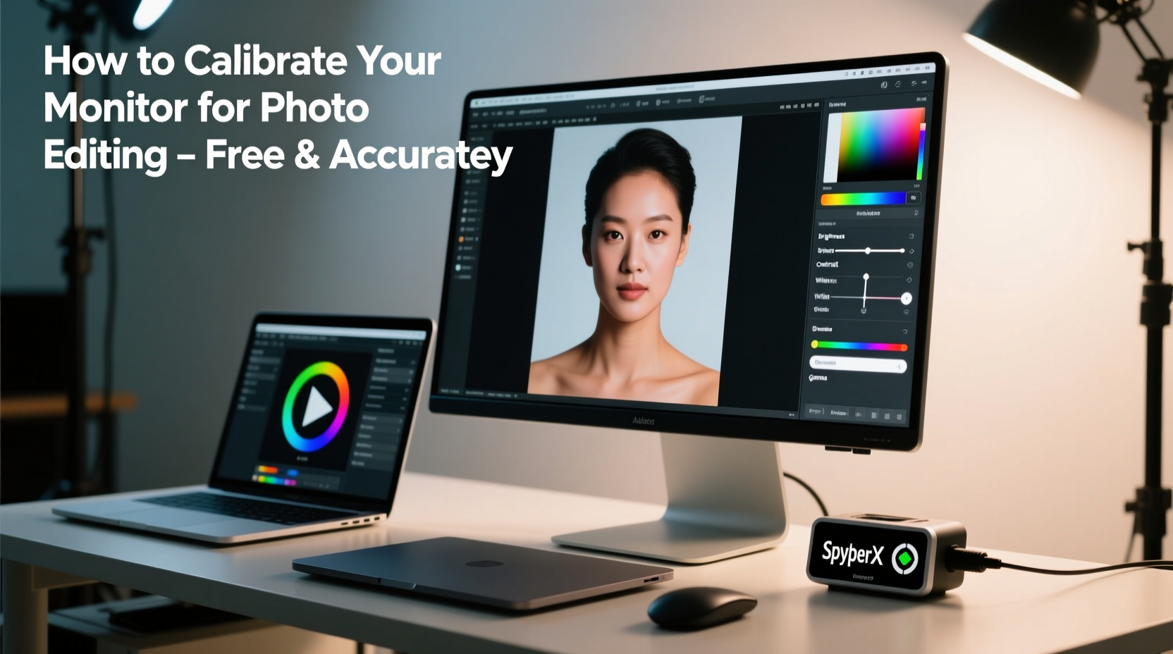
Accurate color representation is essential for photo editors, whether you're a hobbyist or a professional working toward client delivery. Without proper calibration, the vibrant red in your image might appear dull on another screen, or skin tones could look unnaturally warm. While high-end colorimeters can cost hundreds of dollars, not every editor needs to invest in one. With careful manual adjustments and free software tools, you can achieve surprisingly accurate results—especially if you understand the fundamentals of display behavior and lighting conditions.
The goal isn’t perfection at the expense of accessibility, but consistency and reliability within your workflow. By leveraging built-in operating system tools, free calibration software, ambient light awareness, and visual test methods, you can significantly improve your monitor’s color accuracy. This guide walks through practical, no-cost strategies that deliver real-world improvements—no hardware required.
Understanding Monitor Color Inaccuracy
Monitors come from the factory with generic settings optimized for bright retail environments, not creative work. These default configurations often emphasize contrast and saturation to catch attention, which distorts true color values. Over time, backlight brightness diminishes, color temperature shifts, and panel aging introduces further inconsistencies. What you see today may not reflect what was there six months ago—even without changing any settings.
Color inaccuracies stem from three main sources: the monitor's native capabilities, environmental lighting, and lack of standardized calibration. For example, viewing an image under warm indoor lighting while your screen emits cool white light creates visual confusion. Your eyes adapt, but the actual data remains flawed. Similarly, glossy screens reflect overhead lights, adding false highlights that mislead editing decisions.
“Even budget monitors can perform well for photo editing when properly calibrated and used in controlled lighting.” — David Liu, Digital Imaging Instructor at Pacific Media Arts
Without hardware calibration devices, we rely on perceptual judgment and software assistance. The key is developing awareness of common pitfalls and learning how to compensate for them systematically.
Step-by-Step Guide to Software-Based Calibration
You don't need a colorimeter to begin improving your monitor’s output. Follow this structured process using only free tools and visual evaluation:
- Prepare your environment: Turn off direct sunlight and strong artificial lights. Close blinds during daytime. Use neutral gray walls if possible to reduce color spill onto the screen.
- Warm up your monitor: Power it on and let it run for at least 30 minutes. LCDs stabilize after warming, ensuring more consistent brightness and color output.
- Reset to factory defaults: Access your monitor’s OSD (On-Screen Display) menu and select “Reset” or “Factory Settings.” This clears any custom presets that may skew results.
- Set correct resolution and scaling: Run the monitor at its native resolution. Avoid digital zoom or UI scaling that can blur text and affect perceived sharpness.
- Select the right color mode: Choose “Standard,” “sRGB,” or “Photo” mode if available. Avoid “Vivid,” “Dynamic,” or “Game” modes—they oversaturate colors.
- Adjust brightness manually: Set brightness between 100–120 cd/m². If unsure, use a full-screen grayscale test image (available online) and adjust until you can just distinguish the darkest gray from black.
- Set color temperature to 6500K: This mimics daylight and aligns with standard sRGB and Adobe RGB color spaces. Most monitors allow this adjustment via the OSD menu.
Using Free Calibration Tools Effectively
While hardware calibrators provide precise measurements, several free software tools help refine your settings visually. These programs generate test patterns and guides to fine-tune gamma, contrast, and color balance.
- DisplayCAL (with ArgyllCMS): Though often paired with hardware, DisplayCAL includes visual calibration modules. Its \"Visual Gamma Calibration\" tool uses adjustable sliders to match on-screen patches, helping approximate gamma curves around 2.2—the standard for most workflows.
- Lagom LCD Monitor Test Pages: A collection of web-based tests for contrast, brightness, response time, and color uniformity. Visit lagom.nl/lcd-test to access interactive pages that reveal hidden details in shadows and highlight clipping.
- EIZO Monitor Test (web version): Offers downloadable test images for checking color gradients, sharpness, and crosstalk. Even without an EIZO monitor, these are useful diagnostic tools.
To use Lagom’s brightness test:
- Navigate to the Brightness test page.
- Show the all-black screen with a small central square.
- Lower brightness until the square barely remains visible against the background.
- Repeat with the contrast test, adjusting so whites are bright but not blown out.
For gamma, use the gamma correction pattern with alternating black-and-white checks overlaid by a gray field. Adjust your graphics card’s gamma setting (via NVIDIA Control Panel, AMD Radeon Software, or macOS Displays preferences) until the gray blends seamlessly with the checkerboard average.
| Tool | Purpose | Best For |
|---|---|---|
| Lagom LCD Tests | Visual diagnostics | Contrast, brightness, uniformity |
| DisplayCAL (Visual Mode) | Gamma & color balance | Intermediate precision tuning |
| HP Display Assistant (Free Edition) | Automated software calibration | Windows users seeking guided setup |
| QuickGamma | Gamma correction via webcam | Creative workaround (limited accuracy) |
Real Example: Calibrating a Budget Laptop Screen
Jamie, a travel photographer based in Portugal, edits exclusively on a five-year-old laptop with a TN panel known for poor viewing angles and color reproduction. Unable to afford a new monitor or calibration device, she followed a disciplined software-only approach before delivering a portfolio to a magazine.
She began by disabling her laptop’s adaptive brightness feature, which constantly altered output based on surroundings. Next, she downloaded DisplayCAL and ran the visual gamma calibration, spending 20 minutes adjusting red, green, and blue channels individually. She used the Lagom contrast test to ensure highlight detail wasn’t clipped and printed a physical grayscale strip to compare against her screen under natural morning light.
Though not perfect, her calibrated setup allowed her to maintain consistent edits across sessions. When she later viewed her final images on a calibrated IPS monitor, the colors were remarkably close—within acceptable tolerance for editorial submission. Her success came not from ideal equipment, but from methodical testing and repetition.
“Hardware helps, but discipline matters more. Jamie edited slower, checked more often, and questioned her assumptions—that made the difference.” — Lena Torres, Photo Editor at Coastal Journal
Do’s and Don’ts of Hardware-Free Calibration
Avoid common mistakes that undermine even the best efforts. Here’s a quick-reference table summarizing critical behaviors:
| Do | Don’t |
|---|---|
| Calibrate in your normal working environment | Use extreme room lighting (e.g., direct sun or colored bulbs) |
| Use sRGB or Adobe RGB color profiles after calibration | Rely solely on default monitor presets like “Vivid” |
| Re-calibrate monthly or after major OS updates | Assume settings stay accurate indefinitely |
| Compare prints or mobile devices occasionally | Trust one screen as universally “correct” |
| Use matte screen protectors to reduce glare | Edit near windows with uncontrolled reflections |
Checklist: Manual Monitor Calibration Routine
Follow this checklist each time you recalibrate your display:
- ☑ Power on monitor and wait 30+ minutes
- ☑ Close curtains and dim room lights
- ☑ Disable adaptive brightness and night modes
- ☑ Reset monitor to factory defaults
- ☑ Select sRGB or Standard picture mode
- ☑ Set brightness to 110 cd/m² (or adjust via Lagom black level test)
- ☑ Set contrast to 80–85% unless specified otherwise by manufacturer
- ☑ Adjust color temperature to 6500K (D65)
- ☑ Fine-tune gamma using DisplayCAL or Lagom test patterns
- ☑ Save settings and assign a custom profile in your OS
- ☑ Reboot and verify consistency
Frequently Asked Questions
Can I really get accurate colors without spending money on a calibrator?
Yes, though with limitations. You won’t achieve lab-grade precision, but for web publishing, social media, or personal printing, software-based calibration delivers usable accuracy. The human eye, when trained and supported by reference tools, remains a powerful instrument—especially when combined with repeatable processes.
How often should I recalibrate my monitor without hardware?
At minimum, once per month. LCDs drift over time due to usage and temperature changes. If you notice inconsistent edits, sudden shifts in skin tone rendering, or mismatched print outputs, recalibrate immediately. Frequent users may benefit from bi-weekly checks.
Is it worth using a smartphone app to calibrate my monitor?
Generally, no. Most phone apps lack the sensor quality and calibration standards needed for reliable readings. They often introduce more error than they solve. Stick to visual methods and trusted software instead.
Maintaining Long-Term Accuracy
Calibration isn’t a one-time fix. To preserve accuracy, integrate small habits into your routine. Keep a log of your settings and note any changes in perceived color balance. Periodically cross-check your work on other devices—a friend’s calibrated monitor, a tablet in sRGB mode, or a local print lab.
Also consider upgrading your workspace before your tools. A hooded monitor cover reduces ambient glare. Painting your editing area in neutral gray minimizes color contamination. Even positioning your desk perpendicular to windows prevents shifting light throughout the day.
Finally, train your eyes. Study professionally edited images on multiple screens. Learn to spot crushed blacks, oversaturated skies, and incorrect white balance. Visual literacy complements technical skill.
Conclusion: Take Control of Your Editing Environment
You don’t need expensive gear to produce trustworthy photo edits. What matters most is consistency, awareness, and diligence. By mastering the software tools available for free, understanding your environment’s impact, and applying disciplined calibration practices, you create a foundation for reliable color work.
Start today: power on your monitor, clear distractions, and walk through the steps. Refine your settings, save a profile, and commit to regular maintenance. Every accurate edit begins with what you see on screen—and you have the power to make it better, regardless of budget.


 浙公网安备
33010002000092号
浙公网安备
33010002000092号 浙B2-20120091-4
Comments
No comments yet. Why don't you start the discussion?